Unlocking single cell spatial omics analyses with scdney
06/13/2025
CUHK_workshop_v3.qmdPresenting authors
Daniel Kim\(^{1,3}\), Lijia Yu\(^{1,2}\), Daniel Kim\(^{1,3}\), Andrew Zhang\(^{1,5}\), Jean Yang\(^{1,2,4}\).
Contributors
Yue Cao\(^{1,2}\), Lijia Yu\(^{1,2}\), Andy Tran\(^{1,2}\), Daniel Kim\(^{1,3}\), Dario Strbenac\(^{1,2}\), Nicholas Robertson\(^{1}\), Helen Fu\(^{3,4}\), Jean Yang\(^{1,2,4}\).
\(^1\) Sydney Precision Data Science
Centre, University of Sydney, Australia
\(^2\) School of Mathematics and
Statistics, University of Sydney, Australia
\(^3\) Faculty of Medicine and Health,
University of Sydney, Australia
\(^4\) Charles Perkins Centre,
University of Sydney, Australia
\(^5\) School of Computer Science,
University of Sydney, Australia
Contact: jean.yang@sydney.edu.au
Overview
The emergence of high-resolution spatial omics technologies has revolutionized our ability to map cellular ecosystems in situ. This workshop explores approaches in multi-sample spatial data analysis. We cover end-to-end workflow considerations—from experimental design and QC to spatial feature interpretation—with case studies in disease prediction.
A subset of the widely-known METABRIC breast cancer cohort has recently been analyzed using imaging mass cytometry: Imaging Mass Cytometry and Multiplatform Genomics Define the Phenogenomic Landscape of Breast Cancer. Patient clinical data was sourced from the Supplementary Table 5 of Dynamics of Breast-cancer Relapse Reveal Late-recurring ER-positive Genomic Subgroups.
- Experience with R.
- Familiarity with the SingleCellExperiment class.
- Basic knowledge in single cell data analysis. You can access our previous workshops for a quick tutorial.
- Ability to install all required R packages, please check
sessionInfoat the end of this document to ensure you are using the correct versions. - Familiarity with our previous workshop vignette on Introduction to Single Cell RNA-seq Analysis.
- Describe and visualise spatial omics datasets.
- Understand approaches for quality control of spatial proteomics data.
- Calculate spatial statistics at the cell-type level using
scFeatures. - Perform multi-view disease outcome prediction with the package
ClassifyR. - Develop an understanding of:
- evaluation of classification and survival models .
- evaluate cohort heterogeneity given a survival model.
- Explore various strategies for disease outcome prognosis using spatial omics data.
Our question of interest
We want to know if the risk of recurrence in the METABRIC breast cancer cohort can be accurately estimated to inform how aggressively they need to be treated.
Part 1: Exploring the data
1.1: Initial data exploration
At the start of any analysis pipeline, it is often good to explore the data to get a sense of the structure and its complexity. Let’s explore the data to answer the questions below:
Questions
- How many features and observations are there in the data and what do the features represent?
- What covariates are in our data?
- Given our question of interest, what variable would be our outcome variable?
First, we take a quick look at the structure of the SingleCell Experiment object.
# Load data
load("../../data/breastCancer.RData")
data_sce = IMC

# Structure of our data
data_sce
## class: SingleCellExperiment
## dim: 38 76307
## metadata(0):
## assays(2): counts logcounts
## rownames(38): HH3_total CK19 ... H3K27me3 CK5
## rowData names(0):
## colnames(76307): MB-0002:345:93 MB-0002:345:107 ... MB-0663:394:577
## MB-0663:394:578
## colData names(17): file_id metabricId ... x_cord y_cord
## reducedDimNames(1): UMAP
## mainExpName: NULL
## altExpNames(0):
# Metadata
#DT::datatable(data.frame(colData(data_sce)))
head(data.frame(colData(data_sce)))
## file_id metabricId core_id ImageNumber ObjectNumber
## MB-0002:345:93 MB0002_1_345 MB-0002 1 345 93
## MB-0002:345:107 MB0002_1_345 MB-0002 1 345 107
## MB-0002:345:113 MB0002_1_345 MB-0002 1 345 113
## MB-0002:345:114 MB0002_1_345 MB-0002 1 345 114
## MB-0002:345:125 MB0002_1_345 MB-0002 1 345 125
## MB-0002:345:127 MB0002_1_345 MB-0002 1 345 127
## Fibronectin Location_Center_X Location_Center_Y SOM_nodes
## MB-0002:345:93 0.4590055 179.7088 27.90110 130
## MB-0002:345:107 0.1176471 193.0588 29.29412 131
## MB-0002:345:113 0.2512903 162.1935 28.83871 83
## MB-0002:345:114 0.4788444 198.3111 29.15556 128
## MB-0002:345:125 6.1901112 262.8889 31.26667 7
## MB-0002:345:127 0.6897432 136.0946 32.98649 130
## pg_cluster description region ki67
## MB-0002:345:93 54 HR- CK7- region_1 low_ki67
## MB-0002:345:107 54 HR- CK7- region_4 low_ki67
## MB-0002:345:113 28 HRlow CKlow region_1 high_ki67
## MB-0002:345:114 54 HR- CK7- region_4 high_ki67
## MB-0002:345:125 11 Myofibroblasts region_2 low_ki67
## MB-0002:345:127 54 HR- CK7- region_1 low_ki67
## celltype sample x_cord y_cord
## MB-0002:345:93 HR- CK7--region1 MB-0002 179.7088 27.90110
## MB-0002:345:107 HR- CK7--region4 MB-0002 193.0588 29.29412
## MB-0002:345:113 HRlow CKlow-region1 MB-0002 162.1935 28.83871
## MB-0002:345:114 HR- CK7--region4 MB-0002 198.3111 29.15556
## MB-0002:345:125 Myofibroblasts-region2 MB-0002 262.8889 31.26667
## MB-0002:345:127 HR- CK7--region1 MB-0002 136.0946 32.98649Here, we take a quick look at what our rows and columns represent and the dimensions of our data.
## [1] "MB-0002:345:93"  "MB-0002:345:107" "MB-0002:345:113" "MB-0002:345:114"
## [5] "MB-0002:345:125" "MB-0002:345:127"## [1] "HH3_total" "CK19" "CK8_18" "Twist" "CD68" "CK14"
# How many features and observations are in our dataset?
dim(data_sce)
## [1] 38 76307In addition to the proteomics data, it’s important to understand what other covariates, such as clinical variables, are in our dataset. These can help us in answering our question(s) of interest or formulate new questions. For example, we can’t explore the association between smoking status and breast cancer severity if the variable for smoking status doesn’t exist in our data.
# Explore covariates

# DT::datatable(clinical)
colnames(colData(data_sce))
## [1] "file_id" "metabricId" "core_id"
## [4] "ImageNumber" "ObjectNumber" "Fibronectin"
## [7] "Location_Center_X" "Location_Center_Y" "SOM_nodes"
## [10] "pg_cluster" "description" "region"
## [13] "ki67" "celltype" "sample"
## [16] "x_cord" "y_cord"1.2: Is this a complex dataset?
Now that we have a basic idea of what our data looks like, we can look at it in more detail. While initial data exploration reveals fundamental patterns, deeper examination is very helpful. As it serves two critical purposes: first, to detect anomalies or biases requiring remediation, and second, to inform our choice of analytical methods tailored to the biological questions at hand.
Examining the proportion of missing values in a dataset is crucial for ensuring the accuracy and validity of data analysis. Missing values can significantly impact the reliability of statistical results, potentially leading to biased conclusions and reduced statistical power. Here, we plot the proportion of missing values for each of our clinical variables.
# What is the proportion of missing values in our clinical data?
gg_miss_var(clinical, show_pct = TRUE)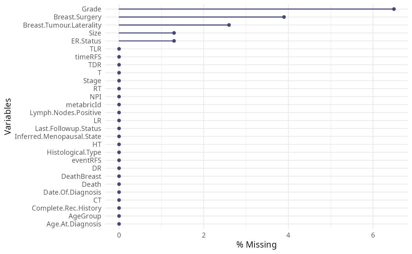
Looking at imbalance in data is crucial because it can lead to biased
models and inaccurate predictions, especially in classification tasks.
Imbalance occurs when one class is significantly underrepresented
compared to others. This can cause models to be overly influenced by the
majority class, leading to poor performance on the minority class. Here,
we tabularise some of the relevant clinical variables and plot the
distribution of the Time to Recurrence-Free Survival
variable.
# Estrogen receptor status
ggplot(clinical, aes(x = ER.Status)) +
  geom_bar(fill = "#0099B4", color = "white", alpha = 0.8) +
  labs(y = "Count\n",
       x = "\nER status") +
  theme_minimal() +
  theme(plot.title = element_text(hjust = 0.5, face = "bold"))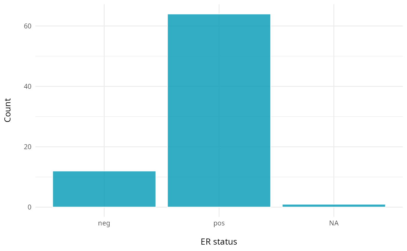
# Histological type
ggplot(clinical, aes(x = Histological.Type)) +
  geom_bar(fill = "#fc6203", color = "white", alpha = 0.8) +
  labs(y = "Count\n",
       x = "\nHistological Type") +
  theme_minimal() +
  theme(plot.title = element_text(hjust = 0.5, face = "bold"))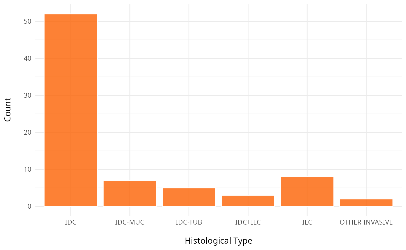
# eventRFS: "Event in Recurrence-Free Survival."It indicates whether the event has occurred.#
ggplot(clinical, aes(x = factor(eventRFS))) +
  geom_bar(fill = "#40dbb2", color = "white", alpha = 0.8) +
  labs(y = "Count\n",
       x = "\nEvent in Recurrence-Free Survival") +
  theme_minimal() +
  theme(plot.title = element_text(hjust = 0.5, face = "bold"))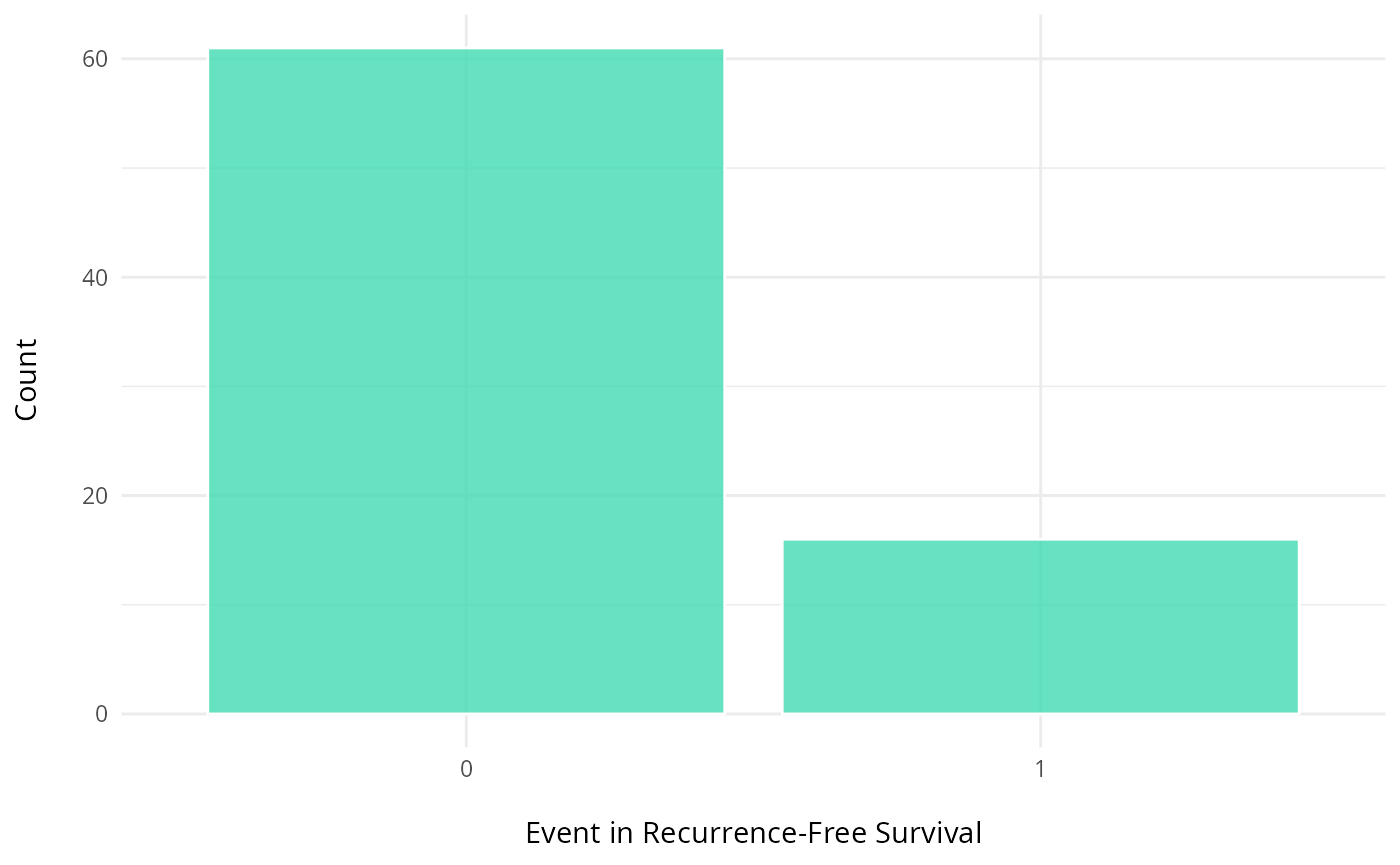
# timeRFS: "Time to Recurrence-Free Survival." It is the time period until recurrence occurs.
ggplot(clinical, aes(x = timeRFS)) +
  geom_histogram(fill = "#de9921", color = "white", alpha = 0.8, bins=20) +
  labs(y = "Frequency\n",
       x = "\ntimeRFS") +
  theme_minimal() +
  theme(plot.title = element_text(hjust = 0.5, face = "bold"))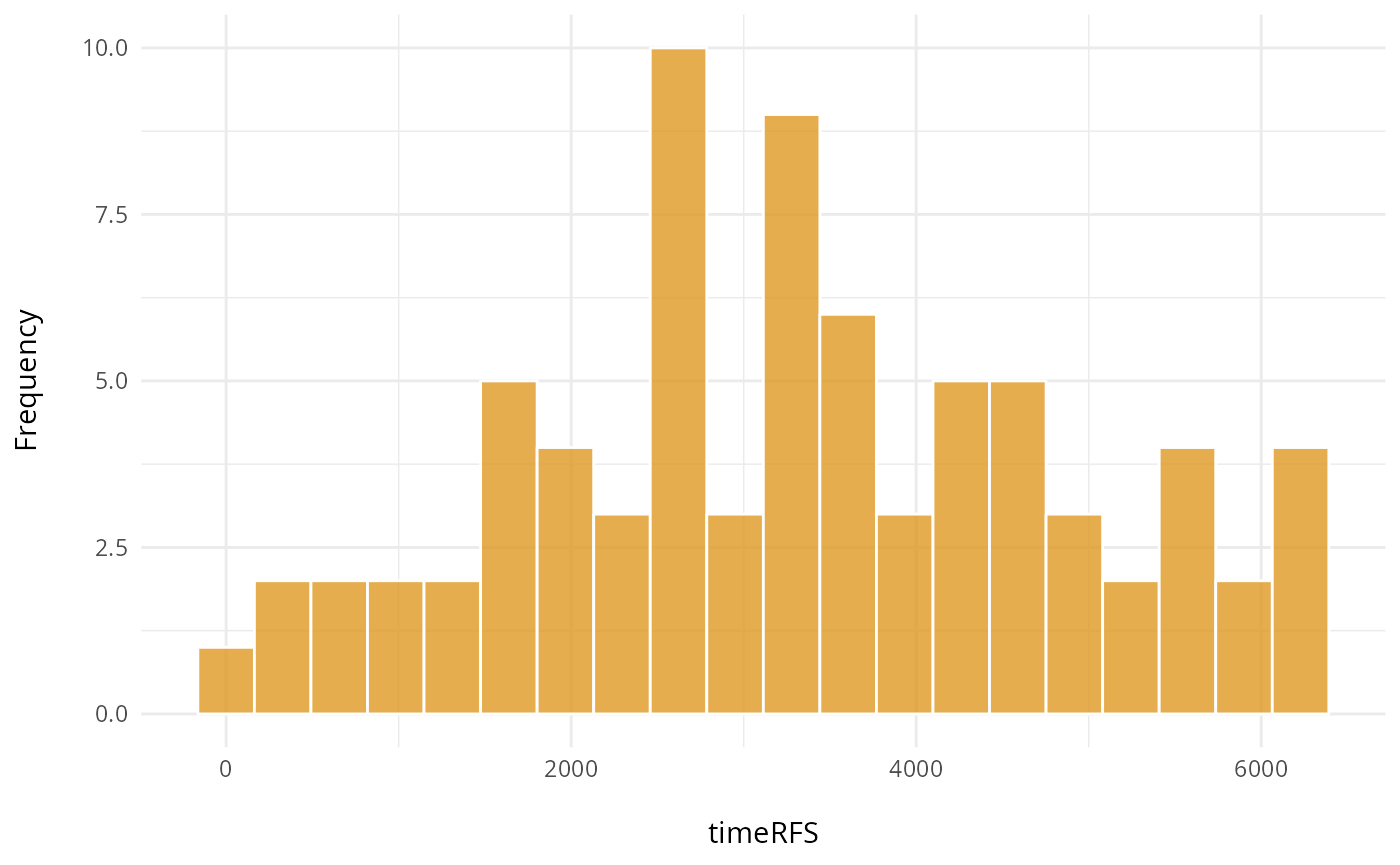
Here, we explore the distribution of the outcomes and variables in the meta-data. We use cross-tabulation to examine the following variables: Surgery vs death, ER status, and Grade.
# Stage and death
table(clinical$Breast.Surgery, clinical$Death, useNA = "ifany")
##
## 0 1
## BREAST CONSERVING 38 14
## MASTECTOMY 16 6
## <NA> 2 1
# ER status and grade
table(clinical$ER.Status, clinical$Grade)
##
## 1 2 3
## neg 0 0 11
## pos 13 30 17
# "Number of individuals based on Grade
table(clinical$Grade, clinical$Death)
##
## 0 1
## 1 12 2
## 2 25 5
## 3 17 11To assess potential batch effects and sample-specific clustering patterns, we visualize the cells in our data colored by the sample of origin. This qualitative inspection provides an intuitive first assessment of any batch effects in our data integration. If there is batch effects then we’d need to apply batch correction to resolve this issue.
#data_sce <- runUMAP(data_sce, scale=TRUE)

# With the UMAP function we can highlight by meta data of interest
# Here we highlight the UMAP by sample ID
plotUMAP(data_sce, colour_by = "metabricId")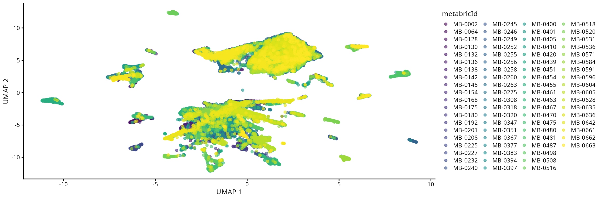
Discussion
- Are there any anomalies or biases that might need to be corrected to ensure our analysis is robust?
- Given our question of interest and the characteristics of our data, are there any particular analytic techniques that would be appropriate? Are there any that would not be appropriate?
Part 2: Quality control
Here, we explore key approaches for evaluating the quality of IMC data. A robust assessment should consider multiple factors, including the density of marker expression, marker correlations, and their co-expression. Something we might want to think about is what characeristics might indicate whether a sample(s) is low/high quality?
cell_counts <- IMC@colData |>  as.data.frame() |>
  dplyr::count(metabricId, name = "cell_count") |>  # Count rows per metabricId
  dplyr::arrange(desc(cell_count))

reducedDim(IMC, "spatialCoords") <- IMC@colData[,c("Location_Center_X","Location_Center_Y")]


cell_type_mapping <- c(
  "B cells" = "B cell",
  "T cells" = "T cell",
  "Macrophages Vim+ CD45low" = "Macrophage",
  "Macrophages Vim+ Slug-" = "Macrophage",
  "Macrophages Vim+ Slug+" = "Macrophage",

  "Endothelial" = "Endothelial",

  "Fibroblasts" = "Fibroblast",
  "Fibroblasts CD68+" = "Fibroblast",
  "Myofibroblasts" = "Fibroblast",
  "Vascular SMA+" = "Fibroblast",

  "Myoepithelial" = "Myoepithelial",

  "HR+ CK7-" = "Tumor HR+",
  "HR+ CK7- Ki67+" = "Tumor HR+",
  "HR+ CK7- Slug+" = "Tumor HR+",

  "HR- CK7+" = "Tumor HR-",
  "HR- CK7-" = "Tumor HR-",
  "HR- Ki67+" = "Tumor HR-",
  "HR- CKlow CK5+" = "Tumor HR-",

  "HRlow CKlow" = "Tumor HR-low/mixed",
  "HER2+" = "Tumor HER2+",
  "Basal CKlow" = "Tumor Basal-like",
  "Hypoxia" = "Tumor Hypoxic"
)

# Convert IMC description to higher-level categories
IMC$high_level_category <- recode(IMC$description, !!!cell_type_mapping)


imc.spe=IMC[,IMC$metabricId%in%cell_counts[1:20,]$metabricId]

# Convert IMC description to higher-level categories
imc.spe$high_level_category <- recode(imc.spe$description, !!!cell_type_mapping)


plots <- plot_marker_densities(imc.spe, sample_id_col = "metabricId",
                                markers_to_plot = c("CD20","CD3","CD68","vWF_CD31","Vimentin","HER2"),
                               assay_name = "logcounts")
2.1: QC for the panel / markers
Here, we want to assess the quality of the markers: it is desirable to see at least two peaks, which would indicate the existence of cell type specific markers in our data.
Questions
- Can we see any cell type specific markers, which are they?
- Are there any non-cell type specific markers?
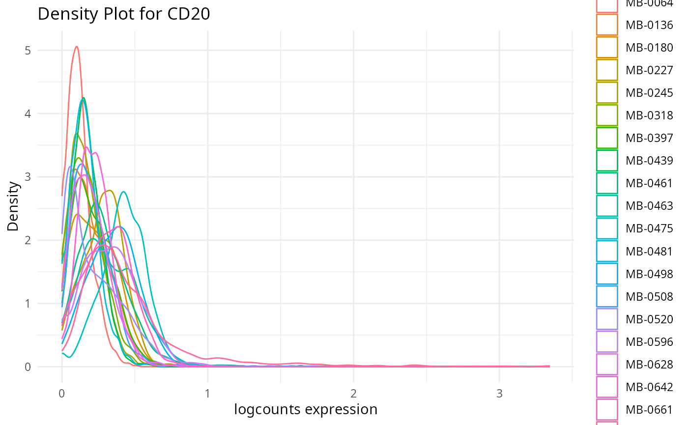
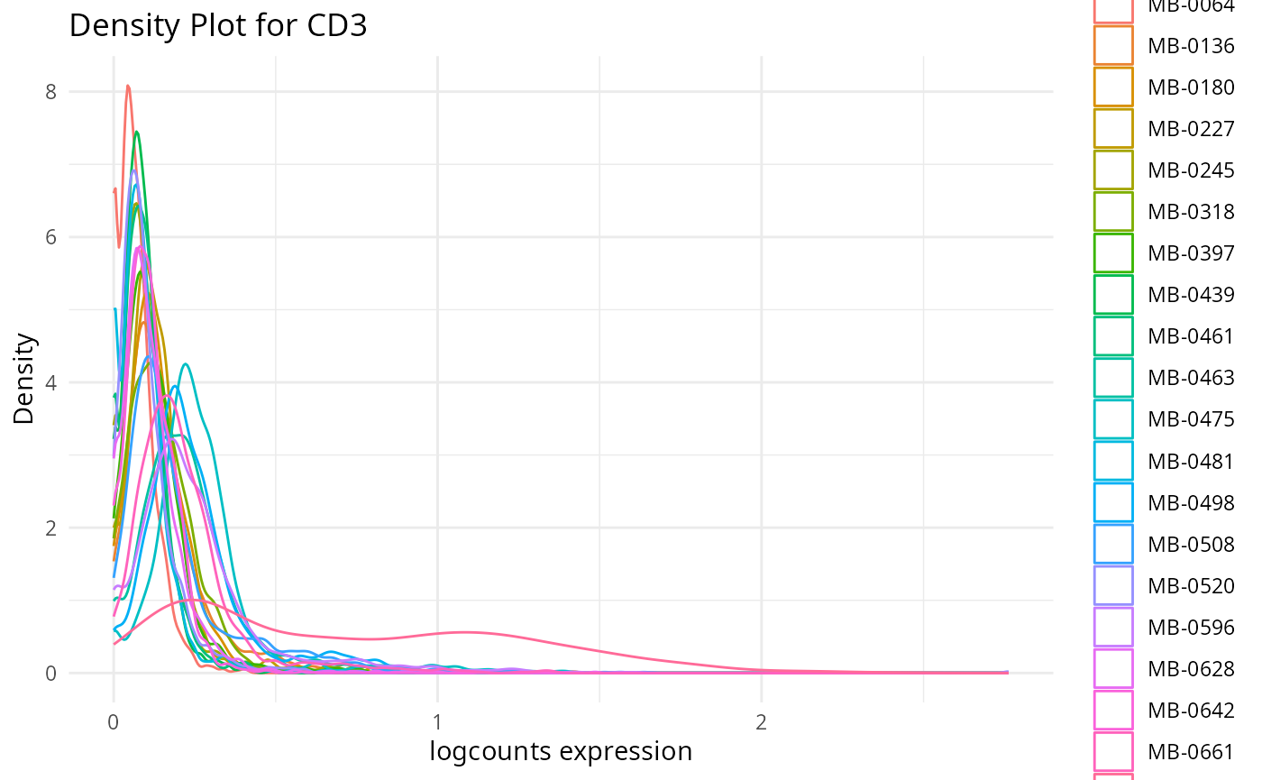
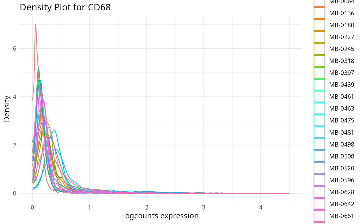
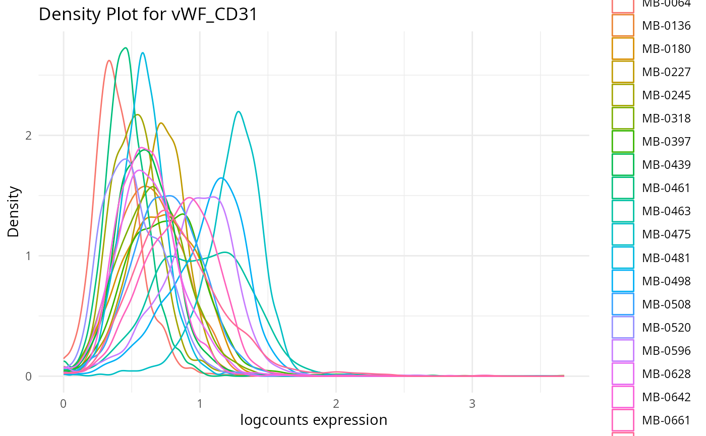
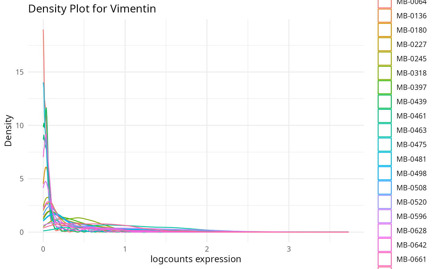
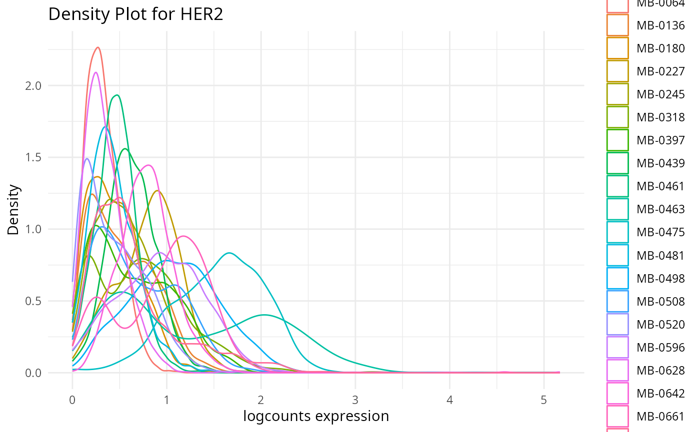
Discussion
- Do we have a sufficient amount of cell type specific markers?
- Is the panel of genes sufficient for our study?
2.2: QC of individual samples
Here we plot the correlation of different markers for a subset of samples. This helps us determine whether a sample has low/high contamination of markers.
Questions
- Which pairs of markers do we expect to be correlated/not correlated.
- Is there any evidence of marker contamination for a given sample?
coexp_df <- readRDS("../../data/coexp_df.rds")
marker_list <- c("CD20", "CD3", "CD68", "vWF_CD31", "Vimentin", "HER2")

# Proportion heatmaps
heatmaps_prop <- plot_pairwise_heatmaps_per_sample(coexp_df, marker_list, stat = "proportion")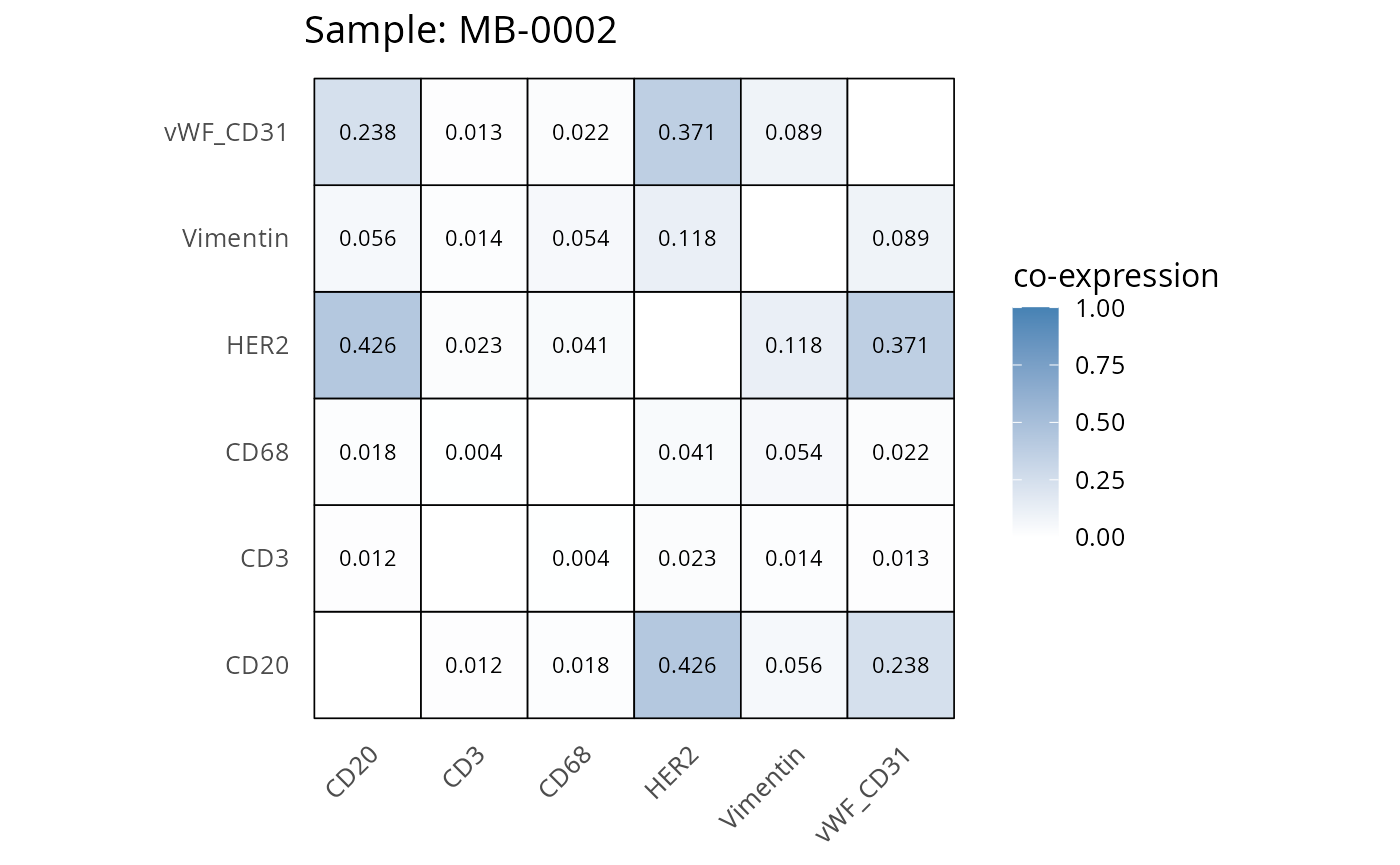
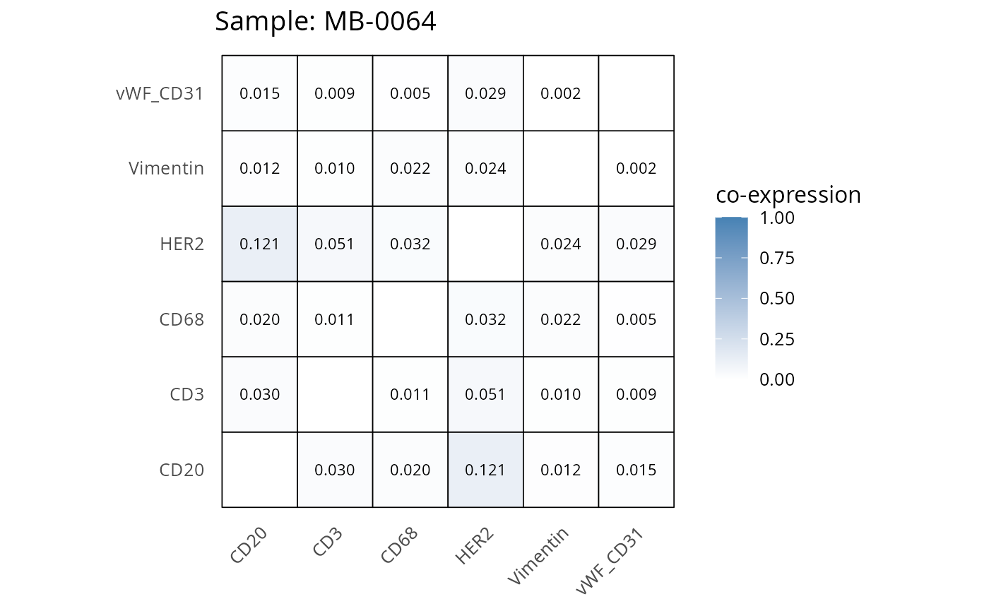
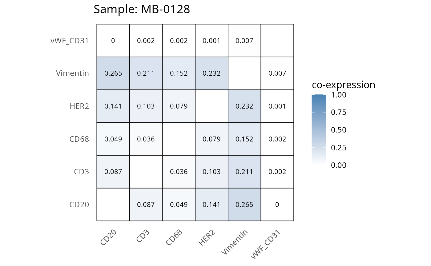
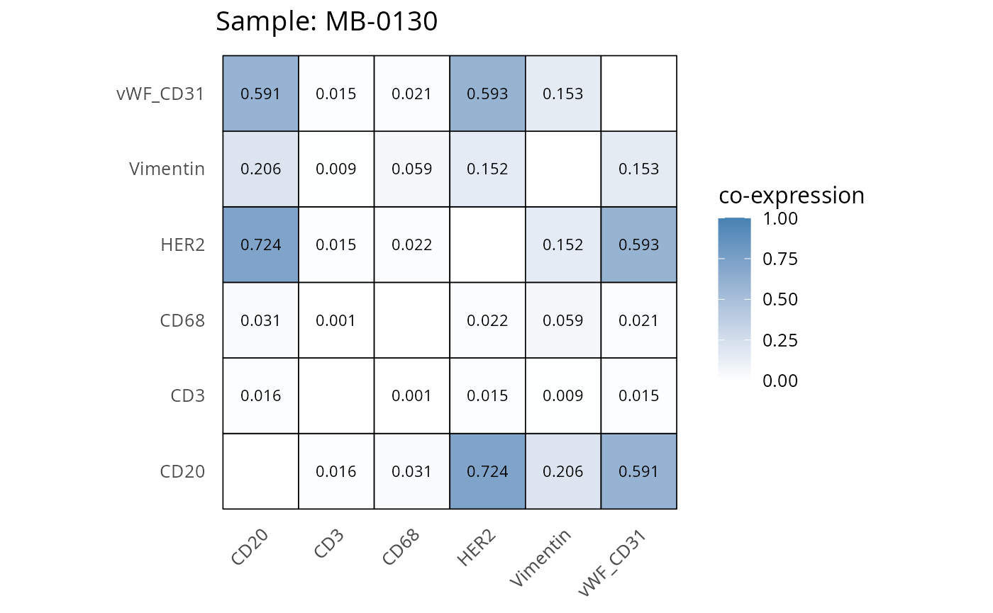

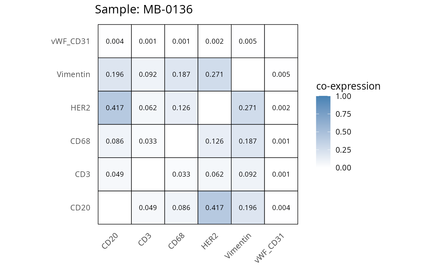

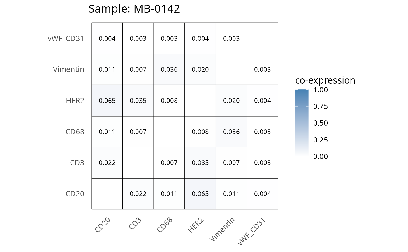
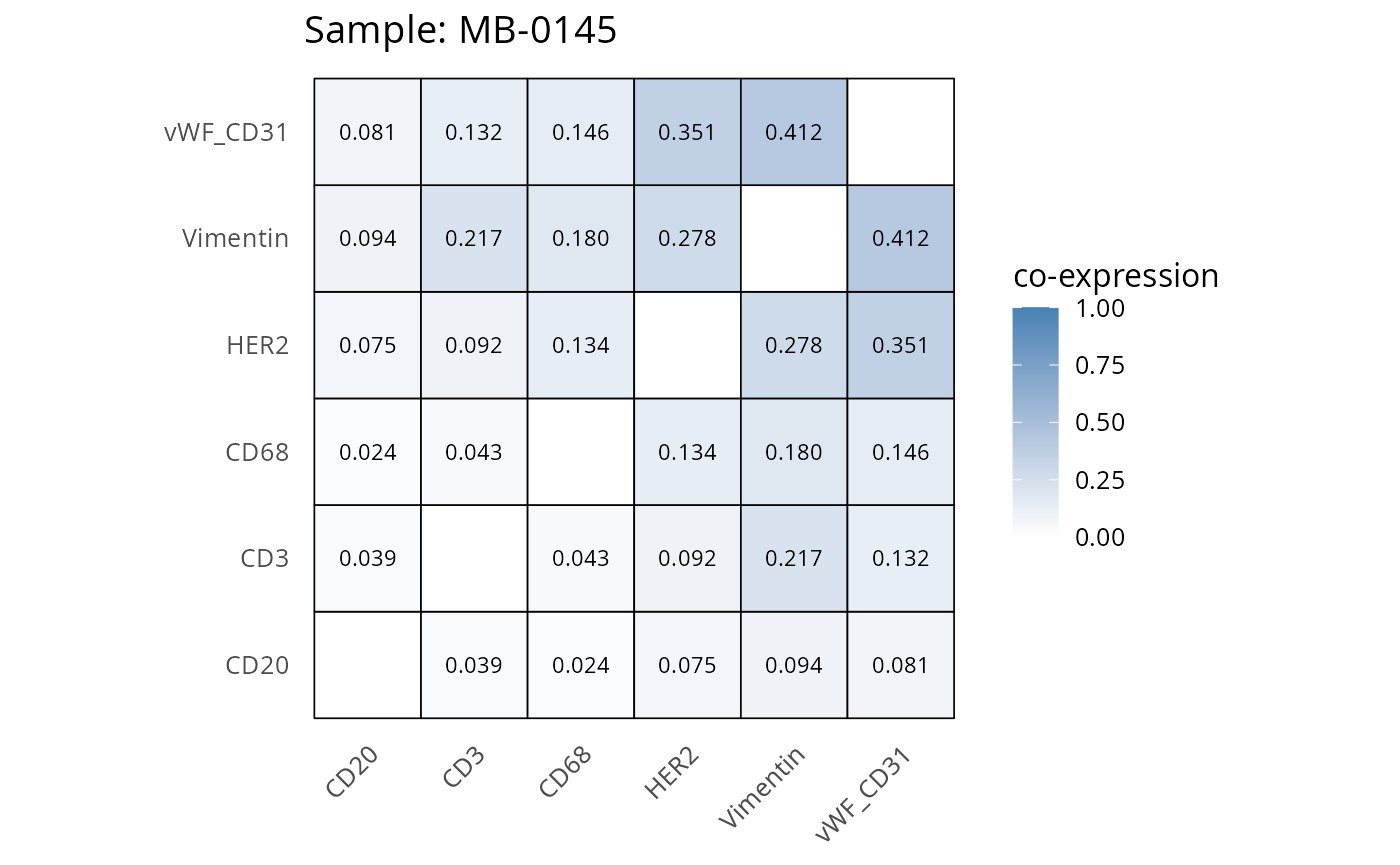
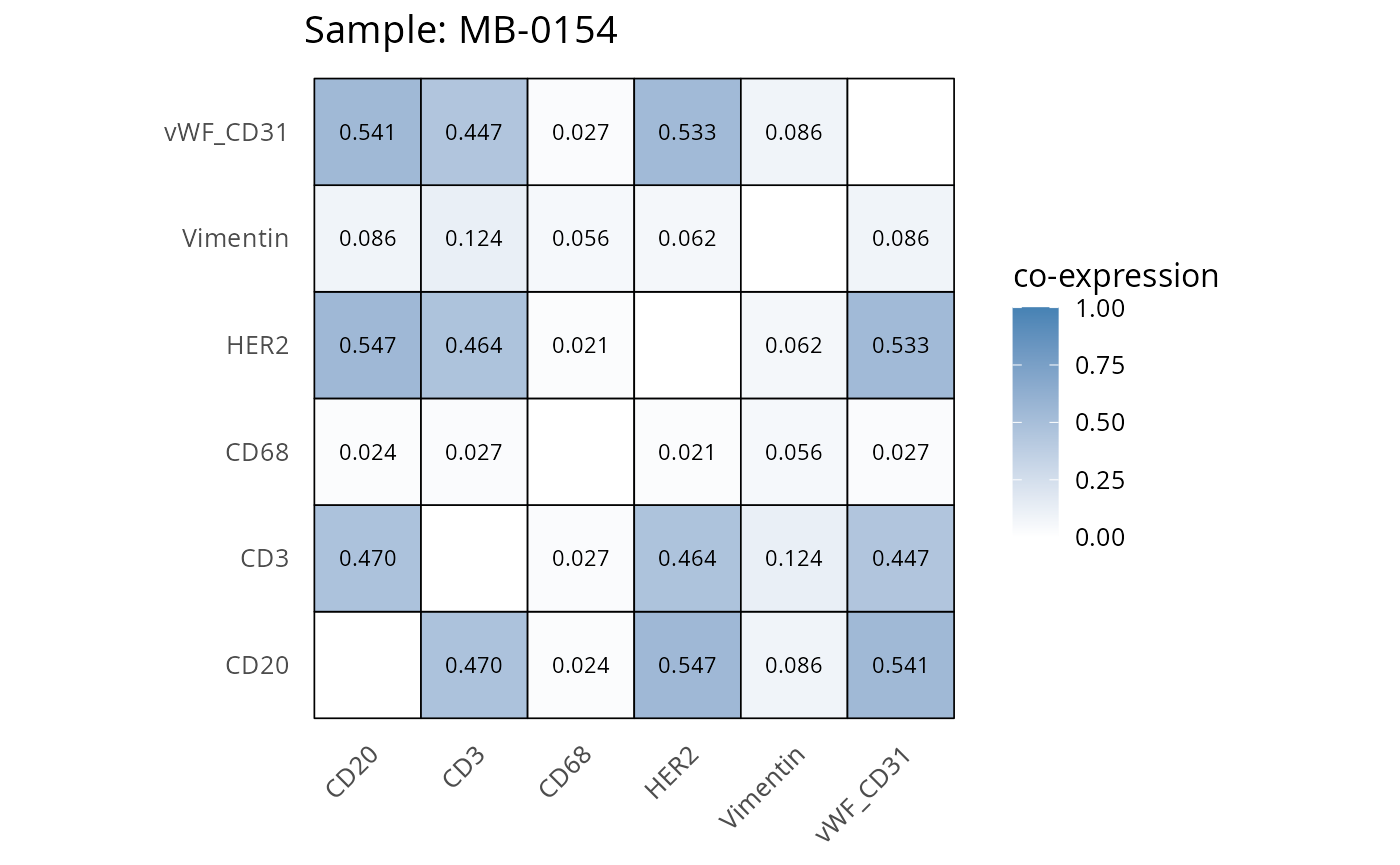


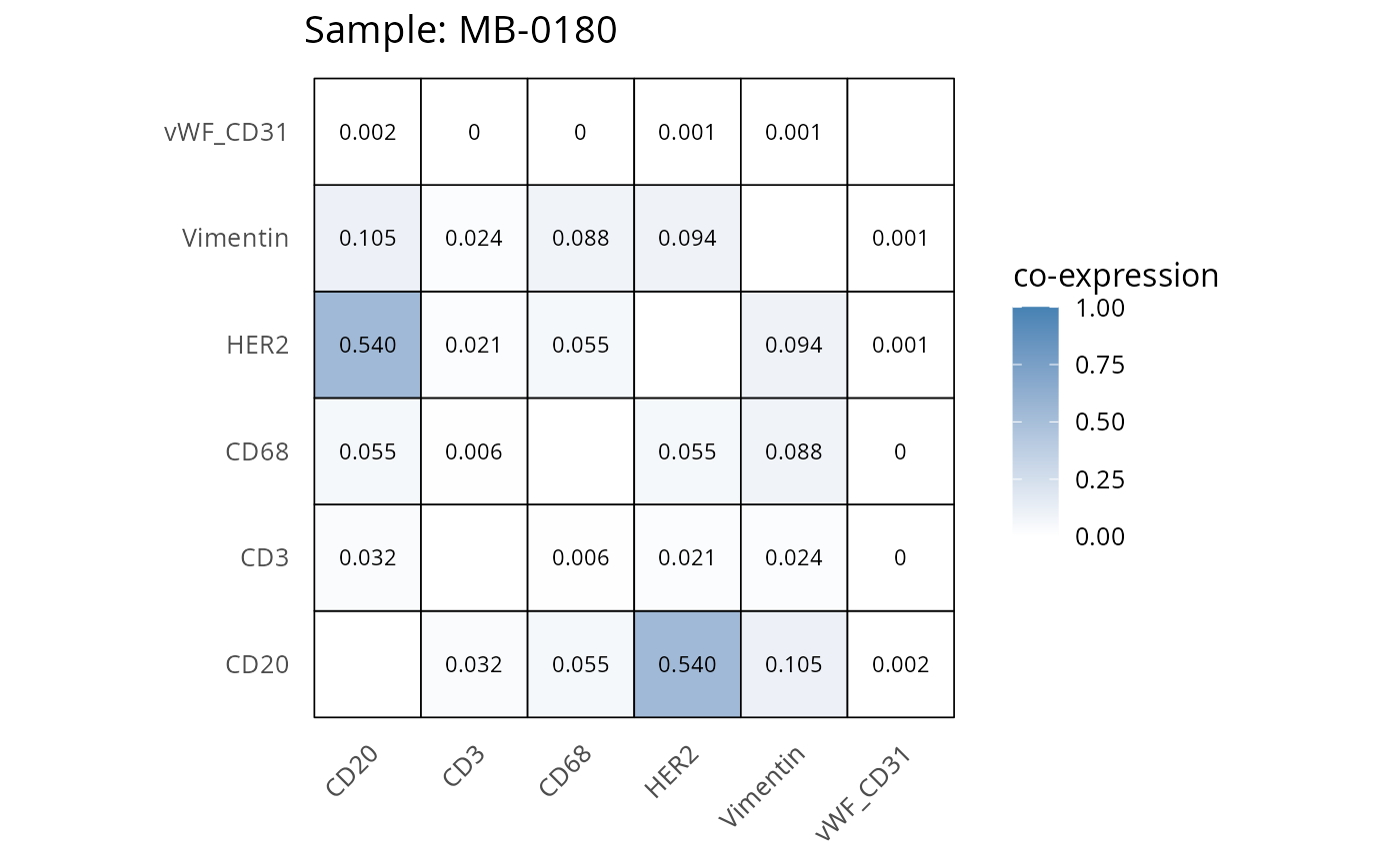
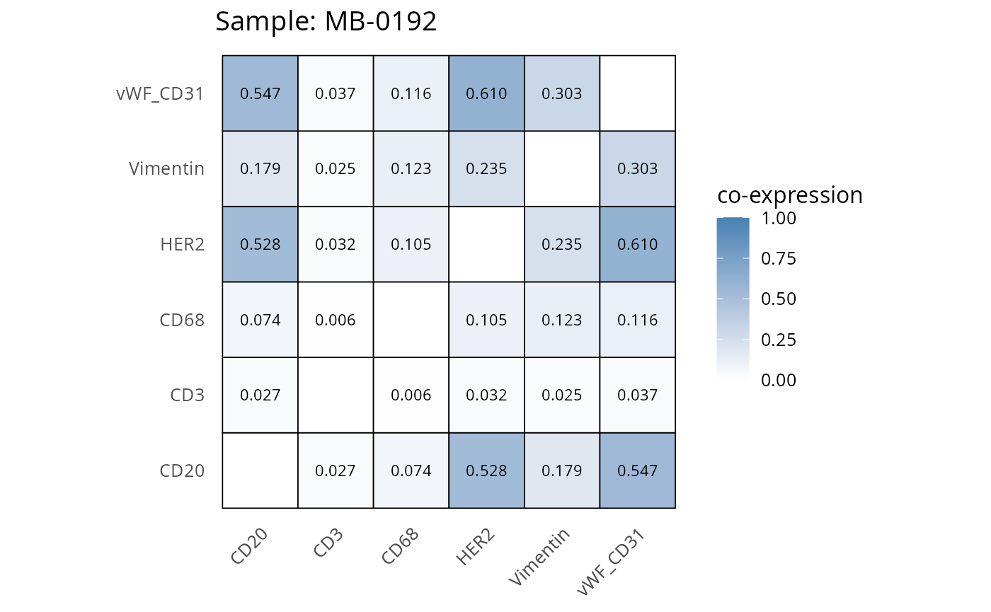

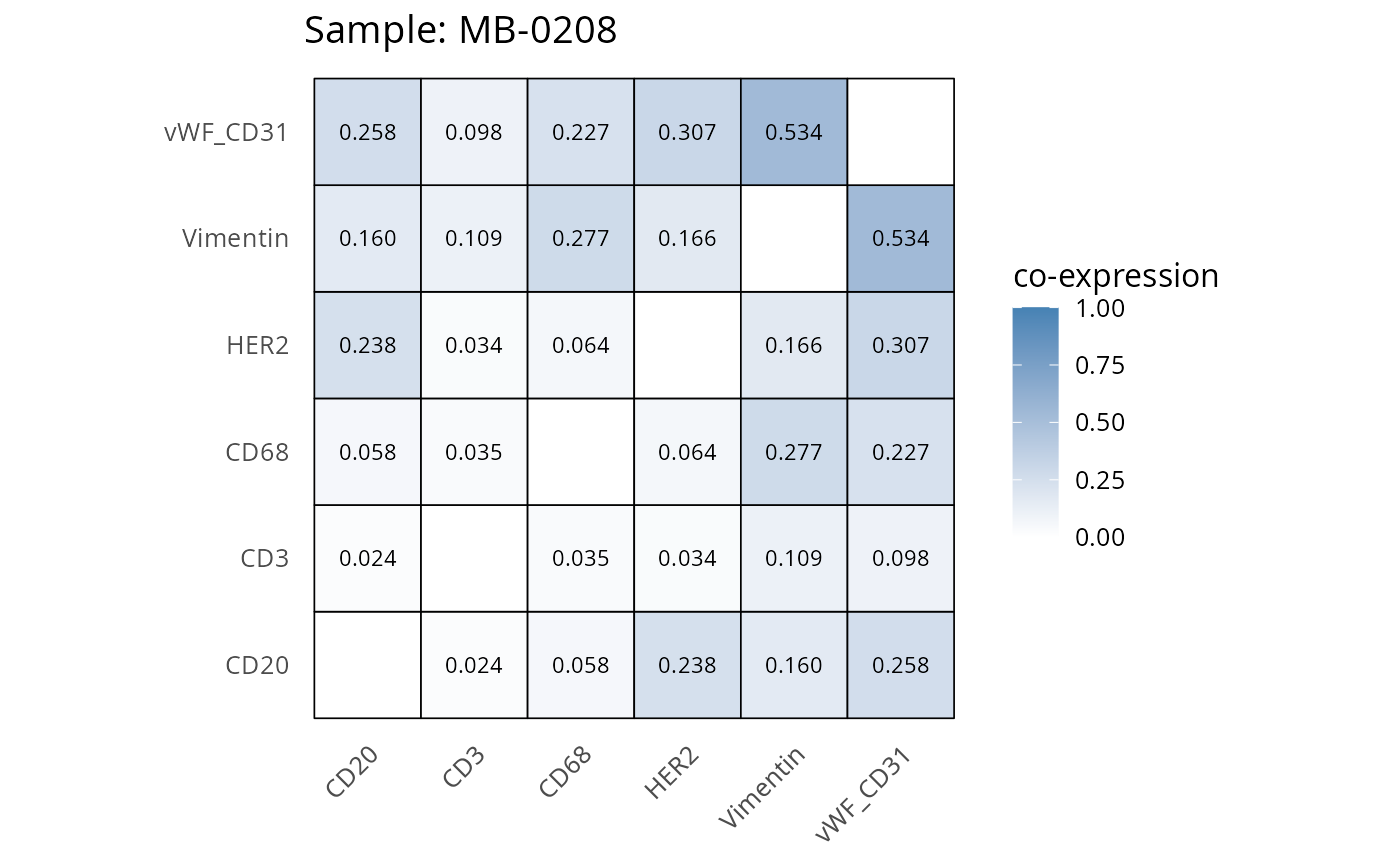

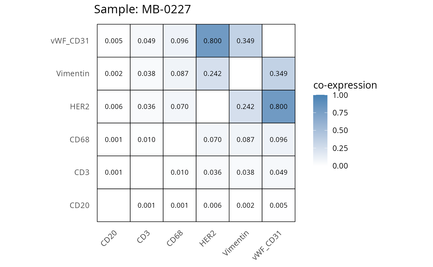
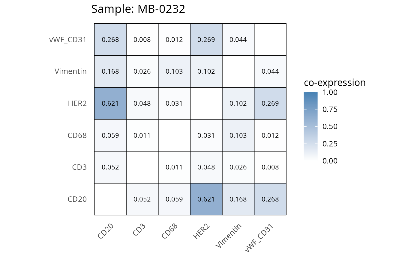
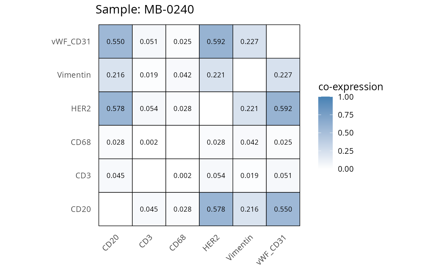

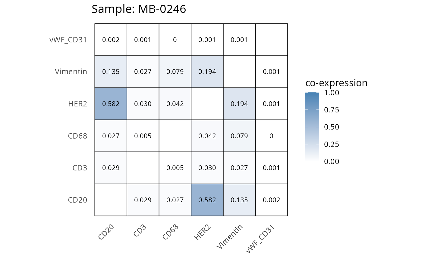


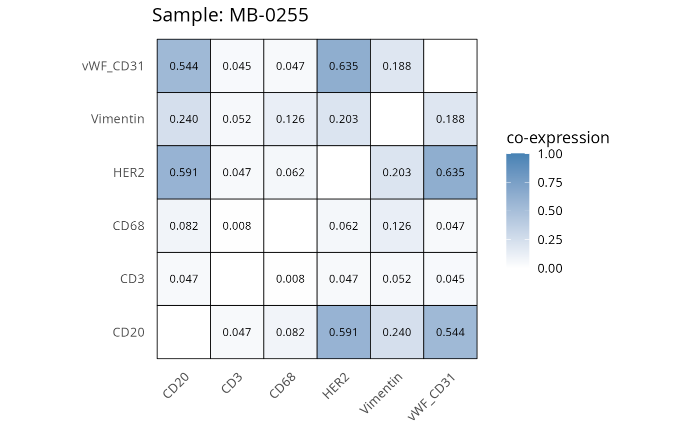
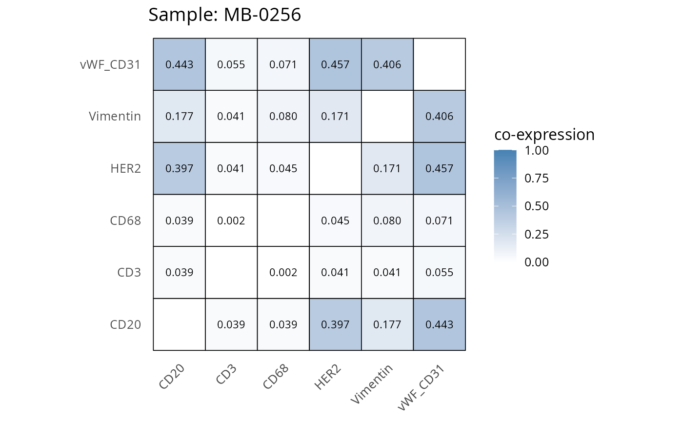
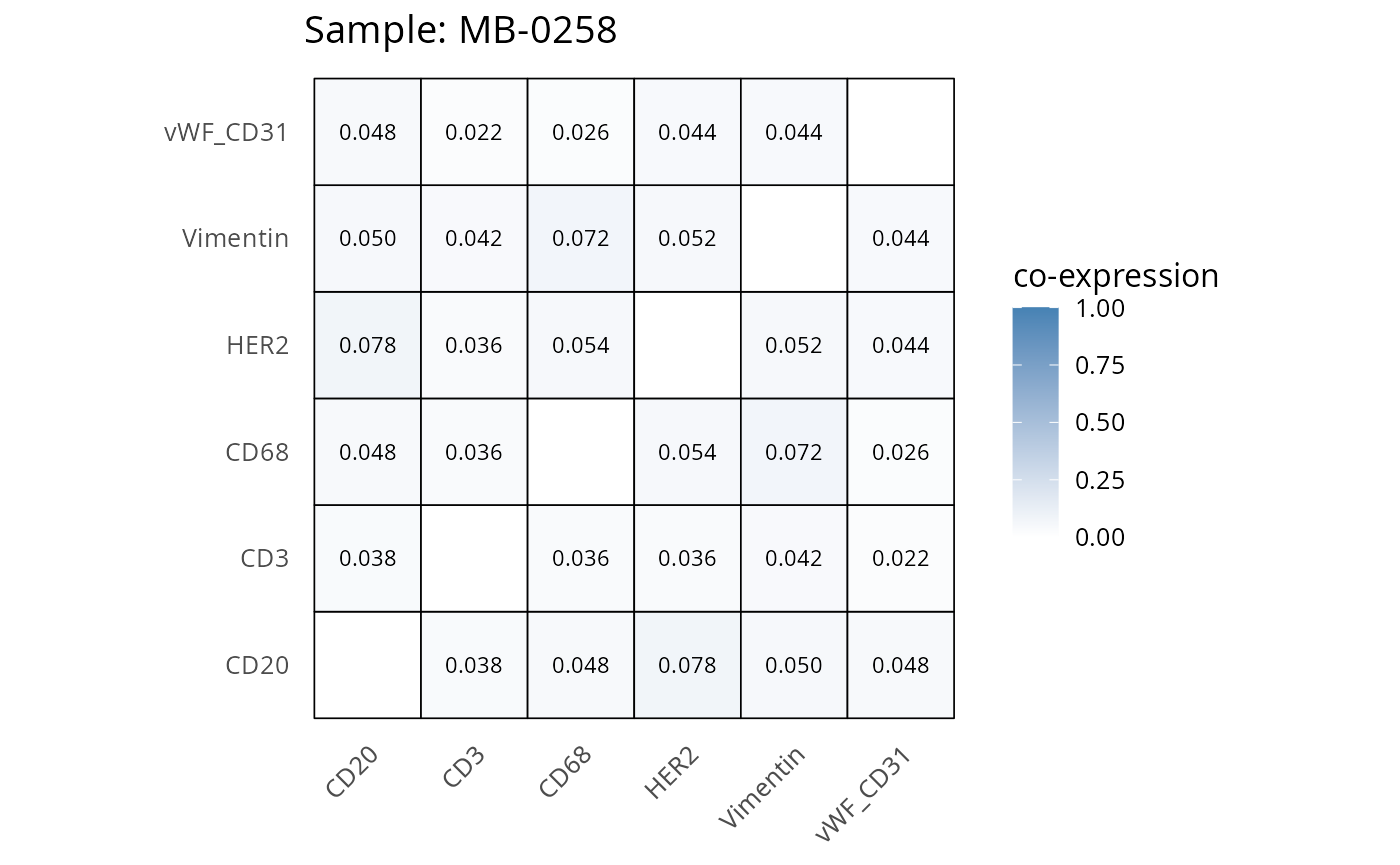
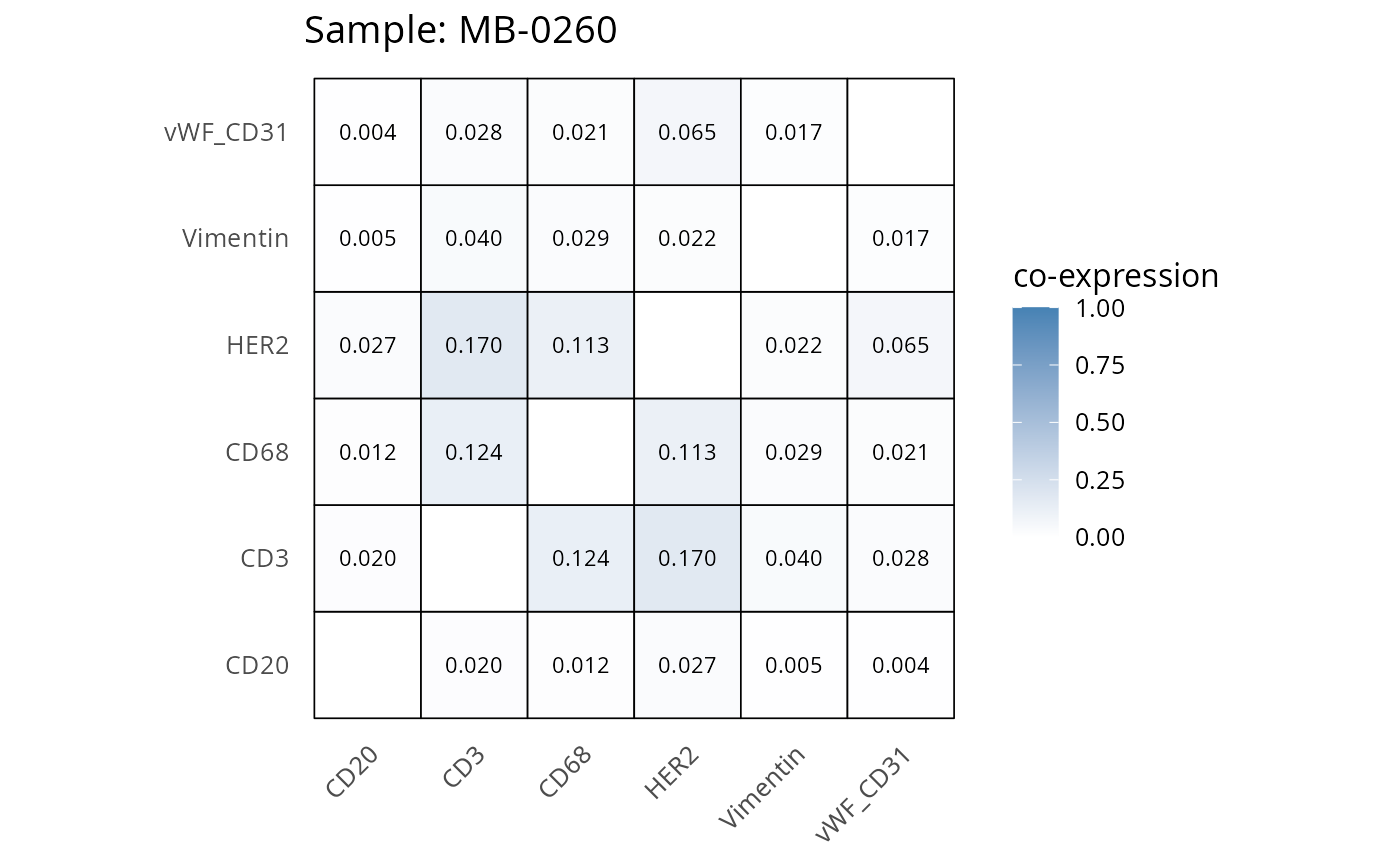
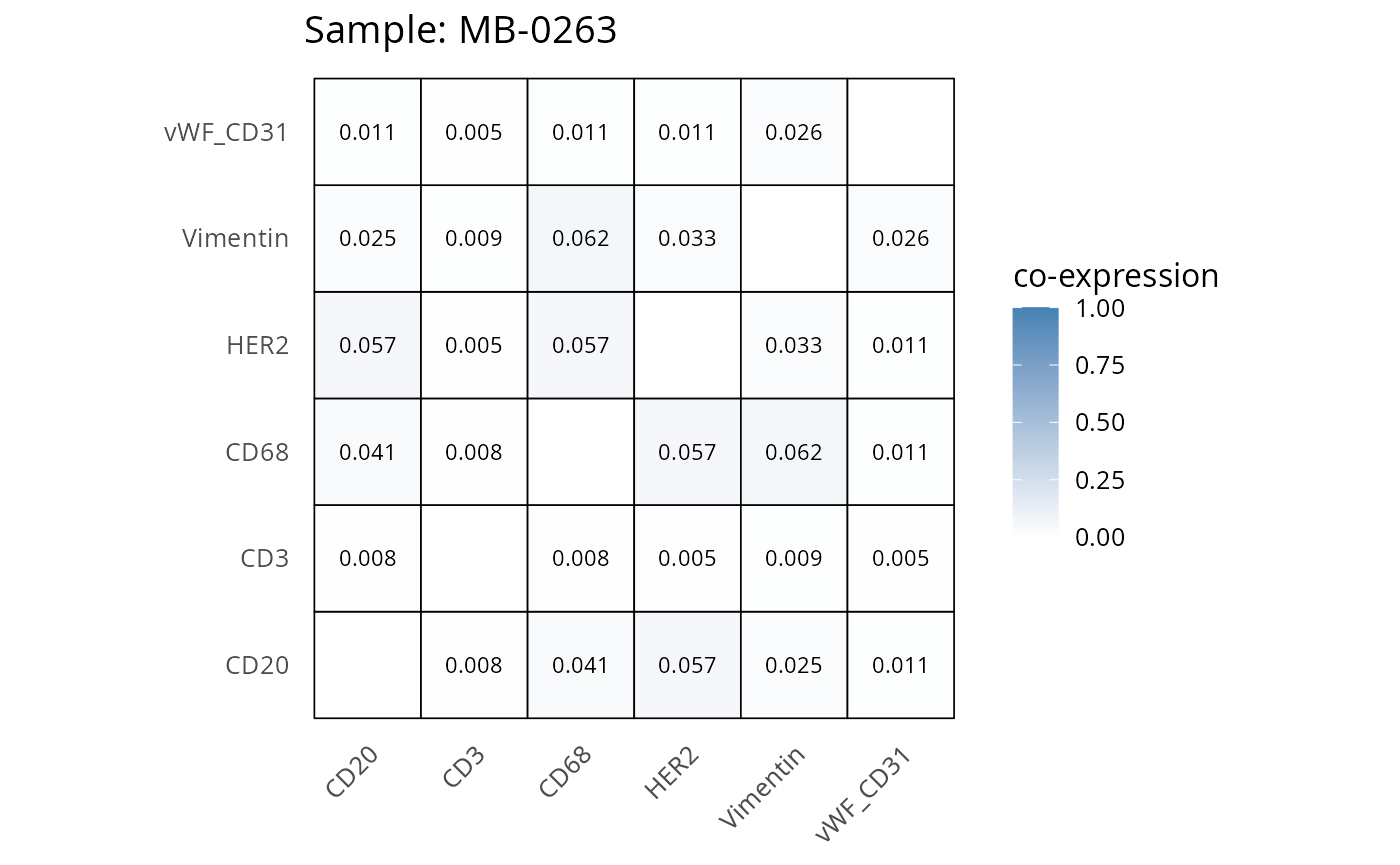
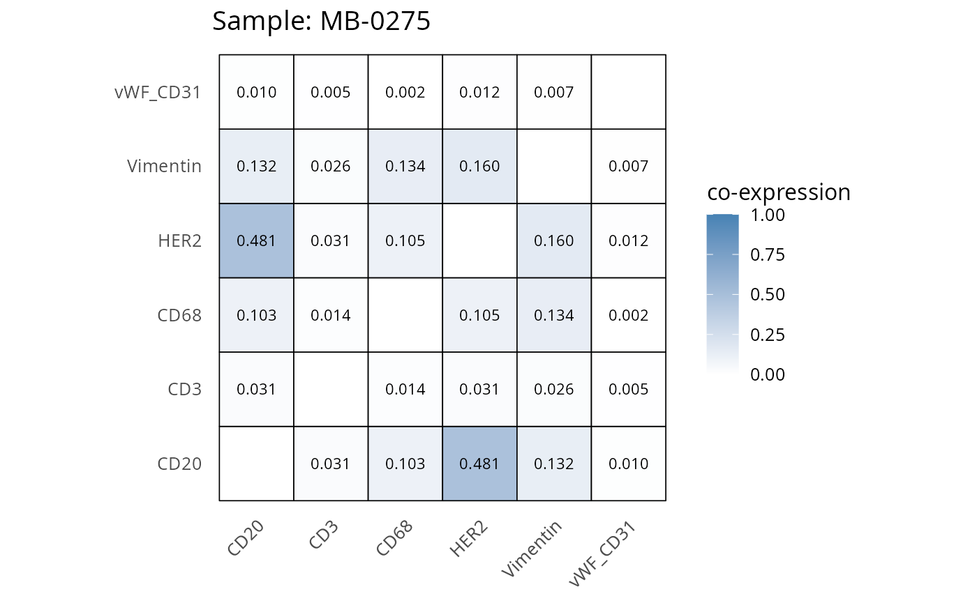
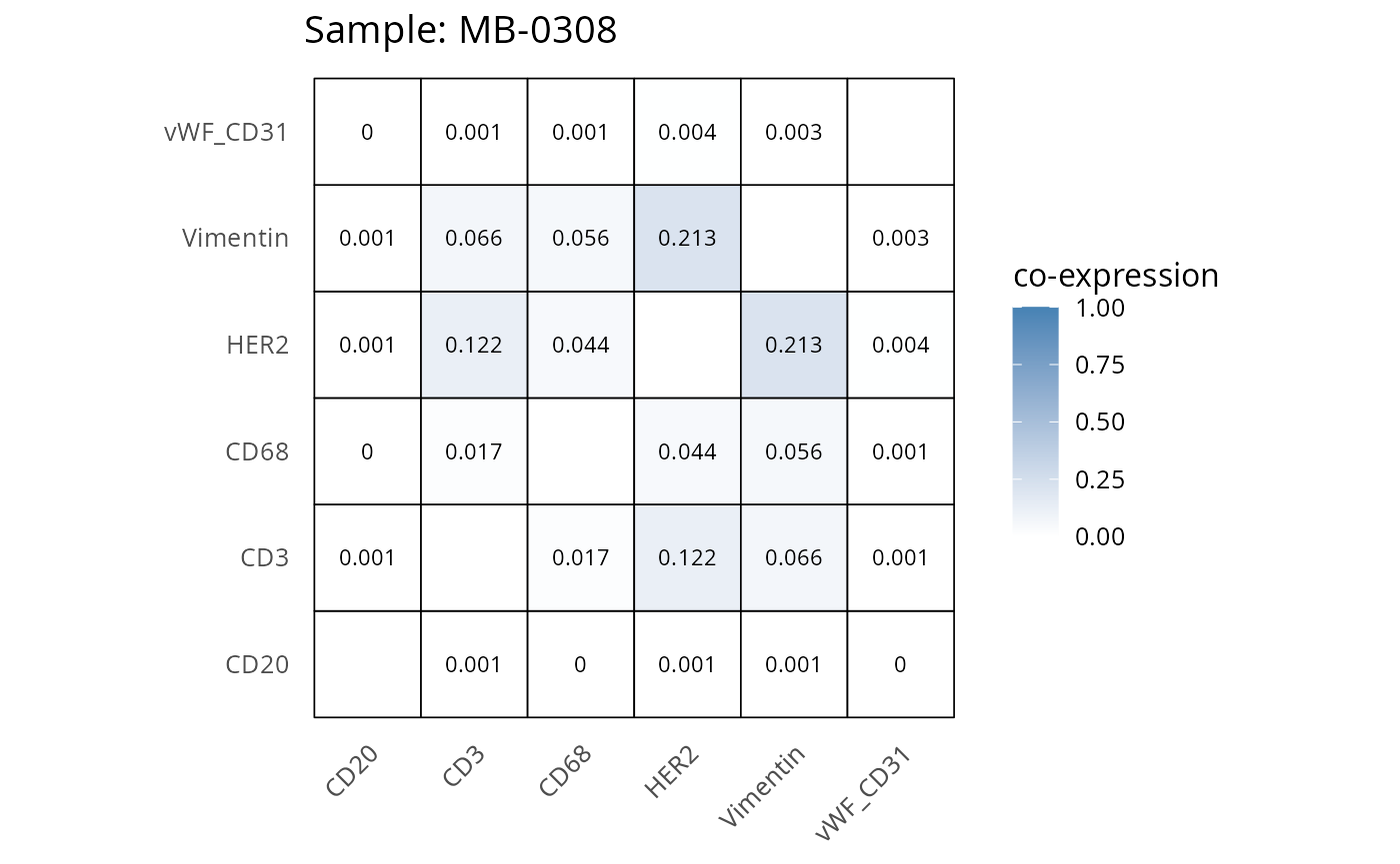
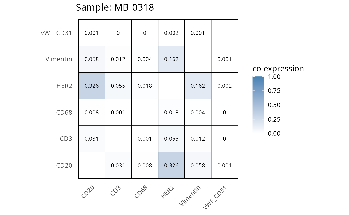

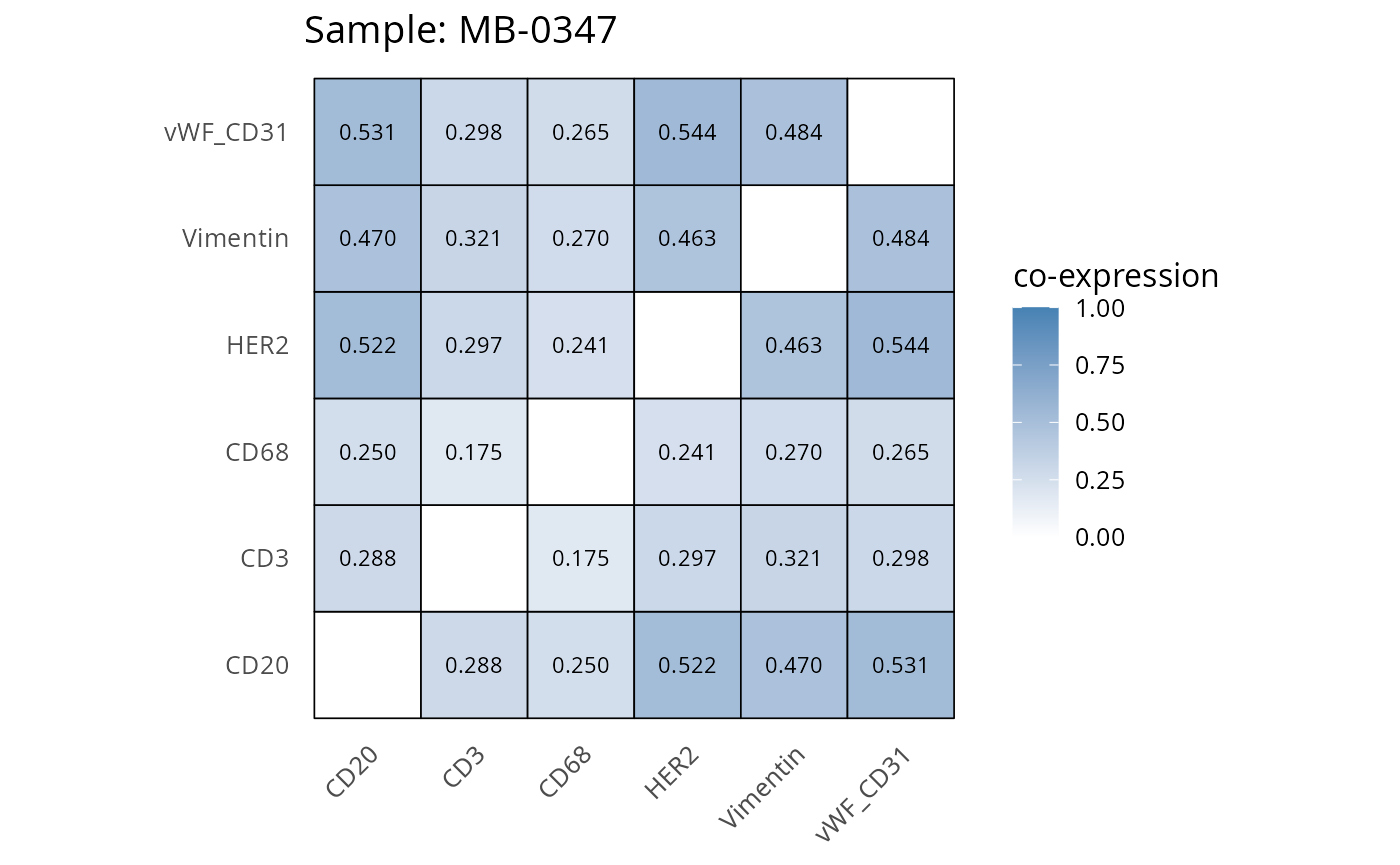

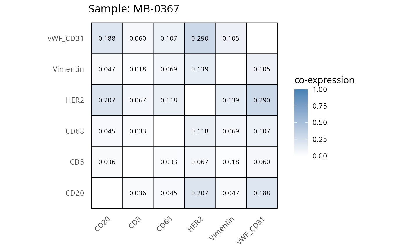
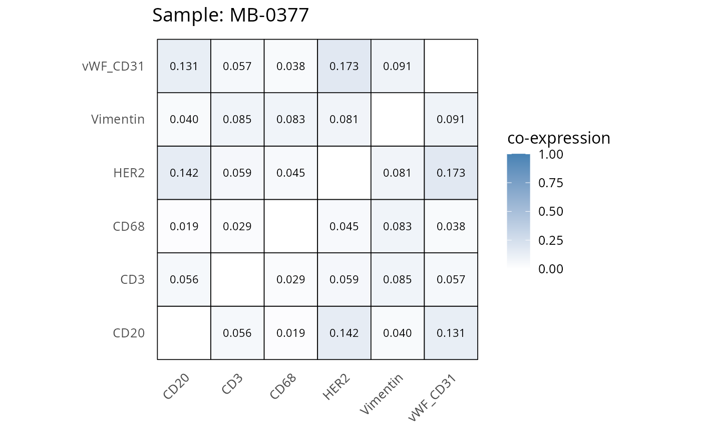
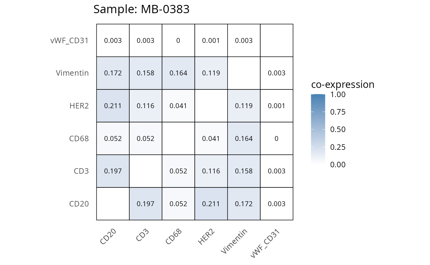
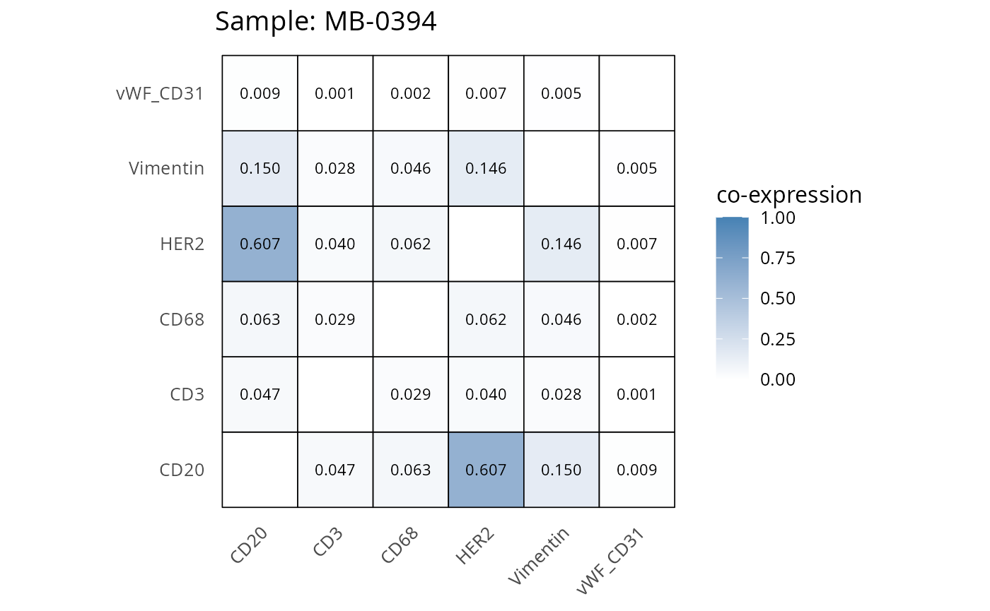
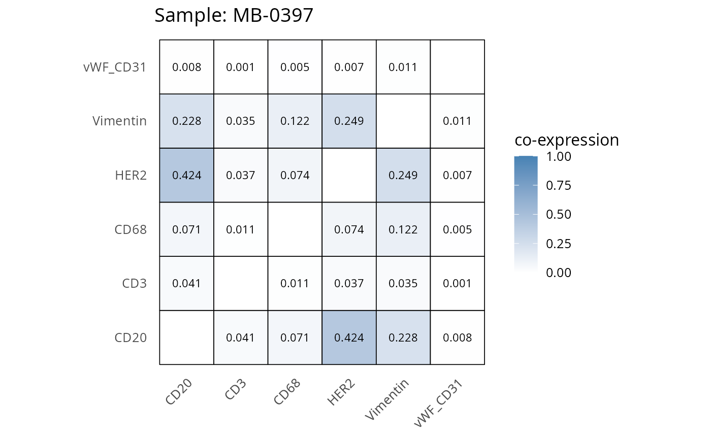
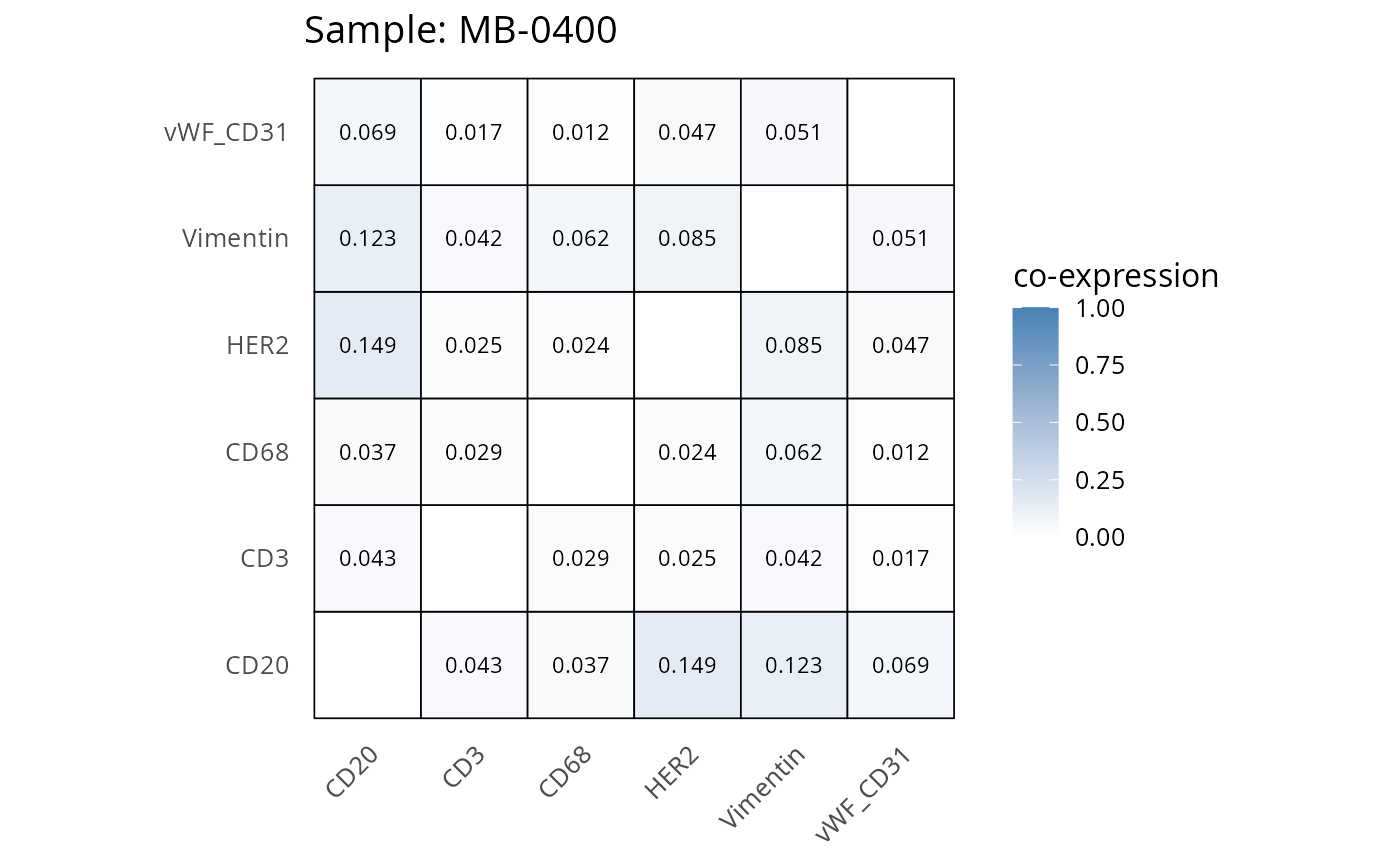


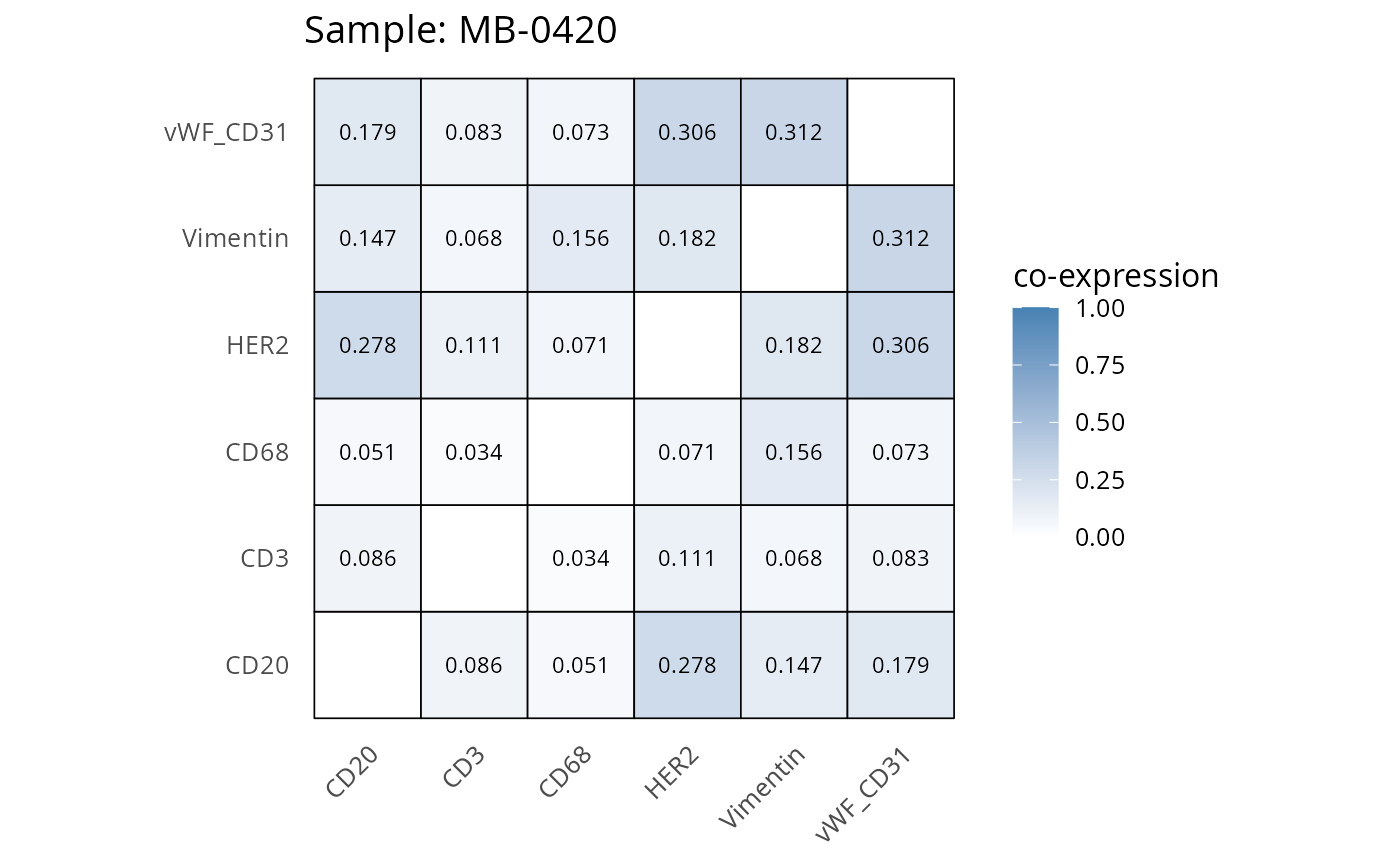
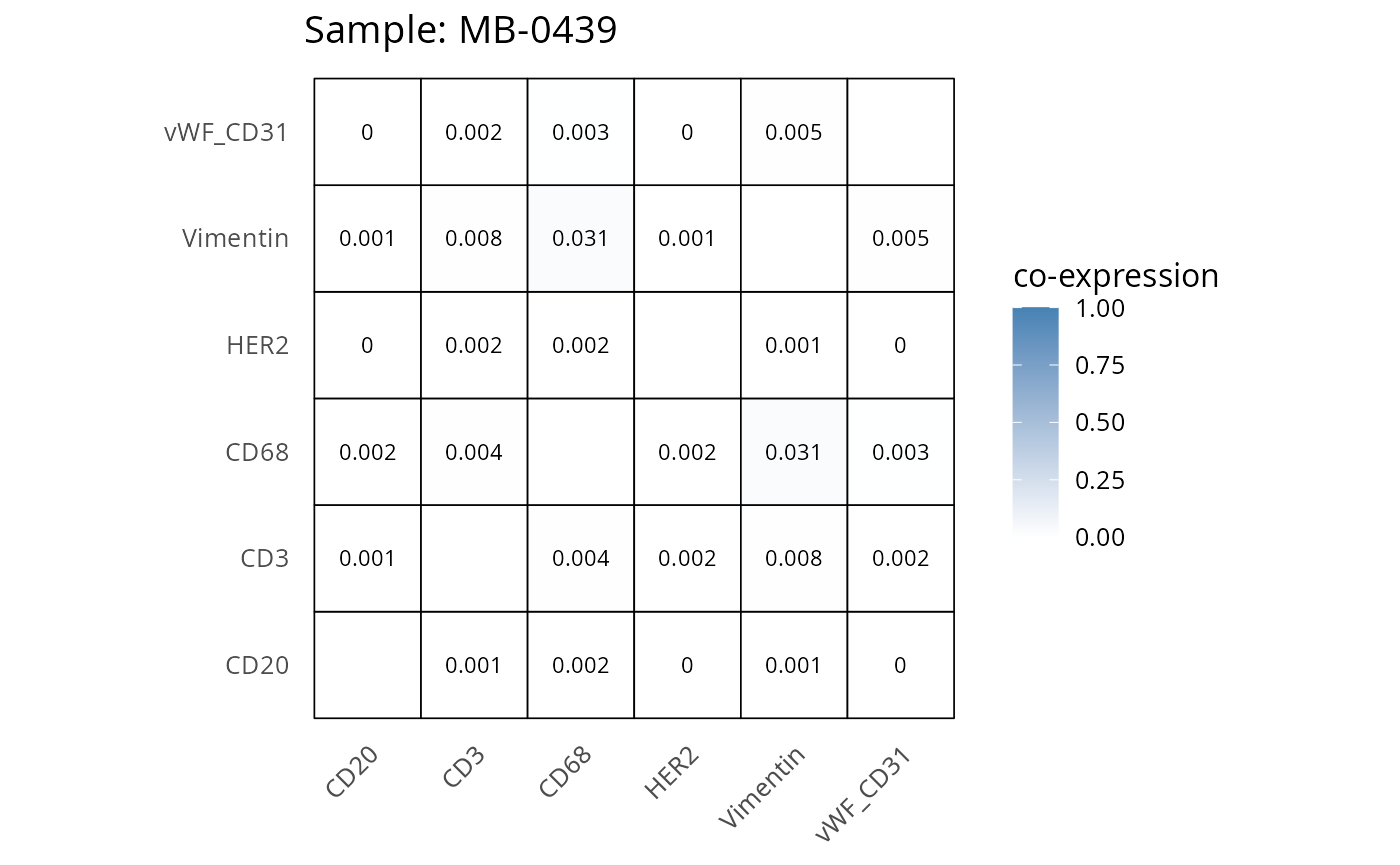
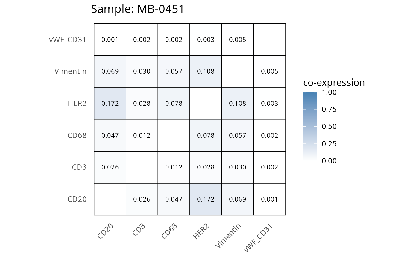
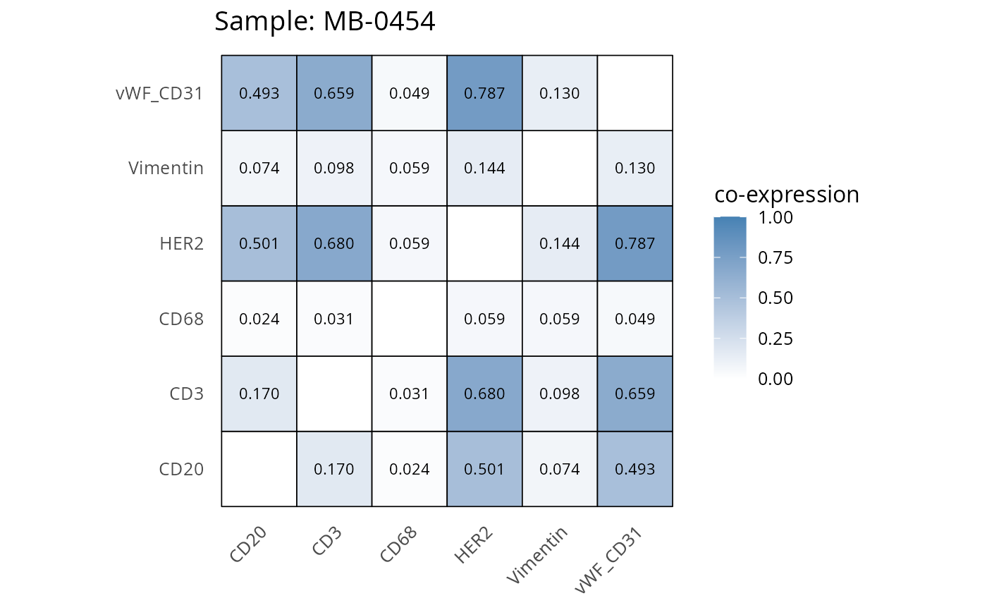
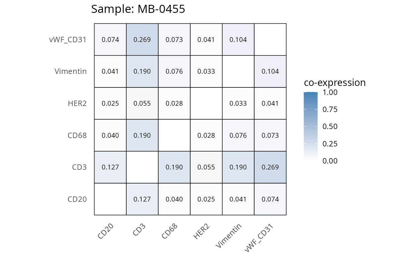
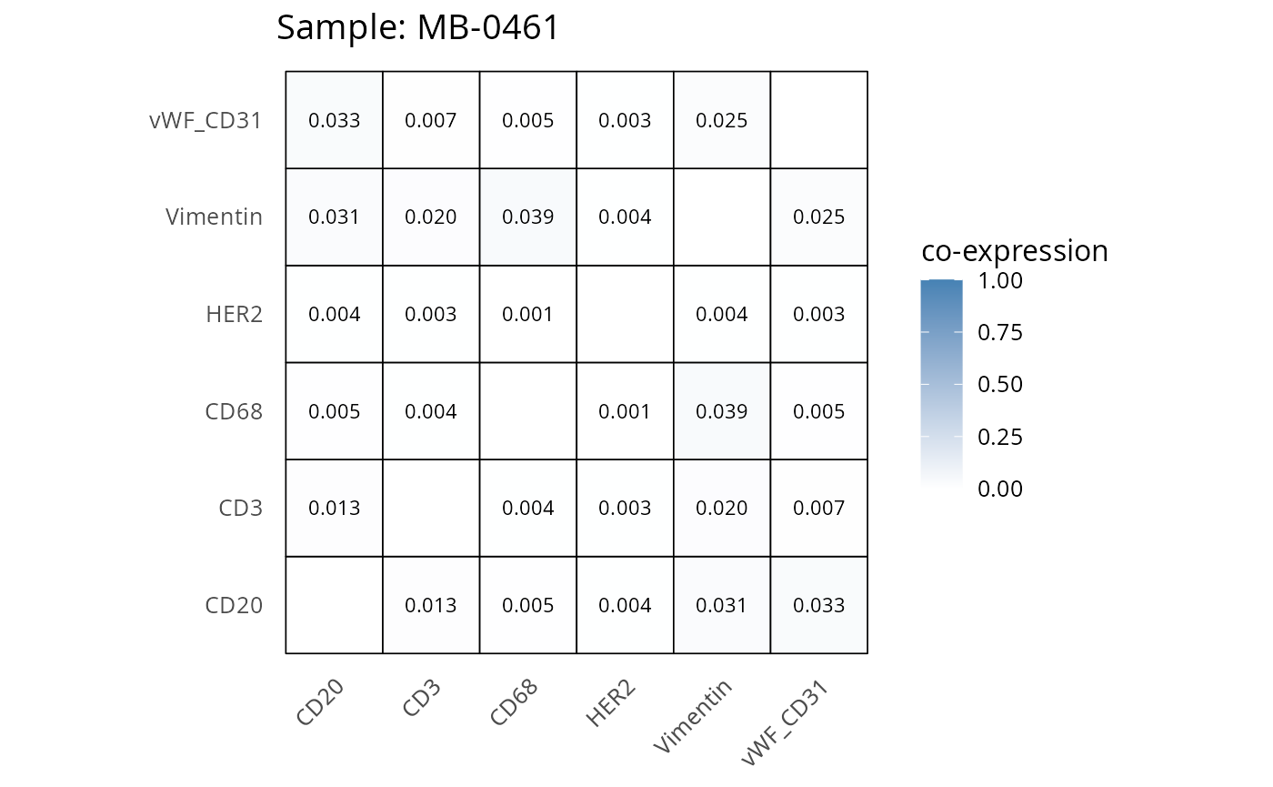


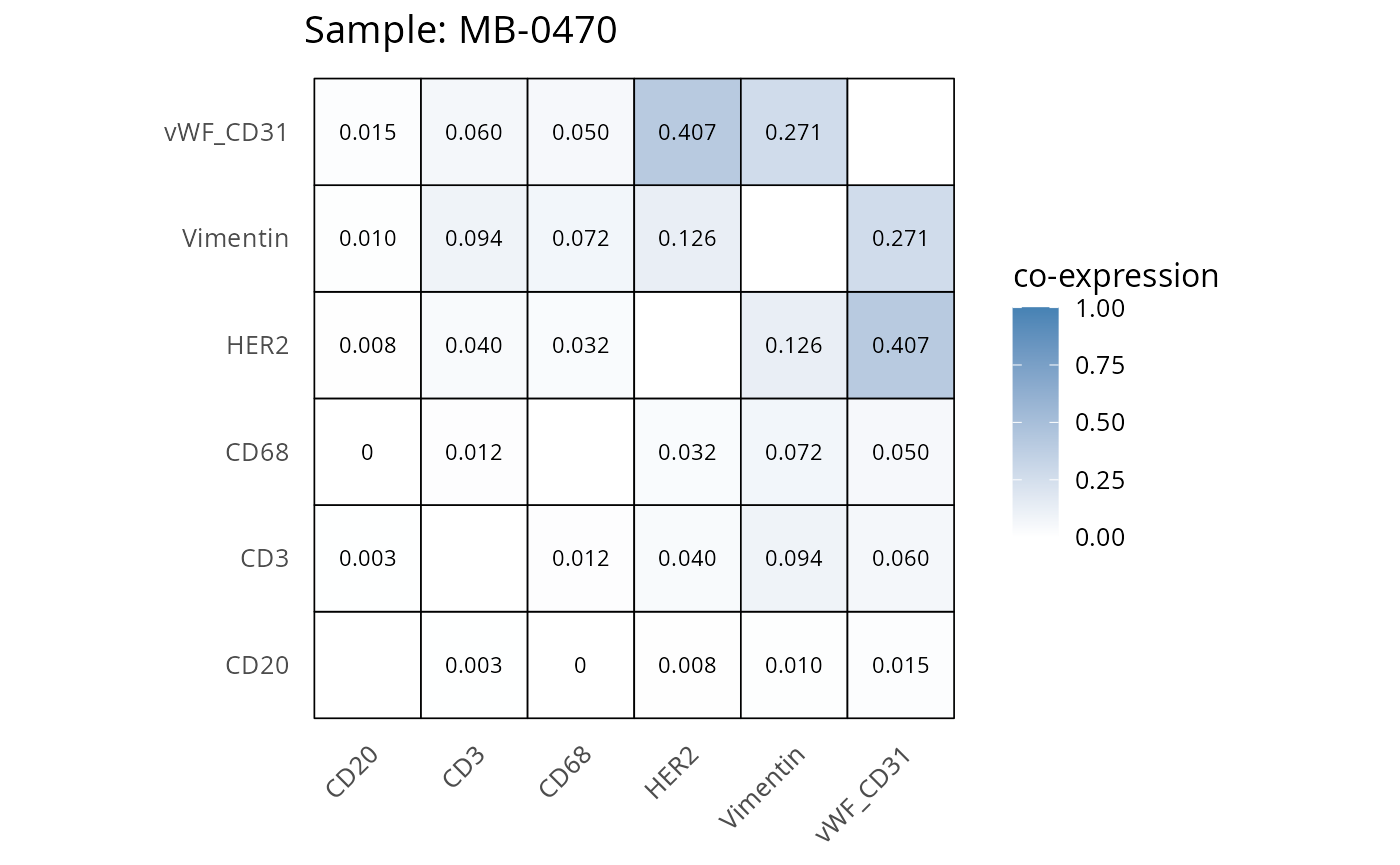
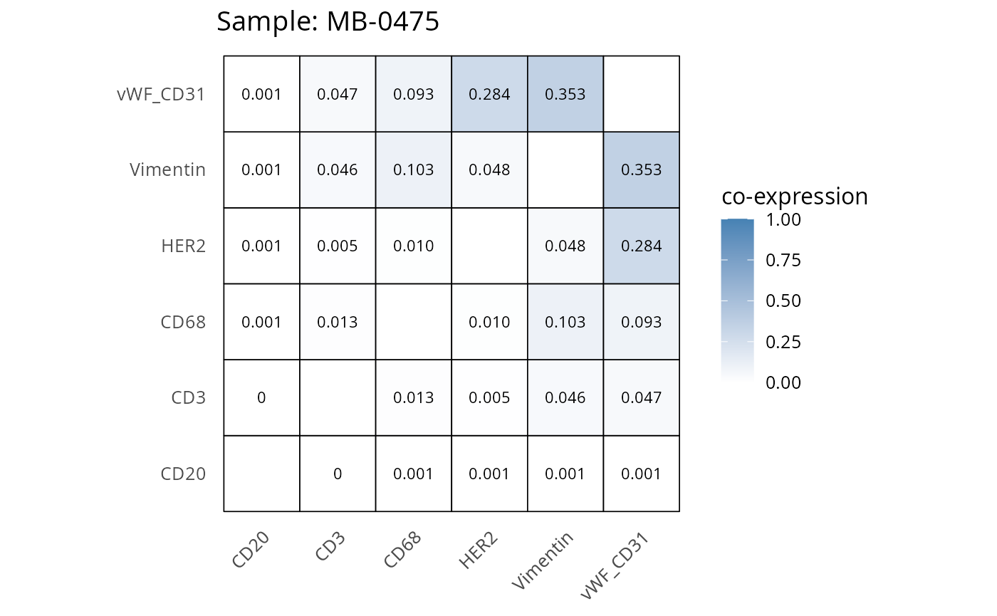
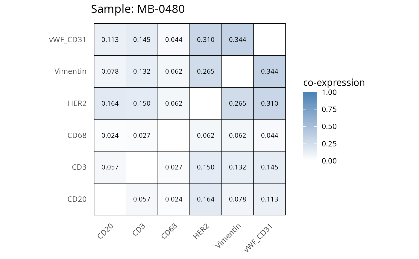
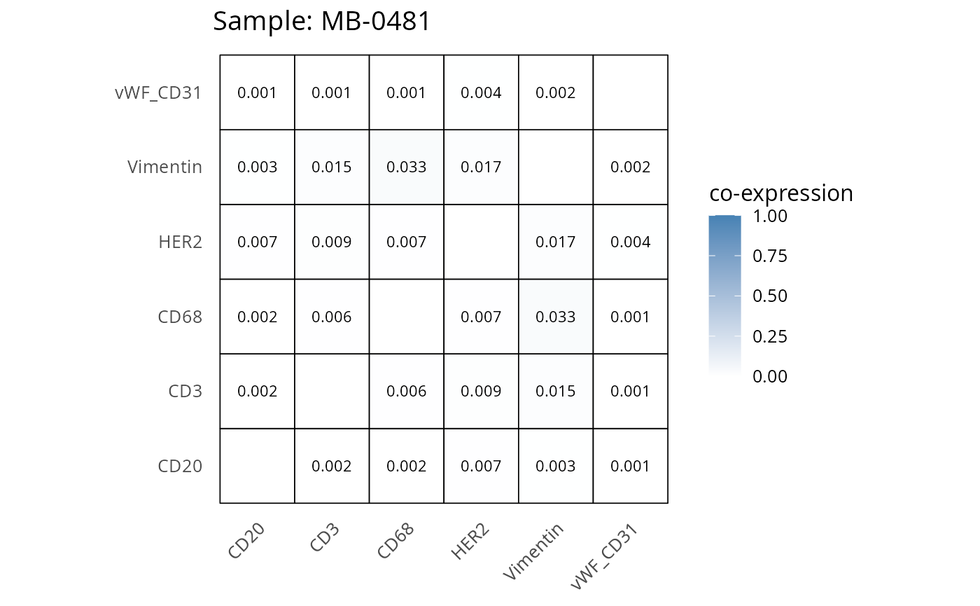
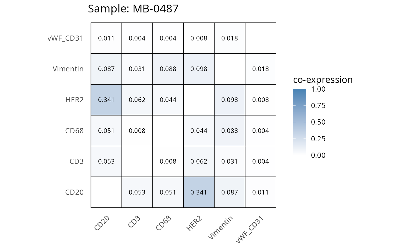
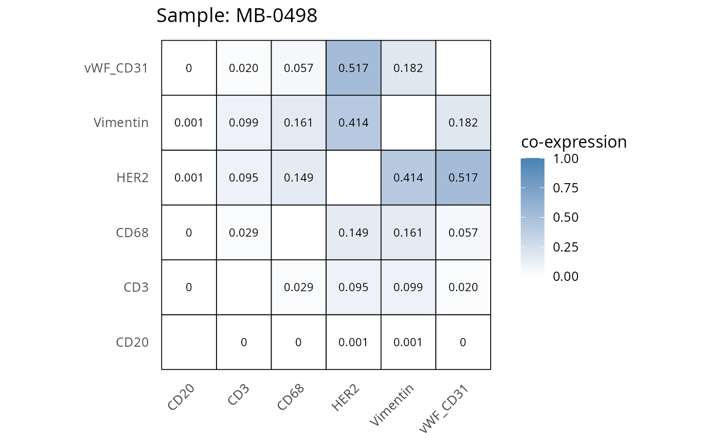
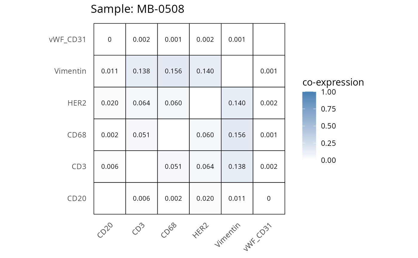
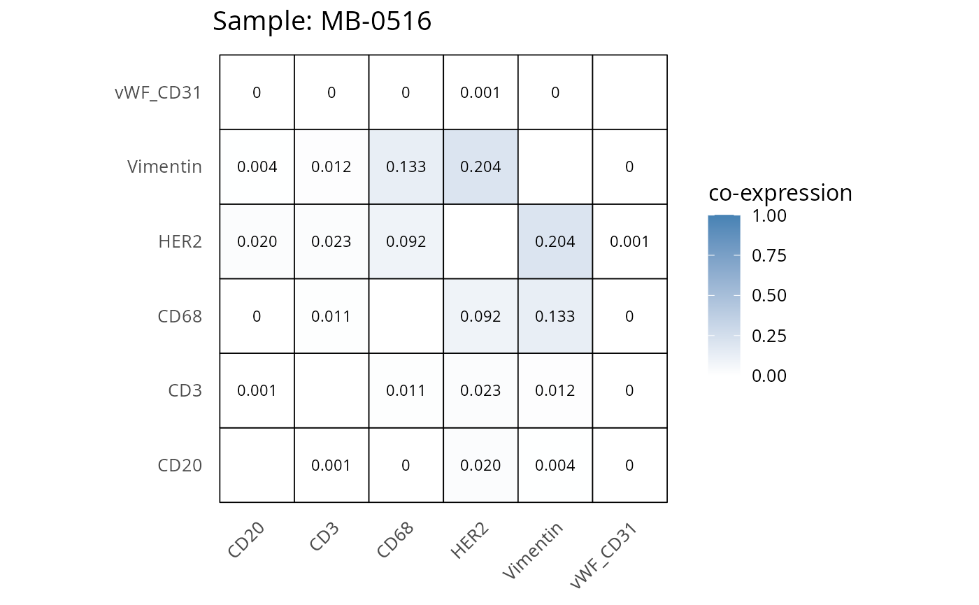
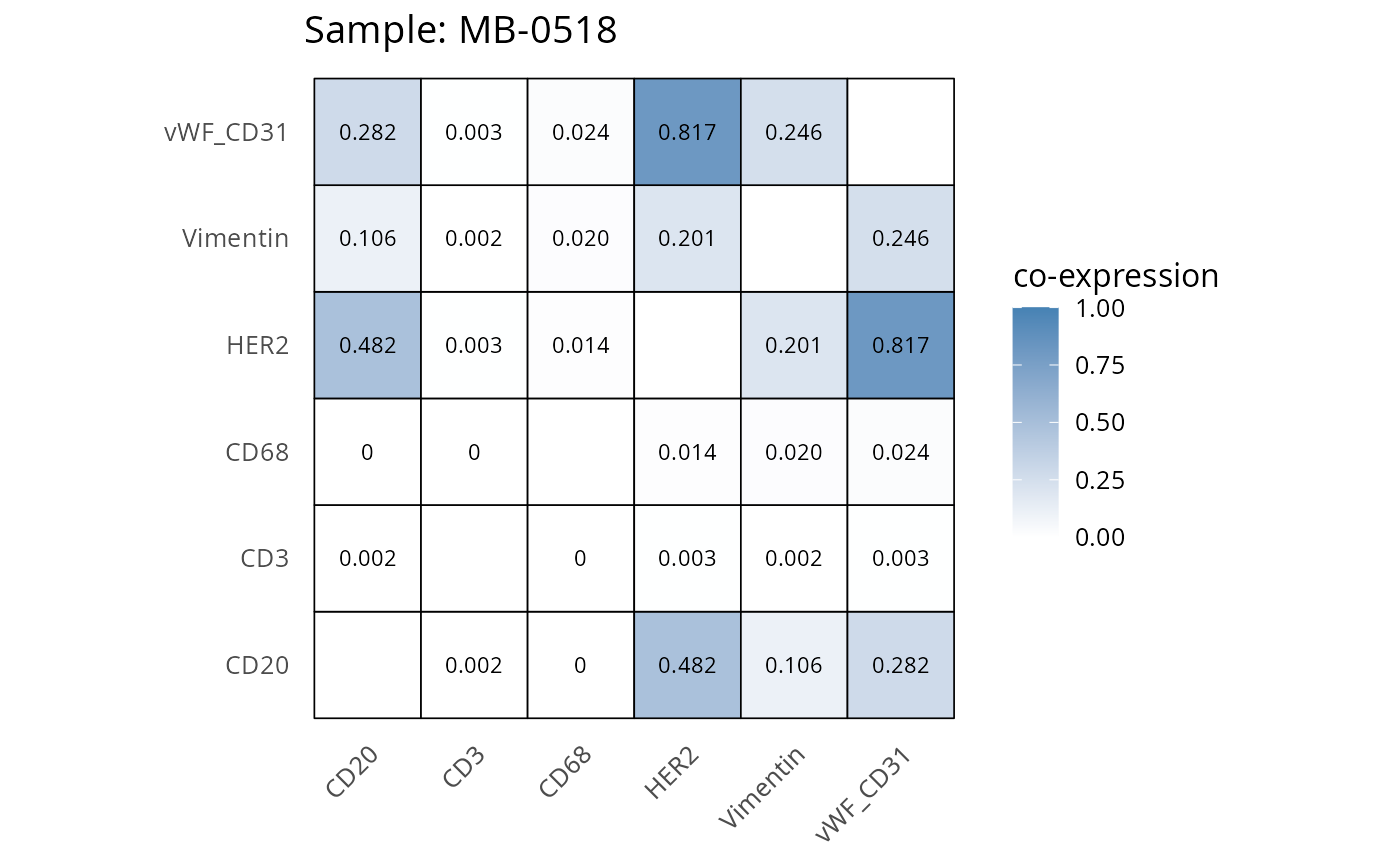
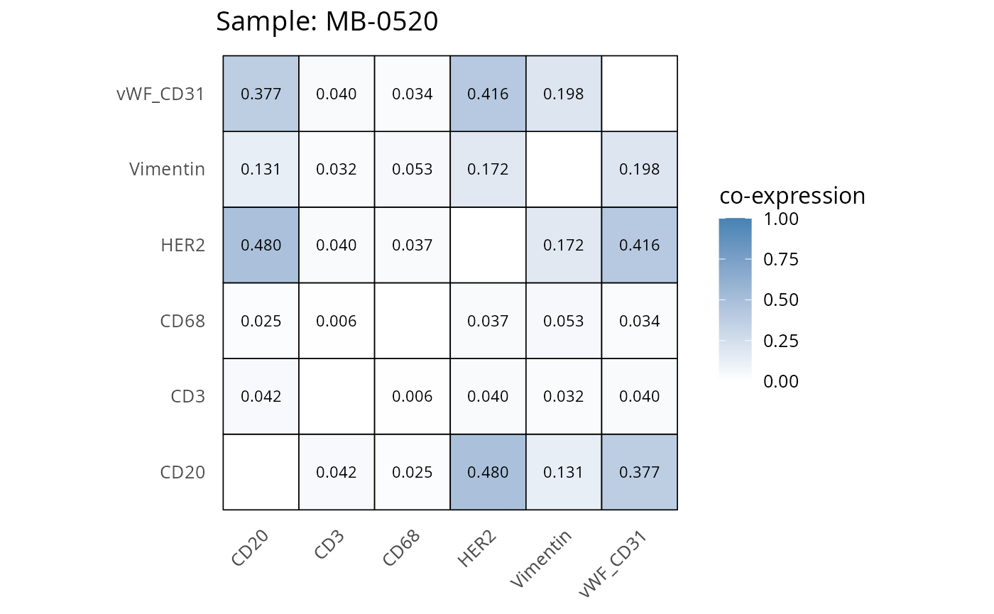
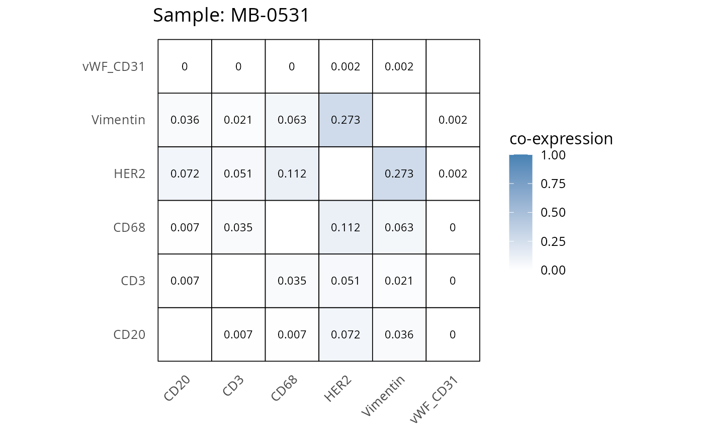
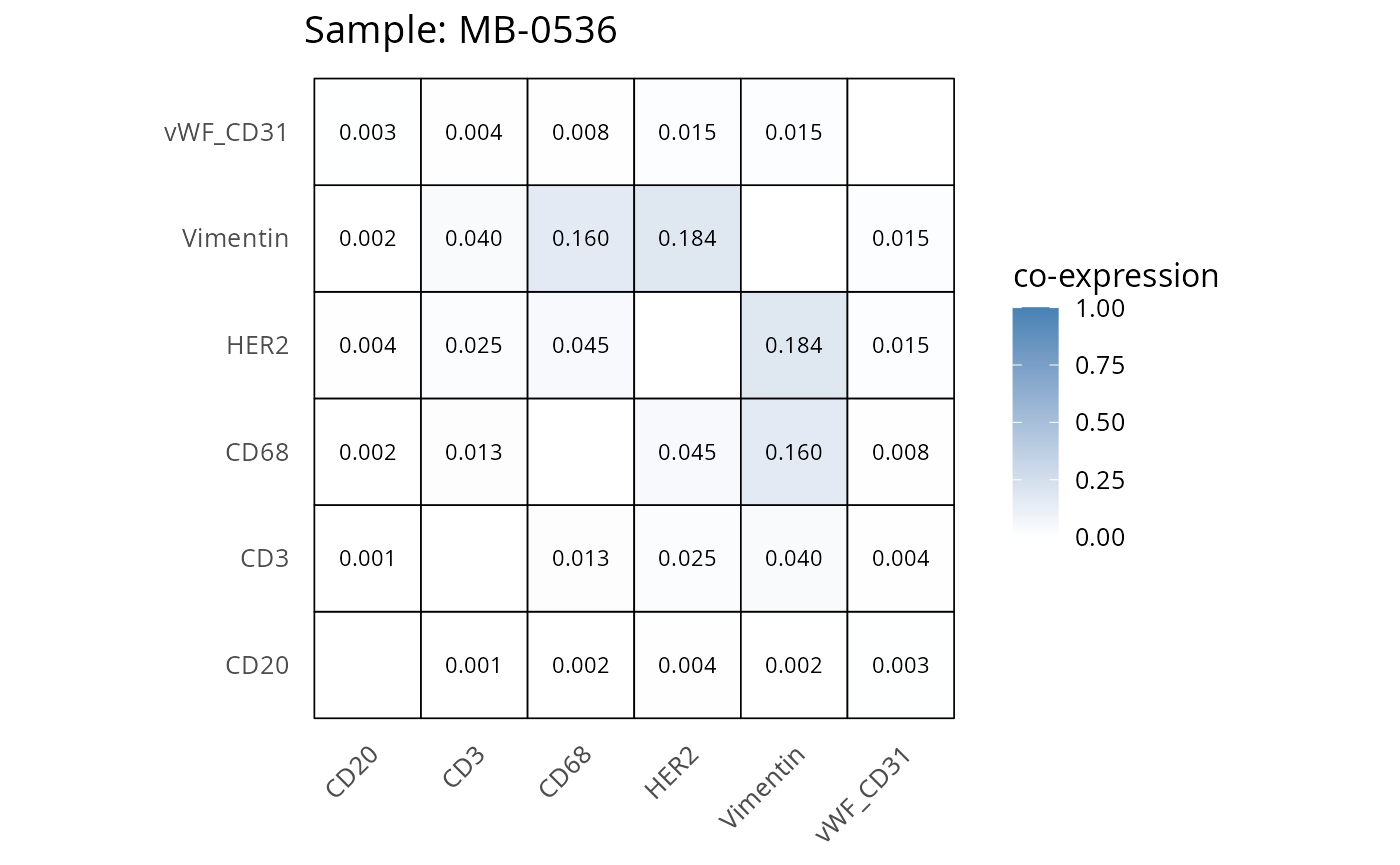
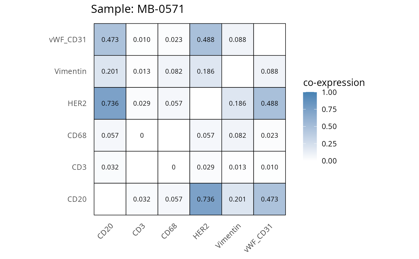
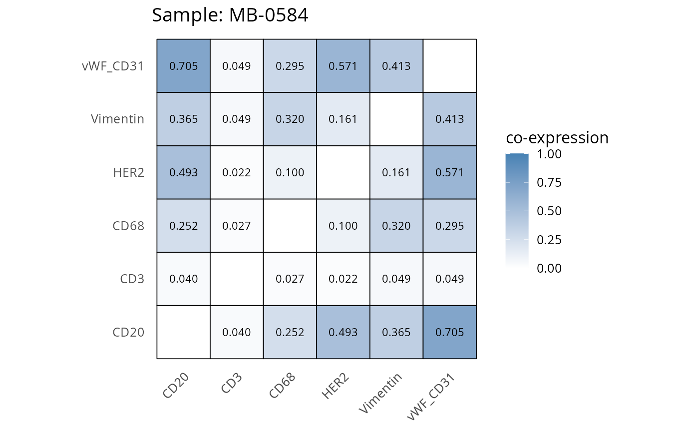
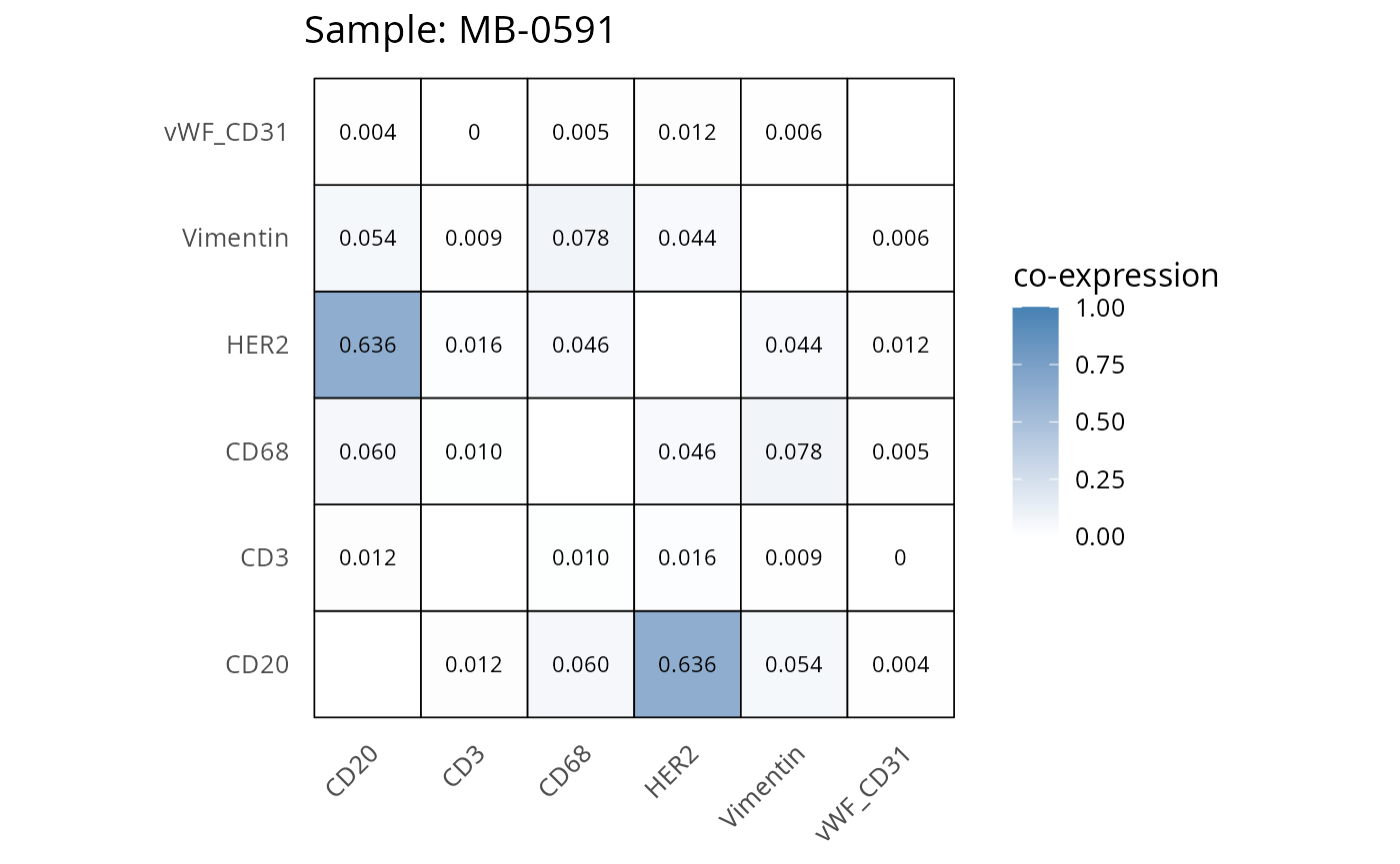
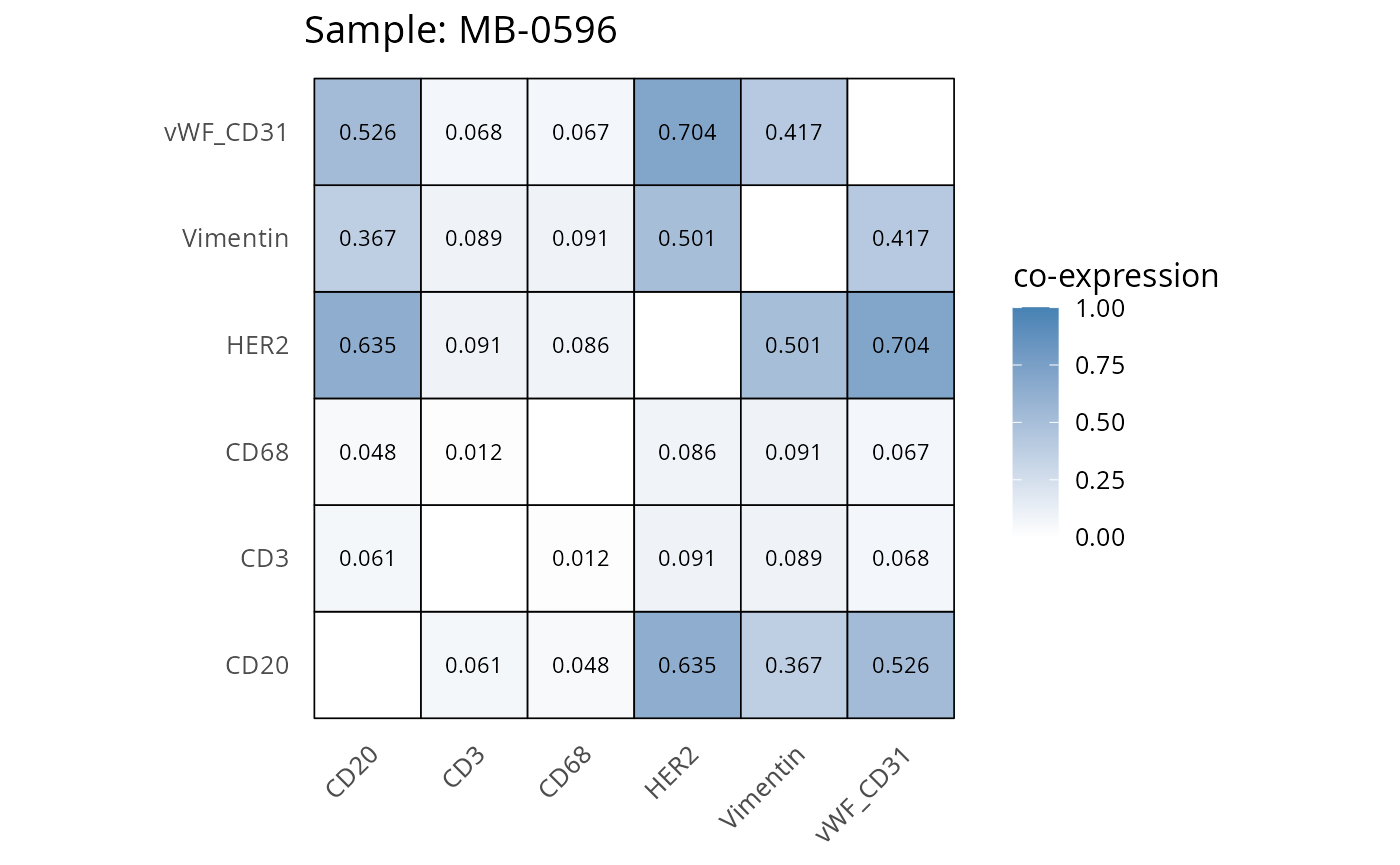
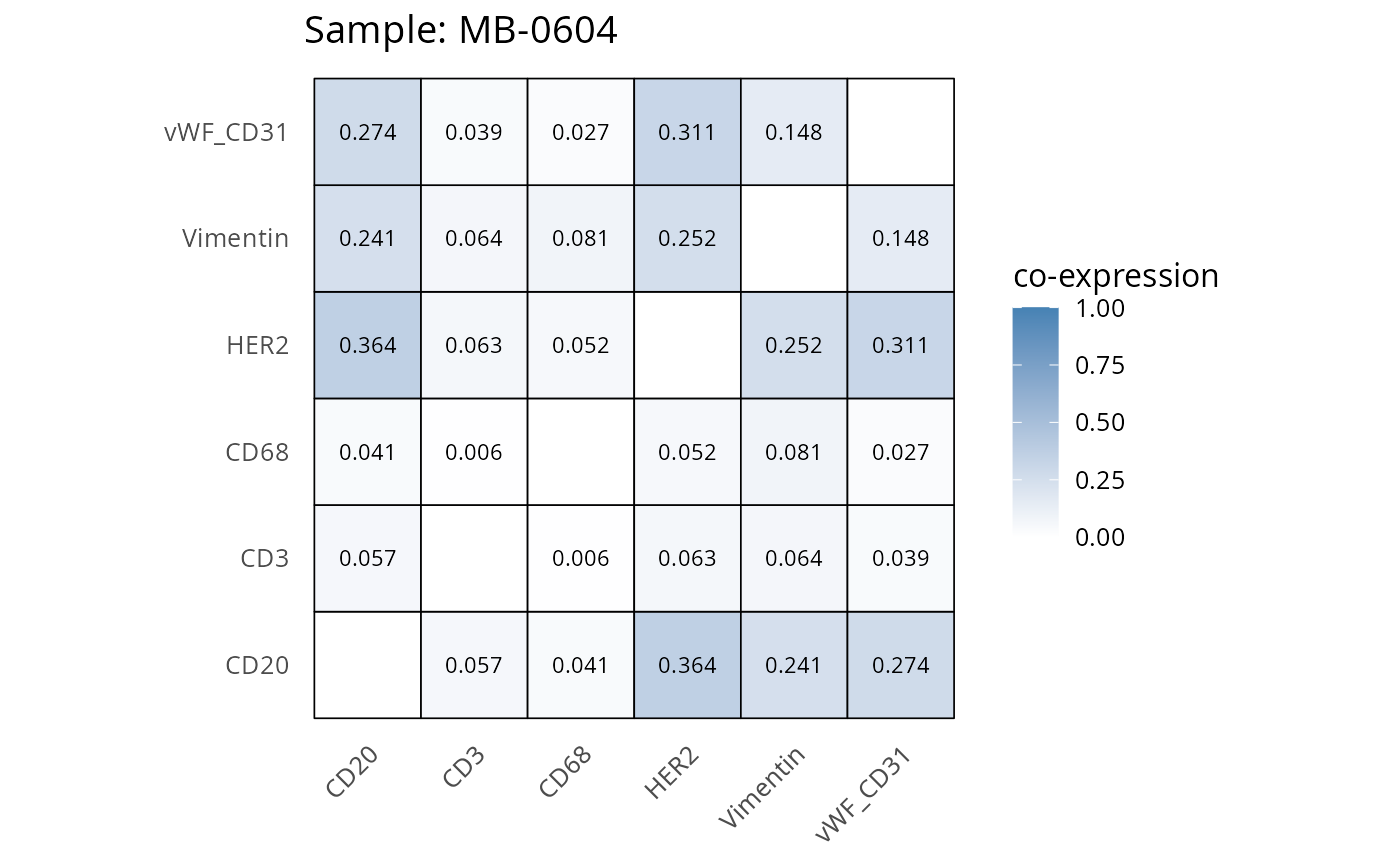
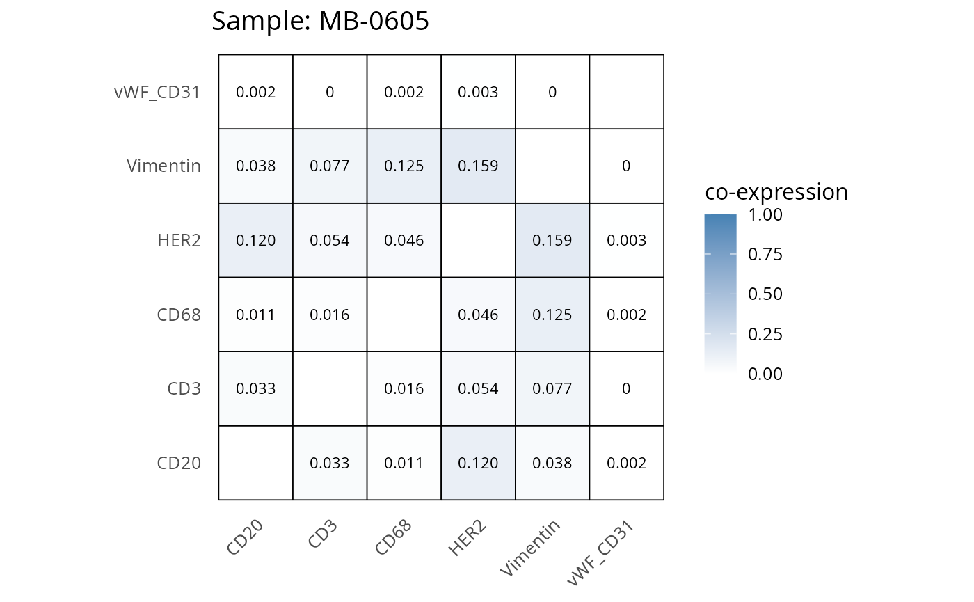
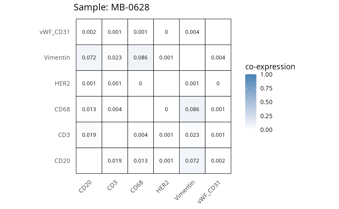
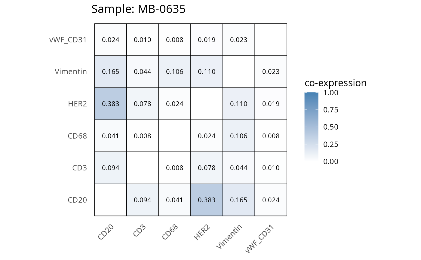
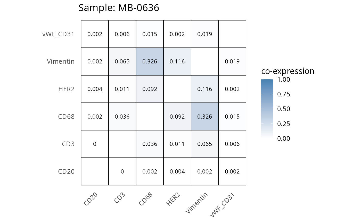

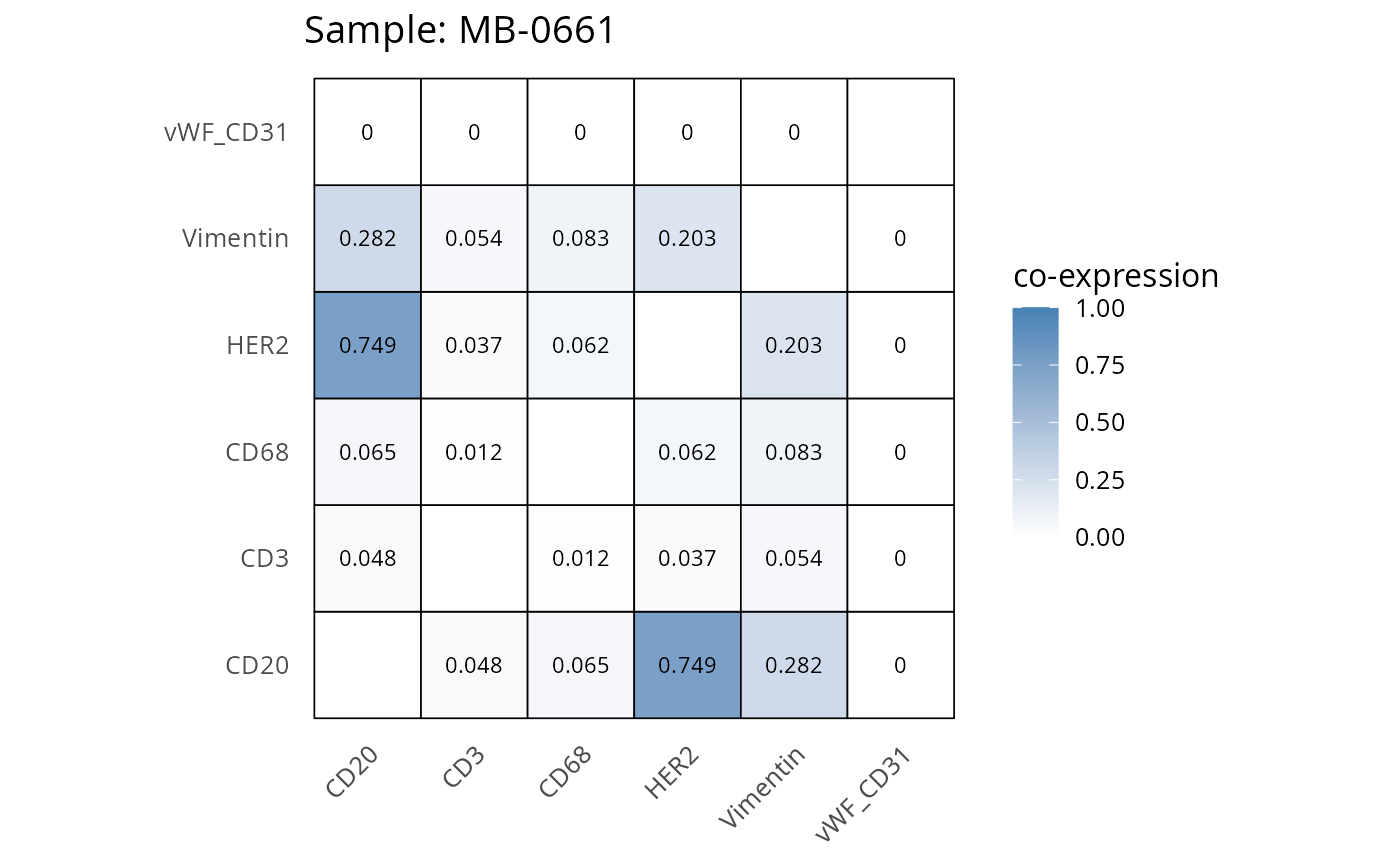
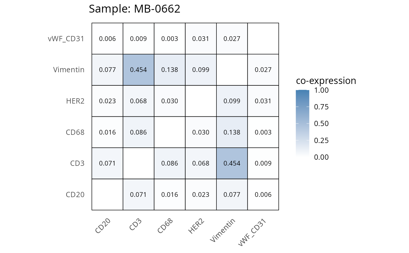
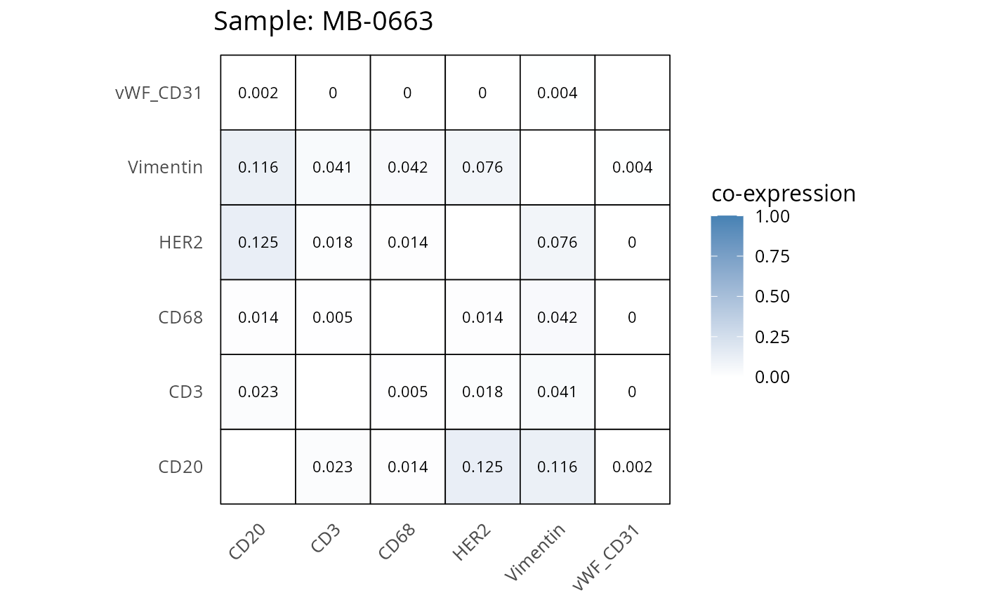
2.3: QC of study as a whole
Questions
- Are there any samples you would like to remove from the data?
- Which samples would you like to keep?
cell_counts <- IMC@colData |>  as.data.frame() |>
  dplyr::count(metabricId, name = "cell_count") |>  # Count rows per metabricId
  dplyr::arrange(desc(cell_count))


mean_coexp_per_sample <- coexp_df %>%
  select(-cell_id, -cell_type) %>%  # remove columns not related to prob values
  group_by(metabricId) %>%
  summarise(mean_coexp_prob = mean(c_across(where(is.numeric)), na.rm = TRUE)) %>%
  ungroup()


merged_df <- left_join(mean_coexp_per_sample, cell_counts, by = "metabricId")

# Scatter plot
ggplot(merged_df, aes(x = cell_count, y = mean_coexp_prob)) +
  geom_point(size = 3, color = "steelblue") +
  labs(
    x = "Cell Count per Sample",
    y = "Mean Co-expression Probability",
    title = "Mean Co-expression vs. Cell Count"
  ) +
  theme_minimal(base_size = 14)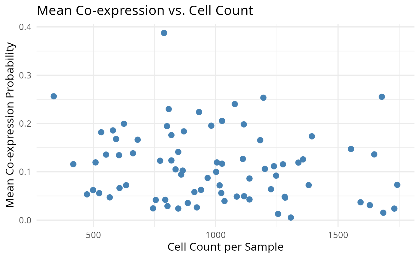
2.4: Does my data agree with literature?
Another way to QC our data is to explore whether the DE genes or associations we find matches current literature. For example, we have a breast cancer cohort. Breast cancer is very well studied and so it should be very easy to perform a DE analysis after pseudobulking our data to see if it makes findings in previous bulk RNA-seq studies of breast cancer cohorts. We can also do this at the single-cell level and compare with previous single-cell proteomic/RNA-seq studies of breast cancer cohorts. We won’t be running the code below. But here is an example of how one might perform a basic DE analysis using package limma.
# Note: The same approach can be used for pseudobulk or single-cell level data.
# Just change `logcounts(data_sce)`

# We want low ki67 to be the reference level (baseline level)
data_sce$ki67 <- factor(data_sce$ki67, levels=c("low_ki67", "high_ki67"))

# Here we specify the design matrix. We are specifying that Y are the expression values and X is ki67 status (but it could be any other variable - such as "good" or "bad" prognosis)
# Y~X: Expression as a function of ki67 status.
design_matrix <- model.matrix(~data_sce$ki67)

# Fit model
fit <- lmFit(logcounts(data_sce), design = design_matrix)

# Estimate variance and SE of coefficients
fit <- eBayes(fit)

tt <- topTable(fit, coef = 2, n = 5, adjust.method = "BH", sort.by = "p")
tt
## logFC AveExpr t P.Value adj.P.Val B
## HH3_total 0.7141833 2.4738506 146.94273 0 0 9496.599
## CK19 0.4401674 0.8206783 81.20218 0 0 3151.934
## CK8_18 1.0394535 1.4776415 107.90431 0 0 5407.860
## Twist 0.2506436 0.4034097 125.83265 0 0 7183.755
## CK14 0.1730002 0.2040003 56.21965 0 0 1538.247Discussion
- How might be check whether these results make sense? What potential issues might we find?
Part 3: Exploring spatial data
This section assumes pre-existing cell type annotations. For unannotated data, two primary annotation strategies are available:
- Unsupervised approach: cluster cells and identify marker genes for manual annotation.
- Supervised approach: transfer labels from reference datasets using supervised learning/classification tools.
For supervised annotation, we recommend scClassify, a robust framework for cell-type classification. Below we visualise the data with and without spatial information before exploring the data further.
Cell types
Following initial assessment of potential batch effects through sample-origin visualization, we now examine cell-type-specific clustering patterns. Distinct, biologically meaningful clusters should emerge for each annotated cell type. The presence of heterogeneous clusters containing unrelated cell types may indicate incomplete or inaccurate cell-type annotations.
plotUMAP(data_sce, colour_by = "description")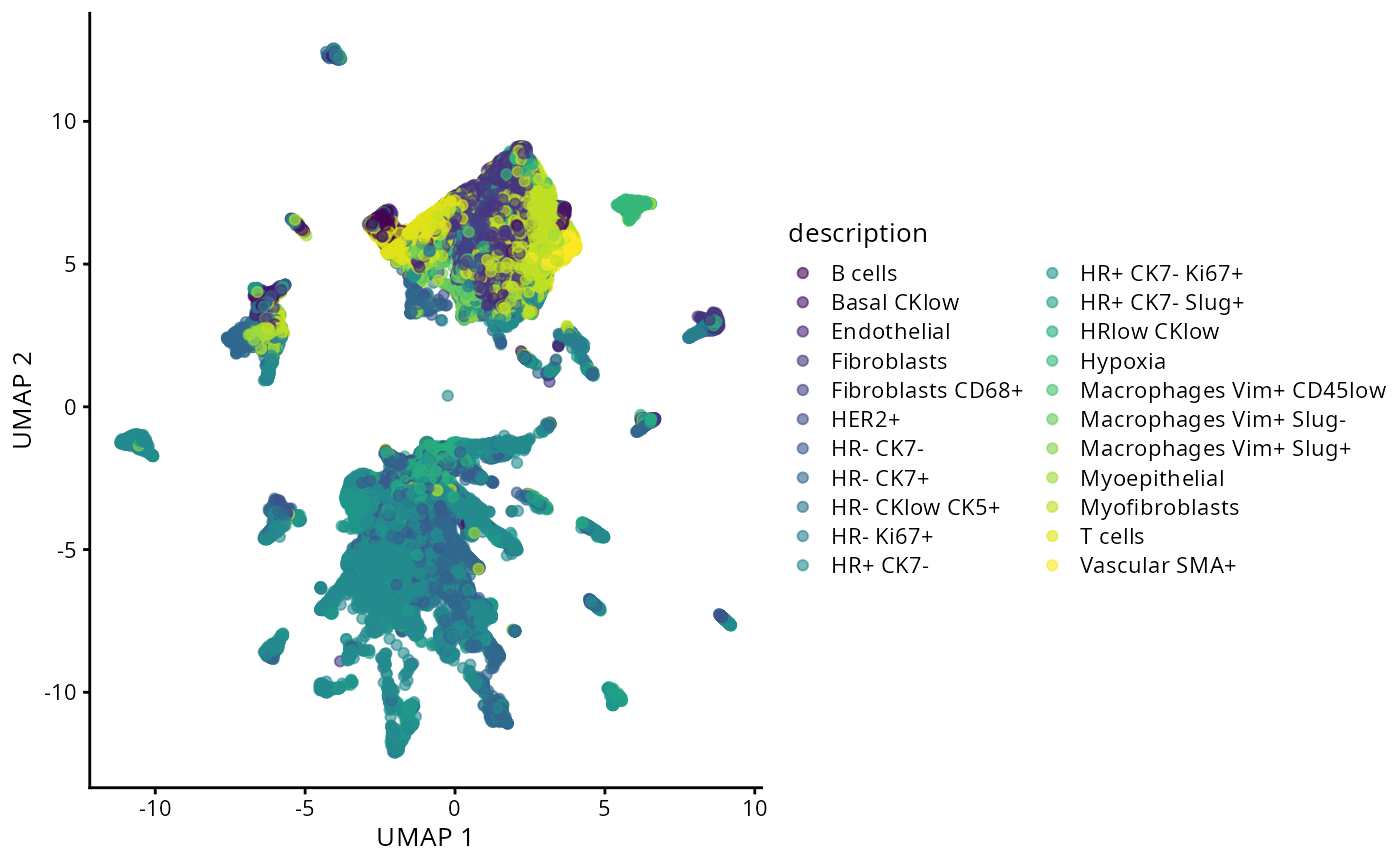
Spatial structure
The advantage with spatial omics is that we can examine the organisation of the cell-types as it occurs on the tissue slide. Here, we visualise one of the slides from a patient. We select a particular patient “MB-0002” and visualise the tissue sample from this patient using ggplot. Do we see any spatial patterning or does it look randomly distributed?
# obtaining the meta data for this patient
one_sample <- data_sce[, data_sce$metabricId  == "MB-0002"]
one_sample  <- data.frame(colData(one_sample))

ggplot(one_sample, aes(x = Location_Center_X, y = Location_Center_Y, colour = description)) +
  geom_point(alpha=0.7) +
  scale_colour_tableau() +
  theme(panel.background=element_blank(),
        axis.line=element_line(color="black")) +
  ggtitle("Original slide")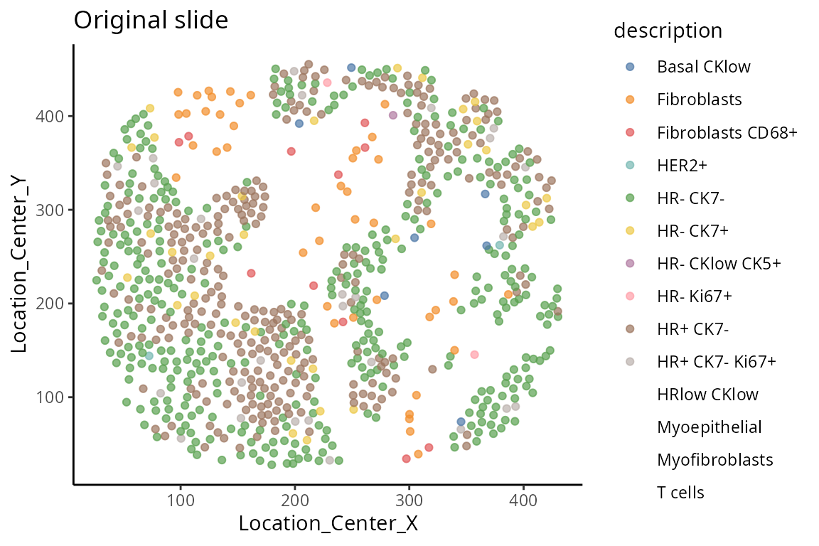
Questions
- What kinds of spatial information might be of interest given the question we’d like to answer?
- How might we try to capture these spatial relationships?
Background: One of the most common questions or analyses in spatial data is spatial domain detection. “Spatial domains” are regions within a tissue where cells share similar gene expression profiles and are physically clustered together. Here, we will use the terminology “spatial domain” and “regions” interchangeably. Most common analytical strategies involve spatial clustering, where different methods use different levels of information, such as gene expression data only, cell type information, and spatial coordinates.
The strategy we demonstrate here uses the lisaClust
function, which uses cell type information to cluster cells into five
distinct spatial regions. As a case study, we will compare individuals
with good or poor prognosis and examine them graphically to see if any
regions appear to be different between good or poor prognosis. We
define: - Good prognosis as individuals with > 10 years
recurrence-free survival and - Poor prognosis as individuals with < 5
years recurrence-free survival.
Below we visualise the spatial domain (regions) detection result based on one individual. Here we will use the terminology “spatial domain” and “regions” interchangeably.
Depending on the number of regions, it may be more useful to
visualise the spatial regions either collectively in a single graph or
separately in multiple graphs. To visualise it in a single graph, the
hatchingPlot() function is used to create hatching patterns
for representating spatial regions and cell-types.
## Extract time to recurrence-free survival
clinical$survivalgroup <- "neither"

## Define poor and good prognosis
clinical$survivalgroup[which( clinical$timeRFS  < 5* 365) ] <- "poor"
clinical$survivalgroup[which( clinical$timeRFS  > 10* 365) ] <-  "good"

## To visualise it in a single graph
hatchingPlot(
  data_sce,
  region = "region",
  imageID = "metabricId",
  cellType = "description",
spatialCoords = c("Location_Center_X", "Location_Center_Y") ) 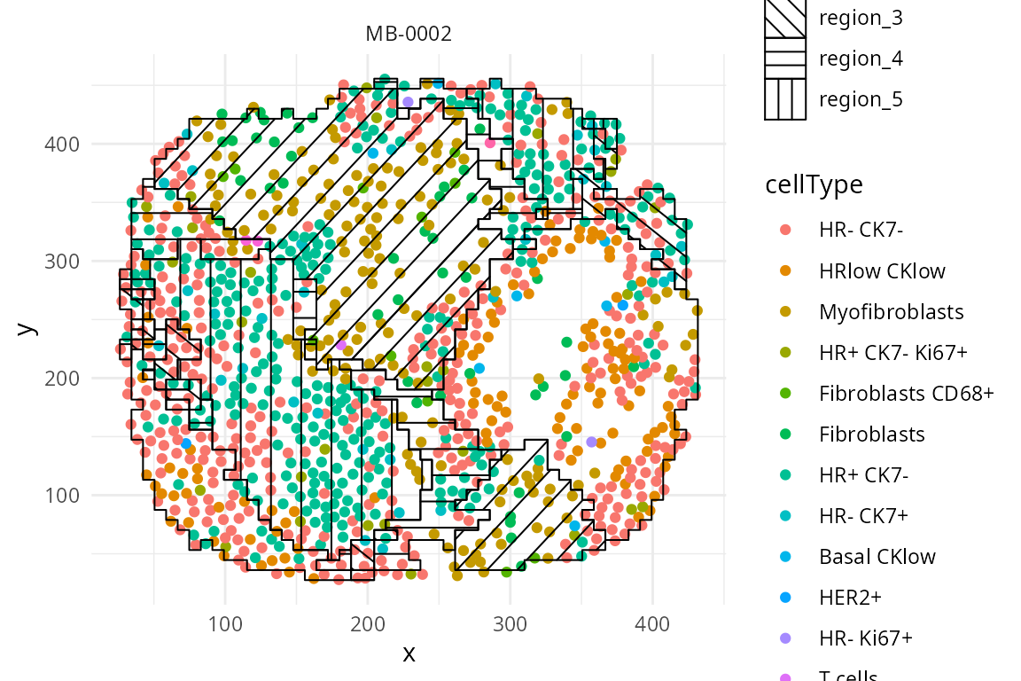
We have written a small function
draw_region_clustering_result to visualise the data
separately in multiple graphs for the individual
MB-0002.
draw_region_clustering_result(data_sce ,
                              sample = "metabricId" ,
                              selected_sample =  "MB-0002" )
## [[1]]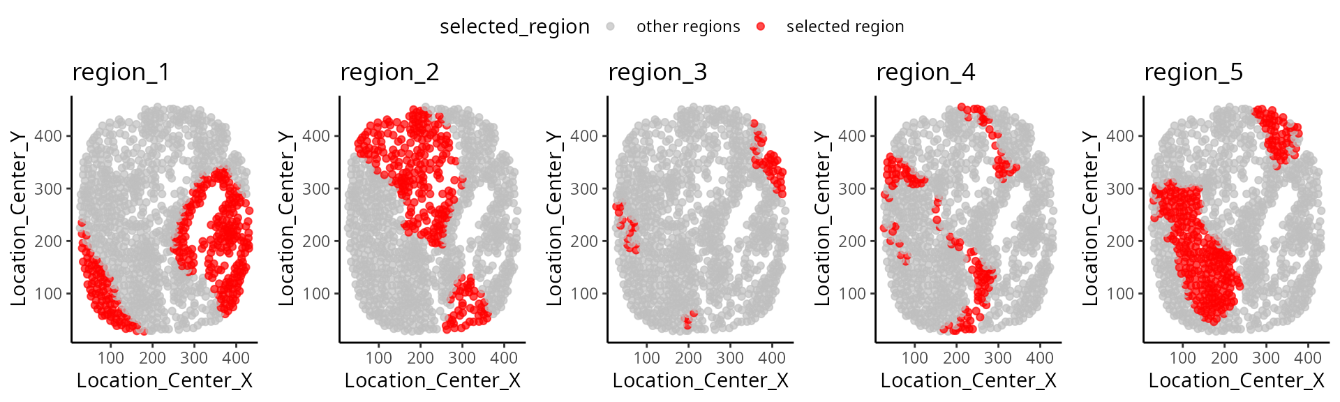
##
## [[2]]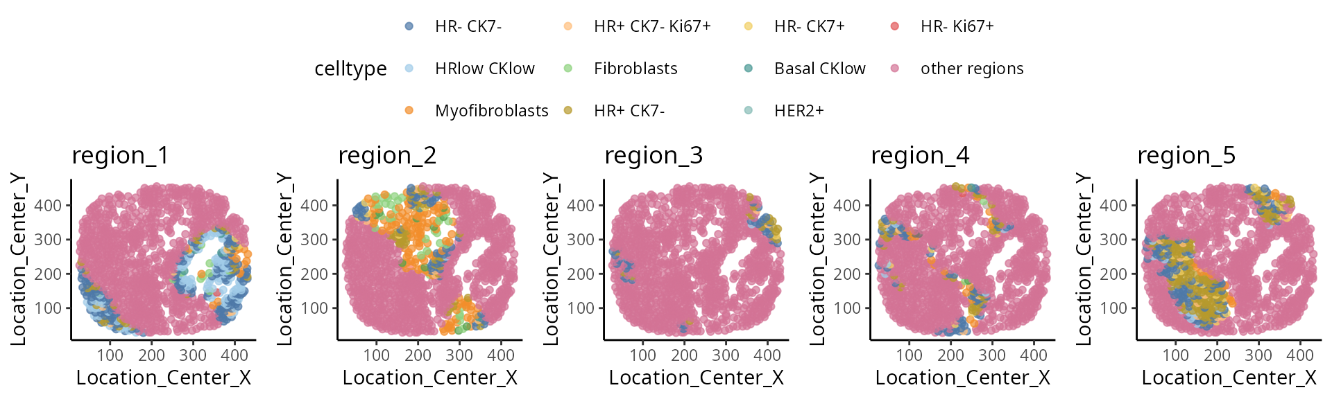
Discussion
- If we’d like to examine multiple individuals, is there a better visualise this information?
We can better interpret the region output by summarising the proportion of each cell-type in a region across the individuals. We look at the composition of cell-types in each region and compare between prognostic outcomes.
draw_dotplot(data_sce,
             sample = "metabricId" ,
             celltype = "description" ,
             group= "survivalgroup" ,
             group_of_interest =  c("poor" , "good"))
## `summarise()` has grouped output by 'Var1', 'Var2'. You can override using the
## `.groups` argument.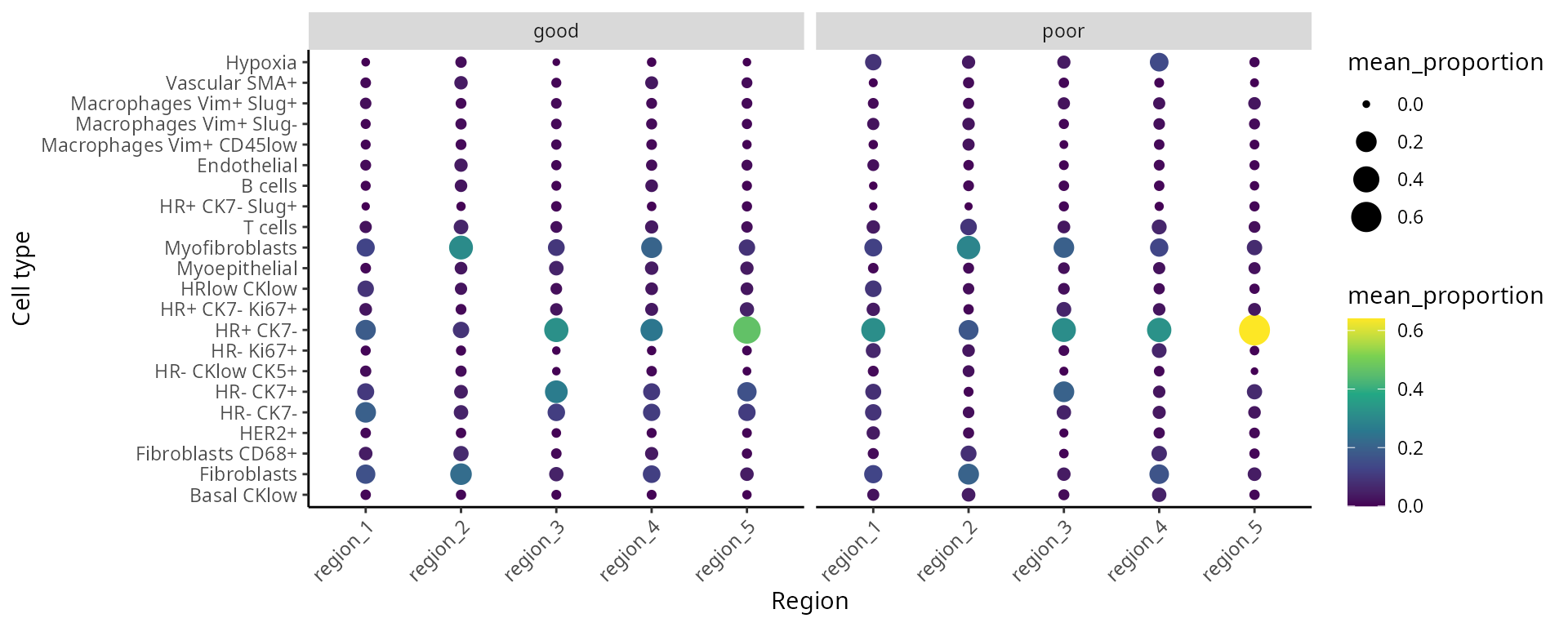
The number of sub-cell types increase considerably when we want to
add spatial domain (region) information. To enhance clarity and
facilitate understanding, it may be helpful to choose a predetermined
region. The code generates a set of boxplots that enable the comparison
of cell-type proportions between individuals with good and
poor prognosis in region_5.
draw_selected_region_boxplot(data_sce,
                             sample = "metabricId" ,
                             celltype ="description" ,
                             group  = "survivalgroup",
                             group_of_interest =  c("poor" , "good"),
                             select_region = "region_5")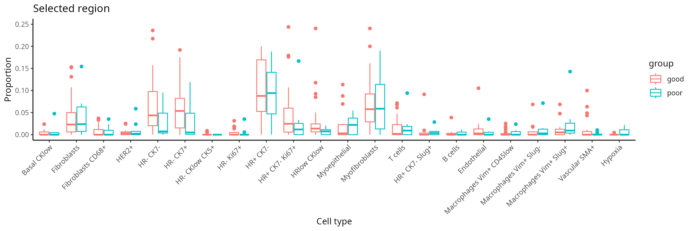
Part 4: Feature engineering with scFeatures
Here, we use scFeatures to generate molecular features for each
individual using the features x cells matrices. These
features are interpretable and can be used for downstream analyses. In
general, scFeatures generates features across six
categories:
- Cell-type proportions.
- Cell-type specific gene expressions.
- Cell-type specific pathway expressions.
- Cell-type interaction scores.
- Aggregated gene expressions.
- Spatial metrics: Nearest neighbour’s correlation, L statistics, and Moran’s I.
The different types of features constructed enable a more
comprehensive multi-view understanding of each individual. By default,
the function will generate a total of 13 different types of features and
are stored as 13 samples x features matrices, one for each
feature type.
In this section, we will examine spatial information from two perspectives. Utilising spatial domain detection described in part 3, we select a specific region of interest and create molecular representations of that region for each individual (Section 4.1). Second, we will utilise spatial statistics to capture spatial relationships within the region of interest, such as Moran’s I (Section 4.2)
region <- data_sce$region

# Define a series of sub-cell-types that is regional specific
data_sce$celltype <- paste0( data_sce$description , "-" , region)
4.1 How to create molecular representations of individuals for an ROI?
Here, we can consider regional information and the following code
allows us to create cell-type specific features for each region. We use
the function “paste0” to construct region-specific sub
cell-types and name it as celltype in the R object
data_sce. For simplicity, in this workshop, the variable
celltype in the R object data_sce refers to
region-specific sub-cell-types.
There are a total of 13 different types of features (feature_types)
that you can choose to generate. The argument type refers the type of
input data we have. This is either scrna (single-cell
RNA-sequencing data), spatial_p (spatial proteomics data),
or spatial_t (single-cell spatial data). In this section,
we will ignore spatial information and generate non-spatial features,
such as pseudobulking at the sample /cell type levels, overall
expression, cell type proportions etc…
Suppose that we are interested in determining the proportion of
cell-types within each region for each individual. It is necessary to
specify type = spatial_p to reflect that we have spatial
proteomics data and feature_types = proportion_raw to
indicate we intend to calculate cell-type proportions for each of the
region-specific cell-types. Suppose we are only interested in the
molecular representation of HR- CK7+ within individuals
within region 5.
## [A] The next few lines extract specific information from data_sce as input to scFeatures.
## Extract the expression matrix from data_sce
IMCmatrix <- assay(data_sce)

## Extract the sample information
## append the condition to the individuals so we can easily retrieve the individuals condition
sample <- data_sce$metabricId
cond  <- clinical[match(sample, clinical$metabricId), ]$survivalgroup
sample <- paste0(sample, "_cond_", cond )

## Extract the region-specific sub-cell-types
celltype <- data_sce$celltype

## Extract the spatial coordinates
spatialCoords <- list(colData(data_sce)$Location_Center_X, colData(data_sce)$Location_Center_Y)

### [B] Running scFeatures
scfeatures_result <- scFeatures(IMCmatrix,
                                sample = sample,
                                celltype = celltype,
                                spatialCoords = spatialCoords,
                                feature_types = "proportion_raw",
                                type = "spatial_p" )
Question
- Are there any regions that are associated with “good” and “poor” prognosis?
- Is this the right way to visualise the results?
## [A] The next few lines extract specific information from data_sce as input to scFeatures.
## Select the HR- CK7+-region sub-cell-type

# There are different ways you can use `scFeatures` to generate molecular representations for individuals and it requires the following information for spatial data.
#
# data,\
# sample,
# X coordinates,
# Y coordinates,
# feature_types, and
# type

index <-   grep("HR- CK7+-region" , data_sce$celltype, fixed=TRUE)
selected_data  <-  IMCmatrix[, index]
selected_sample <-  sample[index]
selected_celltype <- data_sce$celltype[ index]
selected_spatialCoords <- list(colData(data_sce)$Location_Center_X[index],
                               colData(data_sce)$Location_Center_Y[index])

### [B] Running scFeatures
scfeatures_result <- scFeatures( selected_data,
                                 sample = selected_sample,
                                 celltype = selected_celltype,
                                 spatialCoords = selected_spatialCoords,
                                 feature_types = "proportion_raw", type = "spatial_p" )

### [C] Visualize the regional composition makeup for each individual for HR- CK7+ and HR- CK7-
feature <- scfeatures_result$proportion_raw
feature <- feature[ grep("poor|good", rownames(feature)),  ]

plot_barplot(feature ) + ggtitle("Proportion raw feature") + labs(y = "proportion\n")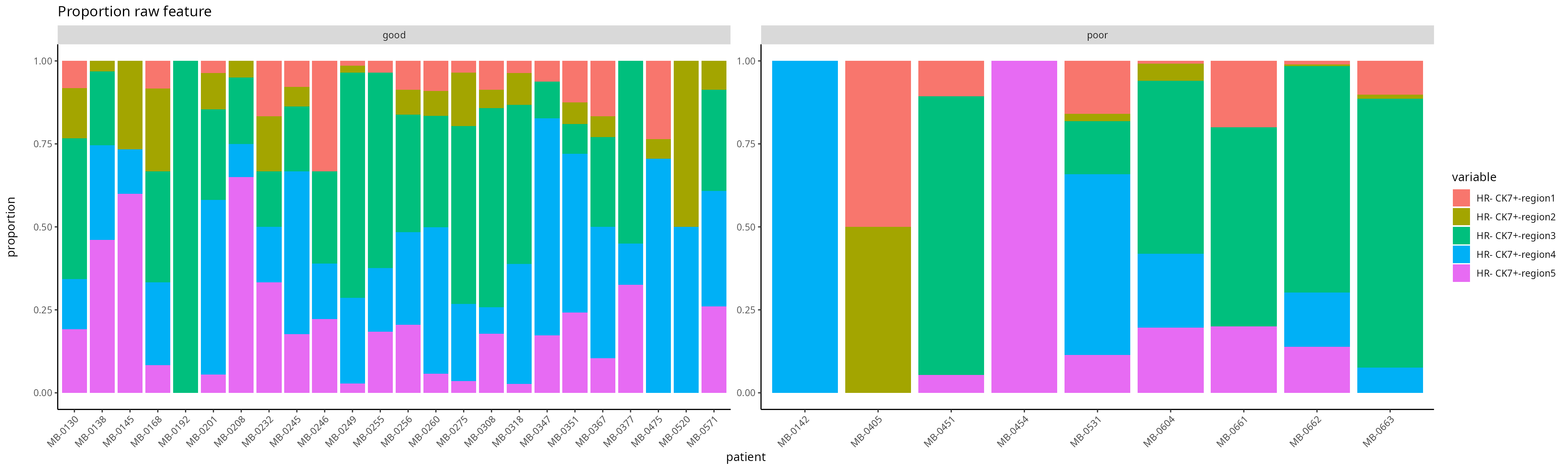
The code below enable us to generate all feature types for all cell-types in a line. Due to limitations with today’s computational capacity, Please DO NOT run it in today’s workshop, it will crash your system.
# here, we specify that this is a spatial proteomics data
# scFeatures support parallel computation to speed up the process
scfeatures_result <- scFeatures(IMCmatrix,
                                type = "spatial_p",
                                sample = sample,
                                celltype = celltype,
                                spatialCoords = spatialCoords,
                                ncores = 32)
Assuming you have already generated a collection of molecular
representation for individuals, please load the prepared RDS file
scfeatures_result.RDS. Again, you can remind yourself that
all generated feature types are stored in a matrix of
samples x features.
# Upload pre-generated RDS file
scfeatures_result <- readRDS("../../data/scfeatures_result.RDS")

# What are the features and the dimensions of features matrices that we have generated?
lapply(scfeatures_result, dim)
## $proportion_raw
## [1] 77 110
##
## $proportion_logit
## [1] 77 110
##
## $proportion_ratio
## [1] 77 5995
##
## $gene_mean_celltype
## [1] 77 4180
##
## $gene_prop_celltype
## [1] 77 4180
##
## $gene_cor_celltype
## [1] 77 27958
##
## $gene_mean_bulk
## [1] 77 38
##
## $gene_prop_bulk
## [1] 77 38
##
## $gene_cor_bulk
## [1] 77 703
##
## $L_stats
## [1] 77 3842
##
## $celltype_interaction
## [1] 77 4393
##
## $morans_I
## [1] 77 38
##
## $nn_correlation
## [1] 77 384.2 How can we represent spatial information and relationships for a given individual?
We will now look at the spatial statistic output by
scFeatures and qualitively assess whether there is any
association between between these statistics and the “good” and “bad”
prognosis groups.
Questions
- What kind of information would spatial statistics provide?
- Are there any differences in the distribution of spatial statistics between the “good” and “bad” prognosis groups?
This metric measures the correlation of proteins/genes between a cell and its nearest neighbour cell.
feature <- scfeatures_result$nn_correlation
feature <- feature[ grep("poor|good", rownames(feature )),  ]
plot_boxplot(feature) +
  theme(panel.background=element_blank(),
        axis.line=element_line(color="black")) +
  ggtitle("Nearest neighbour correlation feature")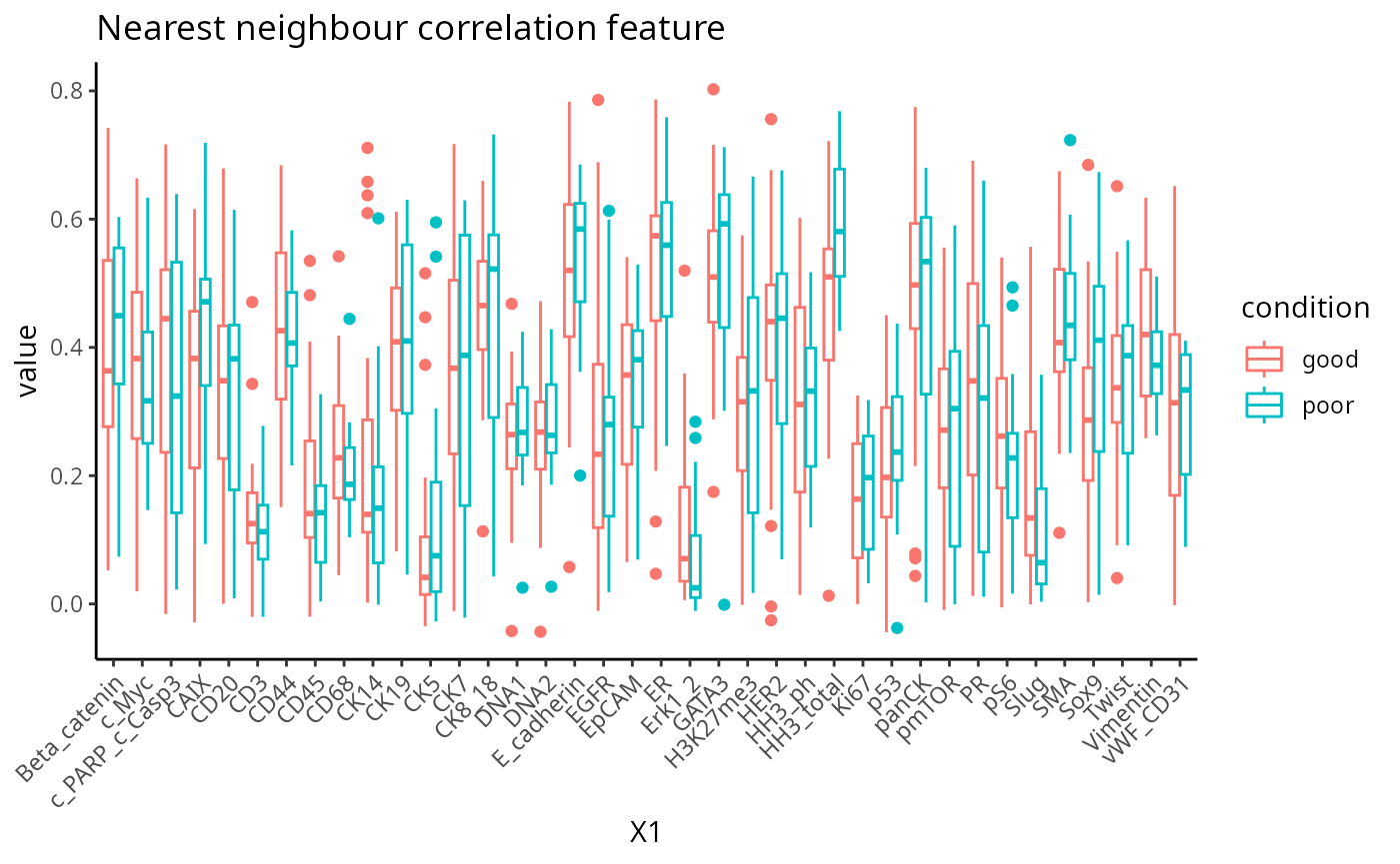
The L function is a spatial statistic used to assess the spatial distribution of cell-types. It assesses the significance of cell-cell interactions, by calculating the density of a cell-type with other cell-types within a certain radius. High values indicate spatial association (co-localisation), low values indicate spatial avoidance.For clarity, we plot the L statistics for a subset of regions.
feature <- scfeatures_result$L_stats
idx <- which(grepl("^T cells-region4_HR", colnames(feature))==TRUE)
feature <- feature[,idx]
feature <- feature[ grep("poor|good", rownames(feature )),  ]
plot_boxplot(feature) +
  theme(panel.background=element_blank(),
        axis.line=element_line(color="black")) +
  ggtitle("L statistics")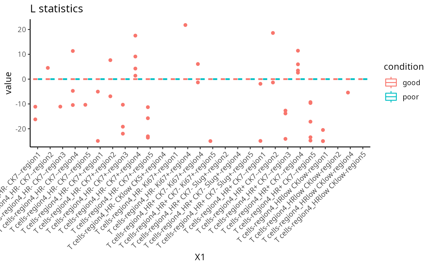
Moran’s I is a spatial autocorrelation statistic based on both location and values. It quantifies whether similar values tend to occur near each other or are dispersed.
feature <- scfeatures_result$morans_I
feature <- feature[ grep("poor|good", rownames(feature )),  ]
plot_boxplot(feature) +
  theme(panel.background=element_blank(),
        axis.line=element_line(color="black")) +
  ggtitle("Moran's I")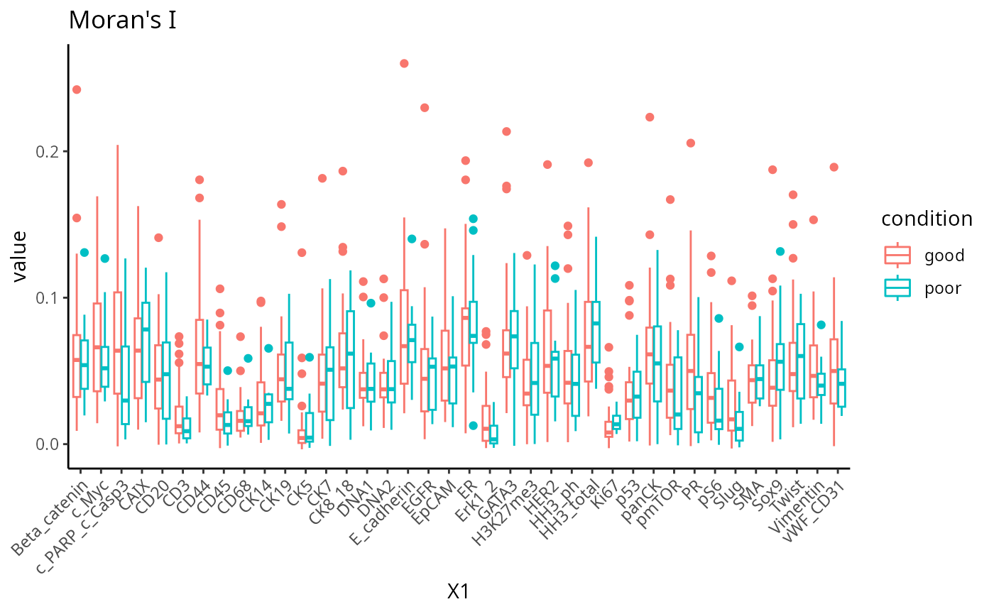
Part 5: Disease classification with ClassifyR
Recurrence risk estimation is a fundamental concern in medical
research, particularly in the context of patient survival analysis. In
this section, we will estimate recurrence risk using the molecular
representation of individuals generated from scFeatures to
build a survival model. We will use classifyR to build the survival
model. The patient outcome is time-to-event, so, by default, ClassifyR
will use Cox proportional hazards ranking to choose a set of features
and also Cox proportional hazards to predict risk scores. We will also
demonstrate other available models in ClassifyR.
Questions
- Are spatial features globally informative in predicting survival?
- If not, for which individuals is it important in predicting survival?
Recall in the previous section that we have stored the 13 matrices of
different feature types in a list. Instead of manually retrieving each
matrix from the list to build separate models, classifyR can directly
take a list of matrices as an input and run a repeated cross-validation
model on each matrix individually. Below, we run 5 repeats of 5-fold
cross-validation. A high score indicates prognosis of a worse outcome
than a lower risk score. Although we have provided the code below, to
save time, just load the prepared RDS file
classifyr_result_IMC.rds and we will focus on the
interpretation in this workshop.
# We use the following variables:
# timeRFS: "Time to Recurrence-Free Survival." It is the time period until recurrence occurs.
# eventRFS: "Event in Recurrence-Free Survival."It indicates whether the event has occurred.
# Breast.Tumour.Laterality: Laterality of tumors, eg, whether the tumor is located in left or right.
# ER.Status: Whether the tumor is ER positive or ER negative.
# Inferred.Menopausal.State: of the patient.
# Grade: of the tumor.
# Size: of the tumor.

usefulFeatures <- c("Breast.Tumour.Laterality", "ER.Status", "Inferred.Menopausal.State", "Grade", "Size")
nFeatures <- append(list(clinical = 1:3), lapply(scfeatures_result, function(metaFeature) 1:5))
clinicalAndOmics <- append(list(clinical = clinical), scfeatures_result)

### generate classfyr result
classifyr_result_IMC <- crossValidate(clinicalAndOmics, c("timeRFS", "eventRFS"),
                    extraParams = list(prepare = list(useFeatures = list(clinical = usefulFeatures))),
                    nFeatures = nFeatures, nFolds = 5, nRepeats = 5, nCores = 5)
classifyr_result_IMC <- readRDS("../../data/classifyr_result_IMC.rds")Cox proportional hazards is a classical statistical method, as opposed to machine learning methods like Random survival forest. These machine learning methods can build remarkably complex relationships between features, however their running time can be much longer than Cox proportional hazards. We use feature selection to limit the number of features considered to at most 100 per metafeature and to save time, you can just load the prepared RDS file. We will compare the predictive performance between these methods.
nFeatures <- append(list(clinical = 1:3), lapply(scfeatures_result[2:length(scfeatures_result)], function(metaFeature) min(100, ncol(metaFeature))))
survForestCV <- crossValidate(clinicalAndOmics, outcome, nFeatures = nFeatures,
                classifier = "randomForest",
                nFolds = 5, nRepeats = 5, nCores = 5)
survForestCV <- readRDS("../../data/survForestCV.RDS")To examine the distribution of prognostic performance, use
performancePlot. Currently, the only metric for
time-to-event data is C-index and that will automatically be used
because the predictive model type is tracked inside of the result
objects.
## Make axis label 45 degree to improve readiability
tilt <- theme(axis.text.x = element_text(angle = 45, vjust = 1, hjust = 1))

## Putting two sets of cross-validation results together
multiresults <- append(classifyr_result_IMC, survForestCV)
ordering <- c("clinical", names(scfeatures_result))
performancePlot(multiresults,
                characteristicsList = list(x = "Assay Name",
                                           row = "Classifier Name"),
                orderingList = list("Assay Name" = ordering)) +
                tilt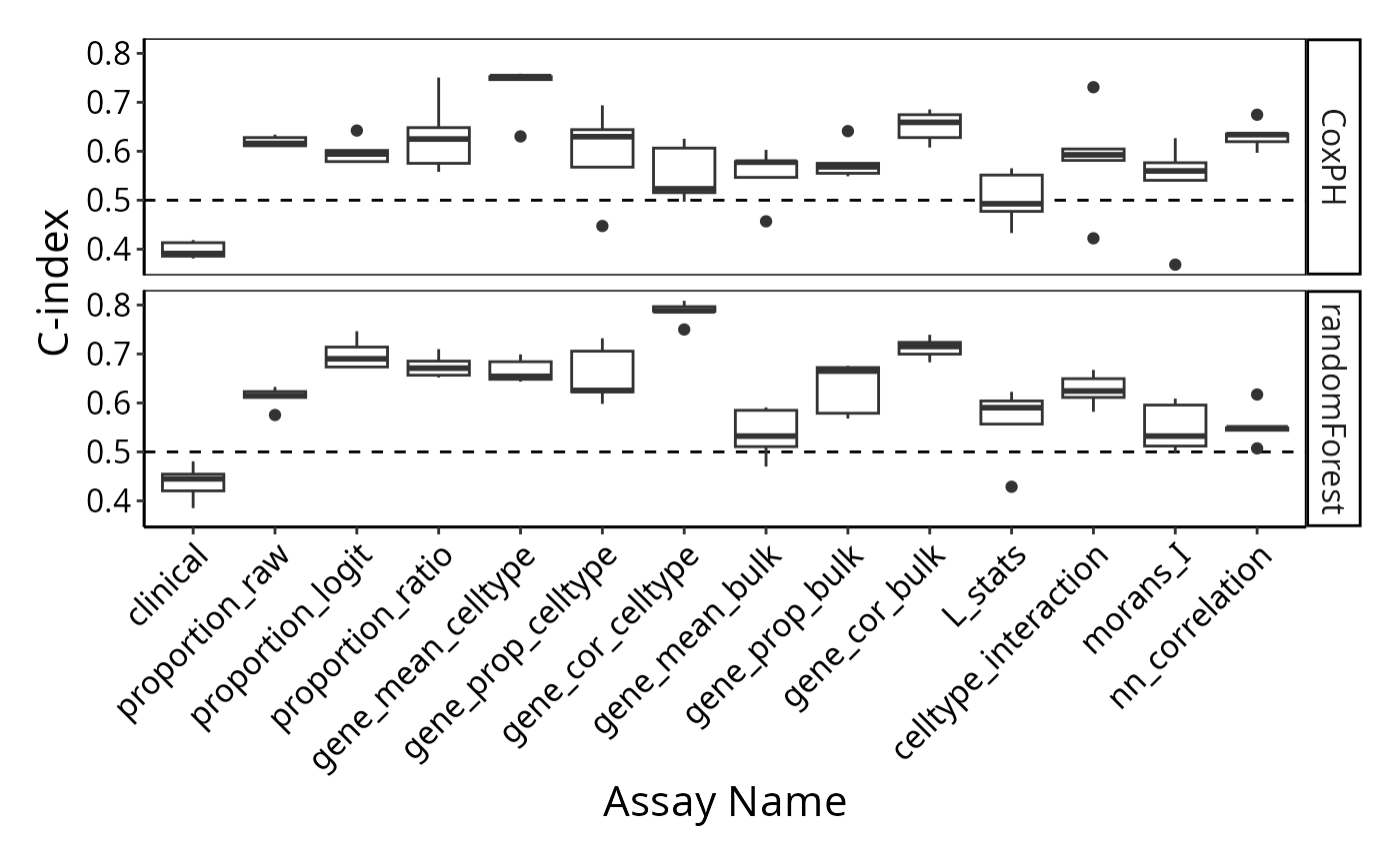
Note how the resultant plot is a ggplot2 object and can
be further modified. The same code could be used for a categorical
classifier because the random forest implementation provided by the
ranger package has the same interface for both. We will
examine feature selection stability with selectionPlot.
selectionPlot(multiresults,
                characteristicsList = list(x = "Assay Name", row = "Classifier Name"),
                orderingList = list("Assay Name" = ordering)) + tilt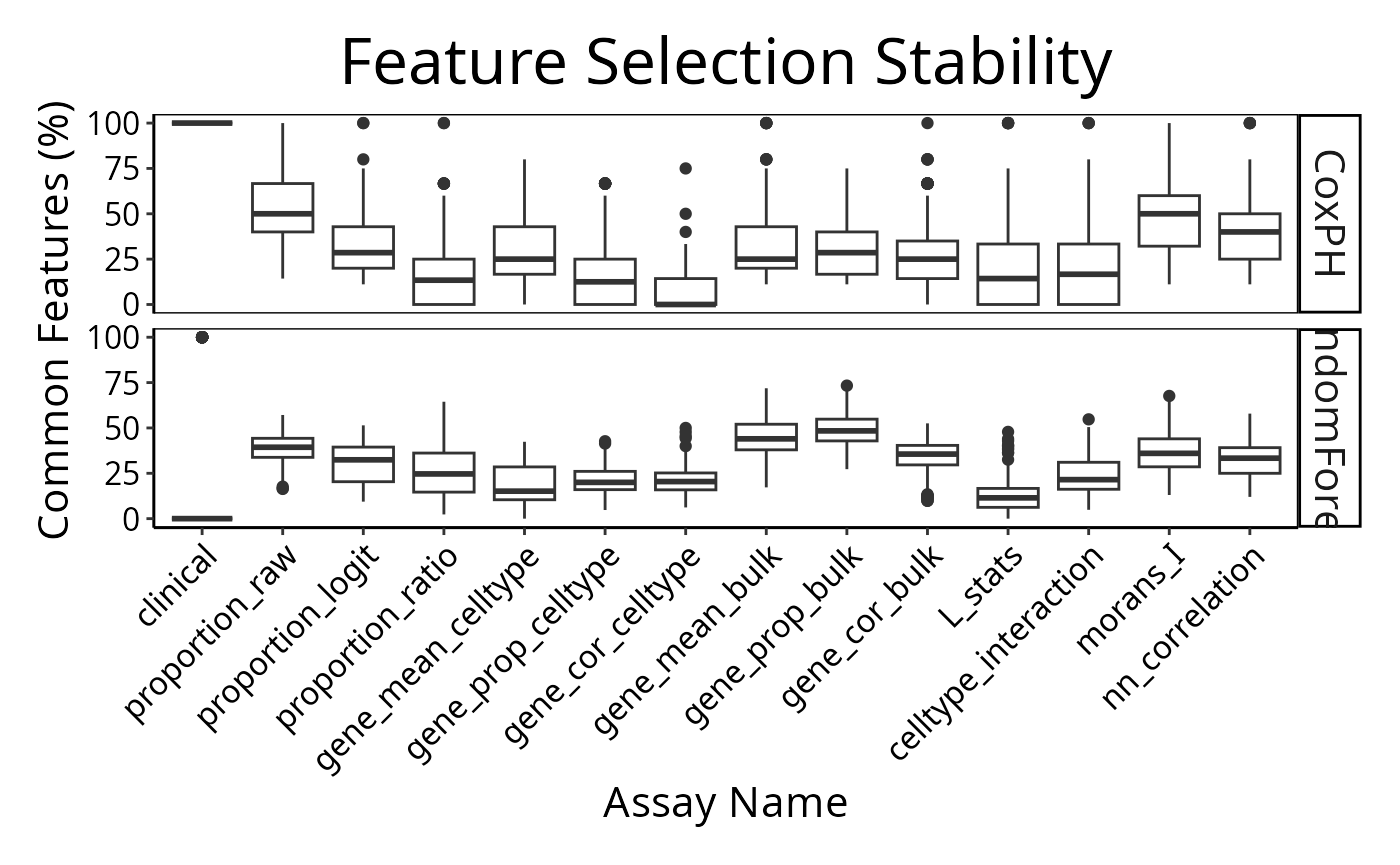
distribution(classifyr_result_IMC[[1]], plot = FALSE)## assay feature proportion
## 1 clinical Inferred.Menopausal.State 1Does each individual require a different collection of features?
Using samplesMetricMap compare the per-sample C-index for
Cox models for all kinds of metafeatures.
library(grid)
samplesMetricMap(classifyr_result_IMC)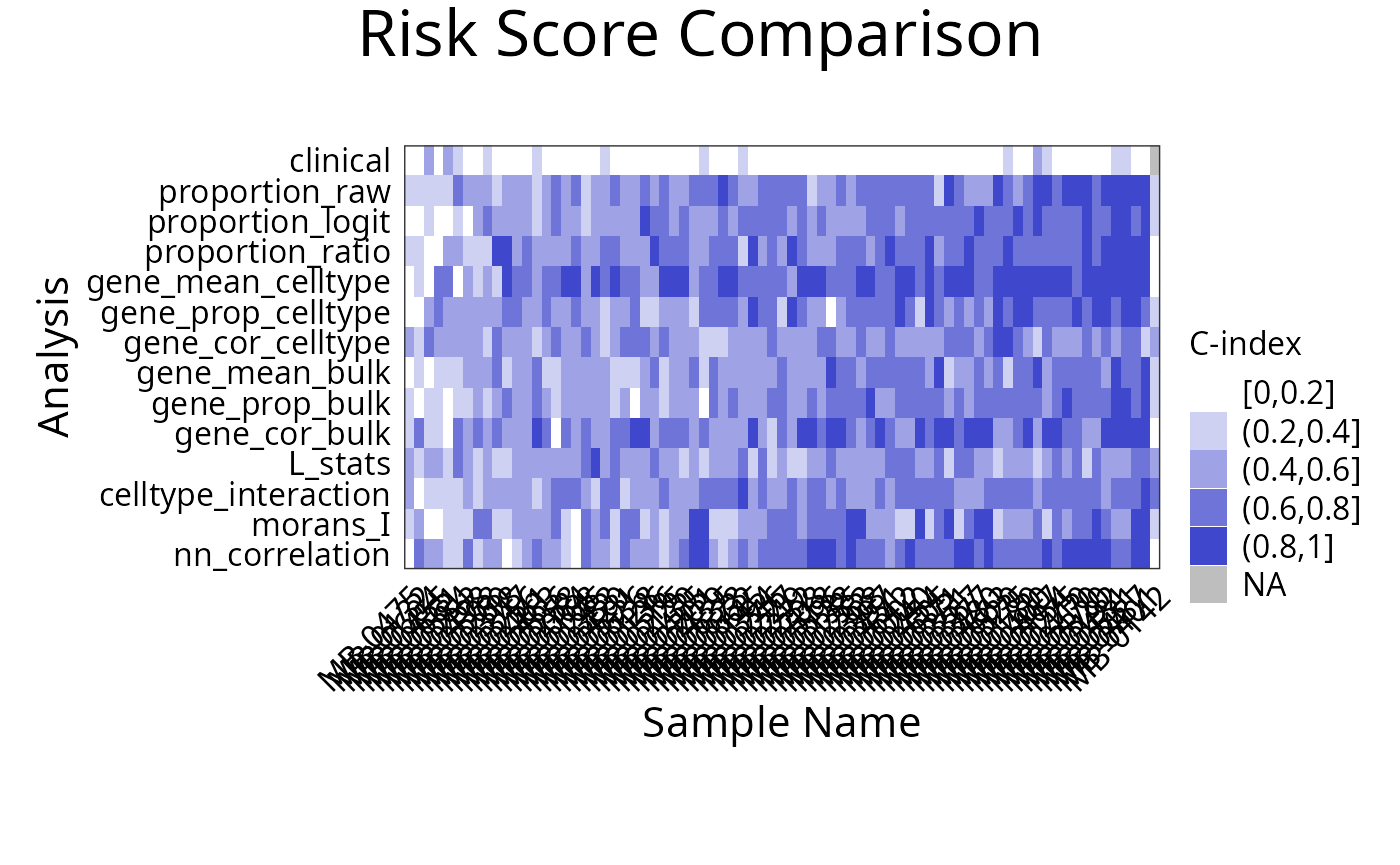
## TableGrob (2 x 1) "arrange": 2 grobs
##   z     cells    name                 grob
## 1 1 (2-2,1-1) arrange       gtable[layout]
## 2 2 (1-1,1-1) arrange text[GRID.text.9048]
Appendix
Explanation of spatial features
- L function:
The L function is a spatial statistic used to assess the spatial distribution of cell-types. It assesses the significance of cell-cell interactions, by calculating the density of a cell-type with other cell-types within a certain radius. High values indicate spatial association (co-localisation), low values indicate spatial avoidance.
tableau_palette <- scale_colour_tableau( palette = "Tableau 20")
color_codes <- tableau_palette$palette(10)
# select one patient
one_sample  <- data_sce[ , data_sce$metabricId == "MB-0128"  ]
one_sample <- data.frame( colData(one_sample) )

one_sample$celltype <- one_sample$description

# select certain cell types to examine the interaction
index <-  one_sample$celltype  %in% c("B cells", "Fibroblasts")
one_sample$celltype[!index] <- "others"
a <-ggplot( one_sample, aes(x = Location_Center_X , y = Location_Center_Y, colour = celltype )) + geom_point()  + scale_colour_manual(values = color_codes)  + ggtitle( "Patient MB-0128 - high L value with \n B cells interacting Fibroblasts")


one_sample$celltype <- one_sample$description
index <-  one_sample$celltype  %in% c("Fibroblasts", "HR- CK7-")
one_sample$celltype[!index] <- "others"
b <- ggplot( one_sample, aes(x = Location_Center_X , y = Location_Center_Y, colour = celltype )) + geom_point()  + scale_colour_manual(values = color_codes)  + ggtitle( "Patient MB-0128 - low L value with \n B cells interacting HR_ CK7")

ggarrange(plotlist = list(a,b))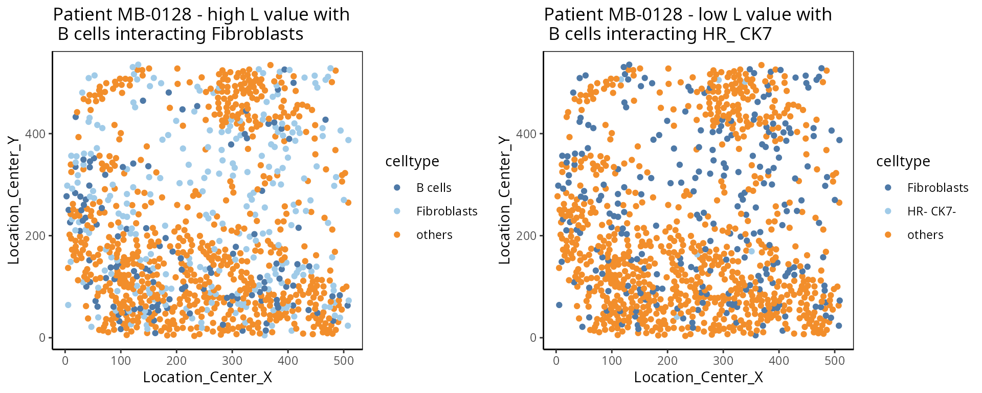
- Cell type interaction composition:
We calculate the nearest neighbours of each cell and then calculate the pairs of cell-types based on the nearest neighbour. This allows us to summarise it into a cell-type interaction composition.
one_sample  <- data_sce[ , data_sce$metabricId == "MB-0263"  ]
one_sample <- data.frame( colData(one_sample) )

one_sample$celltype <- one_sample$description

a <-ggplot( one_sample, aes(x = Location_Center_X , y = Location_Center_Y, colour = celltype )) + geom_point()  + scale_colour_manual(values = color_codes)  + ggtitle("Patient MB-0263")


feature  <- scfeatures_result$celltype_interaction
to_plot <- data.frame( t( feature[ "MB-0263_cond_poor" , ])  )
to_plot$feature <- rownames(to_plot)
colnames(to_plot) <- c("value", "celltype interaction composition")

to_plot <- to_plot[ order(to_plot$value, decreasing = T), ]
to_plot <- to_plot[1:10, ]
to_plot$`celltype interaction composition` <- factor(to_plot$`celltype interaction composition`, levels = to_plot$`celltype interaction composition`)

b <- ggplot(to_plot, aes(x =  `celltype interaction composition`  ,  y = value, fill=`celltype interaction composition`)) + geom_bar(stat="identity" ) + ylab("Major cell-type interactions")  +
  theme(axis.text.x = element_text(angle = 45, vjust = 1, hjust=1))

ggarrange(plotlist = list(a,b))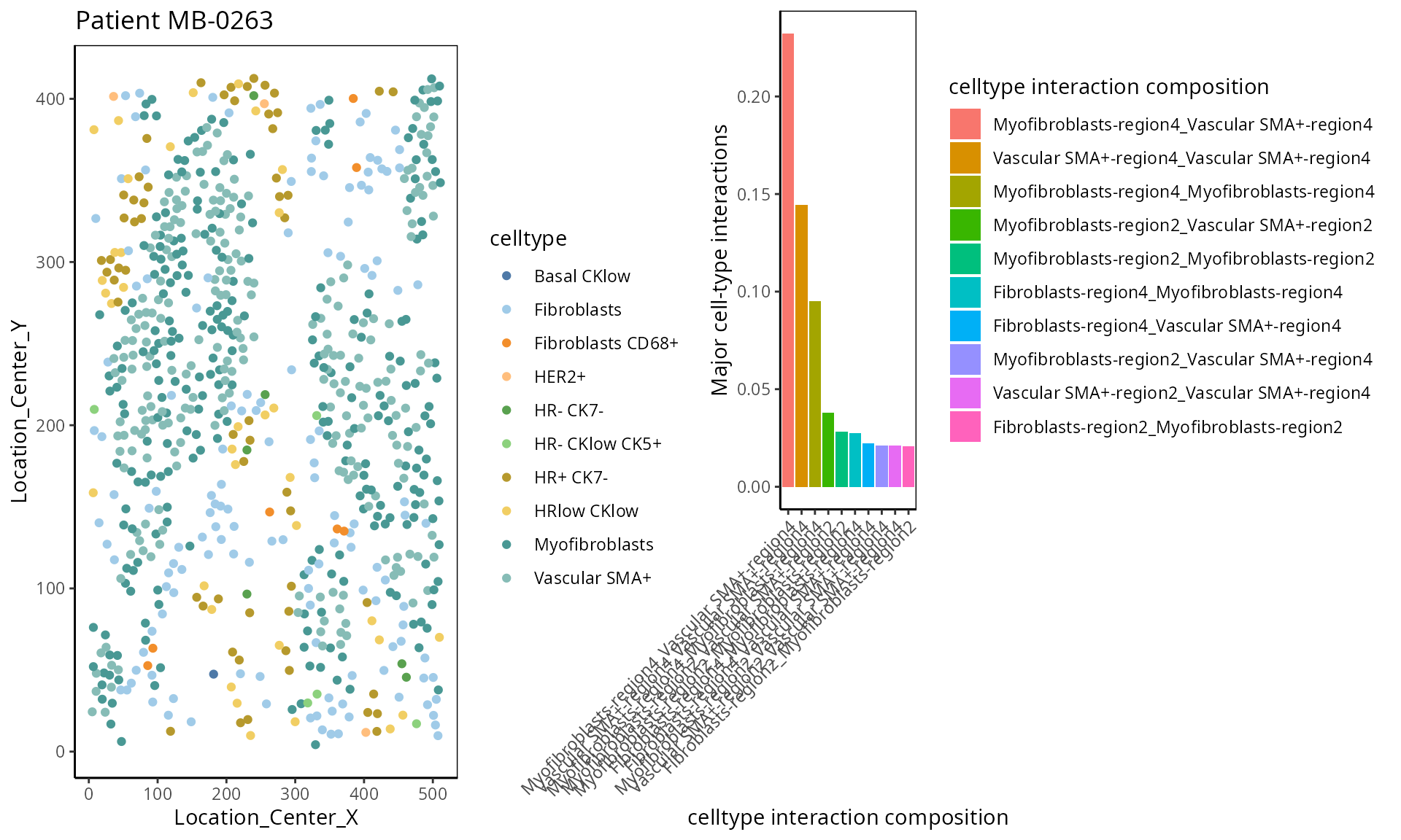
- Moran’s I:
Moran’s I is a spatial autocorrelation statistic based on both location and values. It quantifies whether similar values tend to occur near each other or are dispersed.
high  <- data_sce["Ki67", data_sce$metabricId == "MB-0132"  ]
high_meta <- data.frame( colData(high) )
high_meta$expression <- as.vector(logcounts( high))

low  <- data_sce["Ki67",  data_sce$metabricId == "MB-0249" ]
low_meta <- data.frame( colData(low) )
low_meta$expression <- as.vector(logcounts(low))


a <- ggplot(high_meta, aes(x = Location_Center_X , y = Location_Center_Y, colour =expression)) + geom_point(alpha=0.5) + scale_colour_viridis_c() + ggtitle("Patient MB-0132 - high Moran's I in Ki67")

b <- ggplot(low_meta, aes(x = Location_Center_X , y = Location_Center_Y, colour =expression)) + geom_point(alpha=0.5) + scale_colour_viridis_c() + ggtitle("Patient MB-0249 - low Moran's I in Ki67")

ggarrange(plotlist = list(a,b))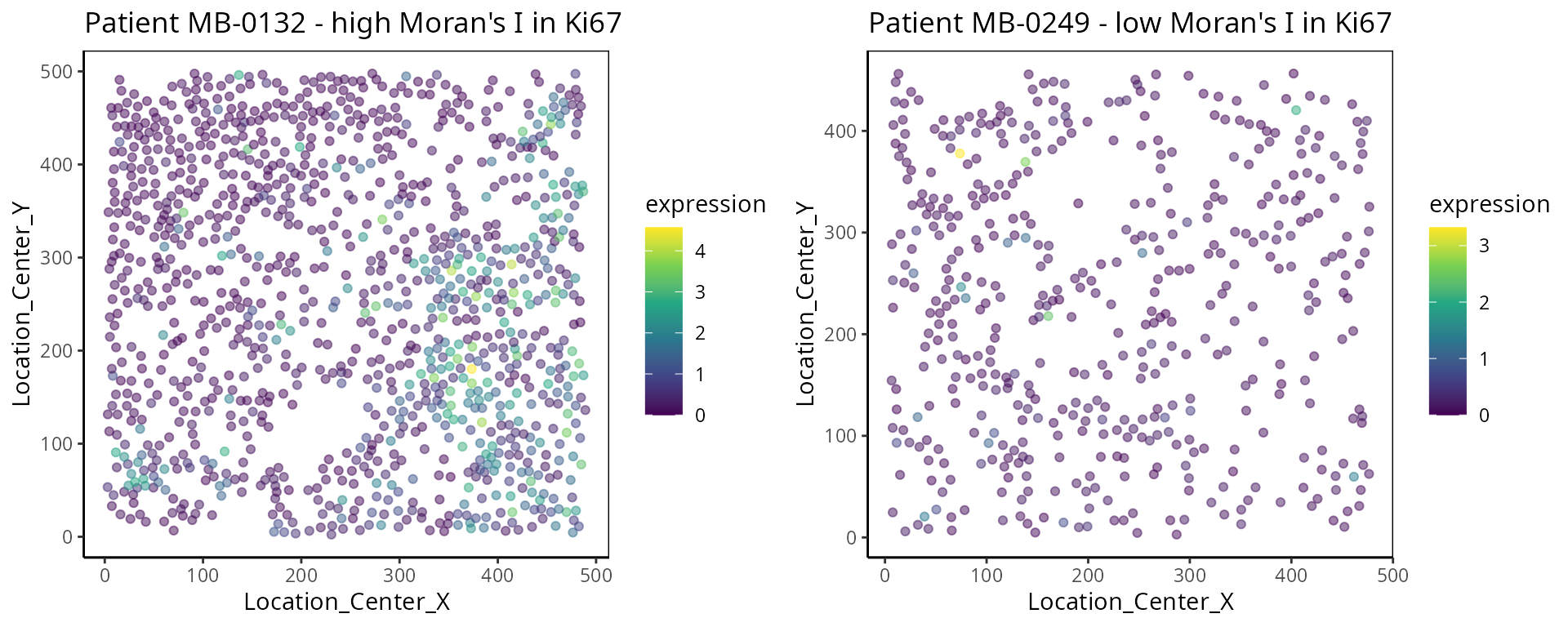
- Nearest Neighbor Correlation:
This metric measures the correlation of proteins/genes between a cell and its nearest neighbour cell.
 plot_nncorrelation <- function(thissample , thisprotein){

       sample_name <- thissample
       thissample <- data_sce[, data_sce$metabricId ==     sample_name]


      exprsMat <- logcounts(thissample)

    # calculate NN correlation
    cell_points_cts <- spatstat.geom::ppp(
            x = as.numeric(thissample$Location_Center_X ), y = as.numeric(thissample$Location_Center_Y),
            check = FALSE,
            xrange = c(
                min(as.numeric(thissample$Location_Center_X)),
                max(as.numeric(thissample$Location_Center_X))
            ),
            yrange = c(
                min(as.numeric(thissample$Location_Center_Y)),
                max(as.numeric(thissample$Location_Center_Y))
            ),
            marks = t(as.matrix(exprsMat))
        )

     value <-  spatstat.explore::nncorr(cell_points_cts)["correlation", ]
      value <-  value[  thisprotein]

    # Find the indices of the two nearest neighbors for each cell
    nn_indices <- nnwhich(cell_points_cts, k = 1)

    protein <-  thisprotein
    df <- data.frame(thiscell_exprs  = exprsMat[protein, ] , exprs =  exprsMat[protein,nn_indices ])

   p <-  ggplot(df, aes( x =thiscell_exprs ,  y = exprs , colour =  exprs  )) +
      geom_point(alpha = 0.3) + ggtitle(paste0( "Patient ", sample_name ,  " nn_corr = " ,  round(value, 2)  )) + scale_colour_viridis_c() + xlab("This cell expression") + ylab("Neighbouring cell expression")

   return (p )

}


p1 <- plot_nncorrelation("MB-0605",  "HER2")
p2 <- plot_nncorrelation("MB-0258",  "HER2")

ggarrange(plotlist = list(p1, p2))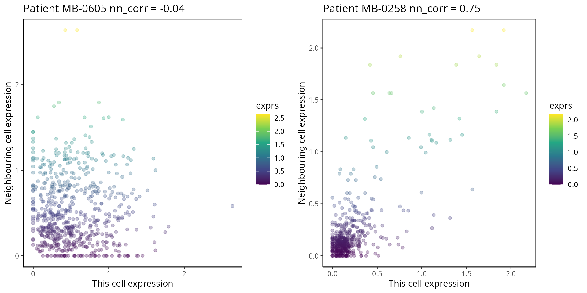
SessionInfo
## R version 4.4.1 (2024-06-14)
## Platform: x86_64-pc-linux-gnu
## Running under: Debian GNU/Linux 12 (bookworm)
##
## Matrix products: default
## BLAS:   /usr/lib/x86_64-linux-gnu/openblas-pthread/libblas.so.3
## LAPACK: /usr/lib/x86_64-linux-gnu/openblas-pthread/libopenblasp-r0.3.21.so;  LAPACK version 3.11.0
##
## locale:
##  [1] LC_CTYPE=C.UTF-8       LC_NUMERIC=C           LC_TIME=C.UTF-8
##  [4] LC_COLLATE=C.UTF-8     LC_MONETARY=C.UTF-8    LC_MESSAGES=C.UTF-8
##  [7] LC_PAPER=C.UTF-8       LC_NAME=C              LC_ADDRESS=C
## [10] LC_TELEPHONE=C         LC_MEASUREMENT=C.UTF-8 LC_IDENTIFICATION=C
##
## time zone: Australia/Sydney
## tzcode source: system (glibc)
##
## attached base packages:
## [1] grid      stats4    stats     graphics  grDevices utils     datasets
## [8] methods   base
##
## other attached packages:
##  [1] purrr_1.0.2                 simpleSeg_1.2.0
##  [3] naniar_1.1.0                reshape_0.8.9
##  [5] scran_1.32.0                scater_1.32.0
##  [7] scuttle_1.14.0              spatstat_3.1-1
##  [9] spatstat.linnet_3.2-1       spatstat.model_3.3-1
## [11] rpart_4.1.23                spatstat.explore_3.3-2
## [13] nlme_3.1-165                spatstat.random_3.3-1
## [15] spatstat.geom_3.3-2         spatstat.univar_3.0-0
## [17] spatstat.data_3.1-2         survminer_0.4.9
## [19] ggpubr_0.6.0                tidyr_1.3.1
## [21] scattermore_1.2             plotly_4.10.4
## [23] limma_3.60.6                dplyr_1.1.4
## [25] spicyR_1.19.2               ggthemes_5.1.0
## [27] lisaClust_1.12.3            ClassifyR_3.9.1
## [29] survival_3.6-4              BiocParallel_1.38.0
## [31] MultiAssayExperiment_1.30.0 generics_0.1.3
## [33] scFeatures_1.3.4            ggplot2_3.5.1
## [35] SingleCellExperiment_1.26.0 SummarizedExperiment_1.34.0
## [37] Biobase_2.64.0              GenomicRanges_1.56.0
## [39] GenomeInfoDb_1.40.1         IRanges_2.38.0
## [41] S4Vectors_0.42.0            BiocGenerics_0.50.0
## [43] MatrixGenerics_1.16.0       matrixStats_1.3.0
##
## loaded via a namespace (and not attached):
##   [1] SpatialExperiment_1.14.0   R.methodsS3_1.8.2
##   [3] GSEABase_1.66.0            tiff_0.1-12
##   [5] EnsDb.Mmusculus.v79_2.99.0 goftest_1.2-3
##   [7] Biostrings_2.72.0          HDF5Array_1.32.0
##   [9] vctrs_0.6.5                digest_0.6.37
##  [11] png_0.1-8                  shape_1.4.6.1
##  [13] EnsDb.Hsapiens.v79_2.99.0  ggrepel_0.9.5
##  [15] deldir_2.0-4               magick_2.8.3
##  [17] MASS_7.3-60.2              pkgdown_2.0.9
##  [19] reshape2_1.4.4             foreach_1.5.2
##  [21] httpuv_1.6.15              withr_3.0.0
##  [23] xfun_0.43                  memoise_2.0.1
##  [25] proxyC_0.4.1               cytomapper_1.16.0
##  [27] ggbeeswarm_0.7.2           systemfonts_1.0.6
##  [29] ragg_1.3.0                 zoo_1.8-12
##  [31] GlobalOptions_0.1.2        gtools_3.9.5
##  [33] V8_4.4.2                   SingleCellSignalR_1.16.0
##  [35] R.oo_1.26.0                KEGGREST_1.44.0
##  [37] promises_1.3.0             httr_1.4.7
##  [39] rstatix_0.7.2              restfulr_0.0.15
##  [41] rhdf5filters_1.16.0        rhdf5_2.48.0
##  [43] rstudioapi_0.16.0          UCSC.utils_1.0.0
##  [45] concaveman_1.1.0           babelgene_22.9
##  [47] curl_6.2.2                 zlibbioc_1.50.0
##  [49] ScaledMatrix_1.12.0        polyclip_1.10-6
##  [51] GenomeInfoDbData_1.2.12    SparseArray_1.4.0
##  [53] fftwtools_0.9-11           xtable_1.8-4
##  [55] stringr_1.5.1              desc_1.4.3
##  [57] evaluate_1.0.3             S4Arrays_1.4.1
##  [59] irlba_2.3.5.1              colorspace_2.1-1
##  [61] magrittr_2.0.3             later_1.3.2
##  [63] viridis_0.6.5              lattice_0.22-7
##  [65] cowplot_1.1.3              XML_3.99-0.16.1
##  [67] ggupset_0.3.0              svgPanZoom_0.3.4
##  [69] class_7.3-22               pillar_1.9.0
##  [71] iterators_1.0.14           EBImage_4.46.0
##  [73] caTools_1.18.2             compiler_4.4.1
##  [75] beachmat_2.20.0            stringi_1.8.3
##  [77] tensor_1.5                 minqa_1.2.7
##  [79] GenomicAlignments_1.40.0   plyr_1.8.9
##  [81] msigdbr_7.5.1              crayon_1.5.3
##  [83] abind_1.4-8                BiocIO_1.14.0
##  [85] sp_2.1-4                   locfit_1.5-9.9
##  [87] terra_1.7-71               bit_4.6.0
##  [89] codetools_0.2-20           textshaping_0.3.7
##  [91] BiocSingular_1.20.0        bslib_0.7.0
##  [93] multtest_2.60.0            mime_0.12
##  [95] splines_4.4.1              circlize_0.4.16
##  [97] Rcpp_1.0.12                sparseMatrixStats_1.16.0
##  [99] knitr_1.46                 blob_1.2.4
## [101] utf8_1.2.4                 AnnotationFilter_1.28.0
## [103] lme4_1.1-35.3              fs_1.6.6
## [105] nnls_1.5                   DelayedMatrixStats_1.26.0
## [107] GSVA_1.52.0                ggsignif_0.6.4
## [109] tibble_3.2.1               Matrix_1.7-0
## [111] scam_1.2-16                statmod_1.5.0
## [113] svglite_2.1.3              visdat_0.6.0
## [115] tweenr_2.0.3               pkgconfig_2.0.3
## [117] pheatmap_1.0.12            tools_4.4.1
## [119] cachem_1.0.8               RSQLite_2.3.6
## [121] viridisLite_0.4.2          DBI_1.2.3
## [123] numDeriv_2016.8-1.1        fastmap_1.2.0
## [125] rmarkdown_2.26             scales_1.3.0
## [127] shinydashboard_0.7.2       Rsamtools_2.20.0
## [129] broom_1.0.5                sass_0.4.9
## [131] BiocManager_1.30.25        graph_1.82.0
## [133] carData_3.0-5              farver_2.1.2
## [135] mgcv_1.9-1                 yaml_2.3.8
## [137] rtracklayer_1.64.0         cli_3.6.5
## [139] lifecycle_1.0.4            bluster_1.14.0
## [141] backports_1.5.0            annotate_1.82.0
## [143] gtable_0.3.5               rjson_0.2.21
## [145] parallel_4.4.1             ape_5.8
## [147] jsonlite_2.0.0             edgeR_4.2.0
## [149] bitops_1.0-9               bit64_4.0.5
## [151] Rtsne_0.17                 spatstat.utils_3.1-0
## [153] BiocNeighbors_1.22.0       bdsmatrix_1.3-7
## [155] highr_0.10                 jquerylib_0.1.4
## [157] metapod_1.12.0             dqrng_0.4.1
## [159] survMisc_0.5.6             R.utils_2.12.3
## [161] lazyeval_0.2.2             shiny_1.8.1.1
## [163] htmltools_0.5.8.1          KMsurv_0.1-5
## [165] ensembldb_2.28.0           glue_1.8.0
## [167] XVector_0.44.0             RCurl_1.98-1.14
## [169] coxme_2.2-22               jpeg_0.1-11
## [171] gridExtra_2.3              AUCell_1.26.0
## [173] boot_1.3-31                igraph_2.0.3
## [175] R6_2.5.1                   gplots_3.1.3.1
## [177] labeling_0.4.3             km.ci_0.5-6
## [179] ggh4x_0.2.8                GenomicFeatures_1.56.0
## [181] cluster_2.1.8.1            Rhdf5lib_1.26.0
## [183] nloptr_2.0.3               DelayedArray_0.30.0
## [185] tidyselect_1.2.1           vipor_0.4.7
## [187] ProtGenerics_1.36.0        raster_3.6-26
## [189] ggforce_0.4.2              car_3.1-2
## [191] AnnotationDbi_1.66.0       rsvd_1.0.5
## [193] munsell_0.5.1              KernSmooth_2.23-26
## [195] data.table_1.17.0          htmlwidgets_1.6.4
## [197] RColorBrewer_1.1-3         rlang_1.1.4
## [199] spatstat.sparse_3.1-0      lmerTest_3.1-3
## [201] ggnewscale_0.4.10          fansi_1.0.6
## [203] beeswarm_0.4.0
Acknowledgments
The authors thank all their colleagues, particularly at The University of Sydney, Sydney Precision Data Science and Charles Perkins Centre for their support and intellectual engagement. Special thanks to Ellis Patrick, Shila Ghazanfar, Andy Tran, Helen, and Daniel for guiding and supporting the building of this workshop.