Making Space Count: Strategies for Analysing Spatial Omics Data
Shreya Rao
Westmead Institute for Medical Research, AustraliaSchool of Mathematics and Statistics, University of Sydney, AustraliaSydney Precision Data Science Centre, University of Sydney, AustraliaEllis Patrick
Westmead Institute for Medical Research, AustraliaSchool of Mathematics and Statistics, University of Sydney, AustraliaSydney Precision Data Science Centre, University of Sydney, Australia24 June 2025
Source:vignettes/spatialAnalysis.Rmd
spatialAnalysis.RmdGlobal paramaters
# set parameters
set.seed(51773)

# set number of cores
nCores = 1
BPPARAM = BiocParallel::SerialParam()

# set ggplot theme
theme_set(theme_classic())
Context
In this workshop, we will analyse some MIBI-TOF data (Risom et al, 2022) profiling the spatial landscape of ductal carcinoma in situ (DCIS), which is a pre-invasive lesion that is thought to be a precursor to invasive breast cancer (IBC). The key conclusion of this manuscript (amongst others) is that spatial information about cells can be used to predict disease progression in patients.
We’ll show that you can reach the same biological conclusion using different spatial analysis methods. Across all approaches, the data consistently points to the same insight: higher CD8 expression in T cells that are close to tumour cells is linked to tumour progression. By working with MIBI-TOF data from Risom et al. (2022), we’ll explore how different ways of measuring spatial context can still uncover meaningful and clinically relevant patterns in the tumour microenvironment.
Load the clinical data
To link image features with disease progression, we need to import
the clinical information that associates each image identifier with its
corresponding progression status and patient metadata. We will do this
here, making sure that the imageID values are correctly
matched.
Read the clinical data
# read the clinical data CSV file

clinicalFile <- "../inst/extdata/1-s2.0-S0092867421014860-mmc1.csv"

# clinicalFile <-   system.file(
#     "extdata/1-s2.0-S0092867421014860-mmc1.csv",
#     package = "GBCCspatialWorkshop2025"
#   )

clinical <- read.csv(
 clinicalFile
)

# create a new 'imageID' column by concatenating relevant identifiers
clinical <- clinical |>
  mutate(imageID = paste0(
    "Point", PointNumber, "_pt", Patient_ID, "_", TMAD_Patient
  ))

# clinical variables of interest
clinicalVariables <- c(
  "imageID", "Patient_ID", "Status", "Age", "SUBTYPE", "PAM50", "Treatment",
  "DCIS_grade", "Necrosis"
)

# find rows where Tissue_Type is "normal" and append "_Normal" to their imageID
image_idx <- grep("normal", clinical$Tissue_Type)
clinical$imageID[image_idx] <- paste0(clinical$imageID[image_idx], "_Normal")

#clinical$Status <- factor(clinical$Status)
rownames(clinical) <- clinical$imageID
Filter to Luminal B subtype
To keep the case study computationally efficient, we are going to only going to analyse patients with Luminal B breast cancer.
# images associated with LumB subtype
lumBImages <- clinical |>
  filter(PAM50 == "LumB") |>
  pull(imageID)
Read in images
The images are stored in the images folder in the form
of single-channel TIFF images. In single-channel images, each pixel
represents intensity values for a single marker. Here, we use the
loadImages function from the cytomapper
package to load all the TIFF images into a CytoImageList
object and store the images as h5 file on-disk.
pathToImages <- "../inst/extdata/images" #system.file("extdata/images", package = "GBCCspatialWorkshop2025")

# approx. runtime: 3 min
images <- cytomapper::loadImages(
  pathToImages,
  single_channel = TRUE, # one image per channel
  on_disk = TRUE, # on-disk loading to save RAM
  h5FilesPath = HDF5Array::getHDF5DumpDir(),
  BPPARAM = BPPARAM,
  as.is = TRUE
)

# free unused memory
gc()
## used (Mb) gc trigger (Mb) max used (Mb)
## Ncells 17785137 949.9 31091971 1660.5 21469164 1146.6
## Vcells 29950829 228.6 86018428 656.3 107028457 816.6
# filter images to LumB samples
images <- images[lumBImages]

# filter clinical data to LumB samples
clinical <- clinical |> filter(PAM50 == "LumB")
Put the clinical data into the colData of
CytoImageList
We can then store the clinical information in the mcols
slot of the CytoImageList object.
# Add the clinical data to mcols of images
mcols(images) <- clinical[names(images), clinicalVariables]
Where are the cells in the images?
Run simpleSeg
The typical first step in analysing spatial data is cell segmentation, which involves identifying and isolating individual cells in each image. This defines the basic units (cells) on which most downstream omics analysis is performed.
There are multiple approaches to cell segmentation. One approach involves segmenting the nuclei using intensity-based thresholding of a nuclear marker (such as DAPI or Histone H3), followed by watershedding to separate touching cells. The segmented nuclei are then expanded by a fixed or adaptive radius to approximate the full cell body.
The simpleSeg
package on Bioconductor provides functionality for user friendly,
watershed based segmentation on multiplexed cellular images based on the
intensity of user-specified marker channels. The main function,
simpleSeg, can be used to perform a simple cell
segmentation process that traces out the nuclei using a specified
channel.
# Generate segmentation masks
# approx. runtime: 90 secs
masks <- simpleSeg(
  images,
  nucleus = c("HH3"), # trace out nuclei using the HH3 marker
  cellBody = "dilate", # use dilation strategy of segmentation
  transform = c("tissueMask","sqrt"), # remove background noise outside of sample area and perform sqrt transform
  sizeSelection = 20, # only cells > 20 pixels will be included
  discSize = 5, # dilate out from nucleus by 5 pixels
  cores = nCores
)
Visualise separation
We can examine the performance of the cell segmentation using the
display and colorLabels functions from the
EBImage package.
# Visualise segmentation performance one way.
EBImage::display(colorLabels(masks[[1]]))
Visualise outlines
To assess segmentation accuracy, we can overlay the nuclei masks onto
the corresponding nuclear intensity channel with the
plotPixels function from the cytomapper
package. Ideally, the mask outlines (shown in white in the image below)
should closely align with the boundaries of the nuclear signal
(visualised in blue), indicating that the segmentation correctly
captures the extent of each nucleus.
# Visualise segmentation performance another way.
cytomapper::plotPixels(
  image = images[1],
  mask = masks[1],
  img_id = "imageID",
  colour_by = c("PanKRT", "HH3", "CD3", "CD20"),
  display = "single",
  colour = list(
    HH3 = c("black", "blue"),
    CD3 = c("black", "green"),
    CD20 = c("black", "red"),
    PanKRT = c("black", "yellow")
  ),
  bcg = list(
    HH3 = c(0, 1, 1.5),
    CD3 = c(0, 1, 3),
    CD20 = c(0, 1, 3),
    PanKRT = c(0, 1, 1.5)
  ),
  legend = NULL
)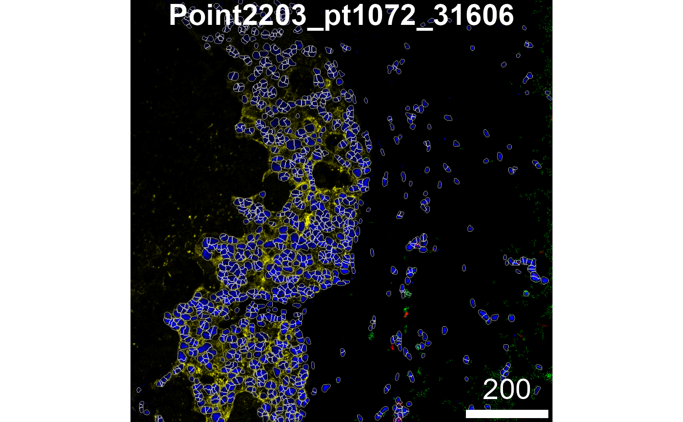
In the image above, we can see that we’ve done relatively well at
capturing the HH3 signal, but perhaps not such a good job at capturing
the PanKRT signal, which largely lies outside our segmented outlines. To
remedy this, we can increase discSize to capture more of
the cell body; however, we need avoid capturing signal from neighbouring
cells. Balancing the dilation size to capture the full cell body while
minimising lateral spillover is therefore crucial.
Summarise cell features
In order to characterise the phenotypes of each of the segmented
cells, measureObjects from cytomapper will
calculate the average intensity of each channel within each cell as well
as a few morphological features. The channel intensities will be stored
in the counts assay in a SpatialExperiment.
Information on the spatial location of each cell is stored in
colData in the m.cx and m.cy
columns. In addition to this, it will propagate the information we have
store in the mcols of our CytoImageList in the
colData of the resulting
SpatialExperiment.
# Summarise the expression of each marker in each cell
# approx. runtime: 2 mins
cells <- cytomapper::measureObjects(
  masks,
  images,
  img_id = "imageID",
  return_as = "sce",
  feature_types = c("basic", "moment"),
  BPPARAM = BPPARAM
)

# Lets make our lives easy and add in x and y
cells$x = cells$m.cx
cells$y = cells$m.cy
cells
## # A SingleCellExperiment-tibble abstraction: 31,416 × 18
## # Features=41 | Cells=31416 | Assays=counts
## .cell imageID object_id m.cx m.cy m.majoraxis m.eccentricity Patient_ID
## <chr> <chr> <dbl> <dbl> <dbl> <dbl> <dbl> <int>
## 1 1 Point2203_… 1 520. 659. 23.7 0.809 1072
## 2 2 Point2203_… 2 524. 637. 24.6 0.964 1072
## 3 3 Point2203_… 3 520. 646. 20.0 0.504 1072
## 4 4 Point2203_… 4 935. 640. 16.3 0.560 1072
## 5 5 Point2203_… 5 854. 760. 20.0 0.580 1072
## 6 6 Point2203_… 6 973. 657. 23.1 0.905 1072
## 7 7 Point2203_… 7 39.8 1001. 14.7 0.463 1072
## 8 8 Point2203_… 8 791. 349. 17.4 0.577 1072
## 9 9 Point2203_… 9 870. 781. 17.6 0.770 1072
## 10 10 Point2203_… 10 474. 942. 25.1 0.758 1072
## # ℹ 31,406 more rows
## # ℹ 10 more variables: Status <chr>, Age <int>, SUBTYPE <chr>, PAM50 <chr>,
## # Treatment <chr>, DCIS_grade <chr>, Necrosis <chr>, objectNum <named list>,
## # x <dbl>, y <dbl>How can we make marker quantification comparable across images?
Variability in marker intensity across images is a common challenge in spatial imaging, often driven by technical factors like staining efficiency, imaging conditions, or sample preparation. These inconsistencies can blur the distinction between marker-positive and -negative cells, leading to misclassification and unreliable comparisons between and within samples. Because raw intensities aren’t always directly comparable across or within images, quality control is an essential next step after segmentation.
Below, we extract marker intensities from the counts
assay and take a closer look at the cytokeratin 7 (CK7)
marker, which is often used as a diagnostic marker in breast cancer.
# Extract marker data and bind with information about images
df <- as.data.frame(cbind(colData(cells), t(assay(cells, "counts"))))

# Plots densities of CK7 for each image.
ggplot(df, aes(x = CK7, colour = imageID)) +
  geom_density() +
  theme(legend.position = "none")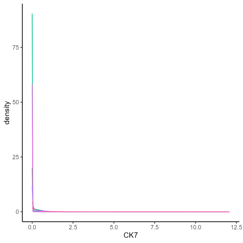
We can see that CK7 intensity is highly skewed, which makes it difficult to distinguish CK7+ cells from CK7- cells. Ideally, we would want to see a bimodal distribution of marker intensity, with one peak corresponding to CK7- cells and the other peak corresponding to CK7+ cells. This clear distinction between marker+ and marker- cells would also ensure that downstream clustering processes can easily distinguish between marker+ and marker- cells.
Additionally, we would also want to see that our marker+ or marker- cells are consistent across images, so that cells classified as CK7+ positive in one image are also classified as CK7+ in another image. If these peaks are not consistent, it might point to image-level batch effects.
To make marker intensity comparable across images, we can transform
and normalise our data using the normalizeCells function
from the simpleSeg. Here we have taken the intensities from
the counts assay, performed an arcsine transform, then for
each image trimmed the 99 quantile and min-max scaled to 0-1. This
modified data is then stored in the norm assay by default.
We can see that this normalised data appears more bimodal, not
perfectly, but likely to a sufficient degree for clustering.
# Transform and normalise the marker expression of each cell type.
# Use a  arc-sine transform, then trimmed the 99 quantile and then remove first principal component
cells <- normalizeCells(cells,
  transformation = "asinh",
  method = c("trim99", "minMax", "PC1"),
  assayIn = "counts",
  cores = nCores
)

# Extract normalised marker information.
norm_df <- as.data.frame(cbind(colData(cells), t(assay(cells, "norm"))))


# Plots densities of normalised CK7 for each image.
ggplot(norm_df, aes(x = CK7, colour = imageID)) +
  geom_density() +
  theme(legend.position = "none")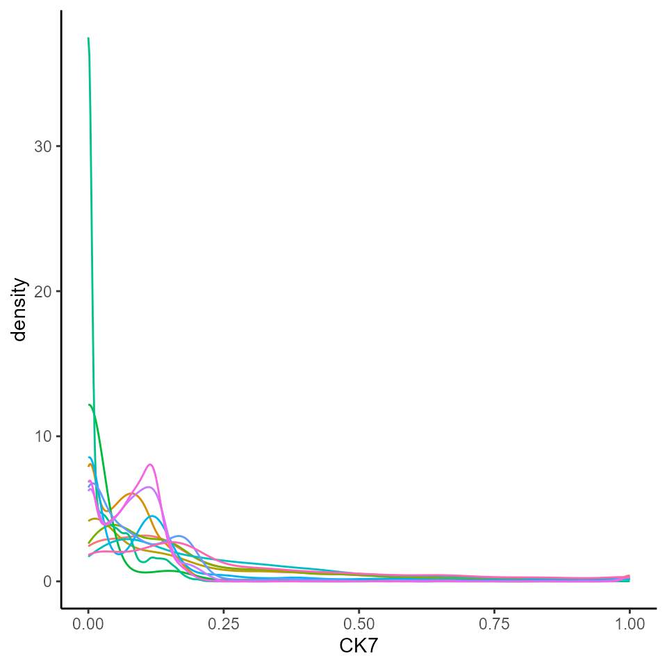
Choosing transformation and normalisation methods
Not all datasets require the same transformation or normalisation strategy. Choosing the right one can depend on both the biological context and the source of technical variability.
If our marker intensities show strong tails, applying a transformation (e.g., square root, log, or arcsinh) can help separate low vs high signal populations.
If we observe inconsistent peaks across images, we could use normalisation techniques such as centering on the mean, scaling by standard deviation, or regression-based adjustments (e.g., removing PC1, capping the highest 1% of values, etc.).
What types of cells are in my images?
Identifying what cell types are present in our images is a key step in many spatial analysis workflows, as it shapes how we analyse tissue composition, measure cell-cell interactions, and track disease mechanisms. One common approach is to apply unsupervised clustering methods followed by manual annotation of the resulting clusters.
Use clustering
Clustering groups cells by similarity in their marker expression patterns, helping to identify distinct cell types or states. The choice of markers to use for clustering can greatly affect the populations we identify. Below, we’ve listed the markers used in the original study, and the cell types they can be used to identify.
# The markers used in the original publication to gate cell types.
useMarkers <- c(
  # Epithelial/tumour markers
  "PanKRT",       # Pan-cytokeratin: general epithelial marker (tumour or normal epithelium)
  "ECAD",         # E-cadherin: adherens junctions, epithelial cell integrity; also seen in myoepithelium
  "CK7",          # Cytokeratin 7: luminal epithelial marker
  "VIM",          # Vimentin: mesenchymal marker; high in fibroblasts, EMT tumour cells, and endothelium

  # Stromal markers
  "FAP",          # Fibroblast activation protein: cancer-associated fibroblasts (CAFs)
  "CD31",         # PECAM1: endothelial cell marker (blood vessels)
  "CK5",          # Cytokeratin 5: basal epithelial and myoepithelial marker
  "SMA",          # Smooth muscle actin: myoepithelial cells and myofibroblasts

  # Immune lineage marker
  "CD45",         # Pan-leukocyte marker: expressed on all immune cells

  # T cells
  "CD4",          # Helper T cells: subset of CD3+ T cells
  "CD3",          # T cell receptor complex: all T cells
  "CD8",          # Cytotoxic T cells: subset of CD3+ T cells

  # B cells
  "CD20",         # B cell marker: mature B cells

  # Myeloid/antigen-presenting cells
  "CD68",         # Macrophage marker: especially tumour-associated macrophages
  "CD14",         # Monocyte marker: also on some dendritic cells
  "CD11c",        # Myeloid dendritic cells: also on monocyte-derived DCs and some macrophages
  "HLADRDPDQ",    # MHC class II: antigen presentation, expressed on DCs, macrophages, B cells

  # Granulocytes and mast cells
  "MPO",          # Myeloperoxidase: neutrophils and granulocytes
  "Tryptase"      # Mast cells: granule content marker, specific for mast cells
)
We can perform clustering with the runFuseSOM function
from the FuseSOM
package. FuseSOM is an unsupervised method that combines a
Self-Organising Map (SOM) architecture with
MultiView integration of correlation-based metrics,
offering improved robustness and accuracy.
Here, we use the same subset of markers as the original manuscript
for cell type gating, and set the number of clusters to
numClusters = 12. Choosing the right number of clusters is
important, as it can significantly influence the results: too few
clusters may group distinct cell types together and mask biological
differences, while too many clusters may artificially split a single
cell population into multiple groups.
# Set seed.
set.seed(51773)

# cells@metadata <- list() # This is sometimes needed to clear the clustering info.

# Generate SOM and cluster cells into 16 groups.
cells <- runFuseSOM(
  cells,
  markers = useMarkers,
  assay = "norm",
  numClusters = 12
)
Check how many clusters should be used
We can assess the suitability of our choice of 12 clusters using the
estimateNumCluster and optiPlot functions from
the FuseSOM package. Here, we focus on the Gap statistic
method, though other options like Silhouette and Within Cluster Distance
are also available.
Generally, we’re looking for the
k(number of clusters) before the point of greatest inflection, or the point beyond which increasingkresults in minimal improvement to clustering quality.There can be several options of
kif there are several points of inflection. The optimal choice depends on the expected number of cell types and the desired level of annotation resolution.
As we can be seen below, we chose the second elbow point as the optimal number of clusters.
cells <- estimateNumCluster(cells, kSeq = 2:30)
optiPlot(cells, method = "gap")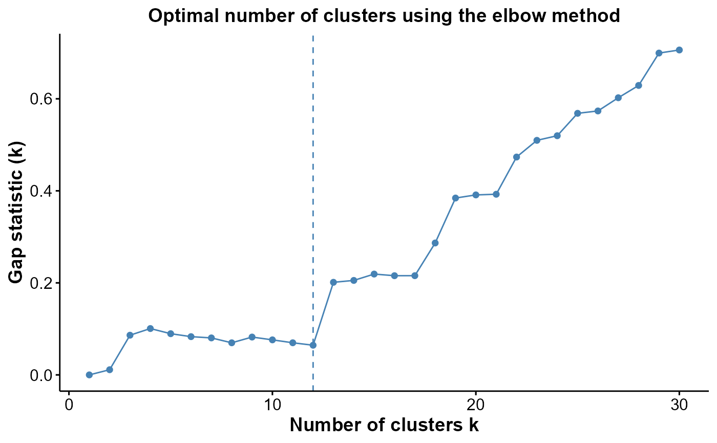
Attempt to interpret the phenotype of each cluster
We can begin the process of understanding what each of these cell
clusters are by using the plotGroupedHeatmap function from
scater. At the least, here we can see we capture all the
major immune populations that we expect to see.
# Visualise marker expression in each cluster.
scater::plotGroupedHeatmap(
  cells,
  features = useMarkers,
  group = "clusters",
  exprs_values = "norm",
  center = TRUE,
  scale = TRUE,
  zlim = c(-3, 3),
  cluster_rows = FALSE
)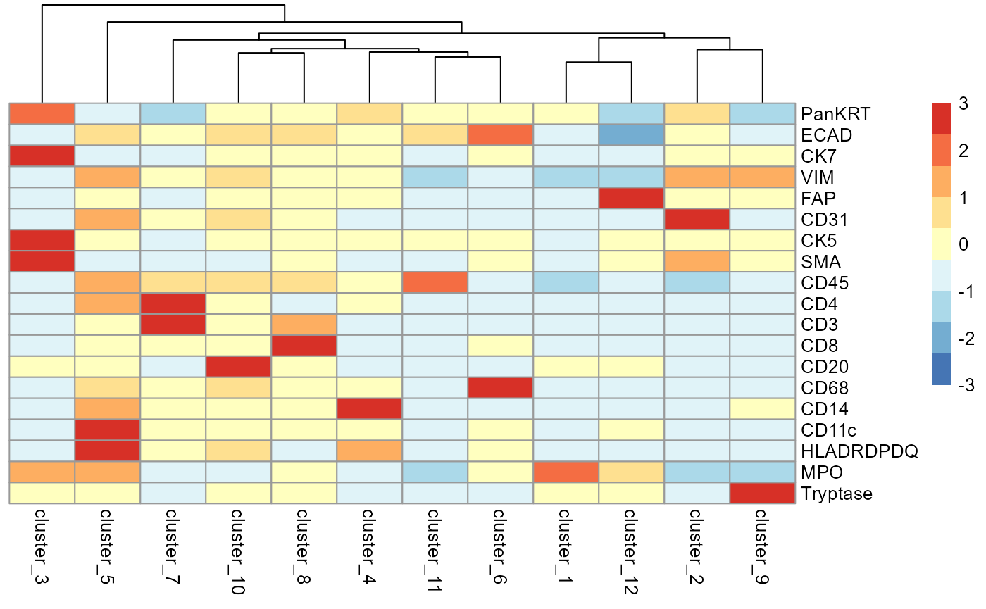
We can then annotate the clusters based on the canonical cell type markers they express.
# annotate cell populations
cells <- cells |>
  mutate(cellType = factor(case_when(
      clusters == "cluster_1" ~ "Tumour",
      clusters == "cluster_2" ~ "Endothelial",
      clusters == "cluster_3" ~ "Myoepithelial",
      clusters == "cluster_4" ~ "Monocyte",
      clusters == "cluster_5" ~ "DC",
      clusters == "cluster_6" ~ "Macrophage",
      clusters == "cluster_7" ~ "T_cell_CD4",
      clusters == "cluster_8" ~ "T_cell_CD8",
      clusters == "cluster_9" ~ "Mast",
      clusters == "cluster_10" ~ "B_cell",
      clusters == "cluster_11" ~ "Other_immune",
      clusters == "cluster_12" ~ "Fibroblast",
      TRUE ~ clusters
  )))
Check cluster frequencies
It’s always helpful to examine the number of cells in each cluster, as this provides insight into cluster relevance and stability. Here, we can see that
# Check cluster frequencies.
colData(cells) |>
  as.data.frame() |>
  dplyr::count(cellType, sort = TRUE) |>
knitr::kable()| cellType | n |
|---|---|
| Tumour | 24883 |
| Endothelial | 2640 |
| Monocyte | 995 |
| Myoepithelial | 574 |
| T_cell_CD4 | 429 |
| Macrophage | 390 |
| Fibroblast | 316 |
| Other_immune | 292 |
| T_cell_CD8 | 274 |
| Mast | 252 |
| DC | 245 |
| B_cell | 126 |
Plot cell types on an image
We can plot the cell types on an image to view their spatial distribution.
reducedDim(cells, "spatialCoords") <- cbind(X = cells$m.cx, Y = cells$m.cy)

cells |>
  filter(imageID == "Point2203_pt1072_31606") |>
  plotReducedDim("spatialCoords", colour_by = "cellType")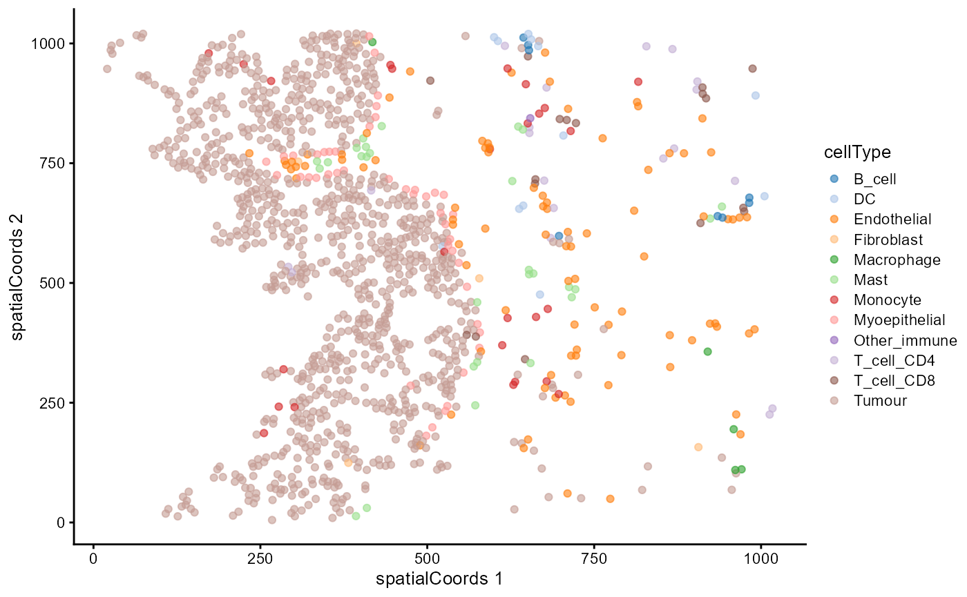
A heatmap of averages can be skewed by extreme values. We can always check the expression profile of the cell types with boxplots.
cells |>
  join_features(features = c("CD3"), assay = "norm", shape = "wide") |>
  ggplot(aes(x = cellType, y = CD3)) + geom_boxplot() +
  theme(axis.text.x = element_text(angle = 45, hjust = 1))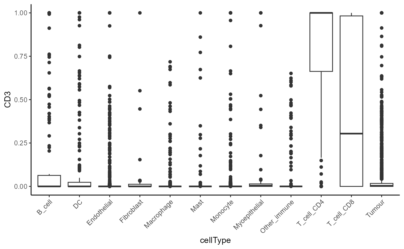
Dimension reduction
As our data is stored in a SingleCellExperiment object,
we can visualise our data in a lower dimension to see how well we can
distinguish our annotated cell populations.
set.seed(51773)
# Perform dimension reduction using UMAP.
# approx. runtime: 12 secs
cells <- scater::runUMAP(
cells,
subset_row = useMarkers,
exprs_values = "norm"
)
# UMAP by cell type cluster.
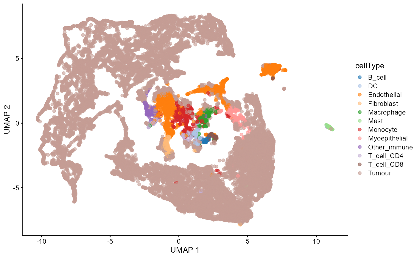
scater::plotReducedDim(
cells,
dimred = "UMAP",
colour_by = "cellType"
)
Are there cell types that are more or less abundant with disease status?
A typical question of top priority would be to test whether certain
cell types are more or less abundant across disease states. We recommend
using a package such as diffcyt for testing for changes in
abundance of cell types. However, the colTest function from
the spicyR package allows us to quickly test for
associations between the proportions of cell types and progression
status using either Wilcoxon rank sum tests or t-tests.
# Perform simple wicoxon rank sum tests on the columns of the proportion matrix.
testProp <- colTest(cells,
  condition = "Status",
  feature = "cellType"
)

testProp
## mean in group nonprogressor mean in group progressor tval.t pval
## Other_immune 0.0036 0.0150 -2.500 0.052
## Fibroblast 0.0140 0.0056 2.000 0.084
## Monocyte 0.0260 0.0380 -1.900 0.088
## T_cell_CD8 0.0064 0.0140 -1.400 0.200
## Macrophage 0.0061 0.0180 -1.300 0.260
## DC 0.0089 0.0056 0.770 0.460
## B_cell 0.0025 0.0056 -0.690 0.510
## Mast 0.0110 0.0078 0.660 0.530
## Tumour 0.8100 0.7700 0.600 0.560
## T_cell_CD4 0.0140 0.0180 -0.390 0.710
## Myoepithelial 0.0230 0.0200 0.370 0.720
## Endothelial 0.0800 0.0790 0.032 0.970
## adjPval cluster
## Other_immune 0.35 Other_immune
## Fibroblast 0.35 Fibroblast
## Monocyte 0.35 Monocyte
## T_cell_CD8 0.60 T_cell_CD8
## Macrophage 0.62 Macrophage
## DC 0.75 DC
## B_cell 0.75 B_cell
## Mast 0.75 Mast
## Tumour 0.75 Tumour
## T_cell_CD4 0.79 T_cell_CD4
## Myoepithelial 0.79 Myoepithelial
## Endothelial 0.97 EndothelialWe can see that immune cells generally tend to be more abundant in progressors compared to non-progressors. CD8 T cells and monocytes in particular tend to be more abundant in progressors compared to non-progressors. We can visualise the difference in abundance for CD8 T cells with a boxplot.
# Calculate cell type proportions for all cell types
prop <- getProp(cells, feature = "cellType")

# Visualise the distribution of CD8 T cells
boxplot(
  prop[, "T_cell_CD8"] ~ clinical[rownames(prop), "Status"],
  main = paste("Proportion of T_cell_CD8 by Clinical Status"),
  xlab = "Clinical Status",
  ylab = "Cell Type Proportion",
)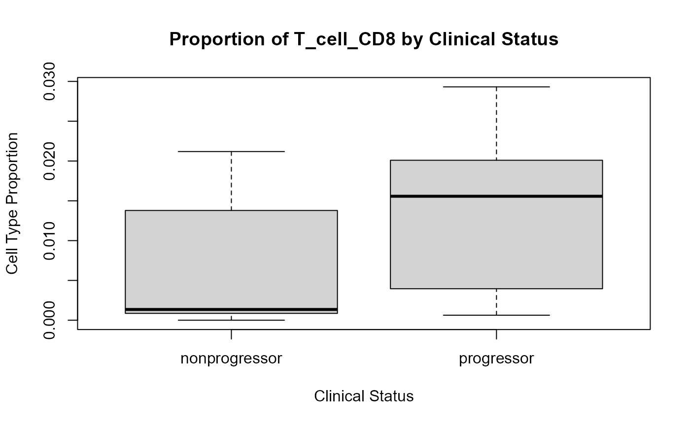
Progressors have a higher proportion of CD8 T cells compared to non-progressors.
Do spatial relationships between cell types change?
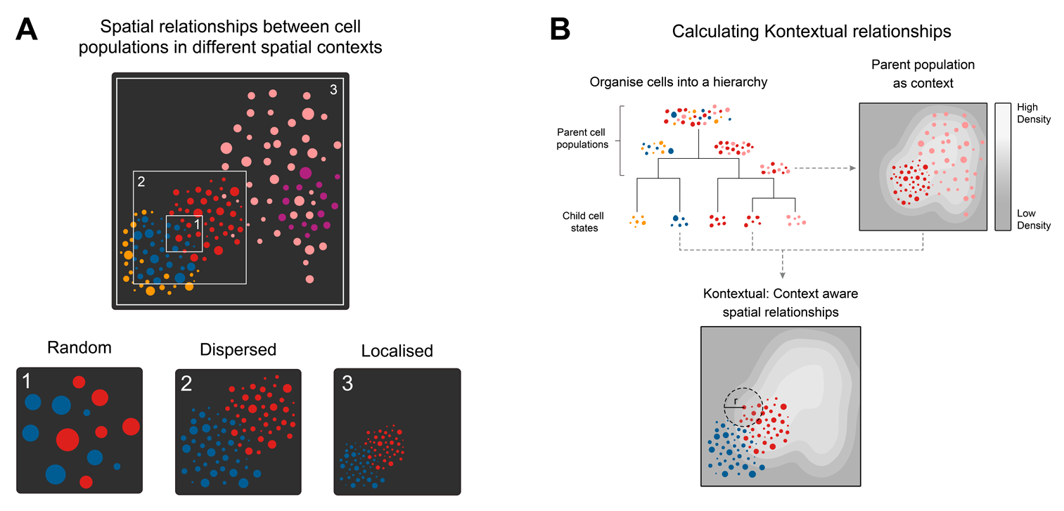
Spatial co-localisation analysis helps uncover whether specific cell types are found near each other more (or less) often than expected by chance. This can reveal insights into immune infiltration, tumour-stroma interactions, or the organisation of functional niches.
Before drawing conclusions from co-localisation patterns, it’s important to recognise the potential confounding factors that can distort results. Tissue architecture is rarely random as cells are often organised into structured regions, influenced by development, disease states, or sampling. If this spatial inhomogeneity isn’t accounted for, standard co-localisation methods can misinterpret natural density variations as meaningful interactions. Similarly, differences in cell abundance across images, due to either biology or technical variability, can affect the stability of association metrics. And finally, variation between samples or replicates must be considered to ensure that observed patterns are consistent and not driven by a few outliers. Any robust co-localisation analysis must address all three of these challenges: local spatial structure, uneven cell-type frequencies, and replicate-level variability.
The spicyR package provides functionality to quantify the degree of localisation or dispersion between two cell types. This localisation metric quantifies whether two cell types in an image tend to be closer together (co-localised) or further apart (dispersed) than would be expected by chance. A positive value indicates that two cell types are co-localised, while a negative value suggests they are dispersed. A value close to zero indicates that the cells are randomly distributed. spicyR can then test for changes in this co-localisation metric across different disease states or groups.
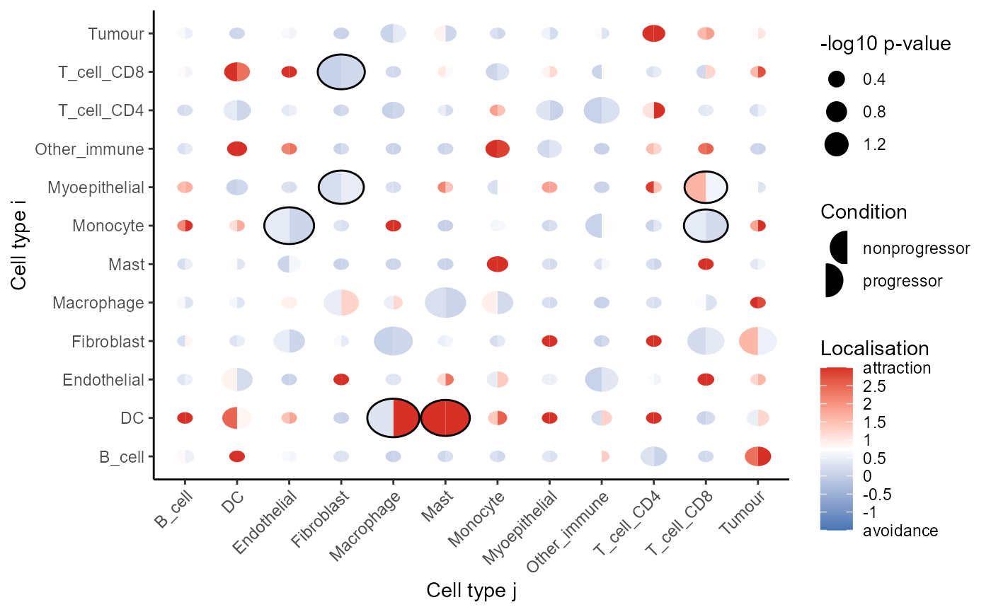
CD8 T cells are more localised with tumour cells in progressors
We can use the spicy function from the
spicyR package to evaluate all pairwise relationships
between cell types. To draw meaningful conclusions from co-localisation
patterns, it’s important to carefully choose the proximity radius
r which is the distance that defines when two cells are
considered “near” each other. This radius should reflect the biological
scale of interaction, such as the typical signaling range or physical
cell contact. If the radius is too small, real associations might be
missed due to slight spatial variability or measurement noise. On the
other hand, if the radius is too large, the analysis may pick up false
signals driven by overall regional cell density rather than genuine
biological interactions.
# Test for changes in pair-wise spatial relationships between cell types.
spicyTest <- spicy(
  cells,
  condition = "Status", # the clinical outcome of interest
  cellType = "cellType",
  imageID = "imageID",
  spatialCoords = c("x", "y"),
  r = 50, # evaluate spatial relationships at 50 pixels
  sigma = 20, # account for tissue inhomogeneity
  cores = nCores
)

topPairs(spicyTest, n = 10)
## intercept coefficient p.value adj.pvalue
## Mast__Myoepithelial 34.825193 -54.783319 0.01547767 0.8122915
## Myoepithelial__Mast 55.620887 -68.464279 0.01799456 0.8122915
## T_cell_CD8__Tumour -21.201628 21.951831 0.02878506 0.8122915
## Tumour__T_cell_CD8 -19.092610 21.202932 0.03676587 0.8122915
## Other_immune__Other_immune 68.307923 121.021178 0.06240734 0.8122915
## T_cell_CD8__Other_immune 102.825649 -97.618586 0.07653005 0.8122915
## Endothelial__Fibroblast 10.699562 19.648439 0.07724427 0.8122915
## Myoepithelial__Macrophage -7.462476 35.577118 0.09129165 0.8122915
## Endothelial__T_cell_CD8 44.566227 -30.426656 0.09871004 0.8122915
## Monocyte__Tumour -6.703681 5.871431 0.10402540 0.8122915
## from to
## Mast__Myoepithelial Mast Myoepithelial
## Myoepithelial__Mast Myoepithelial Mast
## T_cell_CD8__Tumour T_cell_CD8 Tumour
## Tumour__T_cell_CD8 Tumour T_cell_CD8
## Other_immune__Other_immune Other_immune Other_immune
## T_cell_CD8__Other_immune T_cell_CD8 Other_immune
## Endothelial__Fibroblast Endothelial Fibroblast
## Myoepithelial__Macrophage Myoepithelial Macrophage
## Endothelial__T_cell_CD8 Endothelial T_cell_CD8
## Monocyte__Tumour Monocyte TumourOne of our most significant cell type interactions is
Tumour__T_cell_CD8 with a positive coefficient, which
suggests that there is increased localisation between CD8 T cells and
tumour cells in progressors vs non-progressors.
How do we select an optimal value for
r?
The choice of
rwill depend on the degree of co-localistion we expect to see and the biological context. Choosing a small value ofris optimal for examining local spatial relationships, and larger values ofrwill reveal global spatial relationships.When the degree of localistion is unknown, it is best to choose a range of radii to define the co-localisation statistic to capture both local and global relationships.
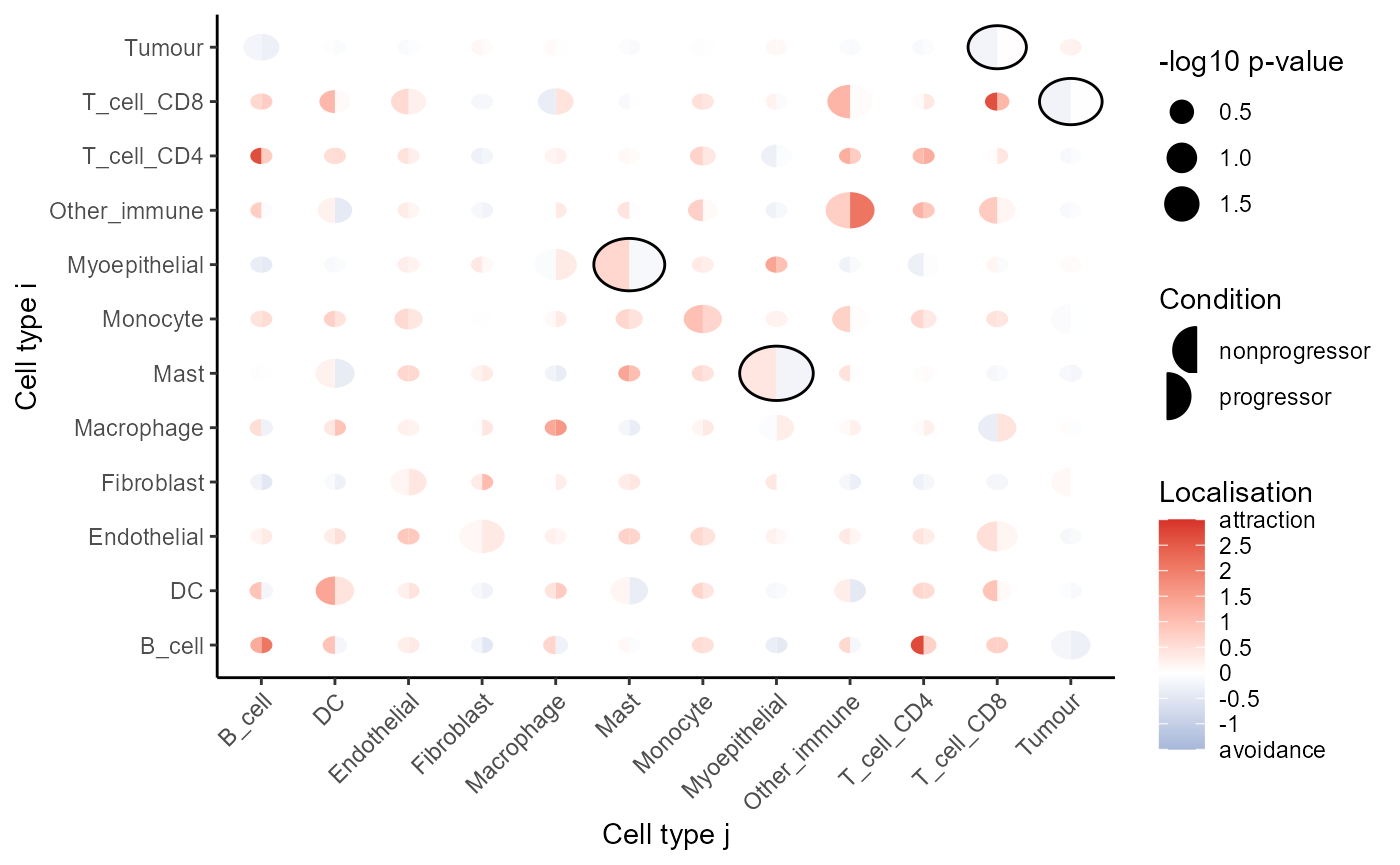
We can visualise these tests using signifPlot, where we
observe that cell type pairs appear to become less attractive (or avoid
more) in progression samples.
# Visualise which relationships are changing the most.
signifPlot(
  spicyTest,
  breaks = c(-1.5, 3, 0.5)
)
We can use the spicyBoxPlot function to visualise the
relationship between a pair of cell types in more detail.
spicyBoxPlot(spicyTest,
             from = "T_cell_CD8",
             to = "Tumour")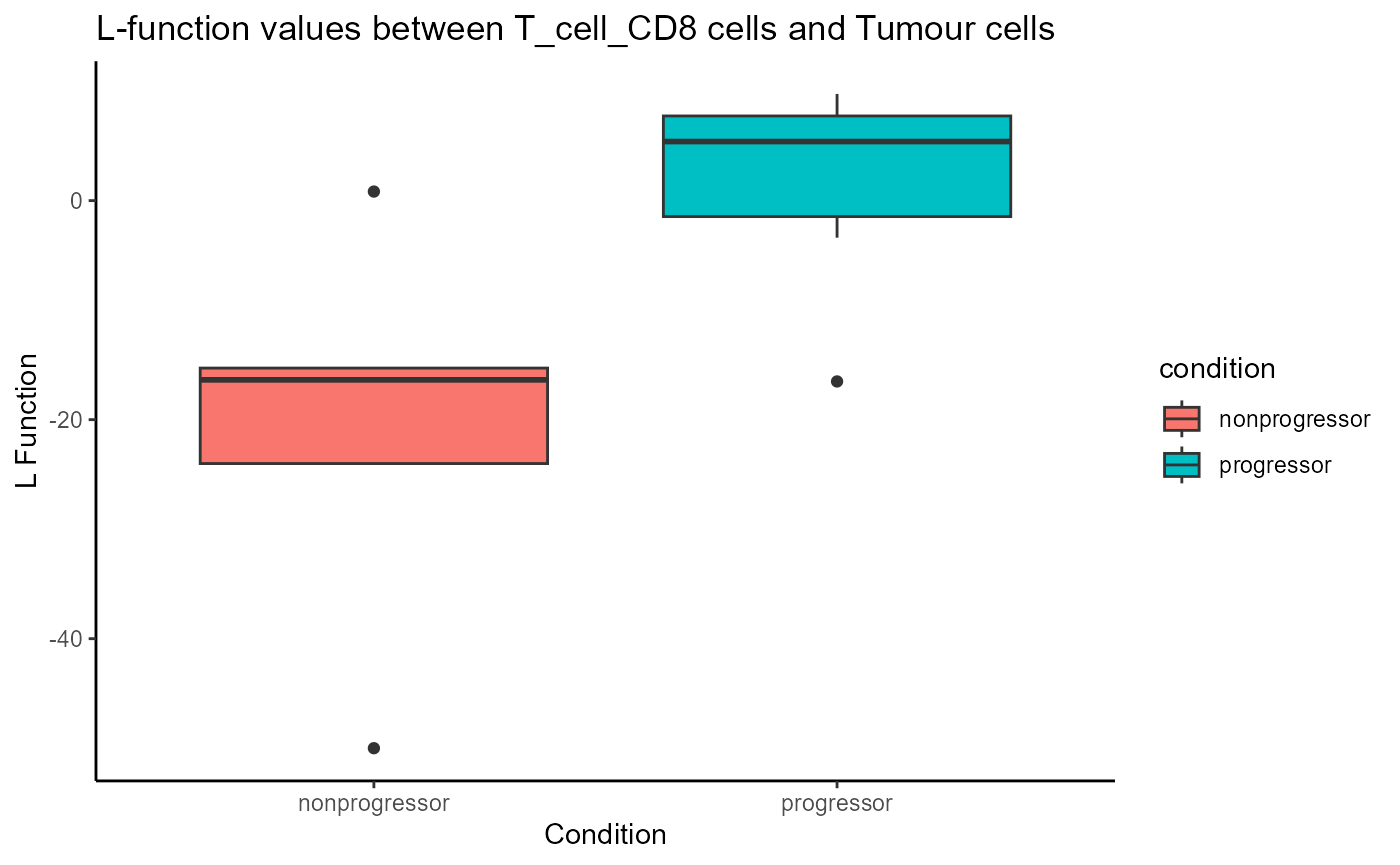
In the plot above, we can see that CD8 T cells are more localised with tumour cells in progressors compared to non-progressors.
We can use the plotImage function to visualise the
spatial relationship between two cell types in a single image. First, we
will combine our calculated L-function with the Status of
the sample.
data.frame(imageID = spicyTest$imageIDs,
           L_func = spicyTest$pairwiseAssoc$T_cell_CD8__Tumour,
           condition = spicyTest$condition)
## imageID L_func condition
## 1 Point2203_pt1072_31606 -24.0092187 nonprogressor
## 2 Point2312_pt1064_20700 8.1487802 progressor
## 3 Point3105_pt1173_31661 -3.3841301 progressor
## 4 Point3108_pt1189_31664 -50.0000000 nonprogressor
## 5 Point3112_pt1165_31672 0.8267805 nonprogressor
## 6 Point3128_pt1085_31690 -16.3650256 nonprogressor
## 7 Point3129_pt1084_31689 NA nonprogressor
## 8 Point5305_pt1117_31627 -15.2909173 nonprogressor
## 9 Point6102_pt1019_20648 6.4741109 progressor
## 10 Point6202_pt1026_20594 4.3152126 progressor
## 11 Point6203_pt1107_31568 9.7401769 progressor
## 12 Point6204_pt1145_31580 -16.5108094 progressorThen, we can use plotImage and specify the image ID to
plot. Below, we’ve plotted Point6102_pt1019_20648, a
progression sample, where we can see CD8 T cells infiltrating
tumours.
plotImage(cells,
          imageToPlot = "Point6102_pt1019_20648",
          from = "T_cell_CD8",
          spatialCoords = c("x", "y"),
          to = "Tumour")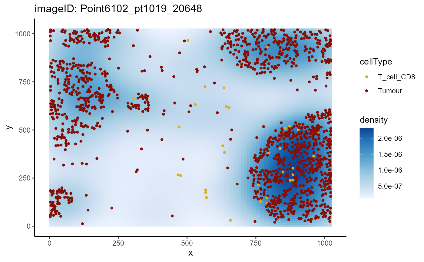
In contrast, when we plot a non-progression sample
(Point2203_pt1072_31606), we can see that CD8 T cells show
minimal infiltration into the tumours compared to the progression
samples.
plotImage(cells,
          imageToPlot = "Point2203_pt1072_31606",
          from = "T_cell_CD8",
          spatialCoords = c("x", "y"),
          to = "Tumour")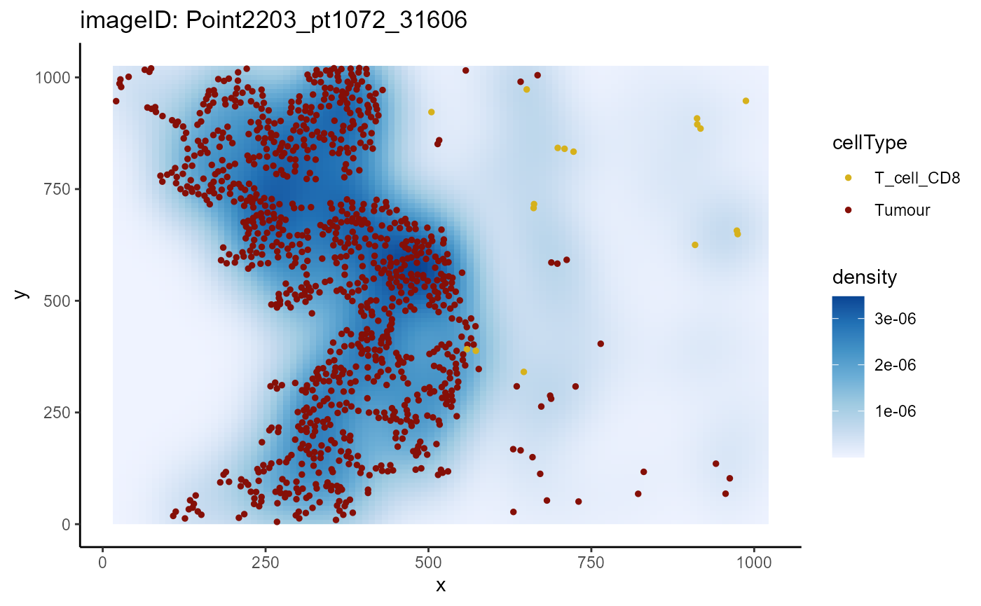
Using spicyR with custom metrics
spicyR can also be applied to custom distance or
abundance metrics. A kNN interactions graph can be generated with the
function buildSpatialGraph from the imcRtools
package. This generates a colPairs object inside of the
SingleCellExperiment object.
spicyR provides the function convPairs for
converting a colPairs object into an abundance matrix by
calculating the average number of nearby cells types for every cell type
for a given k. For example, if there exists on average 3
tumour cells for every CD8 T cell in an image, the column
T_cell_CD8__Tumour would have a value of 3 for that
image.
# build kNN graph
cells <- imcRtools::buildSpatialGraph(cells,
                                      img_id = "imageID",
                                      type = "knn",
                                      k = 20,
                                      coords = c("x", "y"))

# convert colPairs object into an abundance matrix
pairAbundances <- convPairs(cells,
                  colPair = "knn_interaction_graph")

head(pairAbundances["T_cell_CD8__Tumour"])
## T_cell_CD8__Tumour
## Point2203_pt1072_31606 3.0588235
## Point2312_pt1064_20700 11.8333333
## Point3105_pt1173_31661 12.7272727
## Point3108_pt1189_31664 0.6666667
## Point3112_pt1165_31672 12.0000000
## Point3128_pt1085_31690 6.6250000The custom distance or abundance metrics can then be included in the
analysis with the alternateResult parameter.
spicyTestkNN <- spicy(
  cells,
  condition = "Status",
  alternateResult = pairAbundances,
  weights = FALSE,
  BPPARAM = BPPARAM
)

topPairs(spicyTestkNN)
## intercept coefficient p.value adj.pvalue
## DC__Macrophage 0.33644774 4.24938648 0.02567503 0.8052756
## Monocyte__Endothelial 0.44500509 -0.34277753 0.03031836 0.8052756
## DC__Mast 4.56162016 6.01320037 0.03237552 0.8052756
## T_cell_CD8__Fibroblast 0.03398879 0.12042441 0.03658753 0.8052756
## Myoepithelial__Fibroblast 0.23698528 0.22604393 0.04204580 0.8052756
## Monocyte__T_cell_CD8 0.43561625 -0.25217428 0.04563851 0.8052756
## Myoepithelial__T_cell_CD8 1.63058608 -1.04251239 0.04979632 0.8052756
## Macrophage__Mast 0.26411089 -0.18092069 0.05440506 0.8052756
## Fibroblast__Macrophage 0.03230501 0.08242755 0.06449528 0.8052756
## Fibroblast__Tumour 1.58820806 -1.06188136 0.06895171 0.8052756
## from to
## DC__Macrophage DC Macrophage
## Monocyte__Endothelial Monocyte Endothelial
## DC__Mast DC Mast
## T_cell_CD8__Fibroblast T_cell_CD8 Fibroblast
## Myoepithelial__Fibroblast Myoepithelial Fibroblast
## Monocyte__T_cell_CD8 Monocyte T_cell_CD8
## Myoepithelial__T_cell_CD8 Myoepithelial T_cell_CD8
## Macrophage__Mast Macrophage Mast
## Fibroblast__Macrophage Fibroblast Macrophage
## Fibroblast__Tumour Fibroblast Tumour
# Visualise which relationships are changing the most.
signifPlot(
  spicyTestkNN,
  breaks = c(-1.5, 3, 0.5)
)
Similar to the L-function metric, the kNN graph reveals CD8 T cells and tumour cells tend to be more localised in progression samples compared to non-progression samples.
spicyBoxPlot(spicyTestkNN,
             from = "T_cell_CD8",
             to = "Tumour")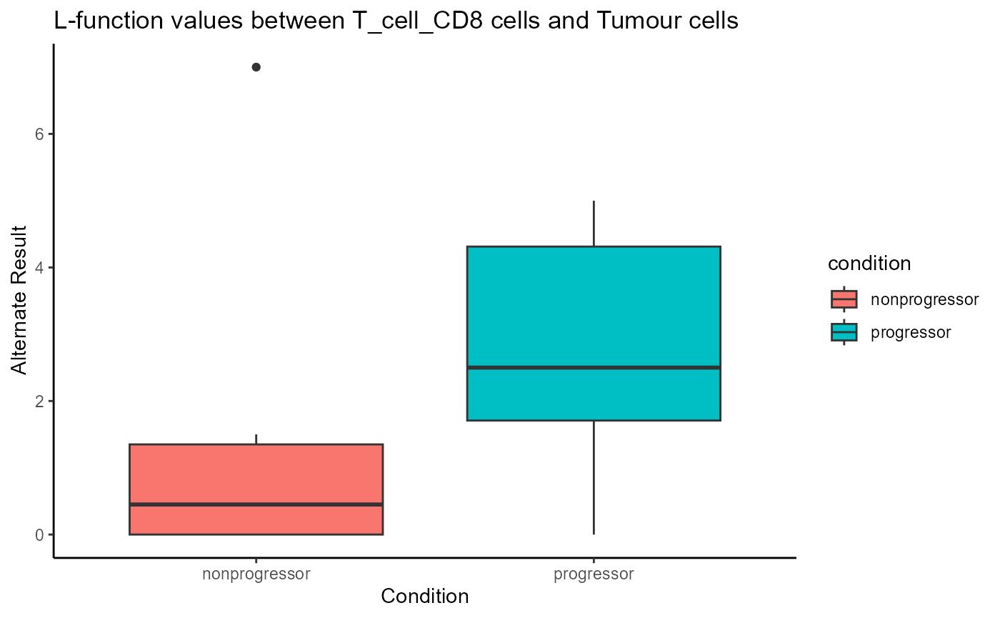
Are tumour cells closer to CD8 T cells than other T cells in progressors?
When assessing whether tumour cells are closer to CD8 T cells than to
other T cells in progressors, it’s important to maintain context by
comparing these distances relative to other immune cell populations.
Using other T cells or immune cells as the reference context helps
account for differences in local immune density and ensures that
observed proximity reflects specific spatial preferences rather than
general immune infiltration. The Kontextual function from
the Statial
package provides a context-aware spatial co-localisation metric.
To use Kontextual, we first define a cell type
hierarchy.
# define cell type hierarchy
biologicalHierarchy <- list(
  T_cell = c("T_cell_CD8", "T_cell_CD4"),
  Immune = c("B_cell", "T_cell_CD8", "T_cell_CD4", "Other_immune", "Mast", "Macrophage", "Monocyte", "DC")
  )
Then, we can create a dataframe containing all pairwise combinations
using the parentCombinations function.
parentDf <- parentCombinations(
  all = as.character(unique(cells$cellType)),
  parentList = biologicalHierarchy
)

head(parentDf)
## from to parent parent_name
## 1 Tumour B_cell B_cell, .... Immune
## 2 Myoepithelial B_cell B_cell, .... Immune
## 3 T_cell_CD4 B_cell B_cell, .... Immune
## 4 T_cell_CD8 B_cell B_cell, .... Immune
## 5 Endothelial B_cell B_cell, .... Immune
## 6 DC B_cell B_cell, .... ImmuneWe can then use the Kontextual function to evaluate
co-localisation between pairs of cell types with respect to a parent
population. In this case, we are calculating the Kontextual
metric over a radius of 100.
kontextualResult <- Kontextual(
  cells = cells,
  parentDf = parentDf,
  r = 100,
  cellType = "cellType",
  spatialCoords = c("x","y"),
  cores = nCores
)

head(kontextualResult)
## imageID test original kontextual r inhomL
## 1 Point2203_pt1072_31606 Tumour__B_cell__Immune -73.68303 -65.03190 100 FALSE
## 2 Point2312_pt1064_20700 Tumour__B_cell__Immune -67.43497 -63.14672 100 FALSE
## 3 Point3105_pt1173_31661 Tumour__B_cell__Immune NA NA 100 FALSE
## 4 Point3108_pt1189_31664 Tumour__B_cell__Immune -75.55826 -75.51256 100 FALSE
## 5 Point3112_pt1165_31672 Tumour__B_cell__Immune NA NA 100 FALSE
## 6 Point3128_pt1085_31690 Tumour__B_cell__Immune NA NA 100 FALSEFor every pairwise relationship (named accordingly:
from__to__parent) Kontextual outputs the
L-function values (original) and the Kontextual value. The
relationships where the L-function and Kontextual disagree
(e.g. one metric is positive and the other is negative) represent
relationships where adding context information results in different
conclusions on the spatial relationship between the two cell types.
# convert from dataframe to wide matrix
kontextMat <- prepMatrix(kontextualResult)

# use spicyR to check for differences in Kontextual metric across disease state
spicyKontextual <- spicy(cells,
                         condition = "Status",
                         imageID = "imageID",
                         cellType = "cellType",
                         alternateResult = kontextMat,
                         cores = nCores)

topPairs(spicyKontextual)
## intercept coefficient p.value adj.pvalue
## Other_immune__Monocyte__Immune 5.414733 -53.27200 0.01303906 0.7586507
## Fibroblast__T_cell_CD8__Immune -63.672925 59.37598 0.02934789 0.7586507
## Monocyte__Other_immune__Immune 8.855369 -46.60338 0.03709287 0.7586507
## Tumour__T_cell_CD8__Immune -37.561821 46.55777 0.04519621 0.7586507
## Macrophage__T_cell_CD8__T_cell -80.726088 62.19997 0.05023799 0.7586507
## Endothelial__Other_immune__Immune 5.098614 -36.87307 0.05132572 0.7586507
## Macrophage__T_cell_CD4__T_cell 29.146710 -37.48498 0.05865110 0.7586507
## Fibroblast__T_cell_CD8__T_cell -50.702323 73.51150 0.05906837 0.7586507
## Macrophage__T_cell_CD8__Immune -83.817595 57.27285 0.06207142 0.7586507
## T_cell_CD8__DC__Immune 29.402132 -64.56446 0.07306763 0.7843987
## from to
## Other_immune__Monocyte__Immune Other_immune Monocyte
## Fibroblast__T_cell_CD8__Immune Fibroblast T_cell_CD8
## Monocyte__Other_immune__Immune Monocyte Other_immune
## Tumour__T_cell_CD8__Immune Tumour T_cell_CD8
## Macrophage__T_cell_CD8__T_cell Macrophage T_cell_CD8
## Endothelial__Other_immune__Immune Endothelial Other_immune
## Macrophage__T_cell_CD4__T_cell Macrophage T_cell_CD4
## Fibroblast__T_cell_CD8__T_cell Fibroblast T_cell_CD8
## Macrophage__T_cell_CD8__Immune Macrophage T_cell_CD8
## T_cell_CD8__DC__Immune T_cell_CD8 DCOne of the results that pops up is
Tumour__T_cell_CD8__Immune, which is the relationship
between tumour cells and CD8 T cells relative to the parent population
of all immune cells. We can see that CD8 T cells are comparatively more
localised with tumour cells from the positive coefficient.
# Visualise which relationships are changing the most.
signifPlot(
  spicyKontextual
)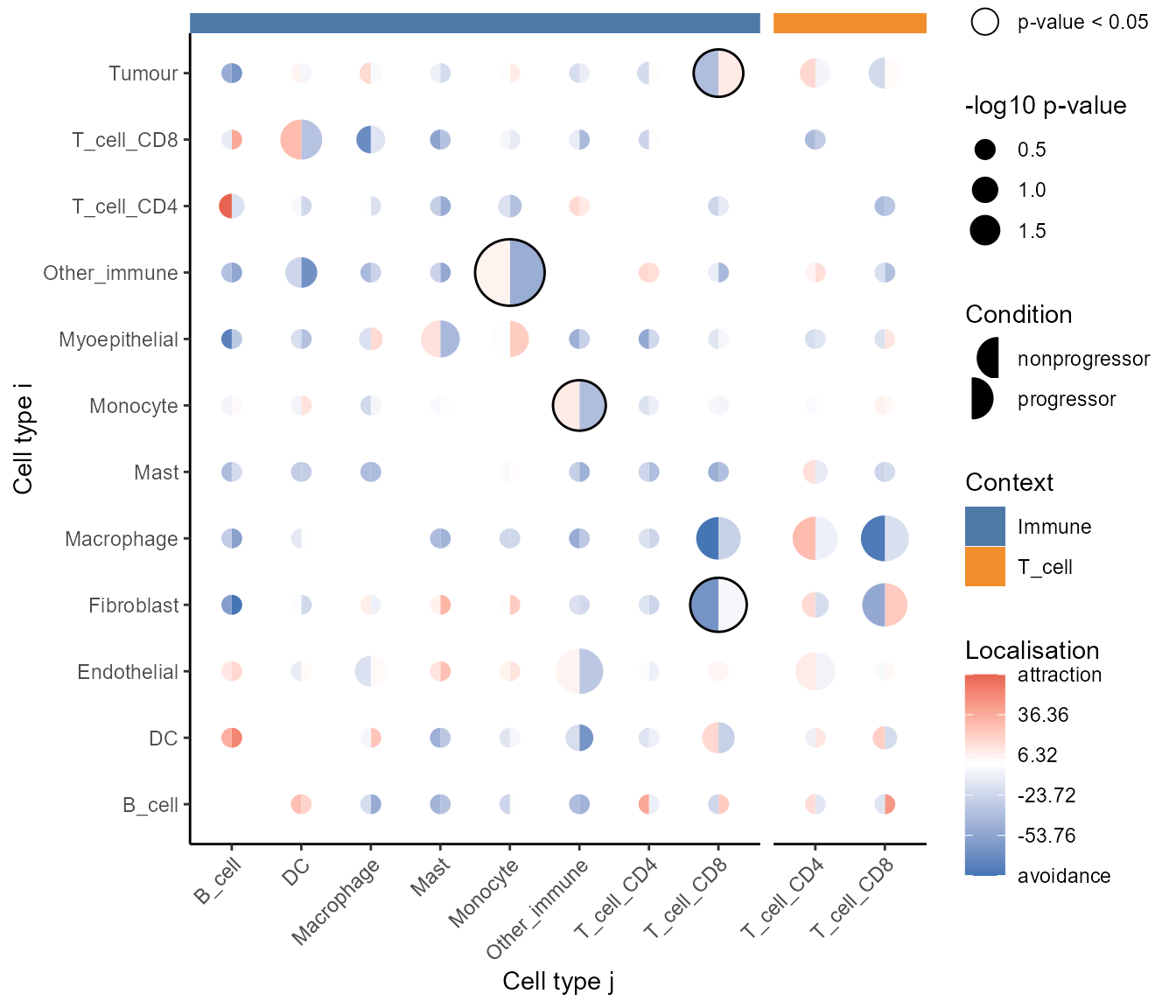
At a glance, we can see that CD8 T cells are more localised with tumour cells relative to both other immune cells and T cells.
Are there any broad spatial domains associated with progression?
Beyond pairwise spatial relationships between cell types, imaging datasets reveal richer layers of tissue organisation through concepts like niches, neighborhoods, microenvironments, and spatial domains. Niches typically describe the immediate surroundings of a specific cell, while spatial domains represent larger tissue compartments formed by coordinated cell arrangements.
The interpretation of spatial domains is highly context-dependent. In cancer research, domain analysis might highlight the distribution of tumor and immune compartments or reveal how domain composition correlates with disease progression. We will first attempt to identify larger spatial domains and determine whether the composition of these domains varies with progression status.
The lisaClust package can be used to calculate the L-function metric over a range of radii, called Local Indicators of Spatial Association, or LISA curves. We can then perform k-means clustering on these LISA curves to obtain spatial domains.
Below, we’ve specified k = 2 to identify two broad
domains.
set.seed(51773)

# Cluster cells into spatial regions with similar composition.
cells <- lisaClust(
  cells,
  k = 2,
  Rs = c(50, 100),
  sigma = 20,
  spatialCoords = c("x", "y"),
  cellType = "cellType",
  regionName = "domain",
  cores = nCores
)
These domains are stored within colData and can be
extracted.
Region - cell type enrichment heatmap
We can try to interpret which spatial orderings the regions are
quantifying using the regionMap function. This plots the
frequency of each cell type in a region relative to what you would
expect by chance.
# Visualise the enrichment of each cell type in each region
regionMap(cells, cellType = "cellType", region = "domain",
          limit = c(0.2, 5)) +
  theme(axis.text.x = element_text(angle = 90, vjust = 0.5, hjust = 1))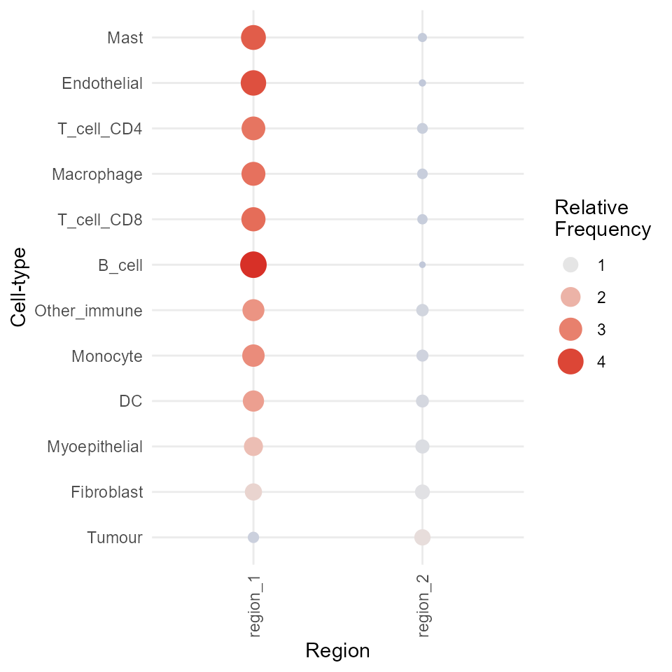
Above, we can see that most immune cells are concentrated in
region_1. We can further segregate these cells by
increasing the number of clusters (domains) if needed.
The choice of k depends largely on the biological
question being asked. For instance, if we are interested in
understanding the interactions between immune cells in a tumor
microenvironment, the number of clusters should reflect the known
biological subtypes of immune cells, such as T cells, B cells,
macrophages, etc. In this case, a larger value of k may be
needed to capture the diversity within these immune cell
populations.
On the other hand, if the focus is on interactions between immune
cells and tumor cells, we might choose a smaller value of k
to group immune cells into broader categories like we have done
here.
Additionally, methods like the Gap statistic, Jump statistic, or
Silhouette score could be employed to determine an optimal value of
k.
Visualise regions
We can quickly examine the spatial arrangement of the spatial domains
using ggplot.
# Extract cell information and filter to specific image.
colData(cells) |>
as.data.frame() |>
filter(imageID == "Point6102_pt1019_20648") |>
# Colour cells by their region.
ggplot(aes(x = m.cx, y = m.cy, colour = domain)) +
  geom_point()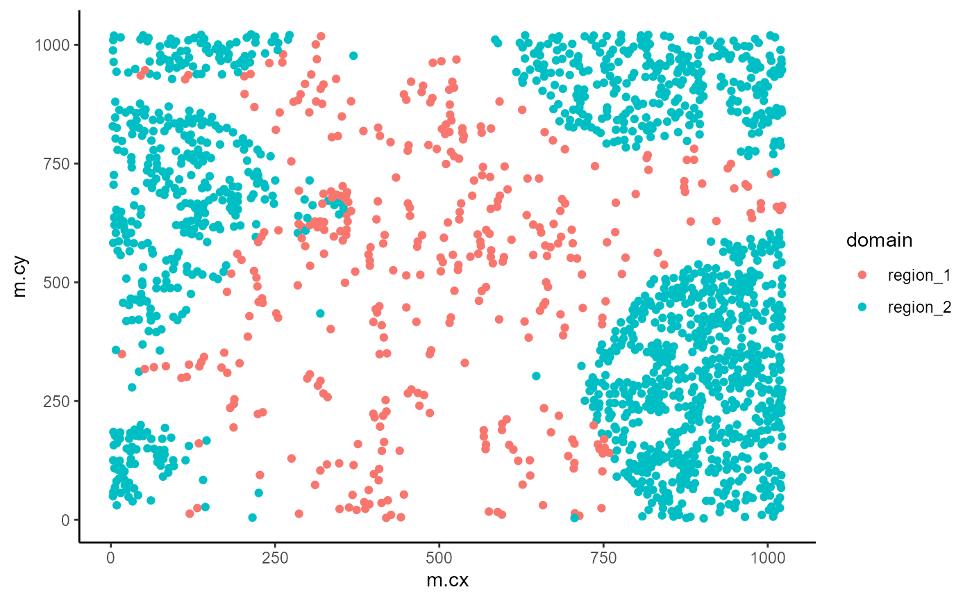
While much slower, we have also implemented a function for overlaying the region information as a hatching pattern so that the information can be viewed simultaneously with the cell type calls.
# Use hatching to visualise regions and cell types.
hatchingPlot(
  cells,
  useImages = "Point6102_pt1019_20648",
  cellType = "cellType",
  region = "domain",
  spatialCoords = c("x", "y"),
  window = "square",
  nbp = 100
)
In the plot above, we can see that region_2 captures our
tumour regions, while region_1 captures the non-tumour
regions.
Test for association with progression
If needed, we can again quickly use the colTest function
to test for associations between the proportions of the cells in each
domain and progression status using either Wilcoxon rank sum tests or
t-tests.
# Test if the proportion of each region is associated
# with progression status.
testRegion <- colTest(
  cells,
  feature = "domain",
  condition = "Status"
)

testRegion
## mean in group nonprogressor mean in group progressor tval.t pval
## region_1 0.19 0.23 -1 0.33
## region_2 0.81 0.77 1 0.33
## adjPval cluster
## region_1 0.33 region_1
## region_2 0.33 region_2Are there any cell type associations with progression that are specific to each domain?
Similarly, we can then check whether the composition of each domain
is significantly associated with tumour progression. To do this, we can
use colTest to perform Wilcoxon rank-sum tests within each
domain For every domain, we test whether there is a significant
difference in cell type proportions between non-progressors and
progressors.
# Test for region 1 (non-tumour domain)
cells |>
  filter(domain == "region_1") |>
  colTest(feature = "cellType", condition = "Status", type = "wilcox")
## tval.W pval adjPval cluster
## Other_immune 4 0.026 0.31 Other_immune
## DC 26 0.240 0.62 DC
## Endothelial 26 0.240 0.62 Endothelial
## Fibroblast 26 0.240 0.62 Fibroblast
## Macrophage 10 0.260 0.62 Macrophage
## B_cell 12 0.420 0.72 B_cell
## Mast 23 0.480 0.72 Mast
## T_cell_CD8 13 0.480 0.72 T_cell_CD8
## Myoepithelial 21 0.700 0.82 Myoepithelial
## T_cell_CD4 15 0.700 0.82 T_cell_CD4
## Monocyte 16 0.820 0.82 Monocyte
## Tumour 16 0.820 0.82 Tumour
# Test for region 2 (tumour domain)
cells |>
  filter(domain == "region_2") |>
  colTest(feature = "cellType", condition = "Status", type = "wilcox")
## tval.W pval adjPval cluster
## Monocyte 5 0.041 0.26 Monocyte
## T_cell_CD8 6 0.064 0.26 T_cell_CD8
## Fibroblast 30 0.065 0.26 Fibroblast
## Other_immune 9 0.170 0.46 Other_immune
## DC 26 0.230 0.46 DC
## T_cell_CD4 10 0.230 0.46 T_cell_CD4
## Mast 25 0.300 0.51 Mast
## Tumour 23 0.480 0.72 Tumour
## Endothelial 15 0.700 0.82 Endothelial
## Myoepithelial 21 0.700 0.82 Myoepithelial
## Macrophage 20 0.750 0.82 Macrophage
## B_cell 18 1.000 1.00 B_cellAbove, we can see that CD8 T cells are differentially abundant in progressors vs non-progressors within tumour domains.
Visualise differences
Boxplot
We can quickly generate a boxplot to visualise the differences in the abundance of CD8 T cells within the tumour domain.
# Obtain cell type proportions within domain 2
df <- cells |>
  filter(domain == "region_2") |>
  getProp(feature = "cellType")

df$imageID <- rownames(df)

# extract imageID and tumour progressio status from colData
cData <- colData(cells) |> as.data.frame() |> distinct(Status, imageID)

# Merge data and visualise
df <- inner_join(df, cData, by = "imageID")

ggplot(df, aes(x = Status, y = T_cell_CD8, colour = Status)) +
  geom_boxplot() +
  theme(legend.position = "none")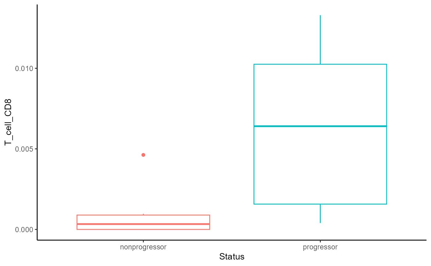
We can see from the boxplot that within the tumour domain, CD8 T cells are more abundant in progressors compared to non-progressors.
Extension: Mixed effects model: interaction between domain and tumour progression status
We can check if there is an interaction effect between domain and
status with mixed effects models. That is, we could test to see if there
are more CD8 T cells in region 2 for progressors than region 1 for
progressors. Below, we build one mixed effects model for every cell type
with a domain/status interaction effect and include imageID
as a random effect.
# Initialize a vector to store p-values from the interaction test
pval <- c()

propD1 <- getProp(cells[,cells$domain=="region_1"])
propD2 <- getProp(cells[,cells$domain=="region_2"])

# Loop through each unique cell type and test for Domain × Status interaction
for (ct in unique(cells$cellType)) {

  # Construct a data frame of proportions for Domain 1 and Domain 2
  df <- data.frame(
    D1 = propD1[rownames(prop), ct],
    D2 = propD2[rownames(prop), ct],
    Status = as.character(clinical[rownames(prop), "Status"]),
    imageID = rownames(prop)
  )

  # Pivot data to long format for modeling
  df_long <- pivot_longer(
    df,
    cols = c("D1", "D2"),
    names_to = "Domain",
    values_to = "Proportion"
  )

  # Fit full model with Domain × Status interaction
  model_full <- lmer(sqrt(Proportion) ~ Domain * Status + (1 | imageID), data = df_long)

  # Fit additive model (no interaction)
  model_add <- lmer(sqrt(Proportion) ~ Domain + Status + (1 | imageID), data = df_long)

  # Perform likelihood ratio test to assess significance of the interaction term
  an <- anova(model_full, model_add)

  # Store p-value for the interaction term
  pval[ct] <- an$`Pr(>Chisq)`[2]
}

# Display sorted p-values to find cell types with strongest Domain × Status effects
sort(pval)
## Macrophage Other_immune Monocyte B_cell Endothelial
## 0.0786973 0.2247567 0.2967773 0.3116240 0.3144622
## Fibroblast Mast DC Myoepithelial Tumour
## 0.4210308 0.5479210 0.5647869 0.8011187 0.8039608
## T_cell_CD4 T_cell_CD8
## 0.9321129 0.9653259We can visualise cell type proportions for one cell type of interest
T_cell_CD8 to examine how abundance changes within
different domains for progressors vs non-progressors.
ct <- "T_cell_CD8"  # Cell type of interest for visualization

# Create a data frame with domain-specific proportions and metadata
df <- data.frame(
  D1 = propD1[rownames(prop), ct],  # Proportion of the cell type in domain D1
  D2 = propD2[rownames(prop), ct],  # Proportion of the cell type in domain D2
  Status = as.character(clinical[rownames(prop), "Status"]),  # Clinical status of each image
  imageID = rownames(prop)  # Unique image identifier
)

# Reshape data to long format for modeling and plotting
df_long <- pivot_longer(
  df,
  cols = c("D1", "D2"),  # Columns representing domain-specific proportions
  names_to = "Domain",   # New column indicating the domain (D1 or D2)
  values_to = "Proportion"  # Corresponding cell type proportion
)

# Fit a linear mixed-effects model with interaction between Domain and Status
# Include random intercept for each image to account for repeated measures
model <- lmer(sqrt(Proportion) ~ Domain * Status + (1 | imageID), data = df_long)

# Create a data frame of combinations for prediction (fixed effects only)
new_data <- expand.grid(
  Domain = unique(df_long$Domain),
  Status = unique(df_long$Status)
)
new_data$Predicted <- predict(model, newdata = new_data, re.form = NA)

# Plot observed data with boxplots, coloured by status
# Transform proportions using square root for better distribution
ggplot(df_long, aes(x = Domain, y = sqrt(Proportion), colour = Status)) +
  geom_boxplot()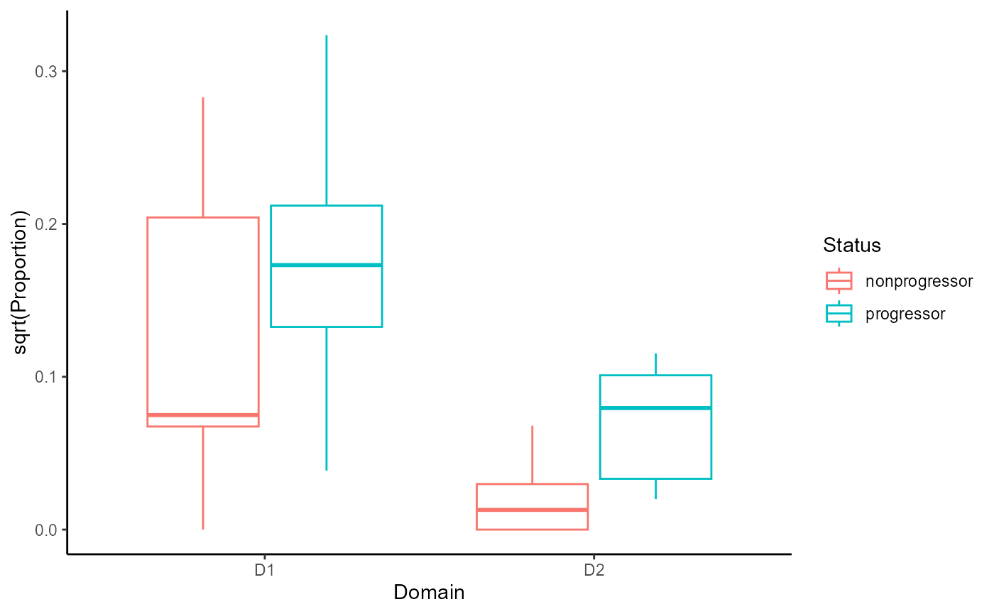
From the graph, we can see that the proportion of CD8 T cells in the
tumour domain (D2) is higher in progressors vs
non-progressors. This is a substantial increase compared to the
proportion of CD8 T cells in the non-tumour domain (D1) in
progressors vs non-progressors.
Are there any cell type niches associated with progression?
Another approach is to identify niches, which are defined by the
immediate surroundings of a cell, usually within a small k-hop. We can
once again use the lisaClust function, this time defining
k = 50 to identify a large number of niches.
set.seed(51773)

# Cluster cells into spatial regions with similar composition.
cells <- lisaClust(
  cells,
  k = 20, # identify 50 niches
  r = 50,
  spatialCoords = c("x", "y"),
  cellType = "cellType",
  regionName = "niche",
  cores = nCores
)
# Test if the proportion of each region is associated
# with progression status.
testNiche <- colTest(
  cells,
  feature = "niche",
  condition = "Status",
  type = "wilcox")

testNiche
## tval.W pval adjPval cluster
## region_8 7 0.061 0.65 region_8
## region_9 6 0.065 0.65 region_9
## region_10 9 0.180 0.76 region_10
## region_5 27 0.180 0.76 region_5
## region_11 26 0.240 0.76 region_11
## region_19 10 0.240 0.76 region_19
## region_12 11 0.310 0.76 region_12
## region_15 24 0.340 0.76 region_15
## region_16 24 0.390 0.76 region_16
## region_6 15 0.400 0.76 region_6
## region_17 13 0.420 0.76 region_17
## region_2 22 0.590 0.91 region_2
## region_20 22 0.590 0.91 region_20
## region_4 16 0.750 1.00 region_4
## region_1 16 0.820 1.00 region_1
## region_14 19 0.940 1.00 region_14
## region_18 19 0.940 1.00 region_18
## region_13 18 1.000 1.00 region_13
## region_3 18 1.000 1.00 region_3
## region_7 18 1.000 1.00 region_7One of the most significant niches we identify is
region_9. We can examine the composition of niche 9 in more
detail below.
# sort by cell type frequency for niche 9
colData(cells) |>
  as.data.frame() |>
  filter(niche == "region_9") |>
  dplyr::count(cellType, sort = TRUE) |>
knitr::kable()| cellType | n |
|---|---|
| Tumour | 287 |
| T_cell_CD8 | 57 |
| Endothelial | 43 |
| Monocyte | 20 |
| T_cell_CD4 | 14 |
| Macrophage | 10 |
| DC | 6 |
| Other_immune | 5 |
| Fibroblast | 4 |
| Myoepithelial | 4 |
| B_cell | 2 |
We can also use the regionMap function to visualise the
relative frequency of each cell type in each niche. This also shows us
that region_9 is enriched for CD8 T cells in
particular.
# Visualise the enrichment of each cell type in each region
regionMap(cells, cellType = "cellType", region = "niche",
          limit = c(0.2, 10)) +
  theme(axis.text.x = element_text(angle = 90, vjust = 0.5, hjust = 1))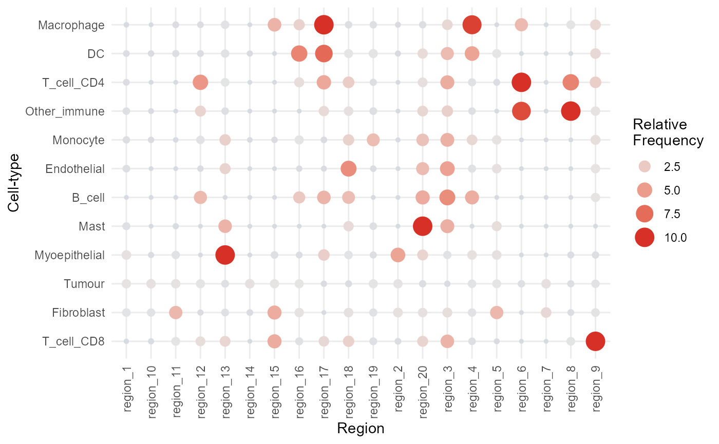
We can confirm this with a Chi-squared test and check whether certain
cell types are highly enriched in certain niches. We can use the
residuals from the Chi-squared test to identify which cell types are
highly enriched in region_9.
# Extract the standardized residuals from the test result
residuals_tab <-
  chisq.test(table(cells$cellType, cells$niche))$res

# Define the top 10 cell types to examine from our previous Wilcox test results
# These are the top 10 niches whose proportion is associated with progression status
top_niches <- rownames(testNiche)[1:10]

# View standardized residuals for "T_cell_CD8" across the top 10 cell types (likely a typo: should be top niches?)
residuals_tab["T_cell_CD8", top_niches]
## region_8 region_9 region_10 region_5 region_11 region_19 region_12
## -0.1557634 26.7226931 -5.6174360 -2.0721696 -0.1673633 -1.1716977 0.9135443
## region_15 region_16 region_6
## 4.0634905 -0.9262987 -0.6470241Proximity related changes in marker expression
What if we hadn’t clustered down to CD8 T cells?
Often we are not able to cluster cell types to a very fine resolution. What if we had not separated CD8+ T cells and CD4+ T cells into two clusters? We will next explore two different ways that we could have seen higher CD8 expression in Tcells as they get closer to Tumour cells in progressors. To do this, we first combine our CD8 and CD4 T cell populations.
cells <- cells |>
  mutate(cellTypeMergeTcells = factor(case_when(
      cellType == "T_cell_CD8" ~ "T_cell",
      cellType == "T_cell_CD4" ~ "T_cell",
      TRUE ~ cellType
  )))
The SpatioMark function in the Statial package
quantifiers markers whose expression levels change within a given cell
type depending on their spatial context. This allows us to detect
context-dependent expression shifts—revealing, for instance, how the
presence of neighbouring immune or tumour cells can influence a cell’s
functional state.
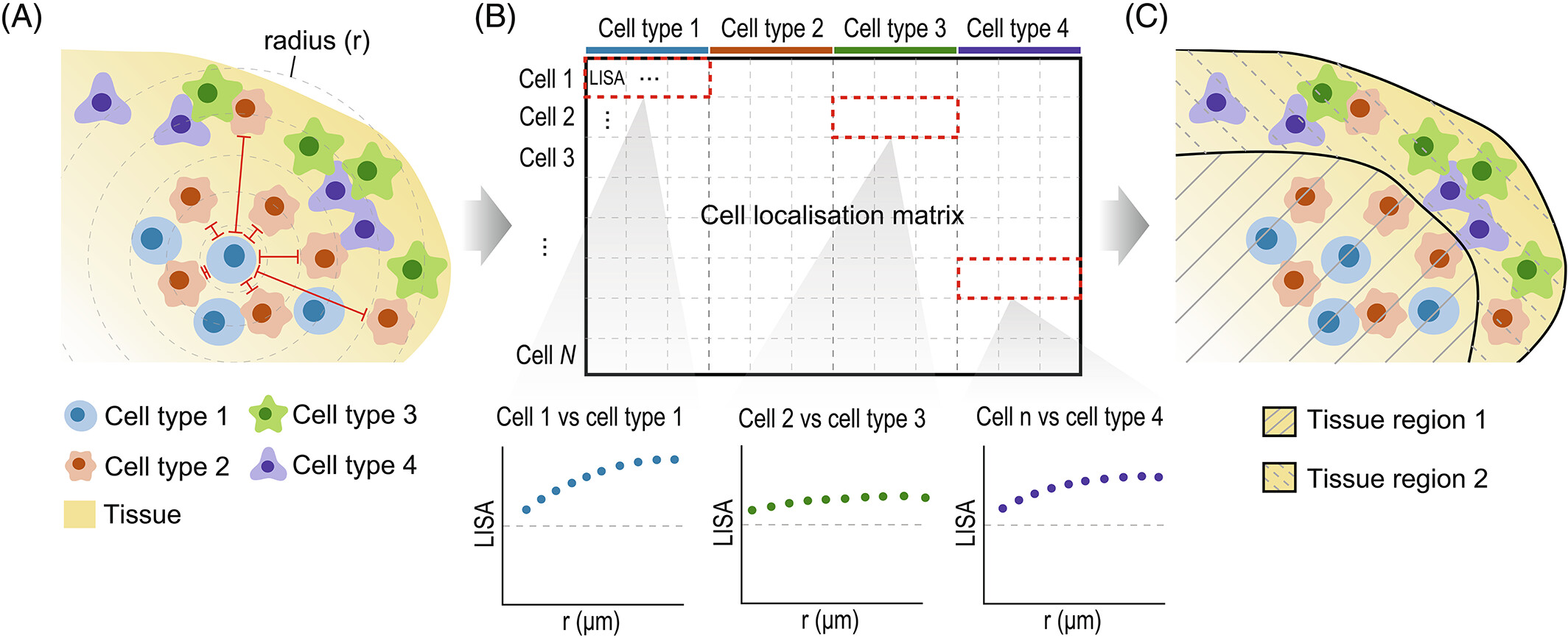
The first step in analysing these changes is to calculate the spatial
proximity and abundance of each cell to every cell type.
getDistances calculates the Euclidean distance from each
cell to the nearest cell of each cell type. getAbundances
calculates the K-function value for each cell with respect to each cell
type. Both metrics are stored in the reducedDims slot of
the SingleCellExperiment object.
# calculate Euclidean distance from each cell to the nearest cell of each cell type
cells <- getDistances(cells,
  cellType = "cellTypeMergeTcells",
  spatialCoords = c("x", "y"),
  redDimName = "distancesTcells"
)

# calculate K-function value for each cell with respect to a cell type
cells <- getAbundances(cells,
  r = 50,
  cellType = "cellTypeMergeTcells",
  spatialCoords = c("x", "y"),
  redDimName = "abundancesTcells",
)

reducedDimNames(cells)
## [1] "spatialCoords" "UMAP" "distancesTcells" "abundancesTcells"
reducedDim(cells, "distancesTcells") |> head()## Tumour Monocyte Endothelial Myoepithelial T_cell Fibroblast
## 1 22.034057 94.17405 21.79926 13.103988 109.436869 160.3764
## 2 8.483157 71.92666 15.59030 9.737801 121.380838 138.5326
## 3 9.737801 81.10465 23.11434 19.028363 114.100864 148.2698
## 4 227.857653 282.92953 16.75182 396.292283 29.472951 379.9621
## 5 219.792515 150.17784 14.50050 335.901877 26.410712 372.3643
## 6 269.279147 304.24672 20.51582 434.963105 7.789803 422.0863
## Mast Macrophage DC B_cell Other_immune
## 1 119.98586 358.5670 82.69765 187.512530 228.4081
## 2 128.41112 380.7980 60.55153 177.995585 244.6841
## 3 126.46066 371.1202 69.60653 183.759035 239.1864
## 4 12.26032 283.2878 81.60618 7.854778 347.2387
## 5 133.37806 408.7120 157.16653 145.281887 216.3331
## 6 32.14279 305.0444 39.88347 13.495938 369.8875
reducedDim(cells, "abundancesTcells") |> head()## Tumour Monocyte Endothelial Myoepithelial Fibroblast T_cell Mast Macrophage
## 1 12 0 3 7 0 0 0 0
## 2 18 0 3 5 0 0 0 0
## 3 17 0 3 5 0 0 0 0
## 4 0 0 5 0 0 3 2 0
## 5 0 0 3 0 0 1 0 0
## 6 0 0 4 0 0 1 1 0
## DC B_cell Other_immune
## 1 0 0 0
## 2 0 0 0
## 3 0 0 0
## 4 0 1 0
## 5 0 0 0
## 6 1 4 0We can then use the calcStateChanges function to examine
whether the expression of different markers changes with proximity to a
cell type (distancesTcells).
stateChangesTcells <- calcStateChanges(
  cells,
  assay = "norm",
  cellType = "cellTypeMergeTcells", # specify the column containing merged T cell types
  type = "distancesTcells", # define the metric of interest
  minCells = 5 # minimum number of cells required to fit a model
)

head(stateChangesTcells)
## imageID primaryCellType otherCellType marker coef
## 39704 Point3105_pt1173_31661 Tumour Tumour COLI 1.212451e-02
## 40934 Point3128_pt1085_31690 Tumour Tumour COLI 8.449011e-03
## 41242 Point3128_pt1085_31690 Tumour DC PDL1 1.117465e-05
## 41226 Point3128_pt1085_31690 Tumour DC FOXP3 5.123219e-04
## 39556 Point2312_pt1064_20700 Tumour Myoepithelial Nuc -1.123727e-03
## 42672 Point6202_pt1026_20594 Tumour B_cell Nuc -6.374297e-04
## tval pval fdr
## 39704 39.69817 9.026499e-265 3.885366e-260
## 40934 36.50794 1.294553e-254 2.786137e-250
## 41242 32.84356 2.035872e-211 2.190802e-207
## 41226 32.84356 2.035872e-211 2.190802e-207
## 39556 -34.94827 2.557274e-210 2.201506e-206
## 42672 -36.24946 2.764889e-204 1.983531e-200The output is a dataframe, where each row corresponds to the relationship between a primary and secondary cell type for a specific marker in a specific image.
# convert stateChangesTcells to a matrix for further analysis
stateMatTcells <- prepMatrix(stateChangesTcells, replaceVal = NA, column = "coef")

# replace all infinity values with NA
stateMatTcells[stateMatTcells == Inf] <- NA
stateMatTcells[1:5, 1:5]
## Tumour__Tumour__COLI Tumour__DC__PDL1 Tumour__DC__FOXP3
## Point3105_pt1173_31661 0.012124512 8.619310e-05 0.0002615293
## Point3128_pt1085_31690 0.008449011 1.117465e-05 0.0005123219
## Point2312_pt1064_20700 0.006626892 NA NA
## Point6202_pt1026_20594 0.003257159 4.718651e-06 0.0004077953
## Point3129_pt1084_31689 0.003176778 -2.966189e-05 0.0003413861
## Tumour__Myoepithelial__Nuc Tumour__B_cell__Nuc
## Point3105_pt1173_31661 -2.259813e-04 NA
## Point3128_pt1085_31690 -8.479729e-05 NA
## Point2312_pt1064_20700 -1.123727e-03 -0.0009206068
## Point6202_pt1026_20594 2.081190e-04 -0.0006374297
## Point3129_pt1084_31689 -3.342275e-04 NAThe output of this conversion is a dataframe where each column
contains the coefficients associated with a specific marker-cell type
pair relationship. For instance, in the column
Tumour__DC__PDL1 the first coefficient is
8.62e-05, which indicates that as tumour cells get closer
to dendritic cells DC they express lower levels of the
marker PDL1 in the image Point3105_pt1173_31661.
We can then check whether this metric is significantly associated
with progression status using colTest.
# drop all columns where more than 40% values are NA (issues with model fit)
stateMatTcells <- stateMatTcells[,colMeans(is.na(stateMatTcells[rownames(prop),]))<0.4]

# t-test to check for changes across progression status
stateResultsTcells <- colTest(stateMatTcells[rownames(prop), ],
                              clinical[rownames(prop), "Status"])
head(stateResultsTcells)
## mean in group nonprogressor
## Myoepithelial__Fibroblast__PanKRT 0.00082
## Monocyte__DC__FAP -0.00038
## Tumour__Fibroblast__PanKRT 0.00050
## Macrophage__Monocyte__CD45 -0.00130
## Myoepithelial__Tumour__PanKRT 0.00740
## T_cell__Macrophage__Nuc 0.00031
## mean in group progressor tval.t pval
## Myoepithelial__Fibroblast__PanKRT 0.00006 7.6 0.00034
## Monocyte__DC__FAP -0.00012 -4.8 0.00100
## Tumour__Fibroblast__PanKRT -0.00013 4.5 0.00120
## Macrophage__Monocyte__CD45 0.00084 -4.9 0.00190
## Myoepithelial__Tumour__PanKRT -0.00260 4.4 0.00250
## T_cell__Macrophage__Nuc -0.00034 4.8 0.00320
## adjPval cluster
## Myoepithelial__Fibroblast__PanKRT 0.92 Myoepithelial__Fibroblast__PanKRT
## Monocyte__DC__FAP 0.92 Monocyte__DC__FAP
## Tumour__Fibroblast__PanKRT 0.92 Tumour__Fibroblast__PanKRT
## Macrophage__Monocyte__CD45 0.92 Macrophage__Monocyte__CD45
## Myoepithelial__Tumour__PanKRT 0.92 Myoepithelial__Tumour__PanKRT
## T_cell__Macrophage__Nuc 0.92 T_cell__Macrophage__Nuc
# Search for our relationship of interest: CD8 expression in T cells with proximity to Tumour cells
stateResultsTcells[grep("T_cell__Tumour__CD8", stateResultsTcells$cluster),]
## mean in group nonprogressor mean in group progressor tval.t
## T_cell__Tumour__CD8 0.0013 -0.0026 2
## pval adjPval cluster
## T_cell__Tumour__CD8 0.086 0.92 T_cell__Tumour__CD8
# Extract the feature of interest for matched samples
feature_values <- stateMatTcells[rownames(prop), "T_cell__Tumour__CD8"]

# Get the clinical status for the same samples
status <- clinical[rownames(prop), "Status"]

# Create a boxplot of the feature stratified by clinical status
boxplot(feature_values ~ status,
        main = "CD8 T cell - Tumour Interactions by Clinical Status",
        ylab = "Interaction Score",
        xlab = "Status")

# Add a horizontal reference line at 0
abline(h = 0, lty = 2, col = "gray40")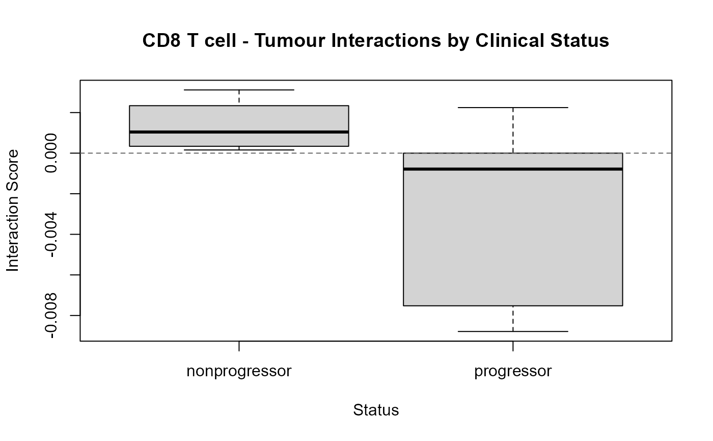
From the boxplot above, we can see that the coefficient is positive for non-progressors, indicating that CD8 expression in T cells increases as distance from Tumour cells increases. On the other hand, the coefficient for progressors is negative, indicating that CD8 expression in T cells increases as the distance to tumour cells decreases.
The plotStateChanges function can be used to visualise
this relationship in the original images. Below, we can see that CD8
expression increases in T cells that are closer to the tumour.
p <- plotStateChanges(
  cells = cells,
  type = "distancesTcells",
  image = "Point2312_pt1064_20700",
  from = "T_cell",
  to = "Tumour",
  marker = "CD8",
  spatialCoords = c("m.cx", "m.cy"),
  assay = "norm",
  cellType = "cellTypeMergeTcells",
  size = 1,
  shape = 19,
  interactive = FALSE,
  plotModelFit = TRUE,
  method = "lm")

# p
p$image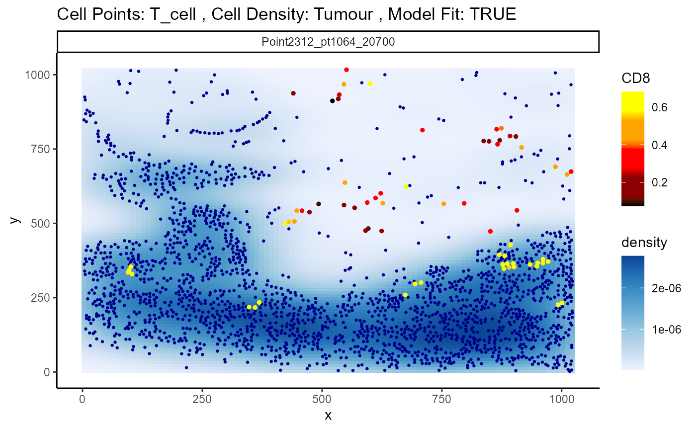
Marker expression across cell types in each domain
We can add another layer of information by looking at average marker
expression within cell types in each domain. The
getMarkerMeans function from the Statial
package can be used to obtain the average expression of each marker
within each cell type and domain.
genesCellDomains <- getMarkerMeans(cells,
                                   imageID = "imageID",
                                   cellType = "cellTypeMergeTcells",
                                   region = "domain",
                                   assay = "norm")

genesCellDomains[1:4,1:4]
## AR__Tumour__region_2 CD11c__Tumour__region_2
## Point2203_pt1072_31606 0.08048068 0.0211739100
## Point2312_pt1064_20700 0.02145274 0.0002032244
## Point3105_pt1173_31661 0.07496809 0.0096168986
## Point3108_pt1189_31664 0.04199875 0.0080186698
## CD14__Tumour__region_2 CD20__Tumour__region_2
## Point2203_pt1072_31606 0.023539461 0.31285259
## Point2312_pt1064_20700 0.005203816 0.06455513
## Point3105_pt1173_31661 0.023166932 0.25978081
## Point3108_pt1189_31664 0.012893295 0.17361917We can then perform t-tests on our columns of interest, which would
be CD8__T_cell__region_2, i.e., expression of CD8 in T
cells in the tumour domain. First, we’ll incorporate tumour progression
status into the dataset above.
genesCellDomains$imageID <- rownames(genesCellDomains)
status <- colData(cells) |> as.data.frame() |> distinct(imageID, Status)
genesCellDomains <- inner_join(genesCellDomains, status, by = "imageID")

t.test(`CD8__T_cell__region_2` ~ Status, data = genesCellDomains)
##
## Welch Two Sample t-test
##
## data: CD8__T_cell__region_2 by Status
## t = -2.4086, df = 7.1888, p-value = 0.04597
## alternative hypothesis: true difference in means between group nonprogressor and group progressor is not equal to 0
## 95 percent confidence interval:
## -0.614363941 -0.007288513
## sample estimates:
## mean in group nonprogressor mean in group progressor
## 0.1105190 0.4213452For comparison, we can repeat the test above for the non-tumour domain.
t.test(`CD8__T_cell__region_1` ~ Status, data = genesCellDomains)##
## Welch Two Sample t-test
##
## data: CD8__T_cell__region_1 by Status
## t = 0.082641, df = 9.5474, p-value = 0.9358
## alternative hypothesis: true difference in means between group nonprogressor and group progressor is not equal to 0
## 95 percent confidence interval:
## -0.3310137 0.3563439
## sample estimates:
## mean in group nonprogressor mean in group progressor
## 0.4129949 0.4003299
# pivot to long format
genes_long <- genesCellDomains |>
  pivot_longer(
    cols = -c(imageID, Status),
    names_to = "feature",
    values_to = "expression"
  )

# Split feature into marker, cell type, domain
genes_long <- genes_long |>
  separate(feature, into = c("marker", "celltype", "domain"), sep = "__")

# Filter to just CD8 and T_cell
genes_plot <- genes_long |>
  filter(marker == "CD8", celltype == "T_cell")

# Plot everything in one plot, colored by domain
ggplot(genes_plot, aes(x = domain, y = expression, colour = Status)) +
  geom_boxplot(position = position_dodge(width = 0.8)) +
  labs(y = "Average CD8 expression", title = "CD8 in T cells across domains")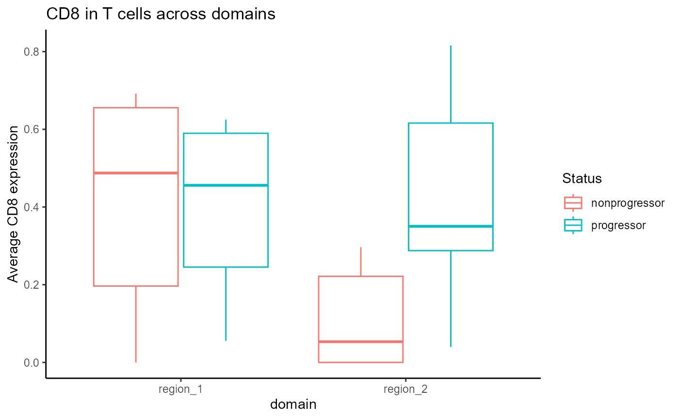
Can we use these spatial metrics to predict patient outcomes?
Classification models play a central role in spatial omics by identifying features that distinguish between patient groups—advancing both mechanistic understanding and clinical stratification. These distinguishing features can capture a wide range of biological signals, from differences in tissue architecture and cell-cell interactions to variations in cell state or microenvironment composition. Depending on the aim, analyses may seek to explain the underlying biology of a condition or to build predictive models for clinical outcomes such as progression, metastasis, or therapeutic response.
However, due to biological heterogeneity, not all features are informative across all individuals. To address this, robust modelling frameworks must accommodate complex, subgroup-specific signals. This ensures that models not only perform well statistically but also yield biologically and clinically meaningful insights. ClassifyR provides such a framework, offering tools for feature selection, repeated cross-validation, performance evaluation, survival analysis, and integration across multiple data types. It is designed to rigorously assess which features predict outcomes, and for which subgroups, thereby enhancing both discovery and translational potential.
We will first create a list to store some of the metrics that we have
quantified: cell type proportions, pairwise cell type co-localisation
(spicyR), and proportions of cells within each domain or
niche (lisaClust), marker changes associated with domains
or cell type proximity (Statial). If you are interested in
experimenting, we provide a range of other spatial feature sets in our
scFeatures
package.
# Create list to store data.frames
data <- list()

# Add proportions of each cell type in each image
data[["props"]] <- getProp(cells, "cellType")

# Add pair-wise associations
data[["pairwise"]] <- getPairwise(
  cells,
  spatialCoords = c("x", "y"),
  cellType = "cellType",
  Rs = c(50, 100),
  sigma = 20,
  cores = nCores
)

data[["pairwise"]] <- as.data.frame(data[["pairwise"]])

# replace NA values with mean
data[["pairwise"]] <- apply(data[["pairwise"]] , 2, function(x){
  x[is.na(x)] <- mean(x, na.rm = TRUE)
  x
})

# Add proportions of cells in domains/niches in each image
data[["domain"]] <- getProp(cells, "domain")
data[["niche"]] <- getProp(cells, "niche")

# Add average marker expression in a domain
data[["genesDomains"]] <- getMarkerMeans(cells,
                                         imageID = "imageID",
                                         region = "domain")


# Add average marker expression per cell type in a domain
data[["genesCellsDomains"]] <- getMarkerMeans(cells,
                                         imageID = "imageID",
                                         cellType = "cellTypeMergeTcells",
                                         region = "domain")


# Add marker expression vs proximity to cell type (spatioMark)
data[["spatioMark"]] <- stateMatTcells
data[["spatioMark"]][is.na(data[["spatioMark"]])] = 0

measurements <- lapply(data, function(x) x[rownames(prop), ])
We will also create an outcome vector which represents the predictions to be made.
outcome <- clinical[rownames(prop),]$Status
outcome
## [1] "nonprogressor" "progressor" "progressor" "nonprogressor"
## [5] "nonprogressor" "nonprogressor" "nonprogressor" "nonprogressor"
## [9] "progressor" "progressor" "progressor" "progressor"ClassifyR provides a convenient function,
crossValidate, to build and test models. We will perform
5-fold cross-validation with 100 repeats for each of the three
metrics.
# Set seed
set.seed(51773)

# Perform cross-validation of an elastic net model with 100 repeats of 5-fold cross-validation
# approx. runtime: 2 mins
cv <- crossValidate(
  measurements = data, # list of dataframes containing our metrics of interest
  outcome = outcome, # outcome vector
  classifier = "randomForest",
  nFolds = 5,
  nRepeats = 10,
  nCores = nCores
)
We can use performancePlot to visualise performance
metrics for all our features. Here, we visualise the AUC for each of the
three feature matrices we tested. Additional performance metrics can be
specified in the metric argument.
# Visualise cross-validated prediction performance
# Calculate AUC for each cross-validation repeat and plot
performancePlot(
  cv,
  metric = "AUC",
  characteristicsList = list(x = "Assay Name")
) +
  theme(axis.text.x = element_text(angle = 45, hjust = 1))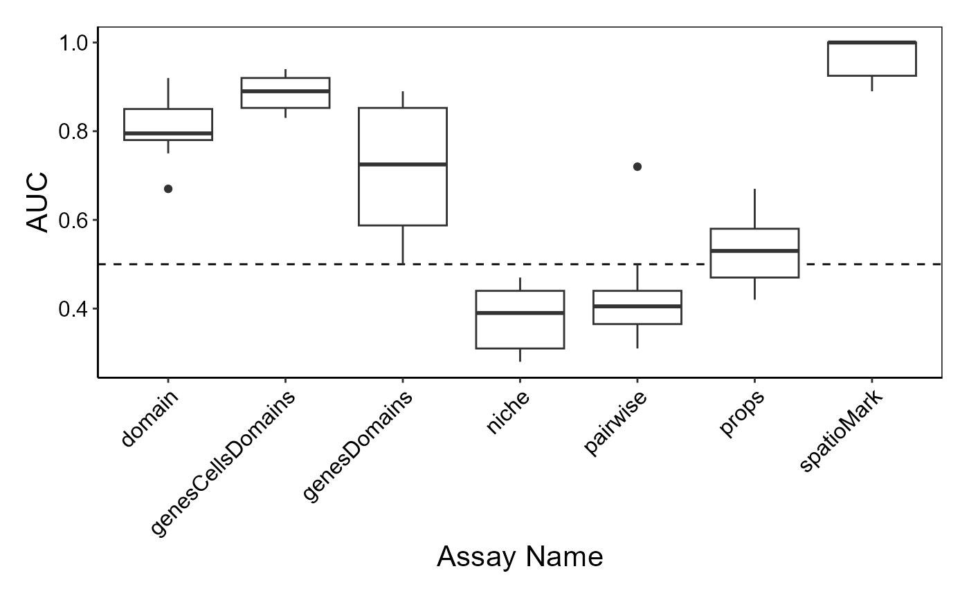
The samplesMetricMap function allows visual comparison
of sample-wise error rates or accuracy measures from the
cross-validation process, helping to identify which samples are
consistently well-classified and which are not.
samplesMetricMap(cv)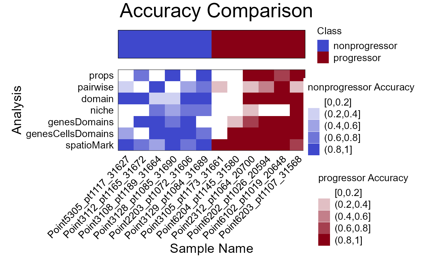
## TableGrob (2 x 1) "arrange": 2 grobs
##   z     cells    name                 grob
## 1 1 (2-2,1-1) arrange       gtable[layout]
## 2 2 (1-1,1-1) arrange text[GRID.text.1994]
sessionInfo
## R version 4.5.0 (2025-04-11 ucrt)
## Platform: x86_64-w64-mingw32/x64
## Running under: Windows 11 x64 (build 26100)
##
## Matrix products: default
##   LAPACK version 3.12.1
##
## locale:
## [1] LC_COLLATE=English_Australia.utf8  LC_CTYPE=English_Australia.utf8
## [3] LC_MONETARY=English_Australia.utf8 LC_NUMERIC=C
## [5] LC_TIME=English_Australia.utf8
##
## time zone: Australia/Sydney
## tzcode source: internal
##
## attached base packages:
## [1] stats4    stats     graphics  grDevices utils     datasets  methods
## [8] base
##
## other attached packages:
##  [1] imcRtools_1.14.0                gridExtra_2.3
##  [3] knitr_1.50                      lme4_1.1-37
##  [5] Matrix_1.7-3                    scFeatures_1.8.0
##  [7] Statial_1.10.0                  treekoR_1.16.0
##  [9] tidySpatialExperiment_1.4.1     ttservice_0.4.1
## [11] tidySingleCellExperiment_1.18.1 SpatialExperiment_1.18.1
## [13] lisaClust_1.15.6                ClassifyR_3.13.2
## [15] survival_3.8-3                  BiocParallel_1.42.0
## [17] MultiAssayExperiment_1.34.0     spicyR_1.21.1
## [19] scater_1.36.0                   scuttle_1.18.0
## [21] ggpubr_0.6.0                    FuseSOM_1.10.0
## [23] simpleSeg_1.9.2                 cytomapper_1.20.0
## [25] SingleCellExperiment_1.30.1     SummarizedExperiment_1.38.1
## [27] Biobase_2.68.0                  GenomicRanges_1.60.0
## [29] GenomeInfoDb_1.44.0             IRanges_2.42.0
## [31] S4Vectors_0.46.0                BiocGenerics_0.54.0
## [33] generics_0.1.3                  MatrixGenerics_1.20.0
## [35] matrixStats_1.5.0               EBImage_4.50.0
## [37] lubridate_1.9.4                 forcats_1.0.0
## [39] stringr_1.5.1                   dplyr_1.1.4
## [41] purrr_1.0.4                     readr_2.1.5
## [43] tidyr_1.3.1                     tibble_3.2.1
## [45] ggplot2_3.5.2                   tidyverse_2.0.0
## [47] BiocStyle_2.36.0
##
## loaded via a namespace (and not attached):
##   [1] graph_1.86.0                igraph_2.1.4
##   [3] plotly_4.10.4               Formula_1.2-5
##   [5] fpc_2.2-13                  BiocBaseUtils_1.10.0
##   [7] tidyselect_1.2.1            bit_4.6.0
##   [9] doParallel_1.0.17           clue_0.3-66
##  [11] lattice_0.22-6              rjson_0.2.23
##  [13] blob_1.2.4                  rngtools_1.5.2
##  [15] S4Arrays_1.8.0              parallel_4.5.0
##  [17] png_0.1-8                   cli_3.6.5
##  [19] ggplotify_0.1.2             ProtGenerics_1.40.0
##  [21] multtest_2.64.0             goftest_1.2-3
##  [23] pkgdown_2.1.3               textshaping_1.0.1
##  [25] BiocIO_1.18.0               kernlab_0.9-33
##  [27] bluster_1.18.0              BiocNeighbors_2.2.0
##  [29] uwot_0.2.3                  curl_6.2.3
##  [31] mime_0.13                   evaluate_1.0.3
##  [33] tidytree_0.4.6              tiff_0.1-12
##  [35] ComplexHeatmap_2.24.0       ggh4x_0.3.0
##  [37] stringi_1.8.7               backports_1.5.0
##  [39] desc_1.4.3                  FCPS_1.3.4
##  [41] lmerTest_3.1-3              XML_3.99-0.18
##  [43] httpuv_1.6.16               flexmix_2.3-20
##  [45] AnnotationDbi_1.70.0        magrittr_2.0.3
##  [47] DataVisualizations_1.3.3    splines_4.5.0
##  [49] mclust_6.1.1                jpeg_0.1-11
##  [51] doRNG_1.8.6.2               ggraph_2.2.1
##  [53] DT_0.33                     ggbeeswarm_0.7.2
##  [55] DBI_1.2.3                   terra_1.8-50
##  [57] HDF5Array_1.36.0            genefilter_1.90.0
##  [59] jquerylib_0.1.4             withr_3.0.2
##  [61] reformulas_0.4.1            class_7.3-23
##  [63] systemfonts_1.2.3           ggnewscale_0.5.1
##  [65] GSEABase_1.70.0             tidygraph_1.3.1
##  [67] bdsmatrix_1.3-7             rtracklayer_1.68.0
##  [69] BiocManager_1.30.25         htmlwidgets_1.6.4
##  [71] fs_1.6.6                    ggrepel_0.9.6
##  [73] tidygate_1.0.14             princurve_2.1.6
##  [75] labeling_0.4.3              SparseArray_1.8.0
##  [77] DEoptimR_1.1-3-1            ranger_0.17.0
##  [79] SingleCellSignalR_1.20.0    diptest_0.77-1
##  [81] h5mread_1.0.1               annotate_1.86.0
##  [83] zoo_1.8-14                  raster_3.6-32
##  [85] XVector_0.48.0              nnls_1.6
##  [87] UCSC.utils_1.4.0            AUCell_1.30.1
##  [89] timechange_0.3.0            foreach_1.5.2
##  [91] fansi_1.0.6                 dcanr_1.24.0
##  [93] patchwork_1.3.0             caTools_1.18.3
##  [95] grid_4.5.0                  data.table_1.17.4
##  [97] ggtree_3.16.0               rhdf5_2.52.0
##  [99] vegan_2.6-10                R.oo_1.27.1
## [101] ggiraph_0.8.13              psych_2.5.3
## [103] irlba_2.3.5.1               gridGraphics_0.5-1
## [105] ellipsis_0.3.2              lazyeval_0.2.2
## [107] yaml_2.3.10                 crayon_1.5.3
## [109] RcppAnnoy_0.0.22            RColorBrewer_1.1-3
## [111] tweenr_2.0.3                later_1.4.2
## [113] codetools_0.2-20            GlobalOptions_0.1.2
## [115] KEGGREST_1.48.0             Rtsne_0.17
## [117] shape_1.4.6.1               limma_3.64.1
## [119] Rsamtools_2.24.0            RTriangle_1.6-0.15
## [121] pkgconfig_2.0.3             spatstat.univar_3.1-3
## [123] GenomicAlignments_1.44.0    aplot_0.2.5
## [125] spatstat.sparse_3.1-0       ape_5.8-1
## [127] viridisLite_0.4.2           xtable_1.8-4
## [129] coop_0.6-3                  fastcluster_1.3.0
## [131] car_3.1-3                   plyr_1.8.9
## [133] httr_1.4.7                  prabclus_2.3-4
## [135] rbibutils_2.3               tools_4.5.0
## [137] beeswarm_0.4.0              broom_1.0.8
## [139] nlme_3.1-168                assertthat_0.2.1
## [141] digest_0.6.37               permute_0.9-7
## [143] numDeriv_2016.8-1.1         bookdown_0.43
## [145] farver_2.1.2                tzdb_0.5.0
## [147] AnnotationFilter_1.32.0     reshape2_1.4.4
## [149] yulab.utils_0.2.0           viridis_0.6.5
## [151] glue_1.8.0                  cachem_1.1.0
## [153] hopach_2.68.0               polyclip_1.10-7
## [155] proxyC_0.5.2                Biostrings_2.76.0
## [157] classInt_0.4-11             profileModel_0.6.1
## [159] FlowSOM_2.16.0              mvtnorm_1.3-3
## [161] ConsensusClusterPlus_1.72.0 mnormt_2.1.1
## [163] statmod_1.5.0               flowCore_2.20.0
## [165] concaveman_1.1.0            ragg_1.4.0
## [167] ScaledMatrix_1.16.0         carData_3.0-5
## [169] minqa_1.2.8                 vroom_1.6.5
## [171] dqrng_0.4.1                 utf8_1.2.5
## [173] graphlayouts_1.2.2          gtools_3.9.5
## [175] diffcyt_1.28.0              analogue_0.18.0
## [177] ggsignif_0.6.4              GSVA_2.2.0
## [179] shiny_1.10.0                GenomeInfoDbData_1.2.14
## [181] cytolib_2.20.0              RProtoBufLib_2.20.0
## [183] distances_0.1.12            R.utils_2.13.0
## [185] rhdf5filters_1.20.0         RCurl_1.98-1.17
## [187] memoise_2.0.1               rmarkdown_2.29
## [189] pheatmap_1.0.12             R.methodsS3_1.8.2
## [191] scales_1.4.0                svglite_2.2.1
## [193] spatstat.data_3.1-6         rstudioapi_0.17.1
## [195] EnsDb.Mmusculus.v79_2.99.0  msigdbr_24.1.0
## [197] cluster_2.1.8.1             spatstat.utils_3.1-4
## [199] hms_1.1.3                   cowplot_1.1.3
## [201] coxme_2.2-22                scam_1.2-19
## [203] colorspace_2.1-1            rlang_1.1.6
## [205] EnsDb.Hsapiens.v79_2.99.0   sparseMatrixStats_1.20.0
## [207] DelayedMatrixStats_1.30.0   shinydashboard_0.7.3
## [209] ggforce_0.4.2               circlize_0.4.16
## [211] mgcv_1.9-1                  xfun_0.52
## [213] e1071_1.7-16                TH.data_1.1-3
## [215] modeltools_0.2-24           iterators_1.0.14
## [217] abind_1.4-8                 treeio_1.32.0
## [219] Rhdf5lib_1.30.0             bitops_1.0-9
## [221] Rdpack_2.6.4                fftwtools_0.9-11
## [223] promises_1.3.3              RSQLite_2.3.11
## [225] sandwich_3.1-1              DelayedArray_0.34.1
## [227] proxy_0.4-27                compiler_4.5.0
## [229] colorRamps_2.3.4            boot_1.3-31
## [231] beachmat_2.24.0             Rcpp_1.0.14
## [233] edgeR_4.6.2                 BiocSingular_1.24.0
## [235] tensor_1.5                  units_0.8-7
## [237] MASS_7.3-65                 uuid_1.2-1
## [239] ggupset_0.4.1               babelgene_22.9
## [241] spatstat.random_3.4-1       R6_2.6.1
## [243] fastmap_1.2.0               multcomp_1.4-28
## [245] rstatix_0.7.2               vipor_0.4.7
## [247] ensembldb_2.32.0            nnet_7.3-20
## [249] rsvd_1.0.5                  gtable_0.3.6
## [251] KernSmooth_2.23-26          deldir_2.0-4
## [253] htmltools_0.5.8.1           ggthemes_5.1.0
## [255] bit64_4.6.0-1               spatstat.explore_3.4-3
## [257] lifecycle_1.0.4             sf_1.0-21
## [259] nloptr_2.2.1                restfulr_0.0.15
## [261] sass_0.4.10                 vctrs_0.6.5
## [263] robustbase_0.99-4-1         spatstat.geom_3.4-1
## [265] scran_1.36.0                ggfun_0.1.8
## [267] sp_2.2-0                    bslib_0.9.0
## [269] pillar_1.10.2               GenomicFeatures_1.60.0
## [271] gplots_3.2.0                magick_2.8.6
## [273] metapod_1.16.0              locfit_1.5-9.12
## [275] jsonlite_2.0.0              brglm_0.7.2
## [277] svgPanZoom_0.3.4            GetoptLong_1.0.5