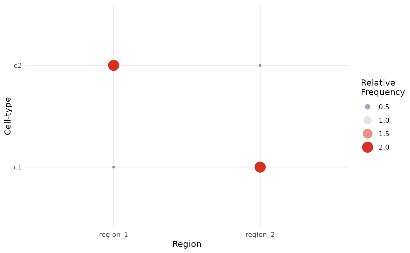
Plot heatmap of cell type enrichment for lisaClust regions
Usage
regionMap(
  cells,
  type = "bubble",
  cellType = "cellType",
  region = "region",
  limit = c(0.33, 3),
  ...
)Examples
set.seed(51773)
x <- round(c(
  runif(200), runif(200) + 1, runif(200) + 2, runif(200) + 3,
  runif(200) + 3, runif(200) + 2, runif(200) + 1, runif(200)
), 4) * 100
y <- round(c(
  runif(200), runif(200) + 1, runif(200) + 2, runif(200) + 3,
  runif(200), runif(200) + 1, runif(200) + 2, runif(200) + 3
), 4) * 100
cellType <- factor(paste("c", rep(rep(c(1:2), rep(200, 2)), 4), sep = ""))
imageID <- rep(c("s1", "s2"), c(800, 800))

cells <- data.frame(x, y, cellType, imageID)

cells <- lisaClust(cells, k = 2)
#> Generating local indicators of spatial association.

regionMap(cells)