Code
# Plot the mask
plotCells(masks)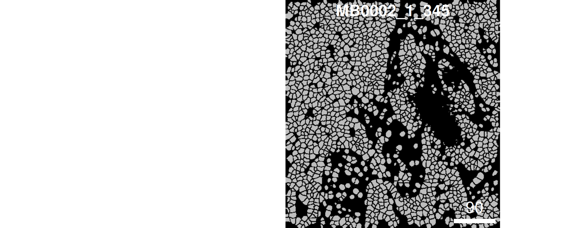
2025-06-13
Presenting authors
Farhan Ameen, Shreya Rao, Lijia Yu, Daniel Kim, Jean Yang.
Contributors
Yue Cao, Lijia Yu, Andy Tran, Daniel Kim, Dario Strbenac, Nicholas Robertson, Helen Fu, Jean Yang.
Sydney Precision Data Science Centre, University of Sydney, Australia
School of Mathematics and Statistics, University of Sydney, Australia
Charles Perkins Centre, University of Sydney, Australia
Faculty of Medicine and Health, University of Sydney, Australia
Contact: jean.yang@sydney.edu.au
The emergence of high-resolution spatial omics technologies has revolutionized our ability to map cellular ecosystems in situ. This workshop explores approaches in multi-sample spatial data analysis. We cover end-to-end workflow considerations—from experimental design and QC to spatial feature interpretation—with case studies in disease prediction.
sessionInfo at the end of this document to ensure you are using the correct versions.scFeatures.ClassifyR.Our question of interest
We want to know if the risk of recurrence in the METABRIC breast cancer cohort can be accurately estimated to inform how aggressively they need to be treated.
To begin, we will start with loading an example image in R. It is not neccessary for you to be familiar with this part, as we will provide you with pre-processed data for the rest of the workshop.
system.file(“extdata”, “MB0002_1_345_fullstack.tiff”, package = “scdneySpatial_ABACBS2025”)
# Plot the mask
plotCells(masks)
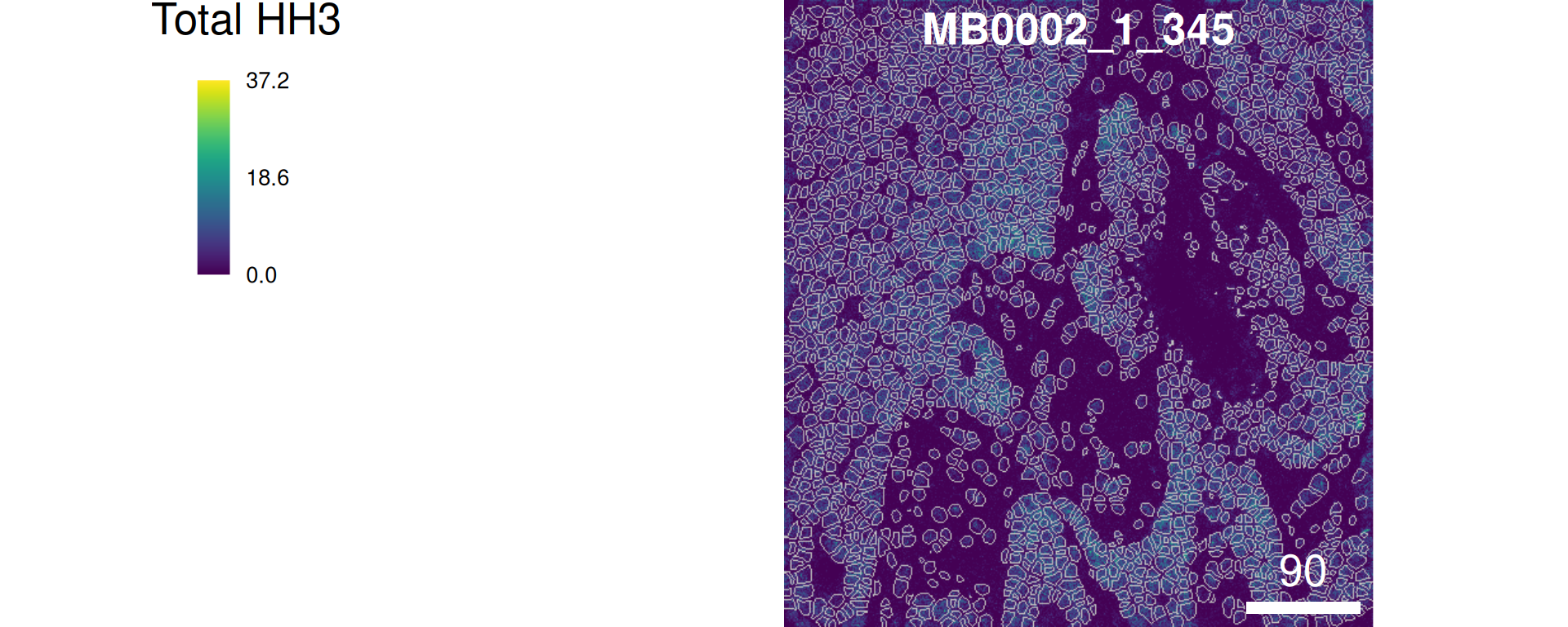
# Plot overlay
combine = plotPixels(
  image    = images,
  mask     = masks,
  img_id   = "sample_id",      # column name in mcols(images)/mcols(masks)
  colour_by = "Total HH3"
)
At the start of any analysis pipeline, it is often good to explore the data to get a sense of the structure and its complexity. Let’s explore the data to answer the questions below:
Questions
Here, we take a quick look at what our rows and columns represent and the dimensions of our data.
[1] "MB-0002:345:93"  "MB-0002:345:107" "MB-0002:345:113" "MB-0002:345:114"
[5] "MB-0002:345:125" "MB-0002:345:127"[1] "HH3_total" "CK19" "CK8_18" "Twist" "CD68" "CK14"
# How many features and observations are in our dataset?
dim(data_sce)
[1] 38 76307In addition to the proteomics data, it’s important to understand what other covariates, such as clinical variables, are in our dataset. These can help us in answering our question(s) of interest or formulate new questions. For example, we can’t explore the association between smoking status and breast cancer severity if the variable for smoking status doesn’t exist in our data.
# Explore covariates

# DT::datatable(clinical)
colnames(colData(data_sce))
[1] "file_id" "metabricId" "core_id"
[4] "ImageNumber" "ObjectNumber" "Fibronectin"
[7] "Location_Center_X" "Location_Center_Y" "SOM_nodes"
[10] "pg_cluster" "description" "region"
[13] "ki67" "celltype" "sample"
[16] "x_cord" "y_cord" Now that we have a basic idea of what our data looks like, we can look at it in more detail. While initial data exploration reveals fundamental patterns, deeper examination is very helpful. As it serves two critical purposes: first, to detect anomalies or biases requiring remediation, and second, to inform our choice of analytical methods tailored to the biological questions at hand.
Looking at imbalance in data is crucial because it can lead to biased models and inaccurate predictions, especially in classification tasks. Imbalance occurs when one class is significantly underrepresented compared to others. This can cause models to be overly influenced by the majority class, leading to poor performance on the minority class. Here, we tabularise some of the relevant clinical variables and plot the distribution of the Time to Recurrence-Free Survival variable.
# Estrogen receptor status
ggplot(clinical, aes(x = ER.Status)) +
  geom_bar(fill = "#0099B4", color = "white", alpha = 0.8) +
  labs(y = "Count\n",
       x = "\nER status") +
  theme_minimal()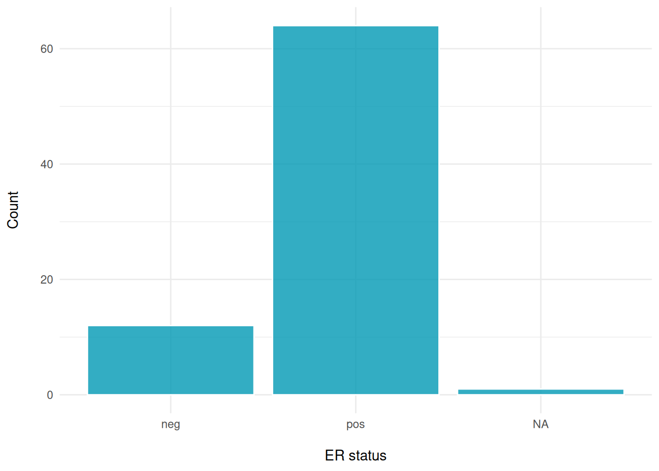
# Histological type
ggplot(clinical, aes(x = Histological.Type)) +
  geom_bar(fill = "#fc6203", color = "white", alpha = 0.8) +
  labs(y = "Count\n",
       x = "\nHistological Type") +
  theme_minimal()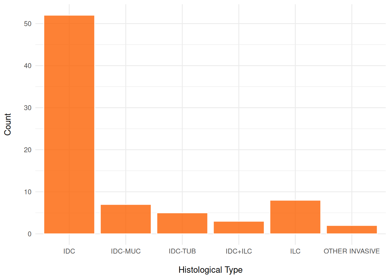
# eventRFS: "Event in Recurrence-Free Survival."It indicates whether the event has occurred.#
ggplot(clinical, aes(x = factor(eventRFS))) +
  geom_bar(fill = "#40dbb2", color = "white", alpha = 0.8) +
  labs(y = "Count\n",
       x = "\nEvent in Recurrence-Free Survival") +
  theme_minimal()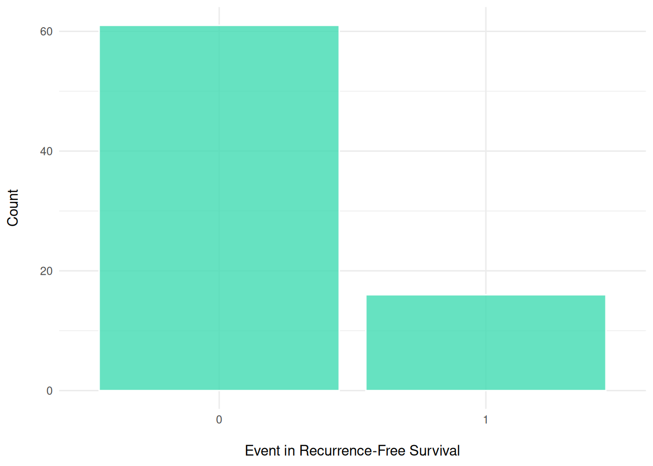
# timeRFS: "Time to Recurrence-Free Survival." It is the time period until recurrence occurs.
ggplot(clinical, aes(x = timeRFS)) +
  geom_histogram(fill = "#de9921", color = "white", alpha = 0.8, bins=20) +
  labs(y = "Frequency\n",
       x = "\ntimeRFS") +
theme_minimal() 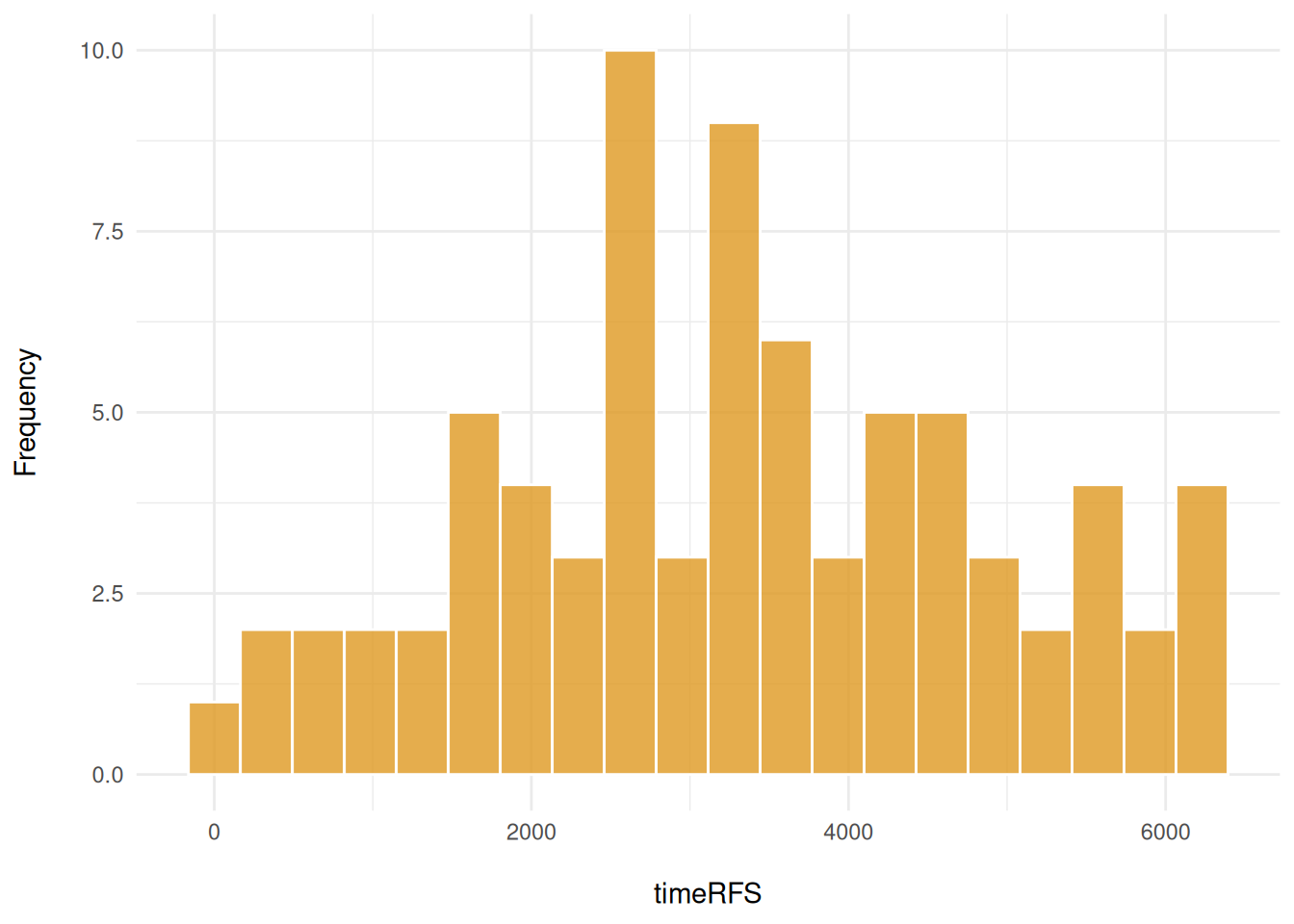
Here, we explore the distribution of the outcomes and variables in the meta-data. We use cross-tabulation to examine the following variables: Surgery vs death, ER status, and Grade.
# Stage and death
table(clinical$Breast.Surgery, clinical$Death, useNA = "ifany")
                     0  1
  BREAST CONSERVING 38 14
  MASTECTOMY        16  6
  <NA>               2  1
# ER status and grade
table(clinical$ER.Status, clinical$Grade)
       1  2  3
  neg  0  0 11
  pos 13 30 17
# "Number of individuals based on Grade
table(clinical$Grade, clinical$Death)
     0  1
  1 12  2
  2 25  5
  3 17 11
To assess potential batch effects and sample-specific clustering patterns, we visualize the cells in our data colored by the sample of origin. This qualitative inspection provides an intuitive first assessment of any batch effects in our data integration. If there is batch effects then we’d need to apply batch correction to resolve this issue.
#data_sce <- runUMAP(data_sce, scale=TRUE)

# With the UMAP function we can highlight by meta data of interest
# Here we highlight the UMAP by sample ID
plotUMAP(data_sce, colour_by = "metabricId") + theme(legend.position = "none") +
  coord_equal()
Discussion
Here, we explore key approaches for evaluating the quality of IMC data. A robust assessment should consider multiple factors, including the density of marker expression, marker correlations, and their co-expression. Something we might want to think about is what characeristics might indicate whether a sample(s) is low/high quality?
cell_type_mapping <- c(
"B cells" = "B cell",
"T cells" = "T cell",
"Macrophages Vim+ CD45low" = "Macrophage",
"Macrophages Vim+ Slug-" = "Macrophage",
"Macrophages Vim+ Slug+" = "Macrophage",
"Endothelial" = "Endothelial",
"Fibroblasts" = "Fibroblast",
"Fibroblasts CD68+" = "Fibroblast",
"Myofibroblasts" = "Fibroblast",
"Vascular SMA+" = "Fibroblast",
"Myoepithelial" = "Myoepithelial",
"HR+ CK7-" = "Tumor HR+",
"HR+ CK7- Ki67+" = "Tumor HR+",
"HR+ CK7- Slug+" = "Tumor HR+",
"HR- CK7+" = "Tumor HR-",
"HR- CK7-" = "Tumor HR-",
"HR- Ki67+" = "Tumor HR-",
"HR- CKlow CK5+" = "Tumor HR-",
"HRlow CKlow" = "Tumor HR-low/mixed",
"HER2+" = "Tumor HER2+",
"Basal CKlow" = "Tumor Basal-like",
"Hypoxia" = "Tumor Hypoxic"
)
# Convert IMC description to higher-level categories
data_sce$high_level_category <- recode(data_sce$description, !!!cell_type_mapping)
# Count cells in each image
cell_counts <- data_sce |>
dplyr::count(metabricId, name = "cell_count") |> # Count rows per metabricId
arrange(desc(cell_count))
# Get the top 20 images with highest cell
high_cell_images <- cell_counts |>
head(20) |>
pull(metabricId)
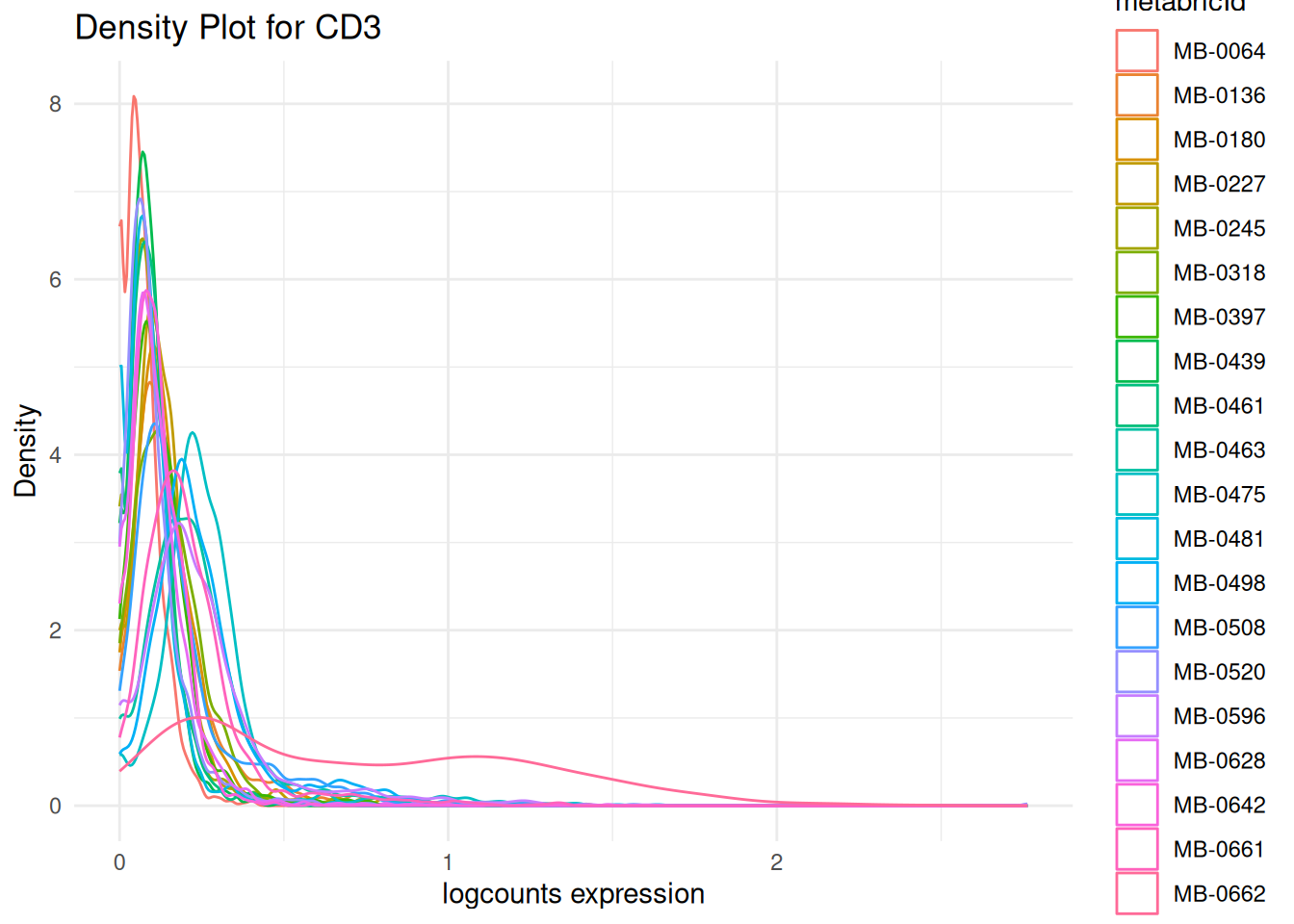
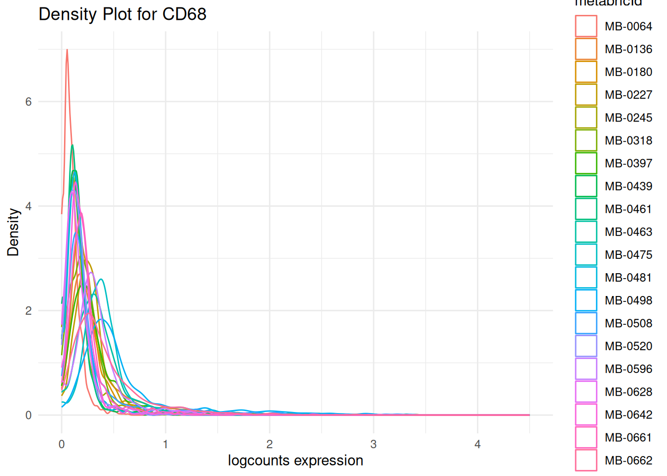
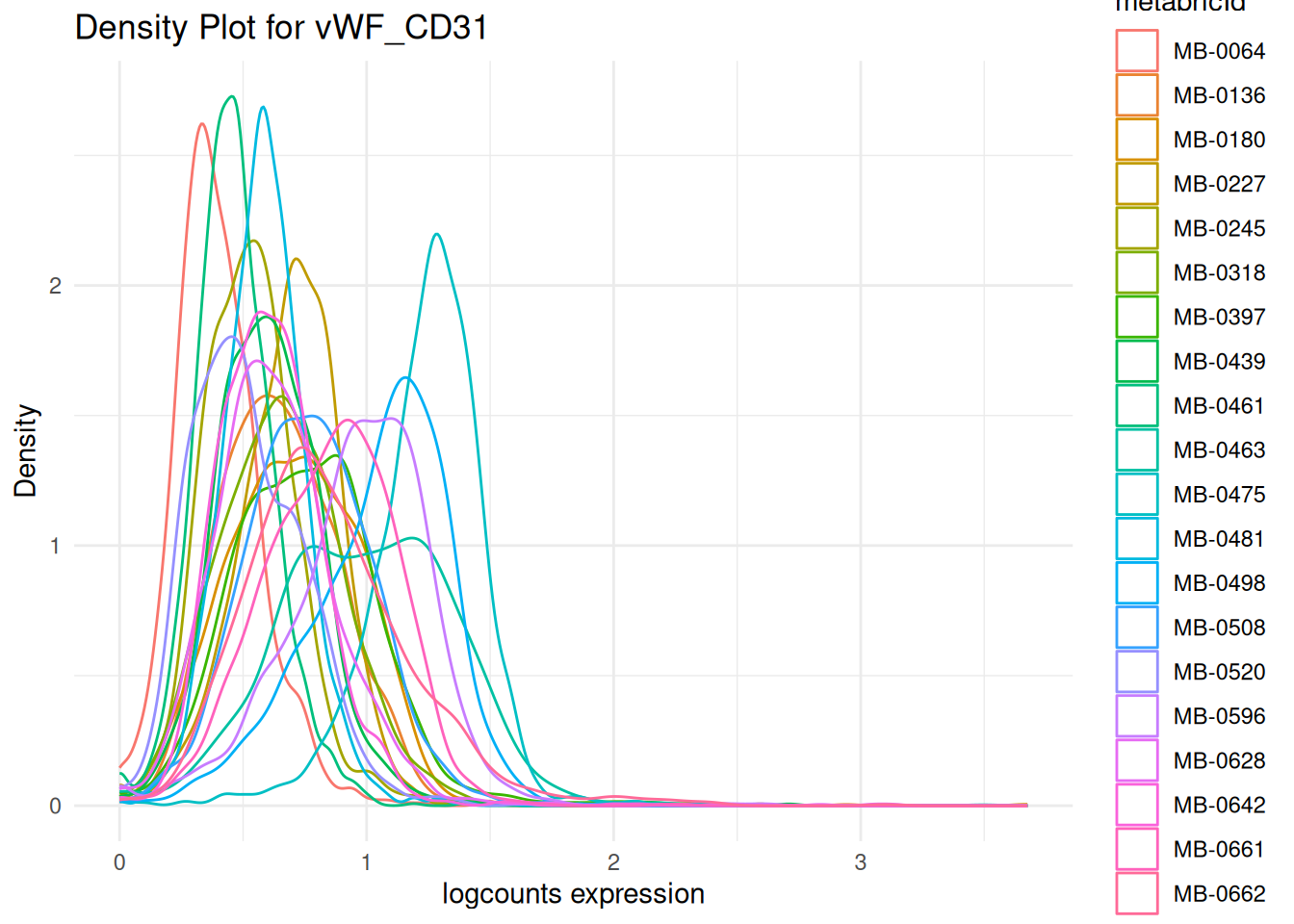
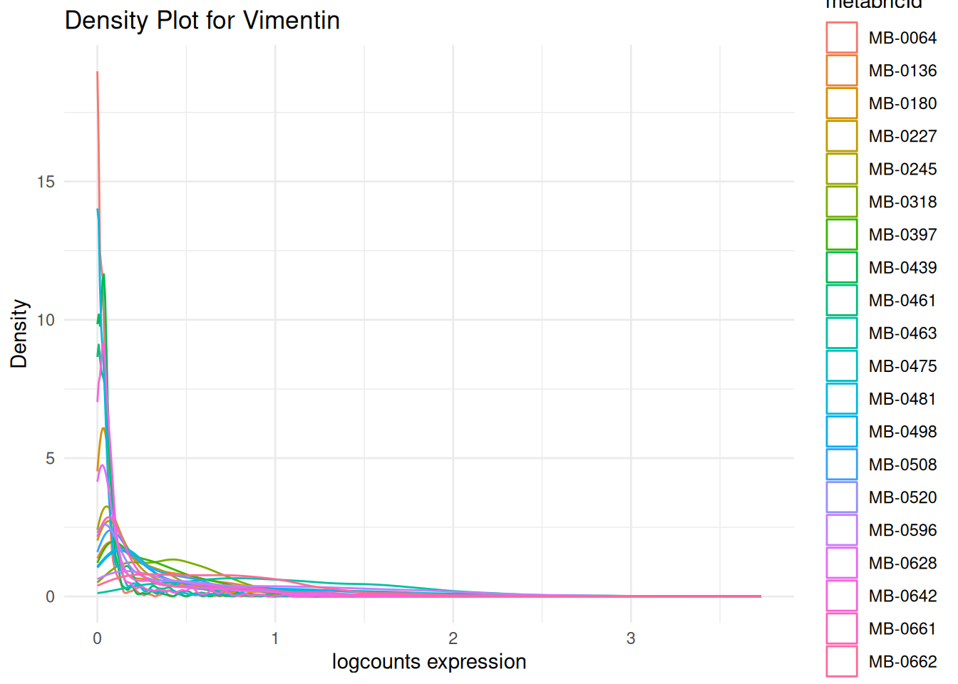
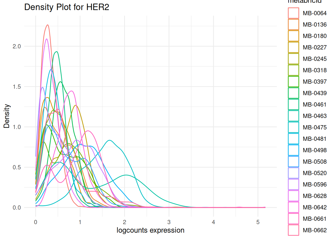
# Visualising marker densities for each image.
plots <- data_sce |>
filter(metabricId %in% high_cell_images) |>
plot_marker_densities(
sample_id_col = "metabricId",
markers_to_plot = c("CD20", "CD3", "CD68", "vWF_CD31", "Vimentin", "HER2"),
assay_name = "logcounts"
)Here, we want to assess the quality of the markers: it is desirable to see at least two peaks, which would indicate the existence of cell type specific markers in our data.
Questions
We assess whether the marker intensities require transformation or normalisation. This step is important for two main reasons:
Skewed distributions: Marker intensities are often right-skewed, which can distort downstream analyses such as clustering or dimensionality reduction.
Inconsistent scales across images: Due to technical variation, the same marker may show very different intensity ranges across images. This can shift what’s considered “positive” or “negative” expression, making it difficult to label cells accurately.
By applying transformation and normalisation, we aim to stabilise variance and bring the data onto a more comparable scale across images.
Tip
What we’re looking for
- Do the CD31+ and CD31- peaks clearly separate out in the density plot? To ensure that downstream analysis goes smoothly, we want our cell type specific markers to show 2 distinct peaks representing our CD31+ and CD31- cells. If we see 3 or more peaks where we don’t expect, this might be an indicator that further normalisation is required.
- Are our CD31+ and CD31- peaks consistent across our images? We want to make sure that our density plots for CD3 are largely the same across images so that a CD3+ cell in one image is equivalent to a CD3+ cell in another image.
# leave out the nuclei markers from our normalisation process
useMarkers <- rownames(data_sce)[!rownames(data_sce) %in% c("DNA1", "DNA2", "HH3", "HH3_total", "HH3_ph")]

# transform and normalise the marker expression of each cell type
data_sce <- normalizeCells(
  data_sce,
  markers = useMarkers,
  transformation = NULL,
  method = c("trim99", "minMax", "PC1"),
  assayIn = "counts",
  assayOut = "norm", # Normalised matrix stored in an assay called "norm"
  imageID = "metabricId"
)

selected_patients = cell_counts |>
  head(10) |>
  pull(metabricId)

norm = plot_marker_densities(
  filter(data_sce, metabricId %in% selected_patients),
  sample_id_col = "metabricId",
  markers_to_plot = "vWF_CD31",
  assay_name = "norm"
)$vWF_CD31 + theme(legend.position = "none") + ggtitle("Normalized Counts - CD31")

log = plot_marker_densities(
  filter(data_sce, metabricId %in% selected_patients),
  sample_id_col = "metabricId",
  markers_to_plot = c("vWF_CD31"),
  assay_name = "logcounts"
)$vWF_CD31 + theme(legend.position = "none") + ggtitle("Log Counts - CD31")

ggarrange(log, norm, ncol=2)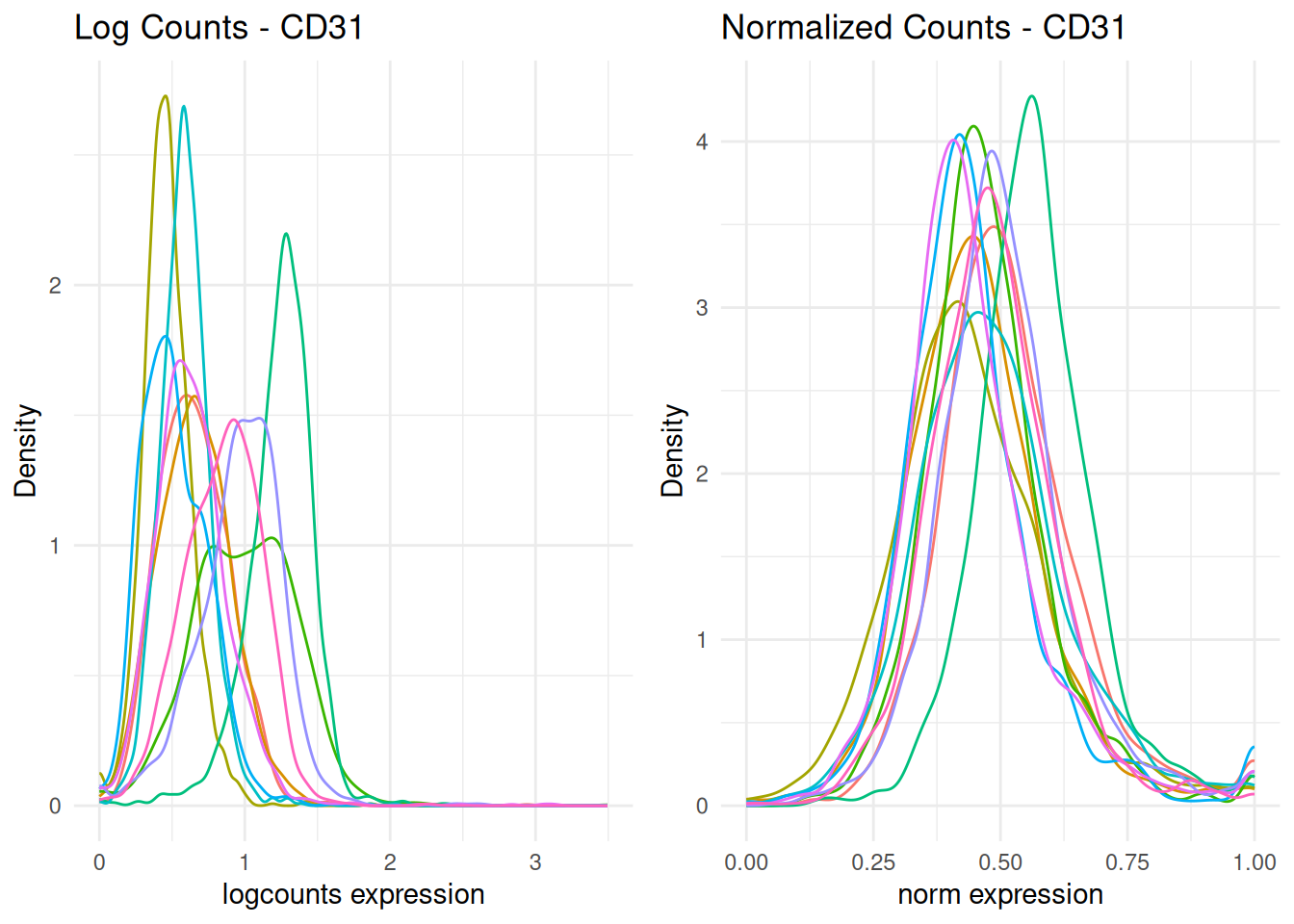
In the plot above, the normalised data appeas more bimodal. We can observe one clear CD31- peak at around 0.50, and a CD31+ peak at 1.00. Image-level batch effects also appear to have been mitigated, since most peaks occur at around the same CD31 intensity.
Discussion
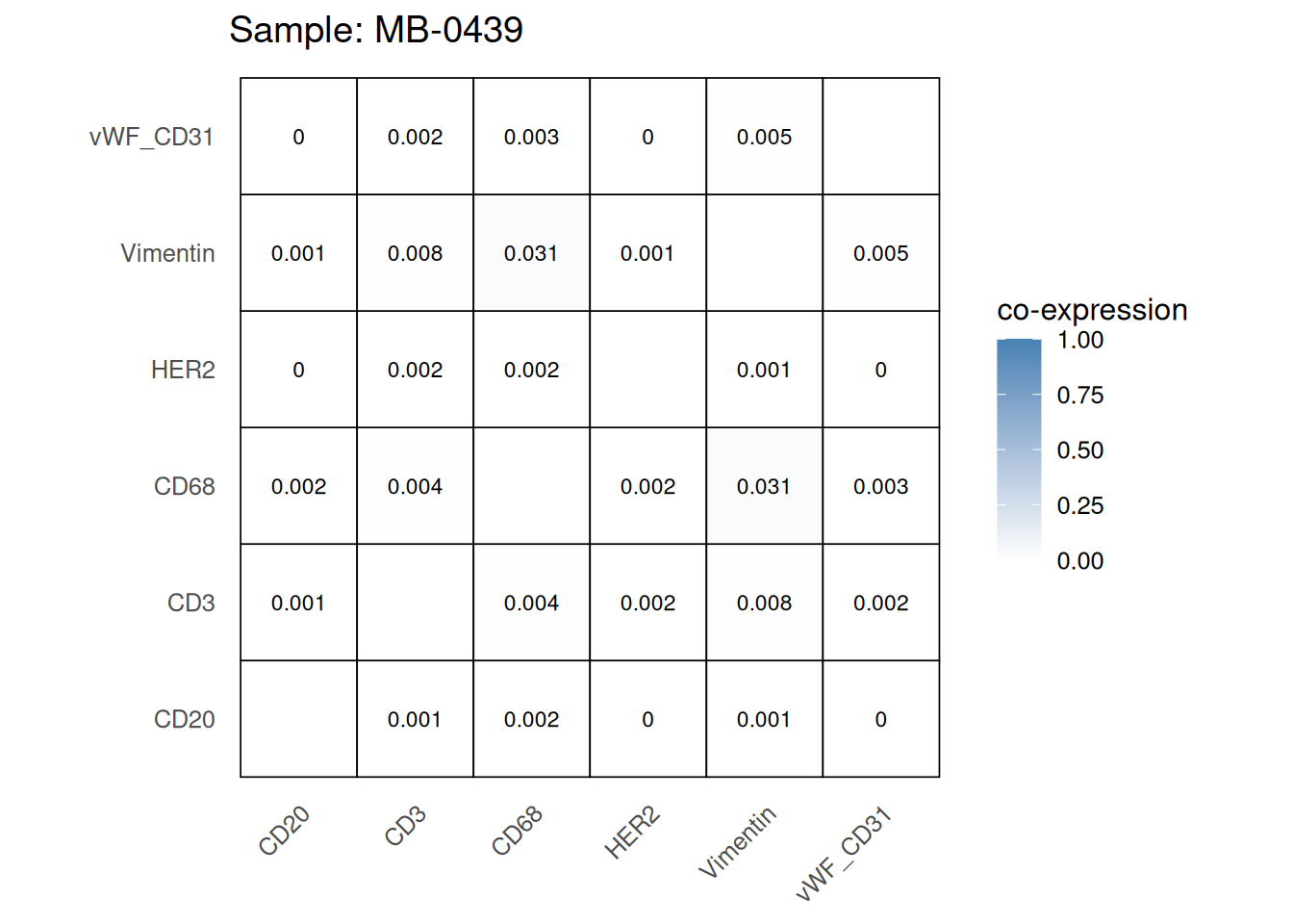
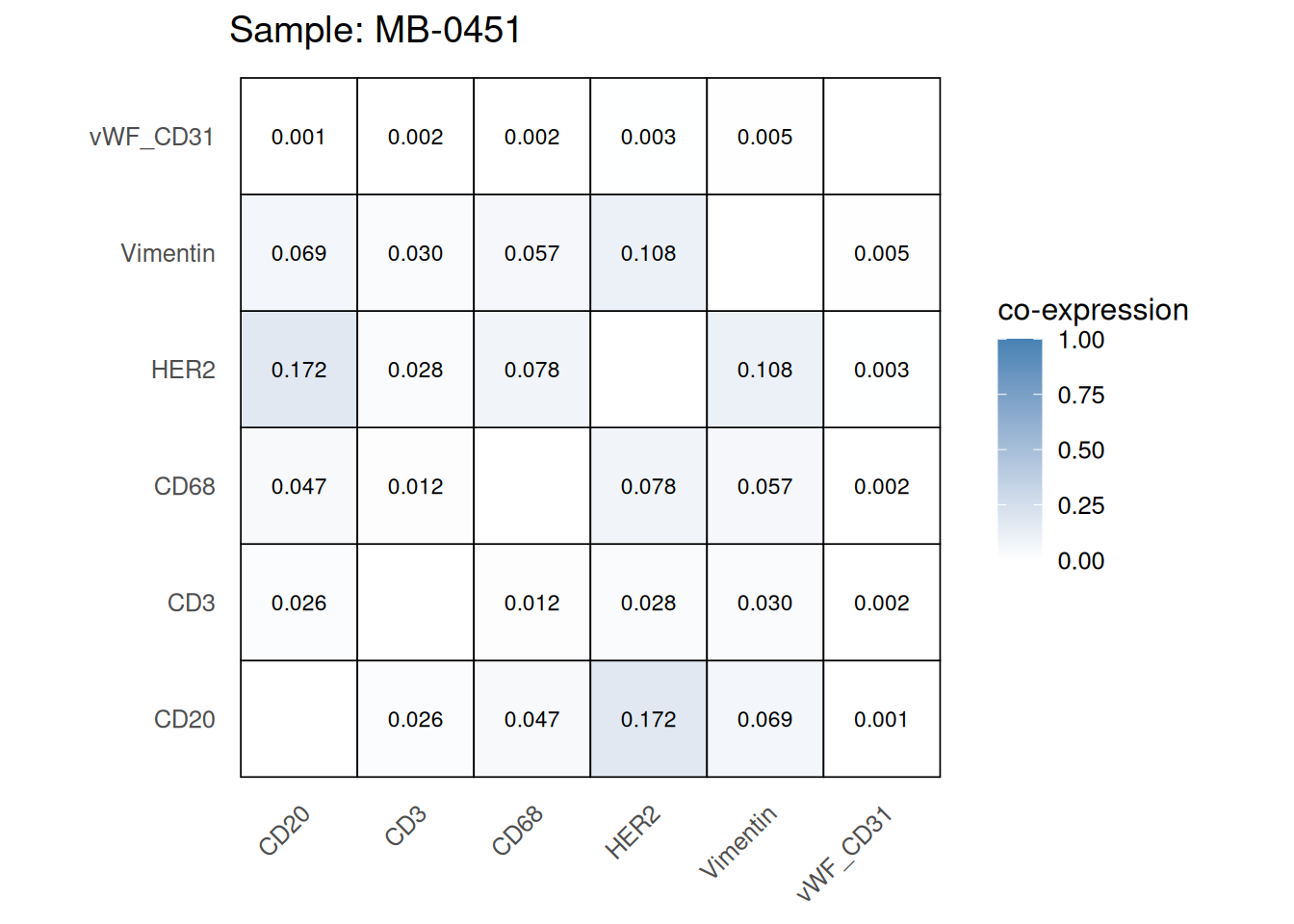
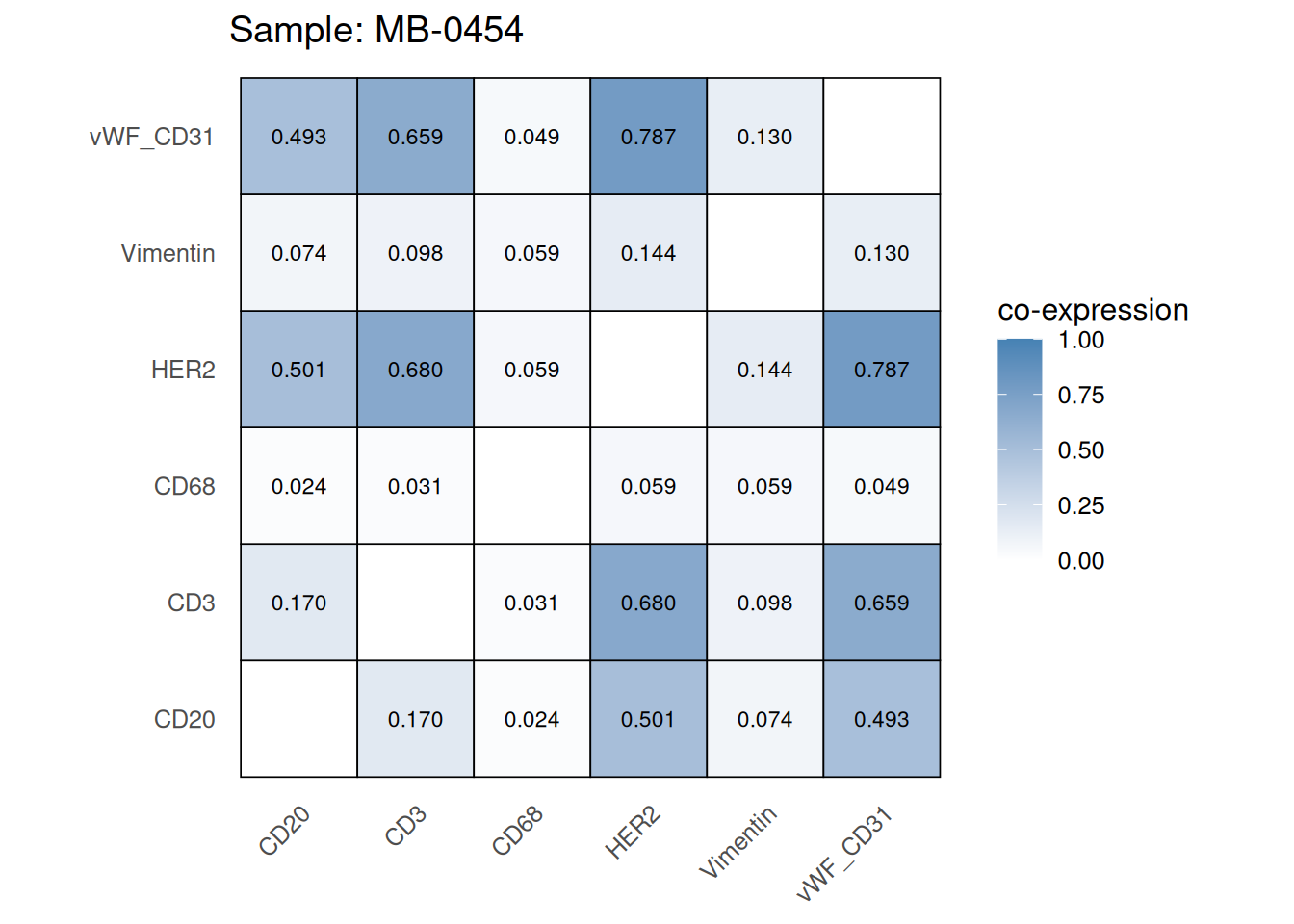
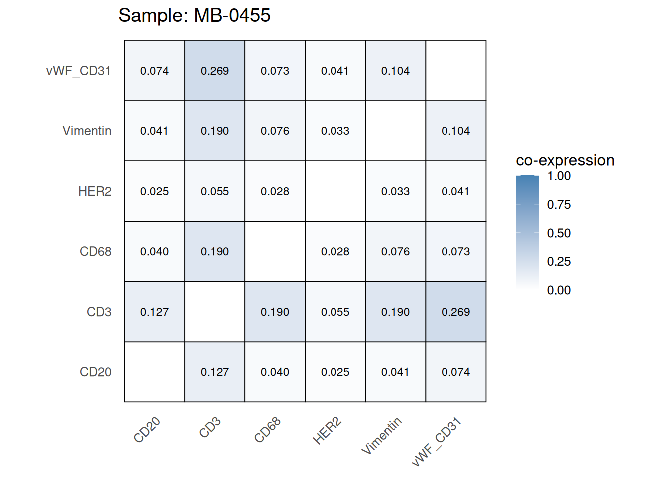
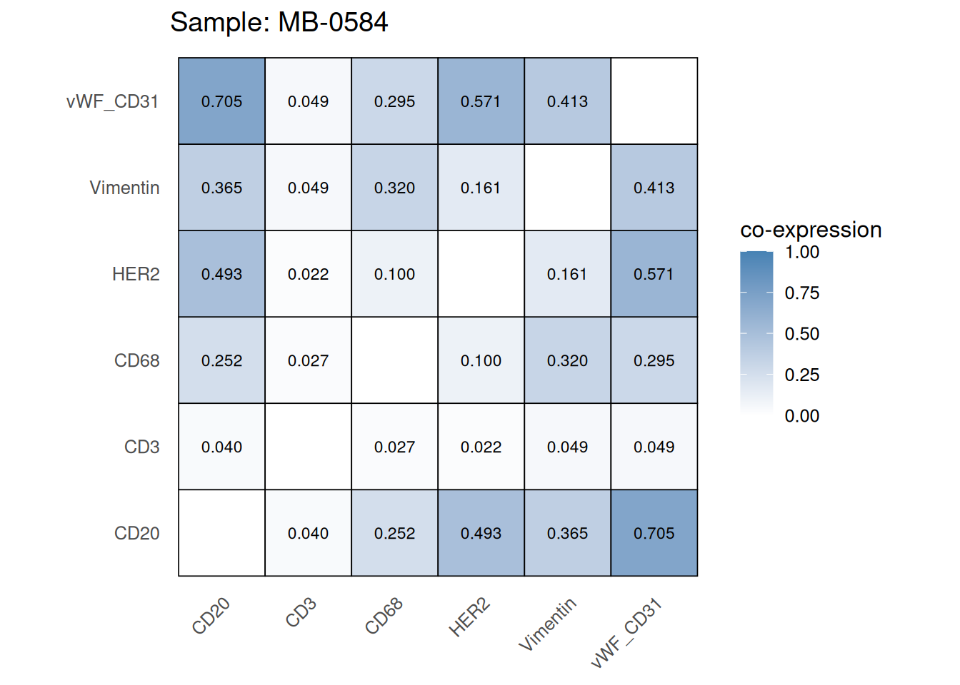
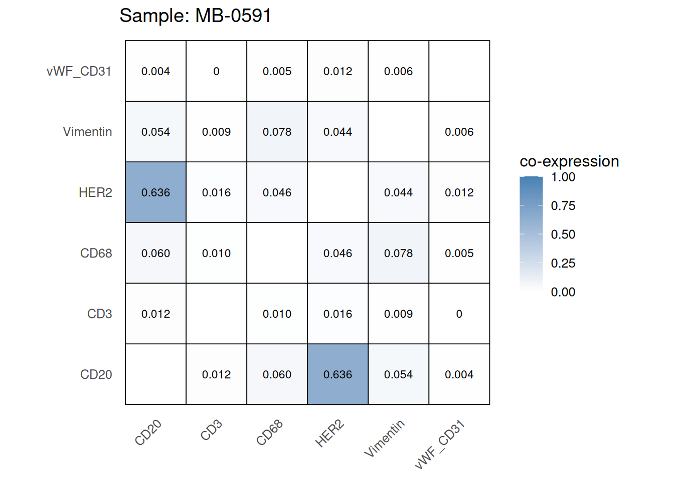
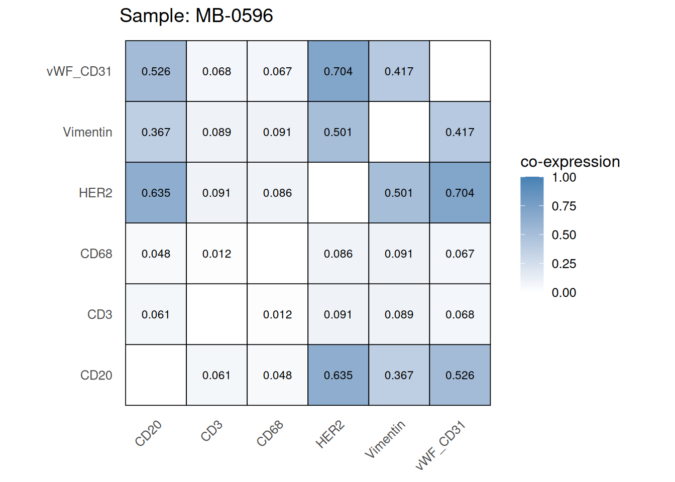
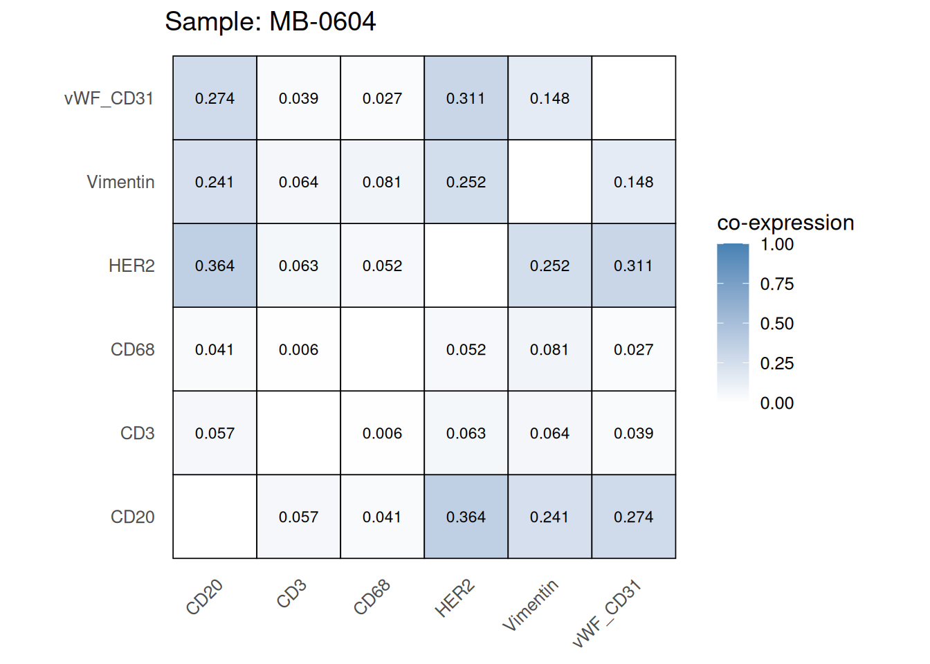
Here we plot the correlation of different markers for a subset of samples. This helps us determine whether a sample has low/high contamination of markers.
Questions
coexp_df <- readRDS(system.file("extdata", "coexp_df.rds",
                        package = "scdneySpatialABACBS2025"))


marker_list <- c("CD20", "CD3", "CD68", "vWF_CD31", "Vimentin", "HER2")

# Proportion heatmaps
heatmaps_prop <- plot_pairwise_heatmaps_per_sample(coexp_df, marker_list, stat = "proportion")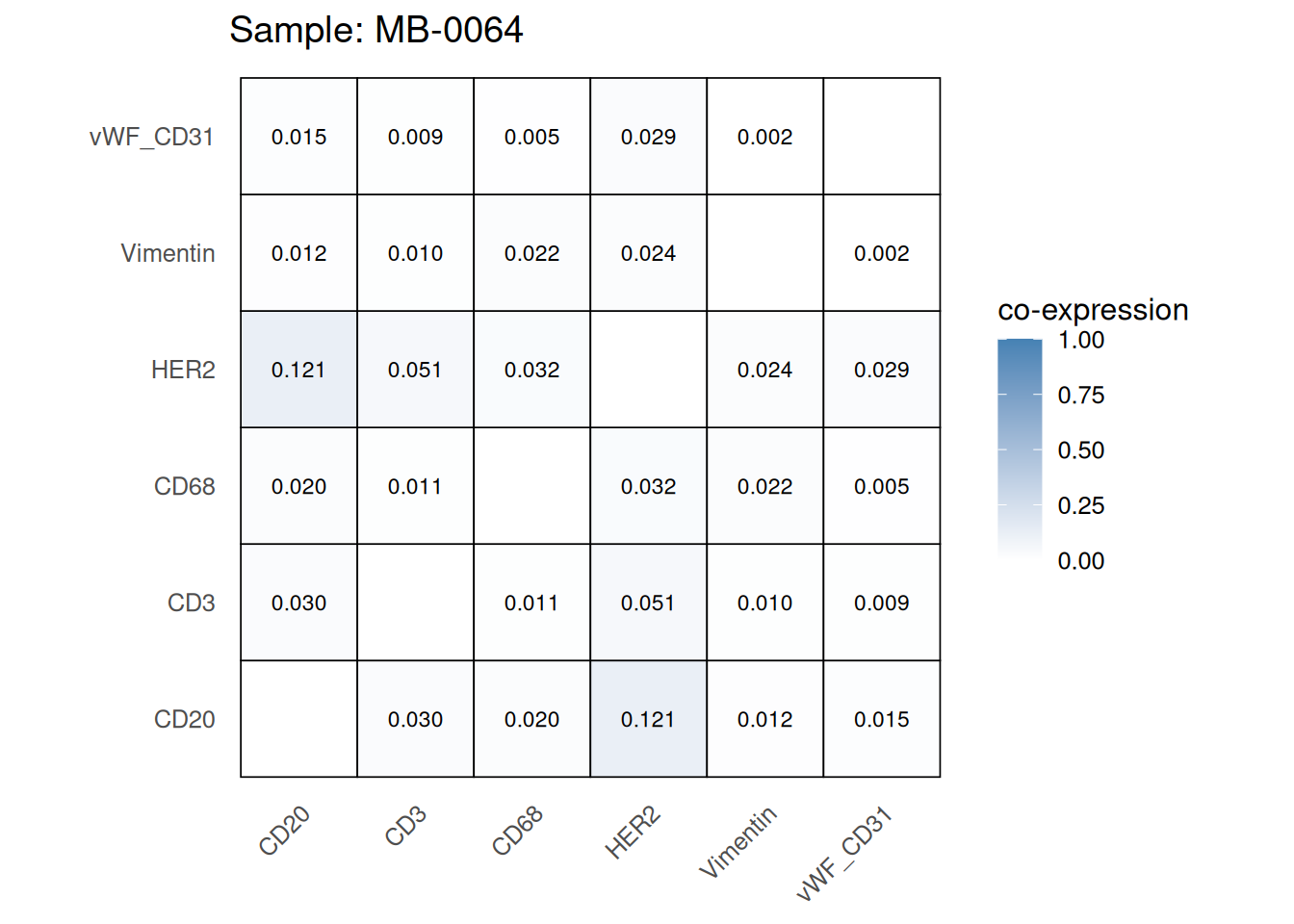
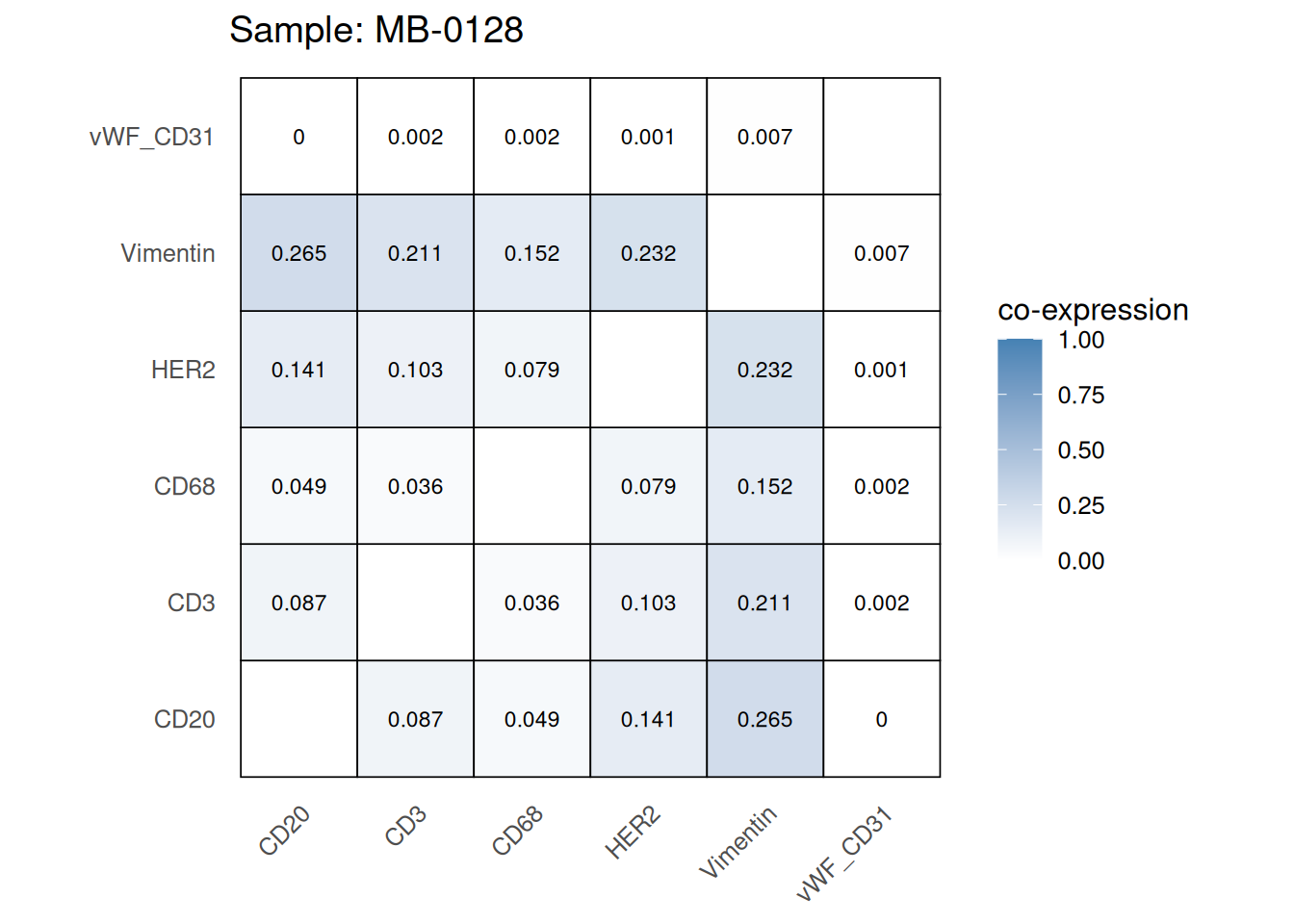
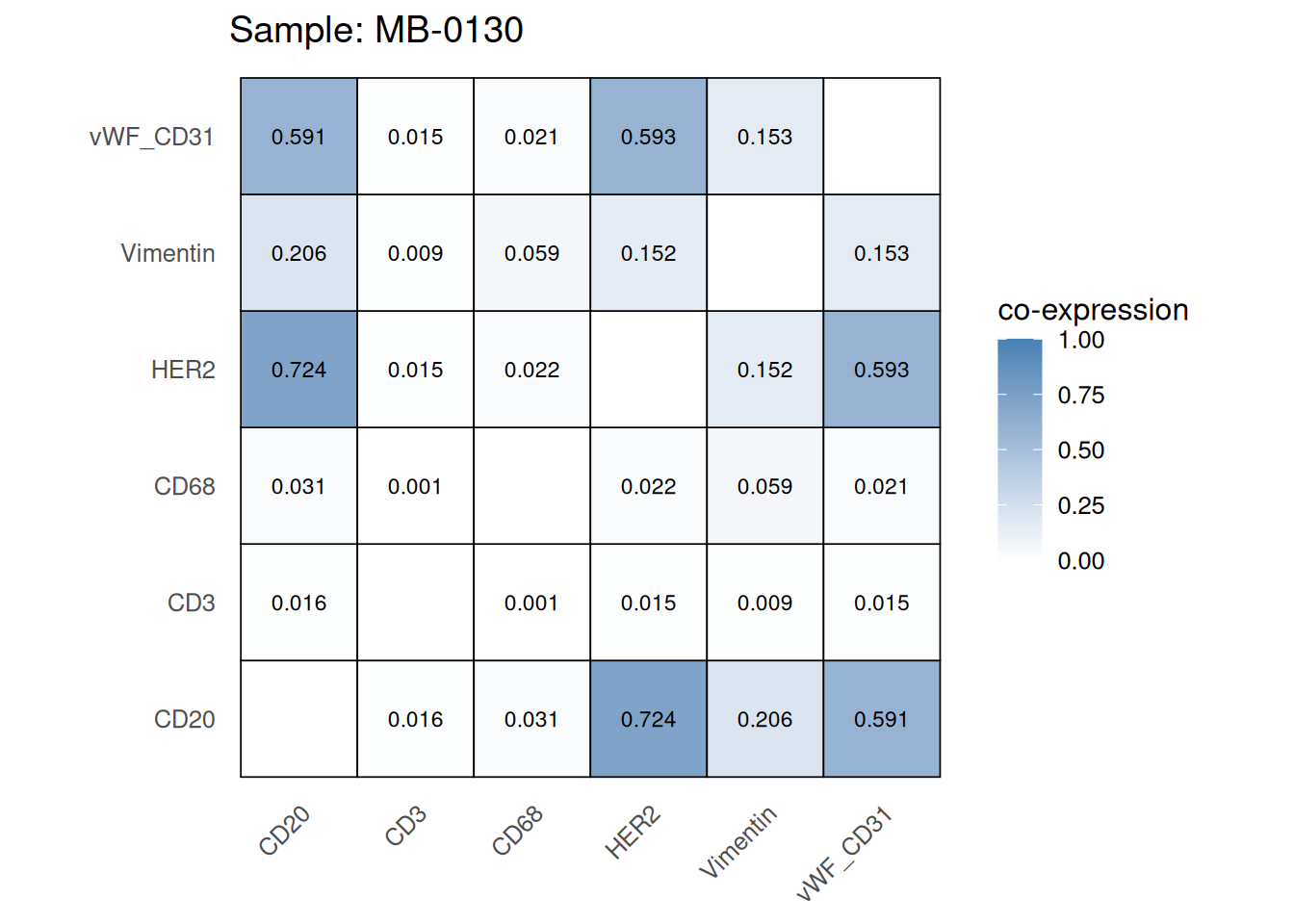
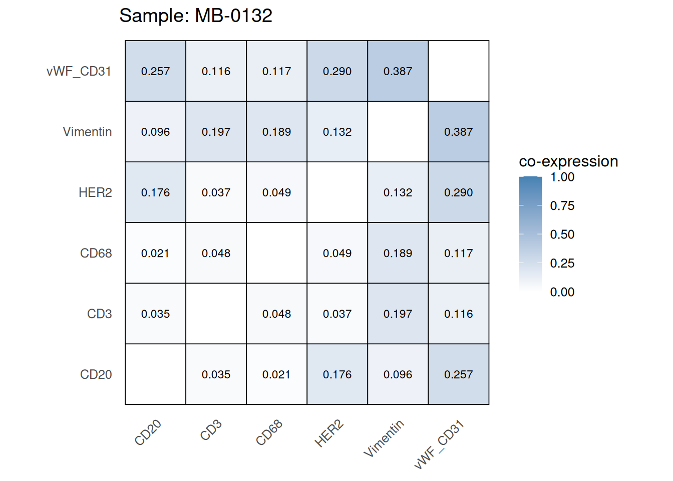
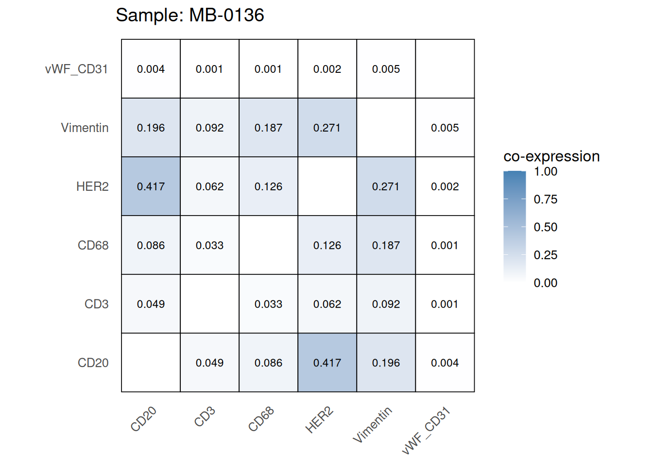
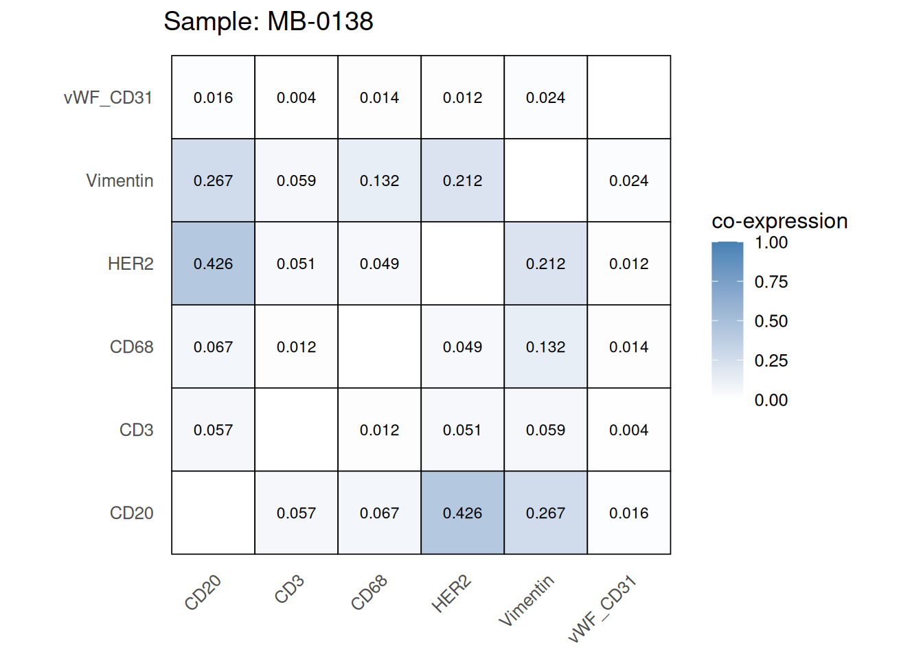
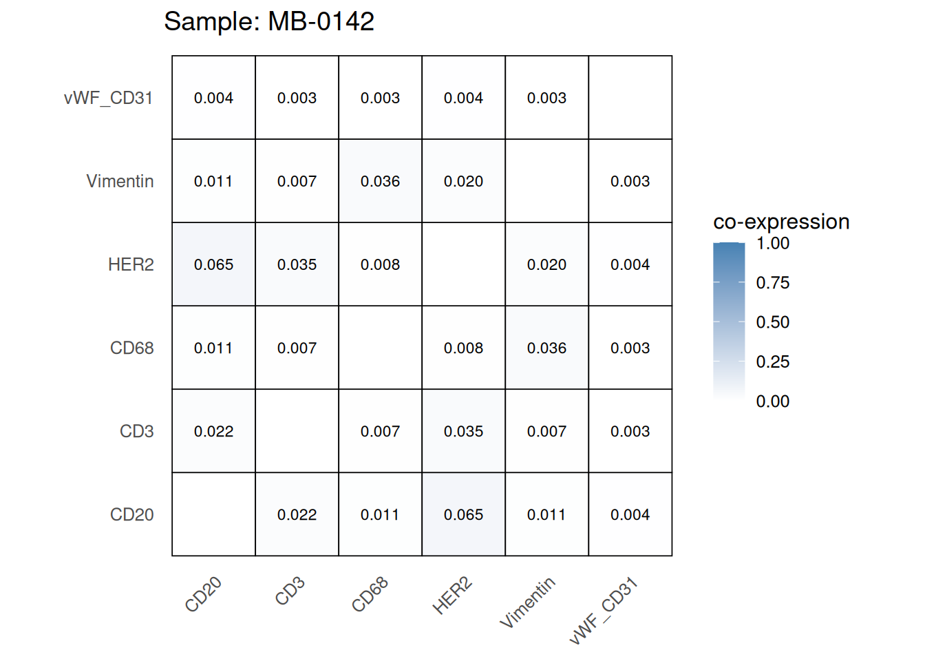
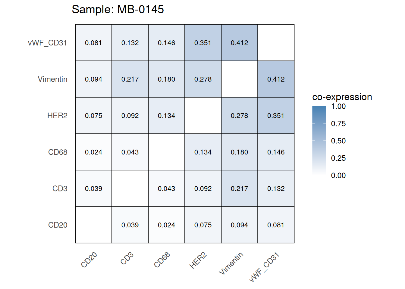
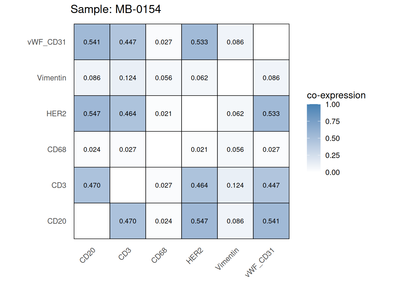
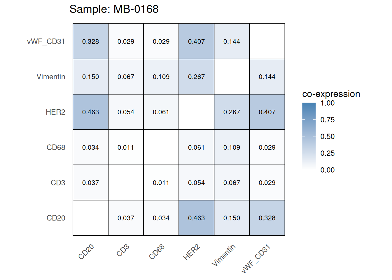
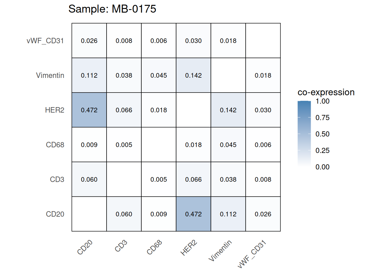
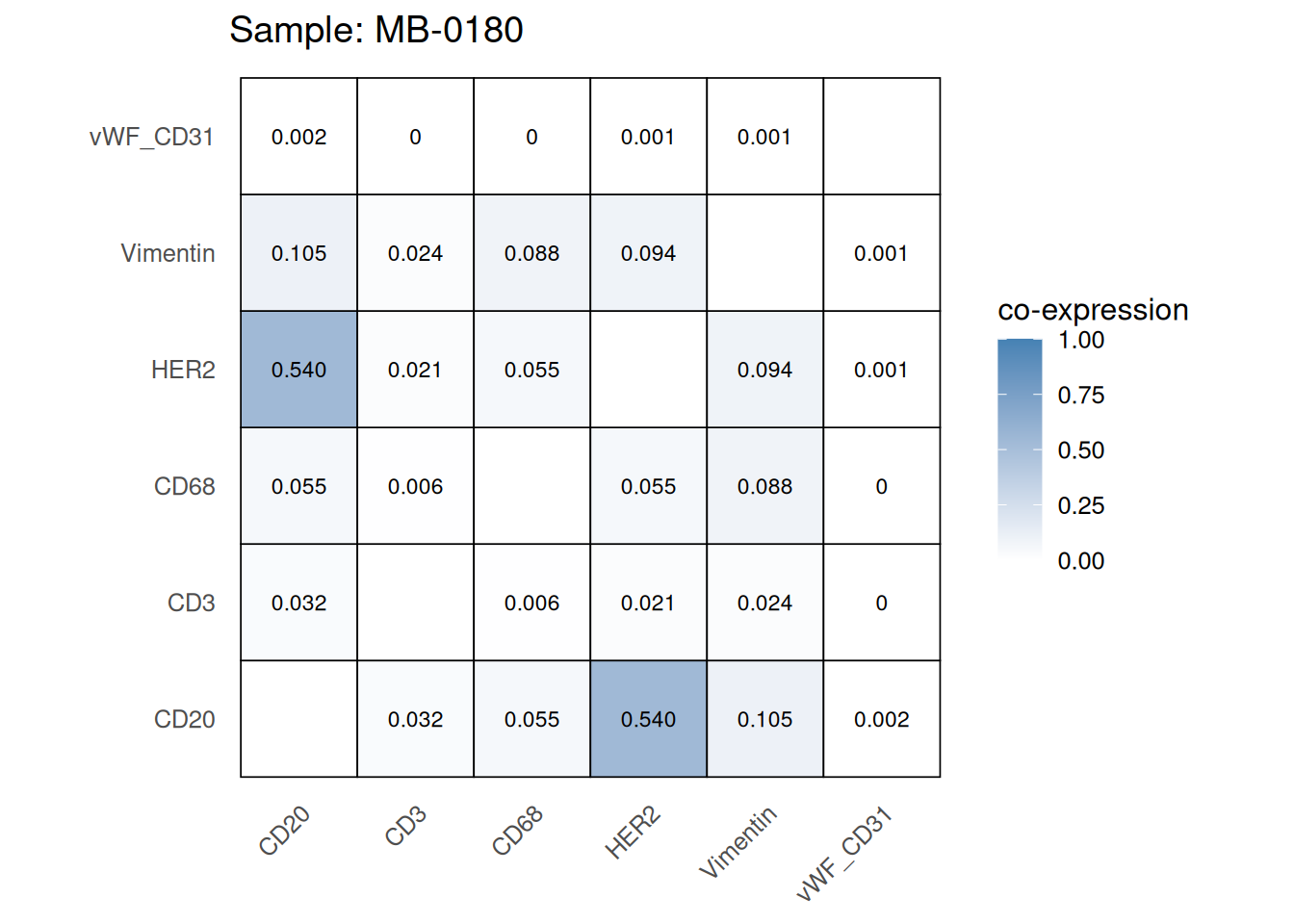
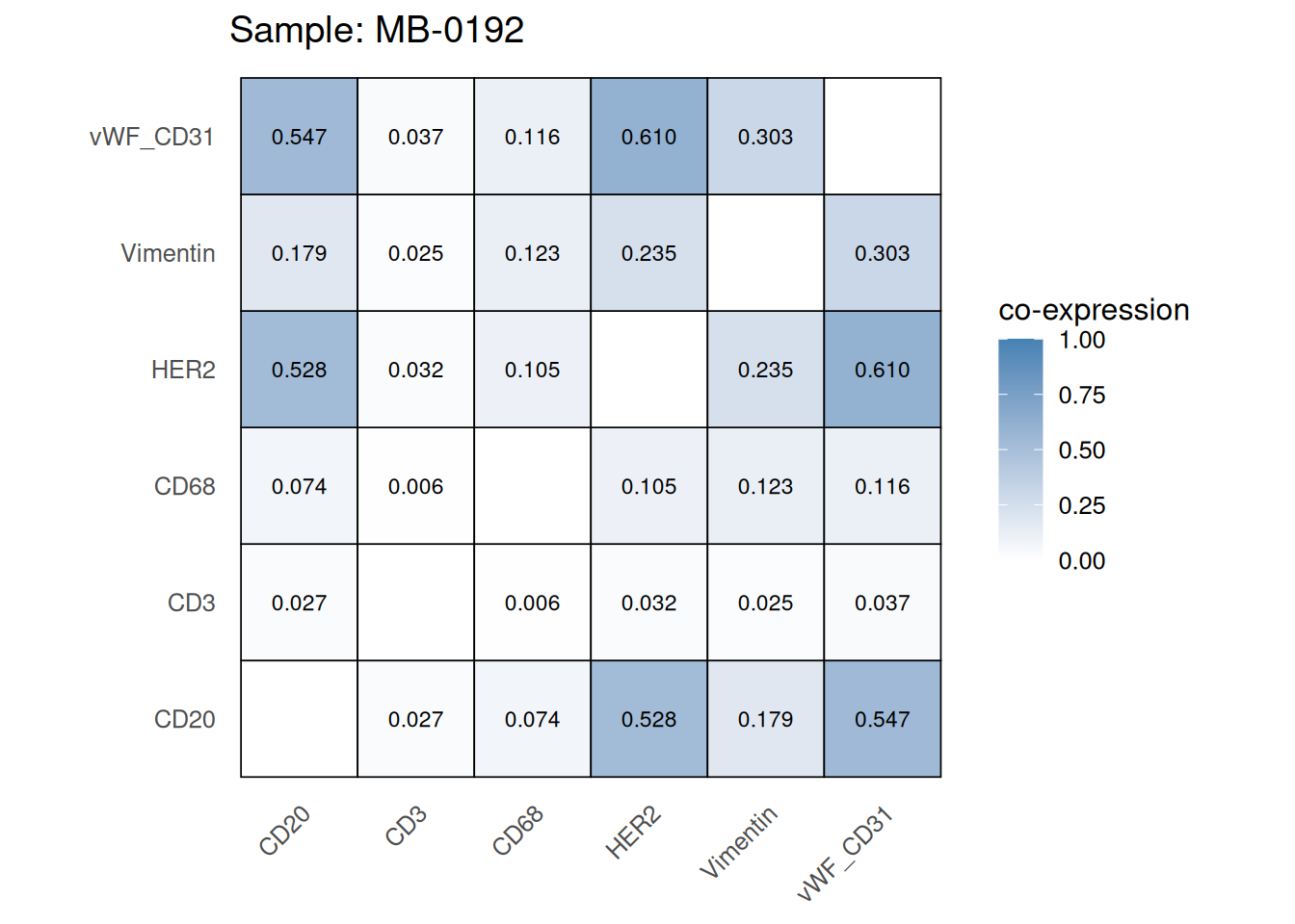
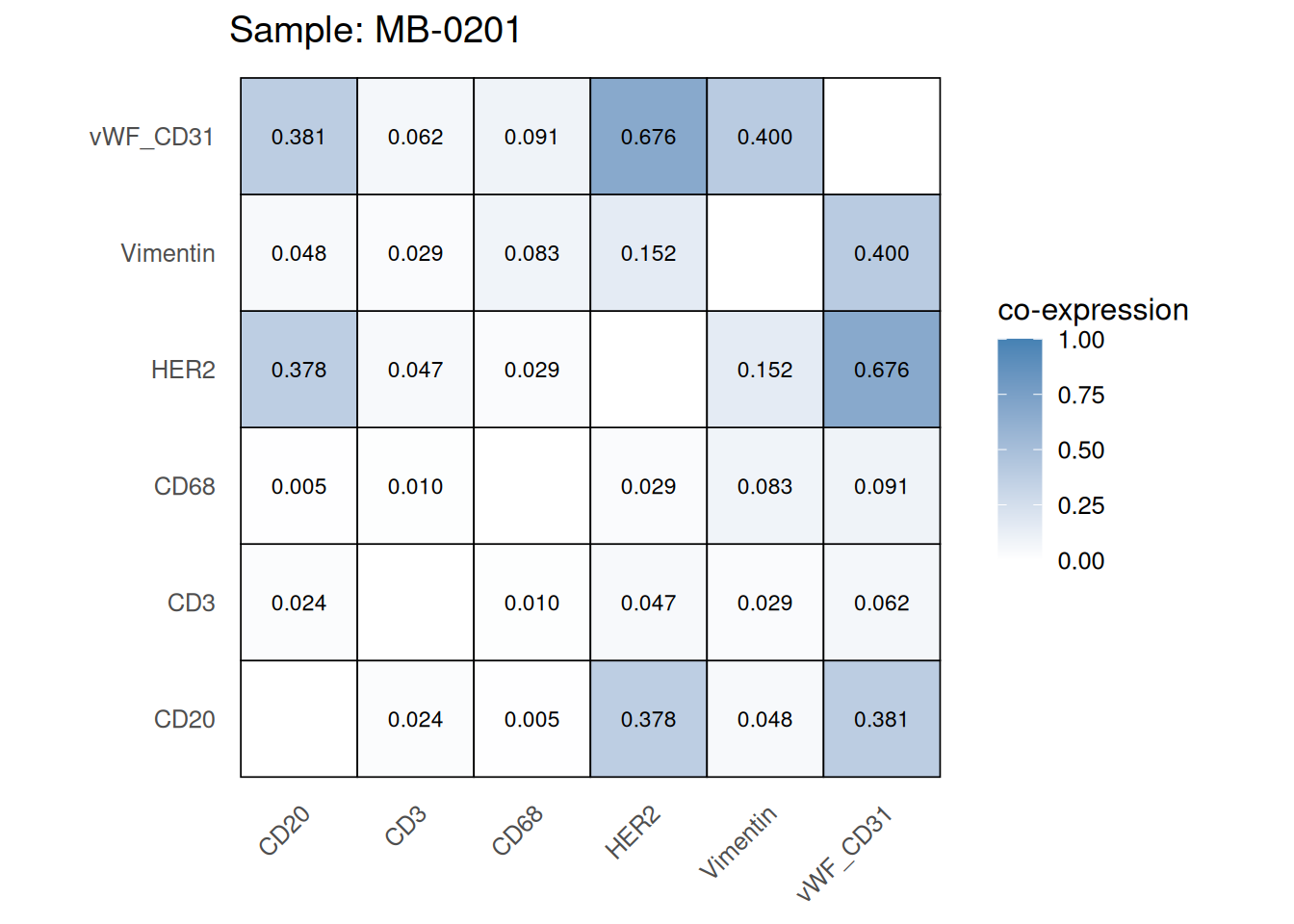
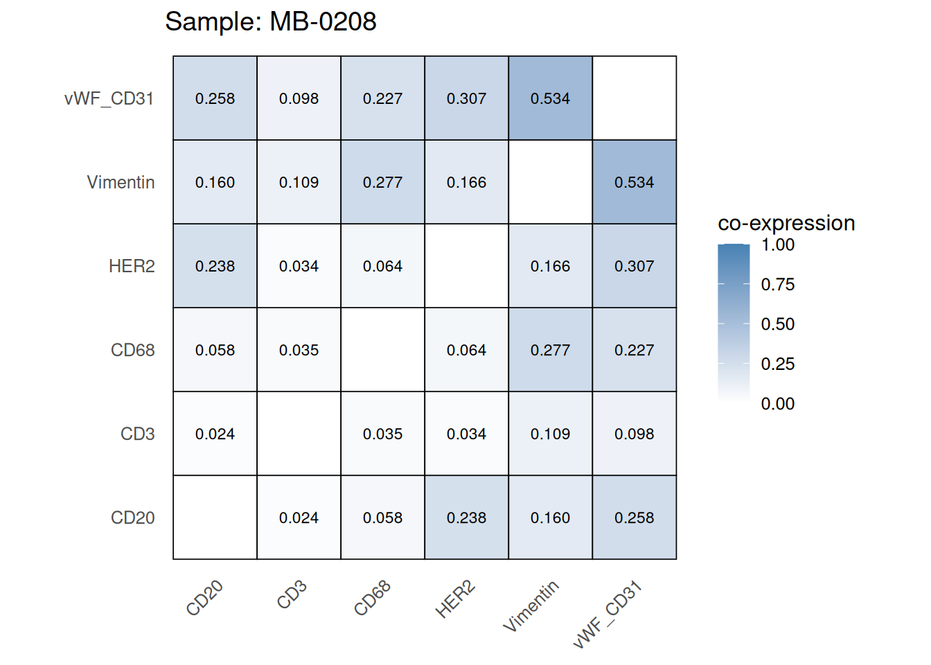
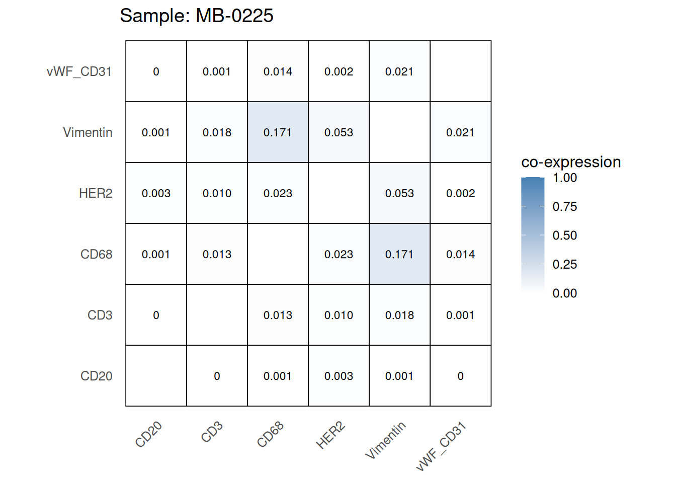
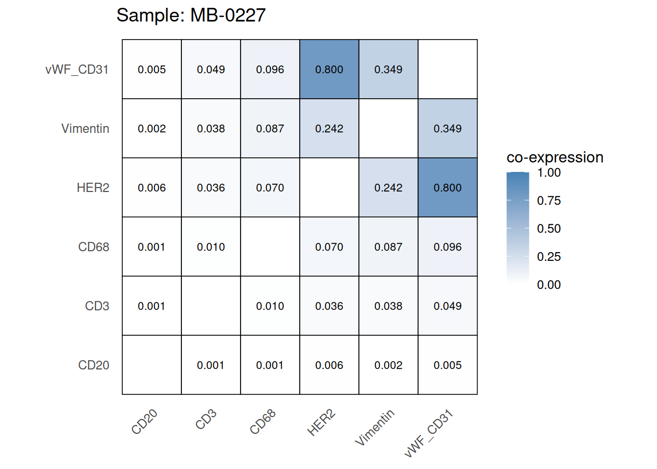
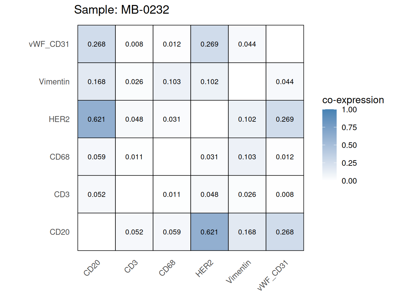
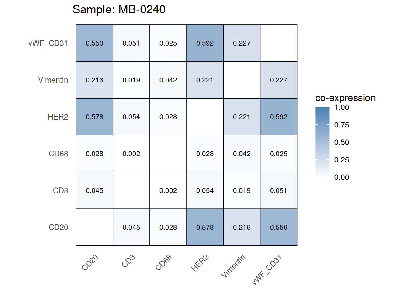
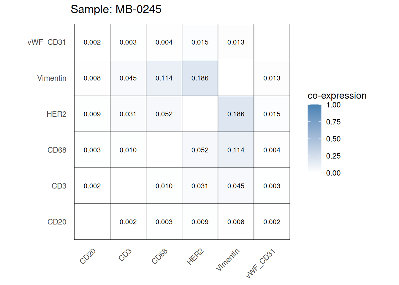
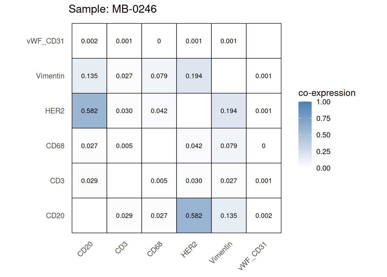
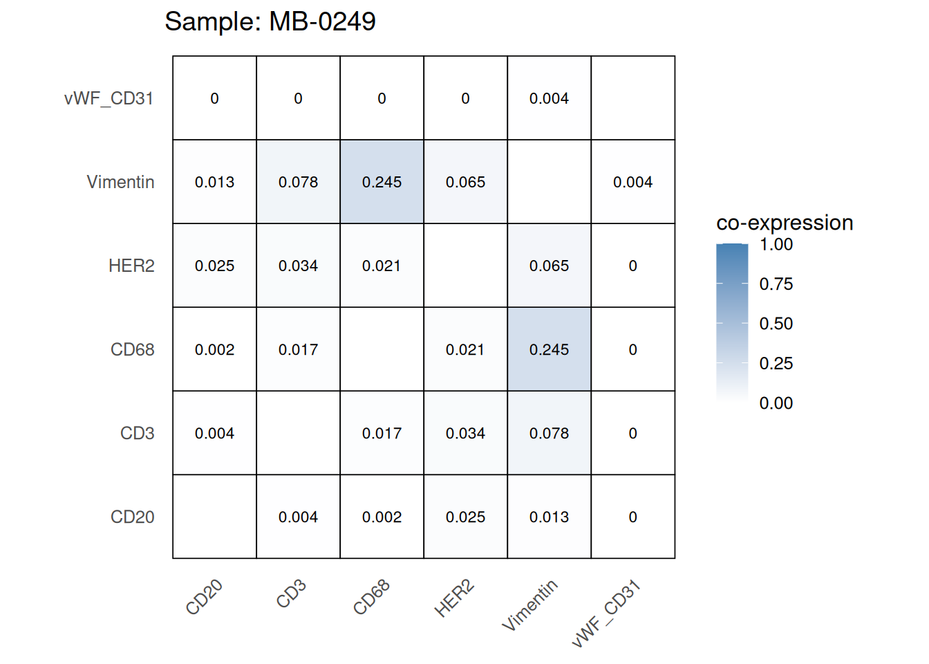
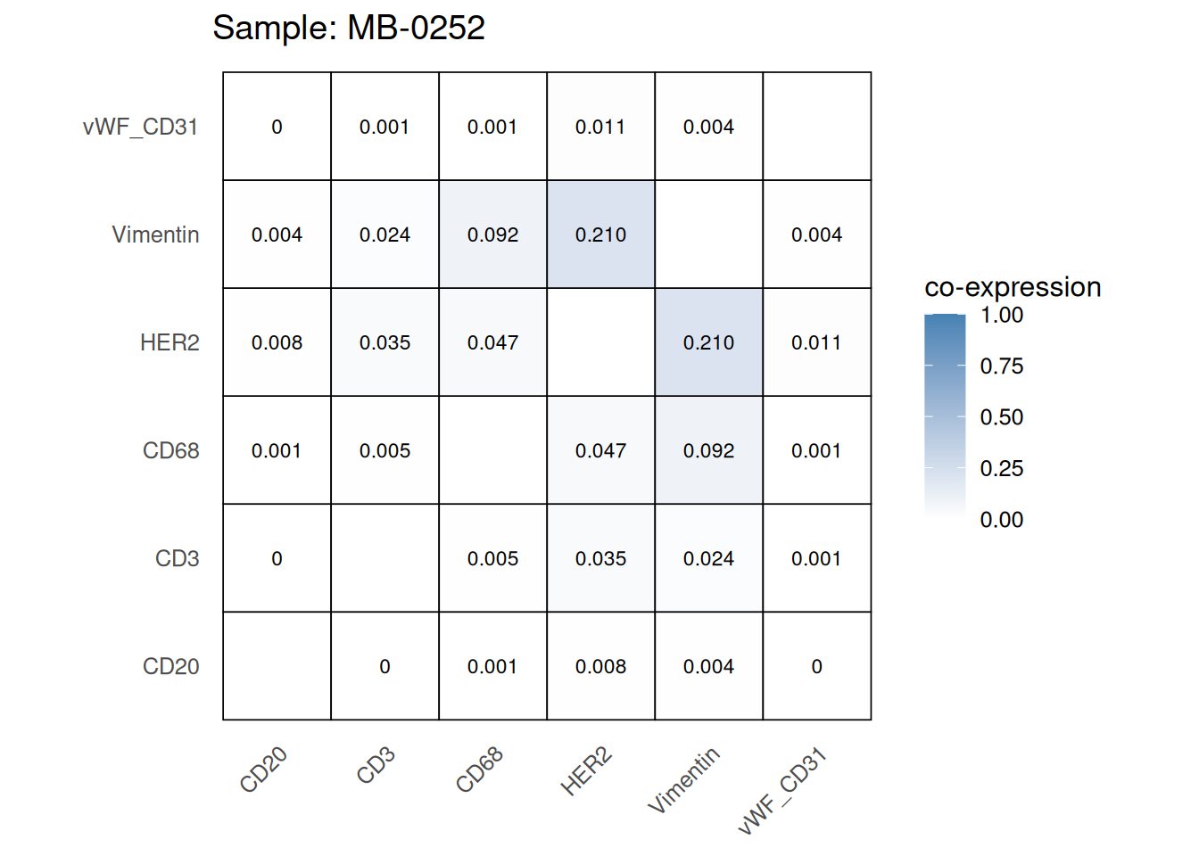
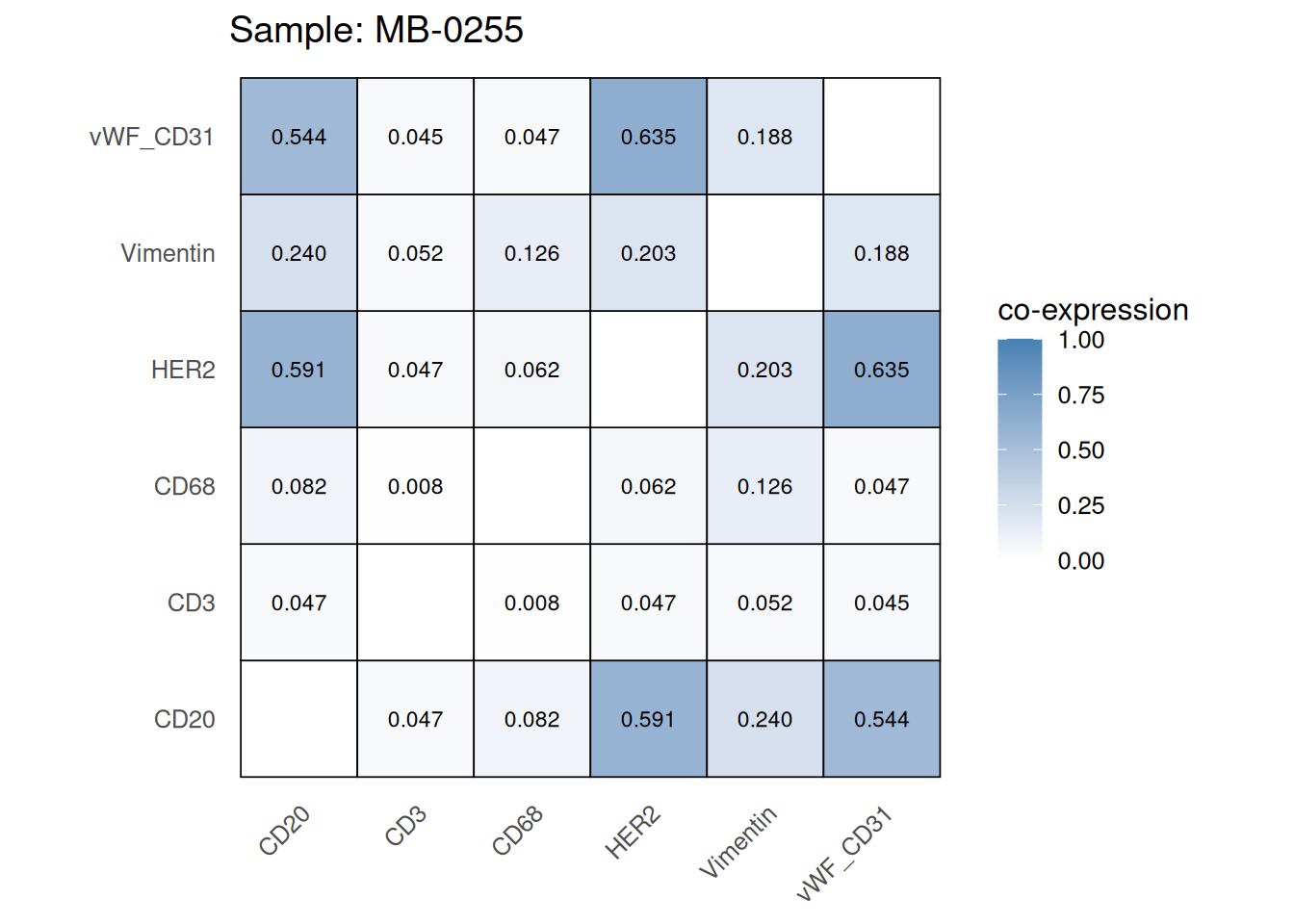
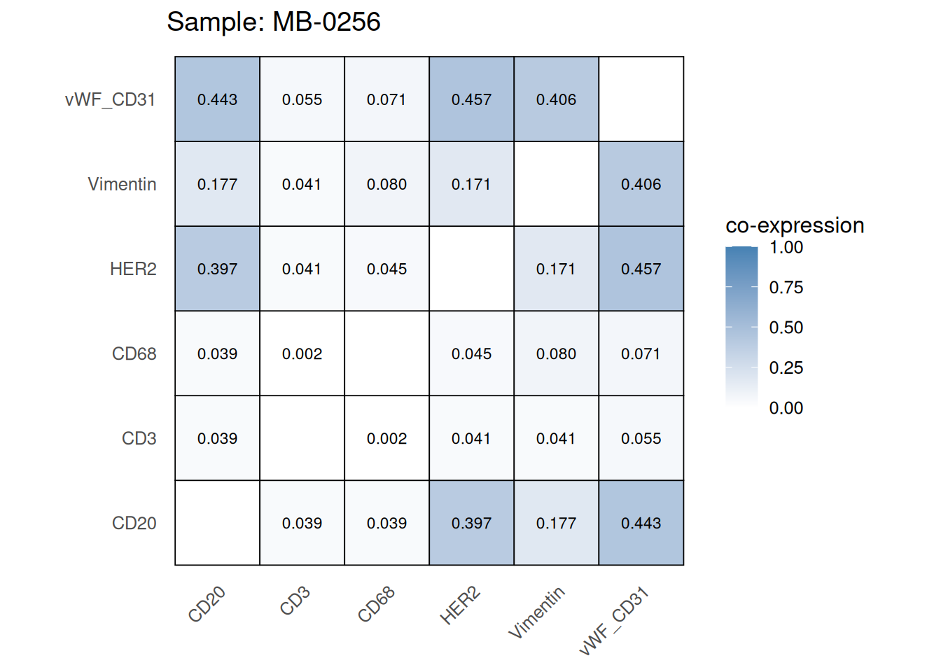
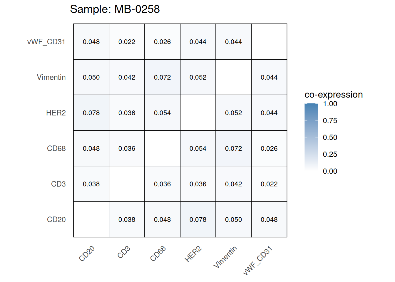
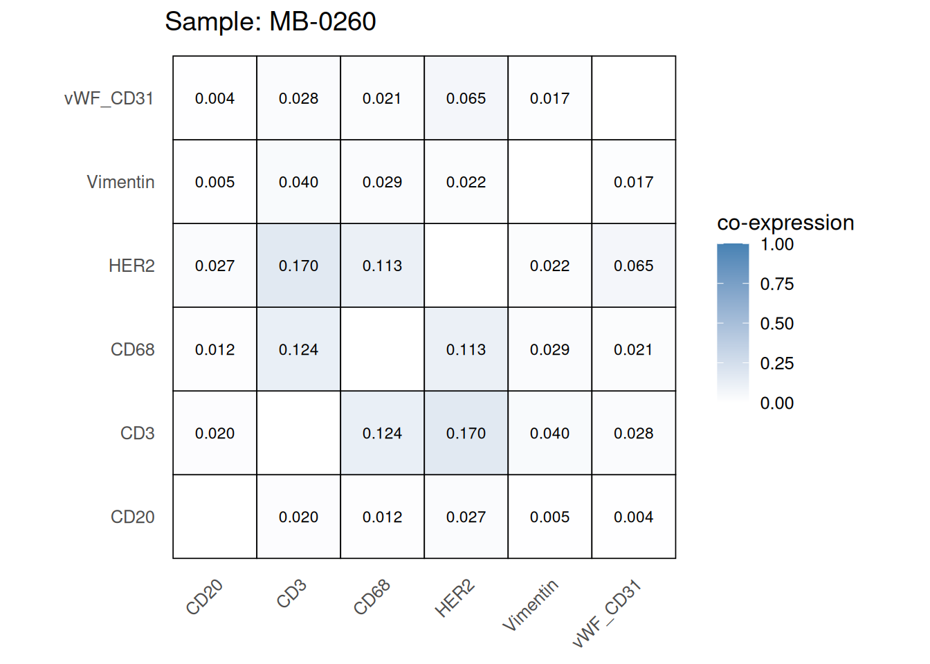
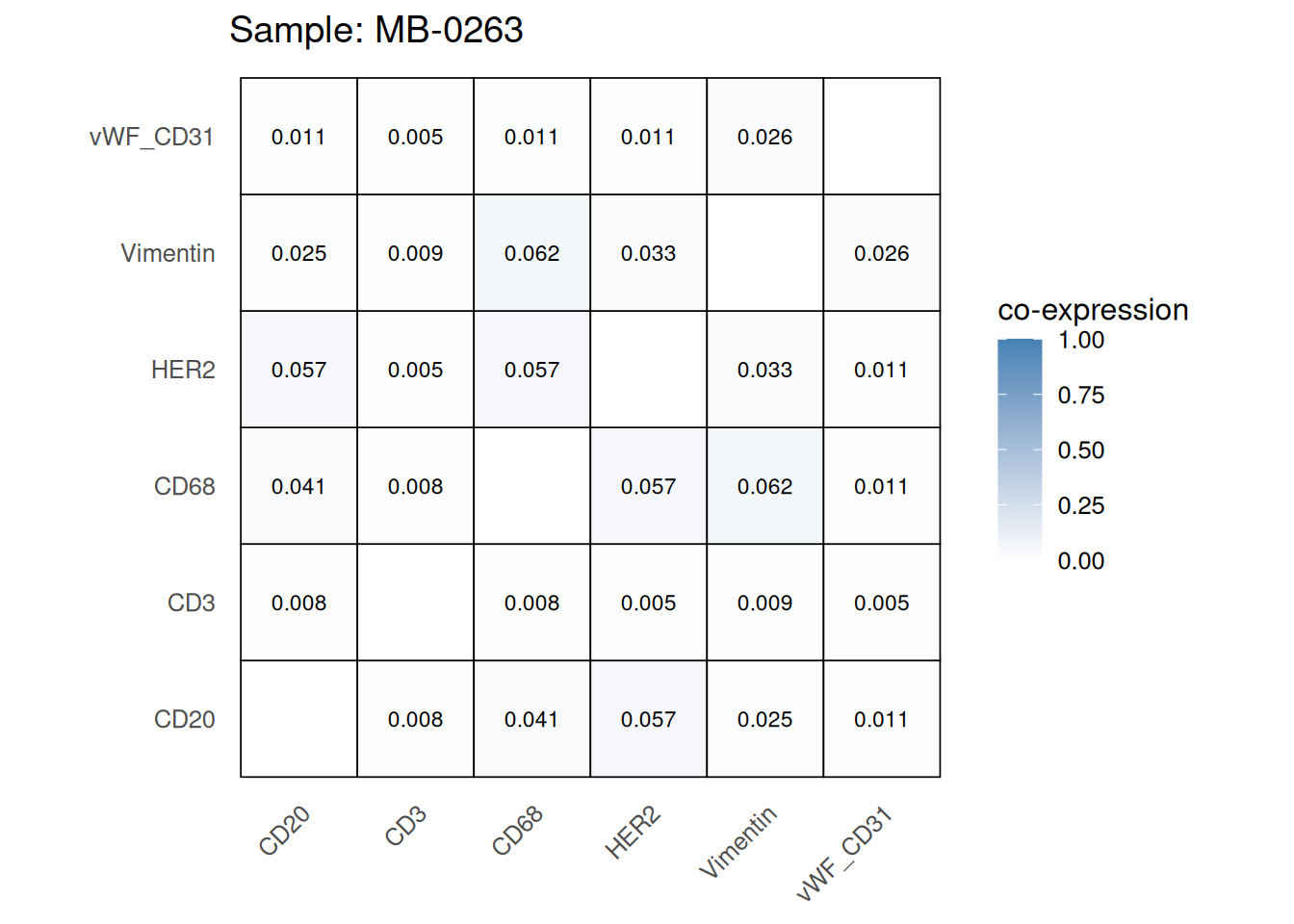
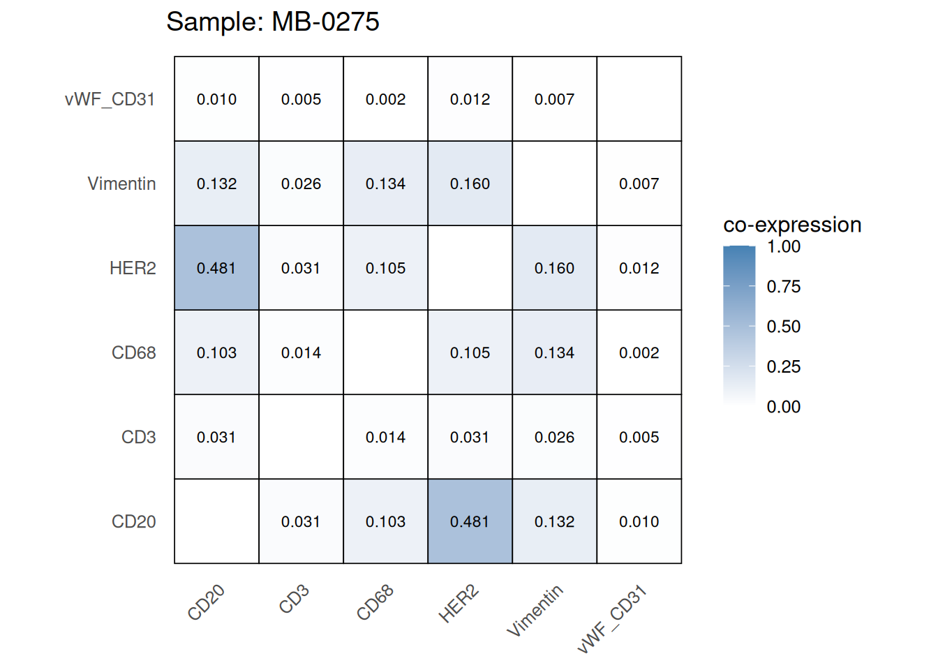
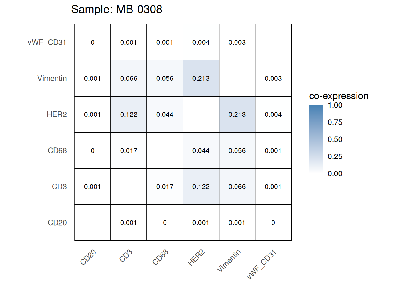
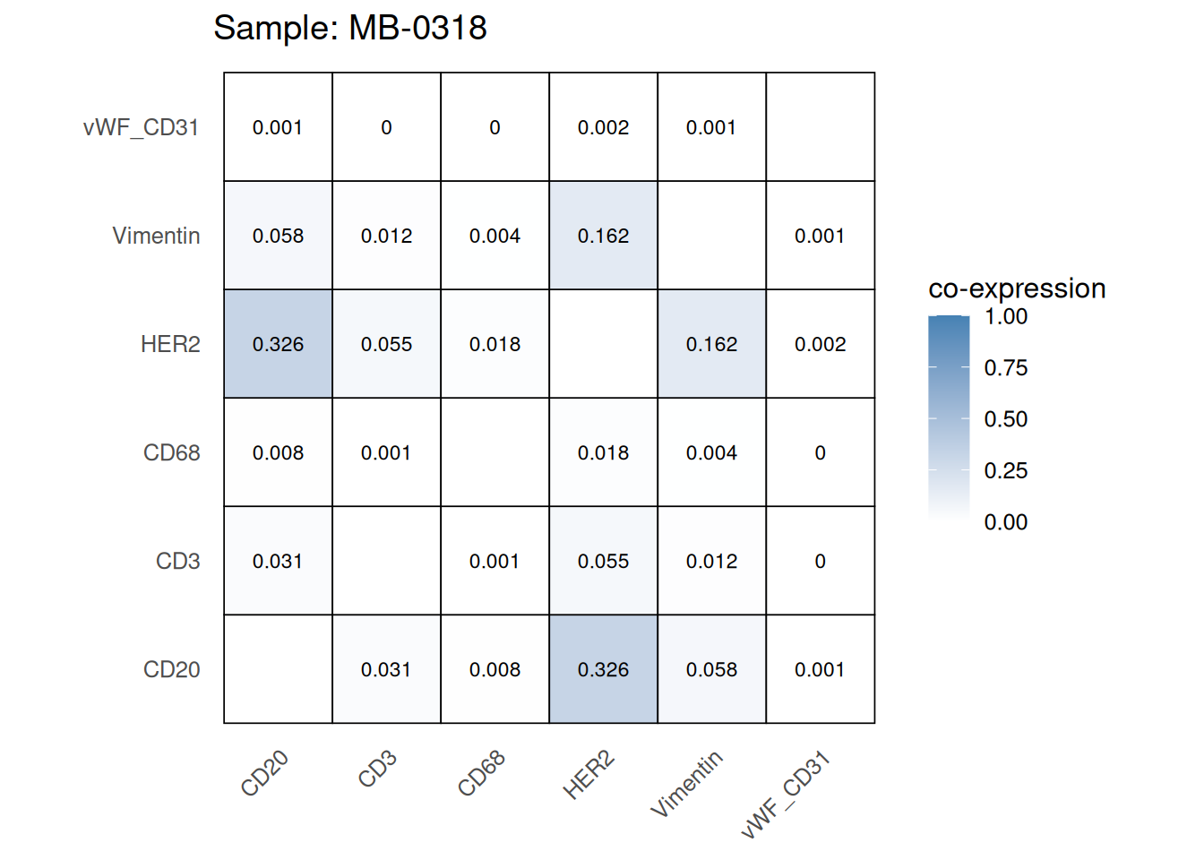
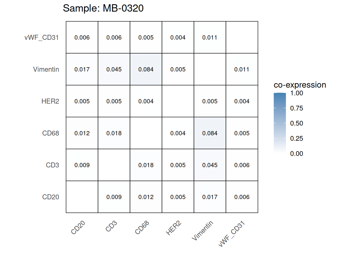
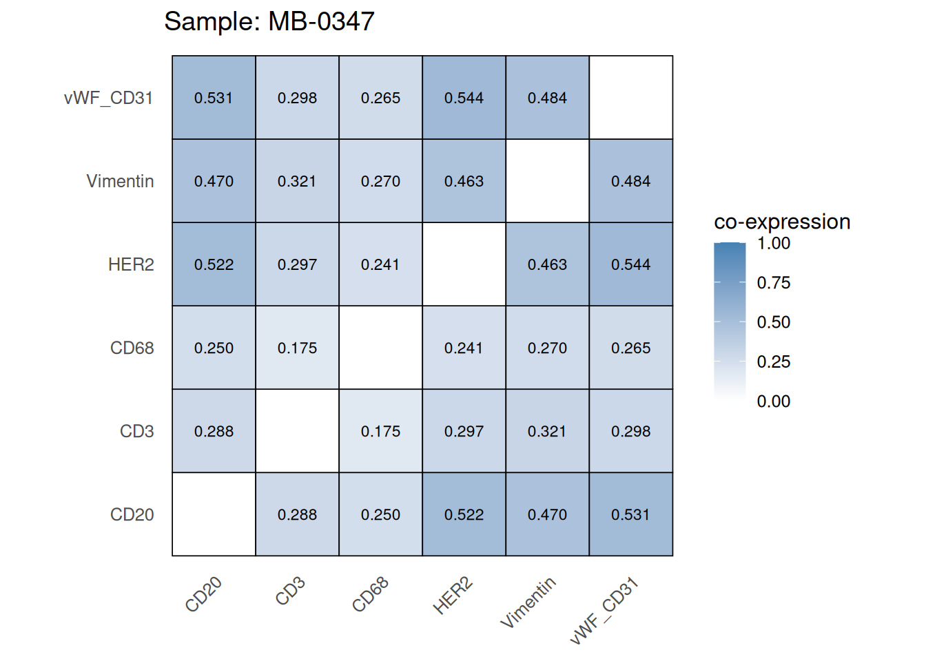
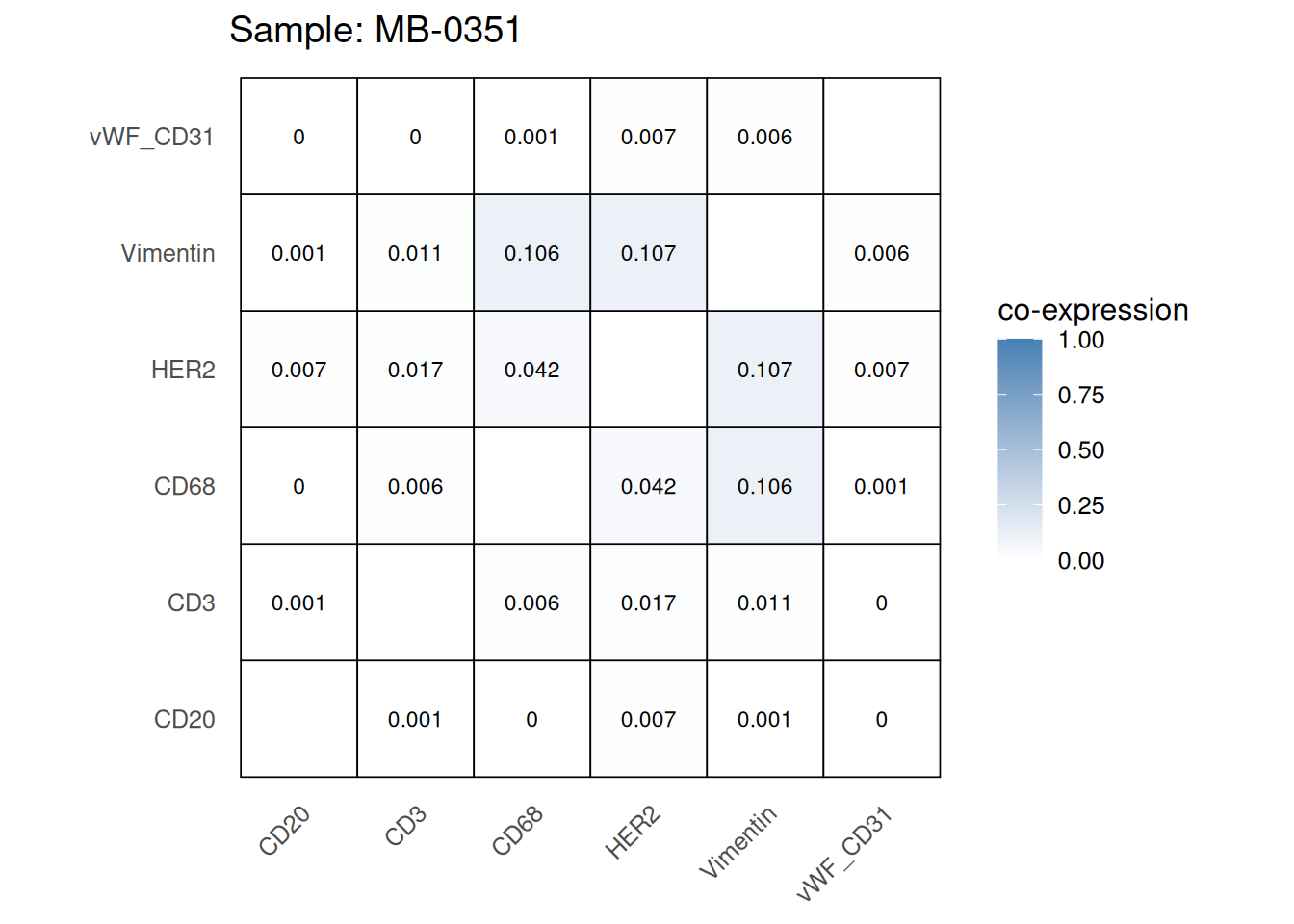
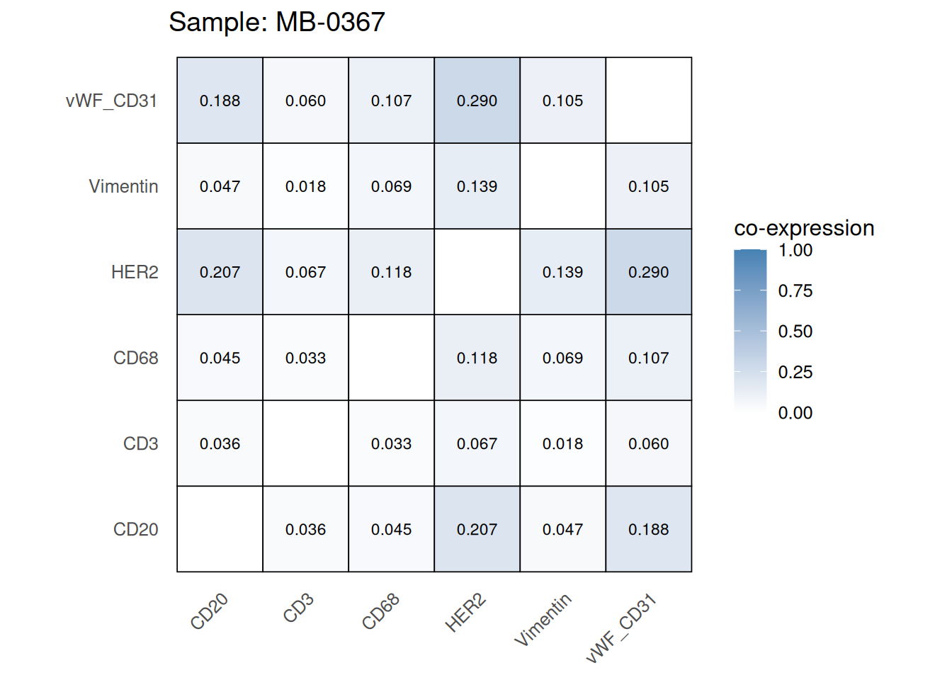
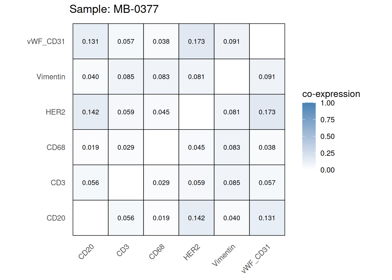
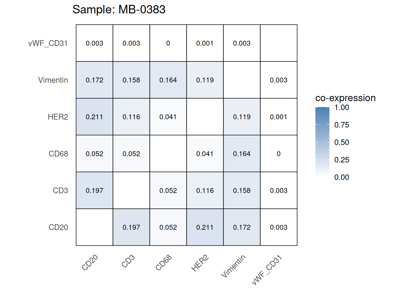
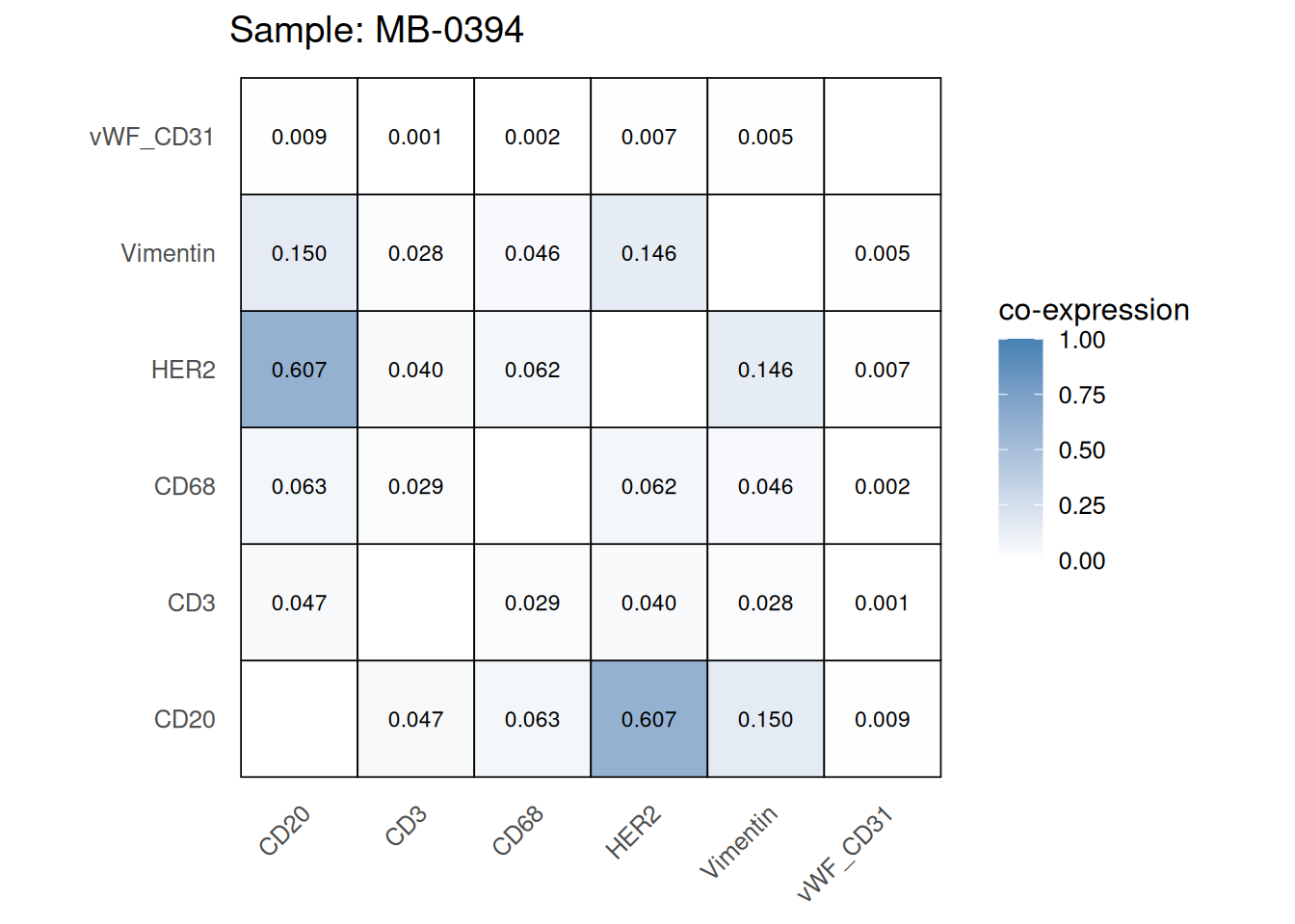
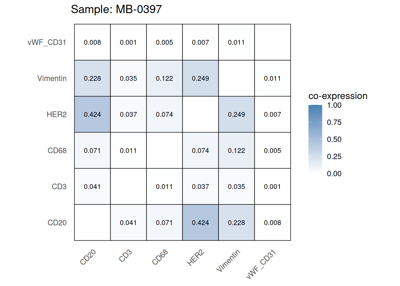
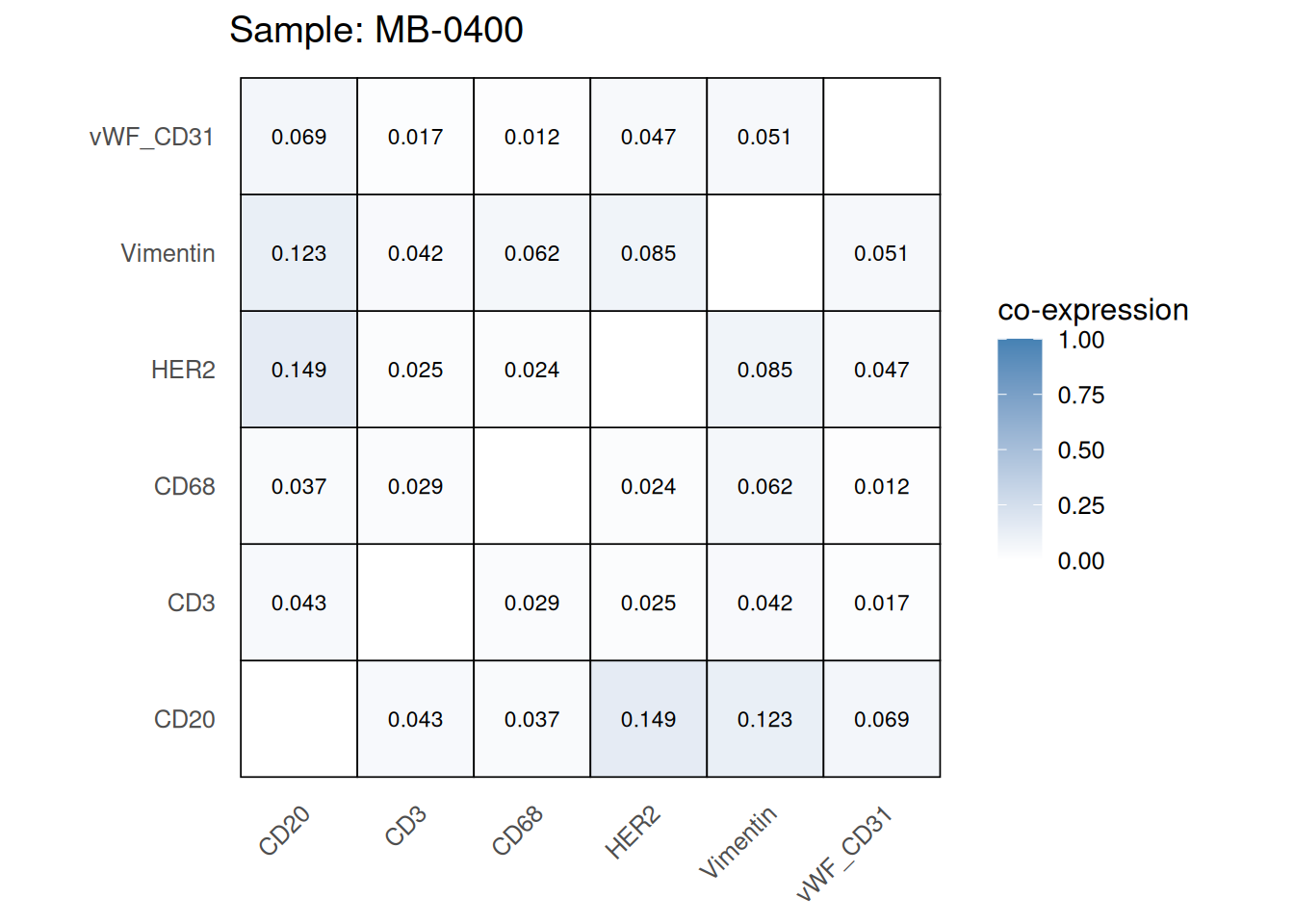
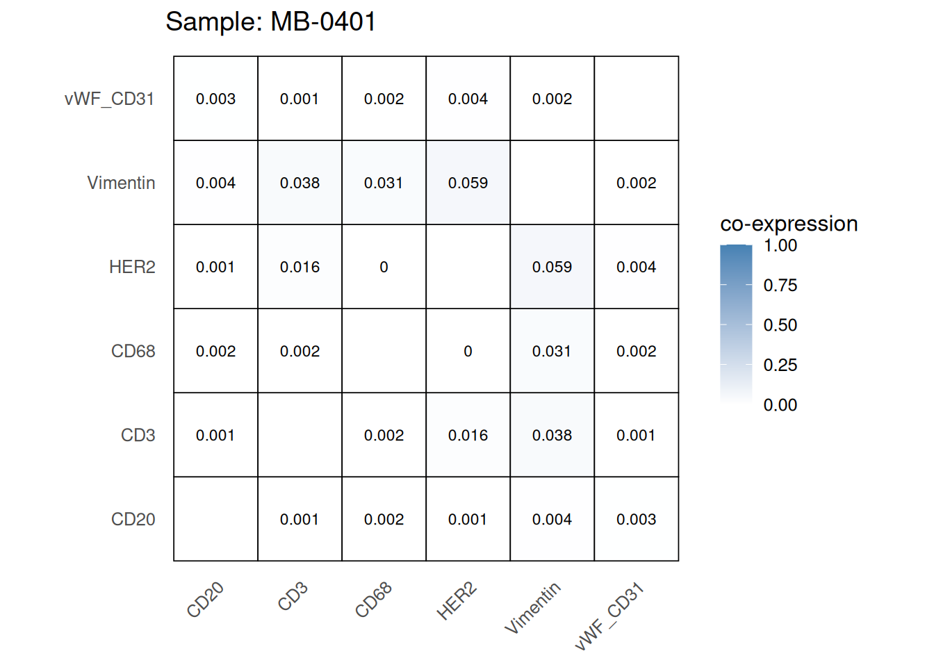
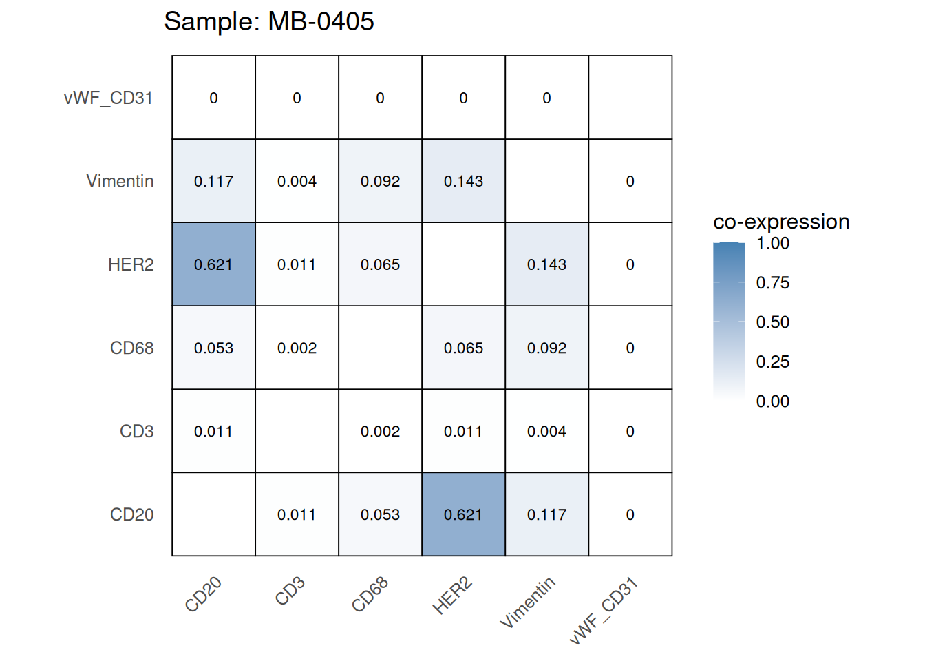
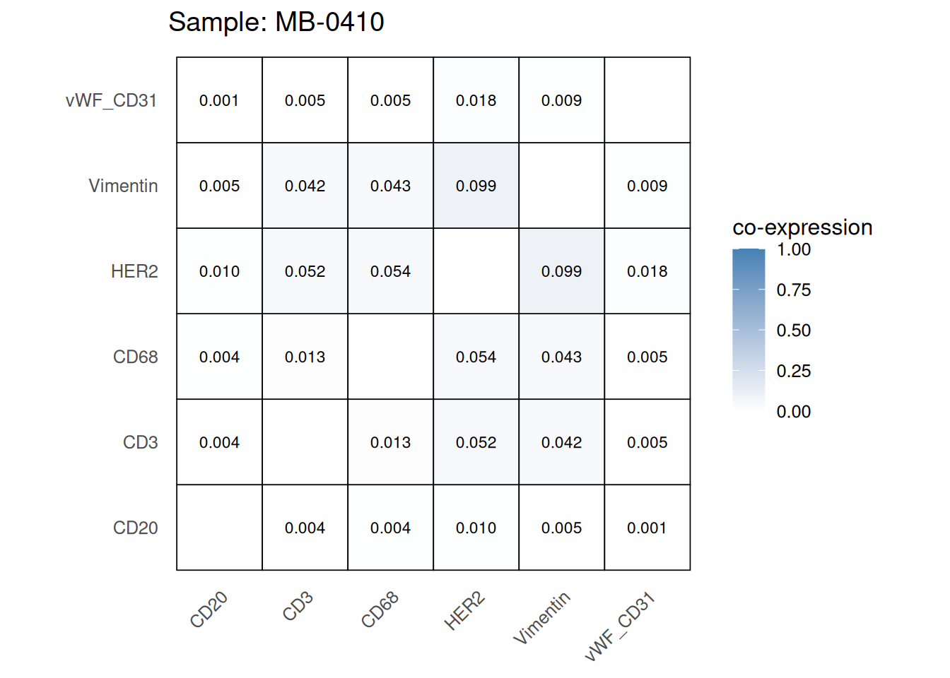
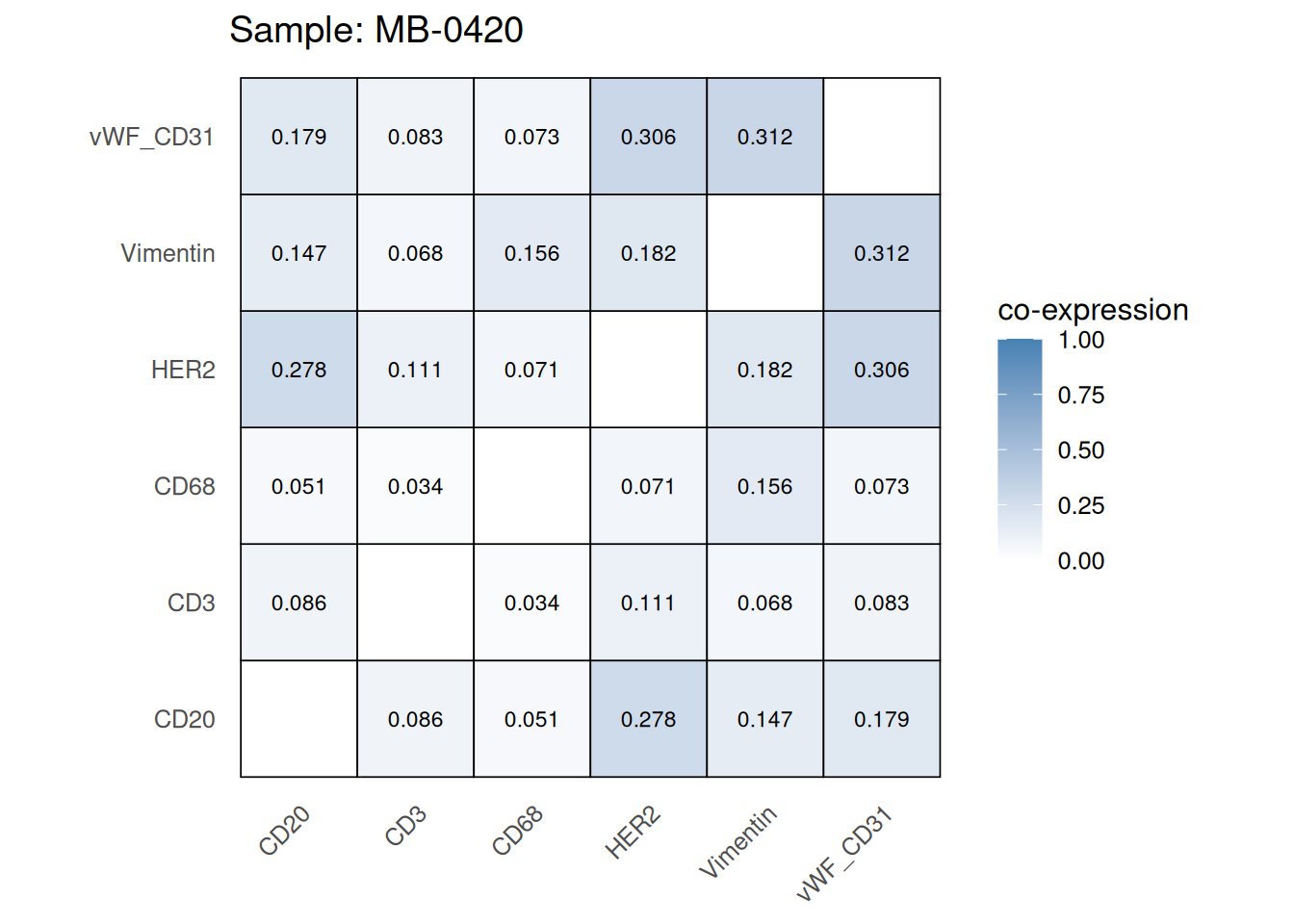
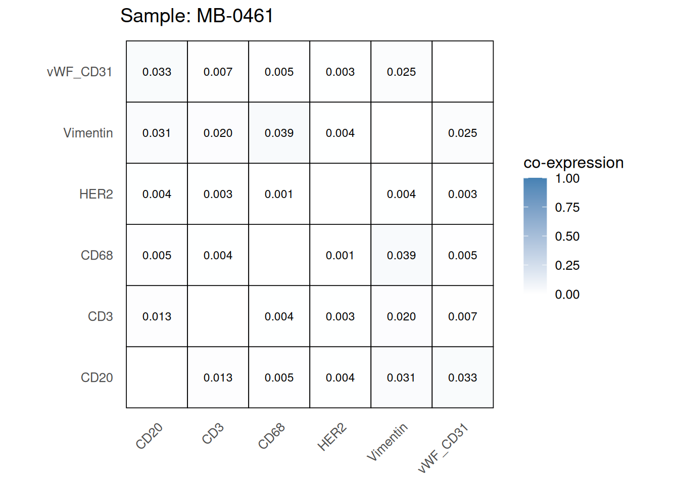
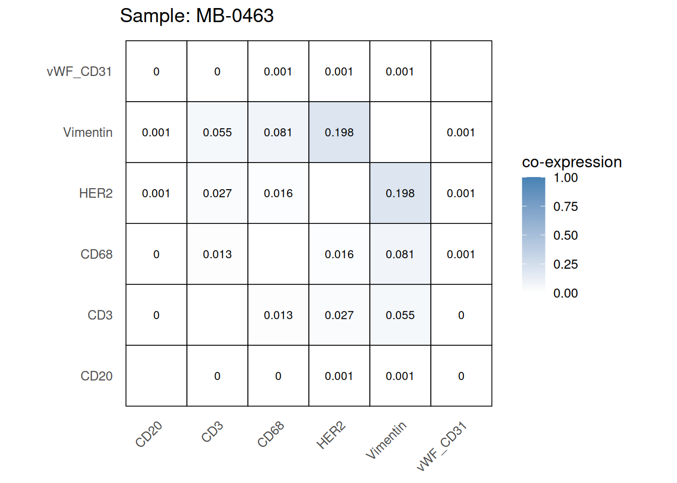
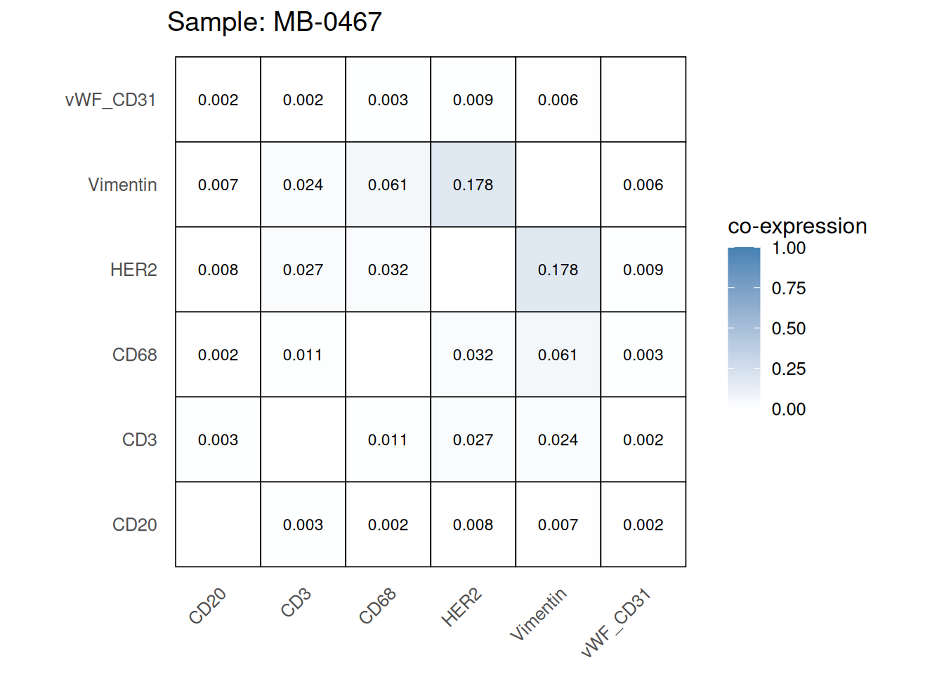
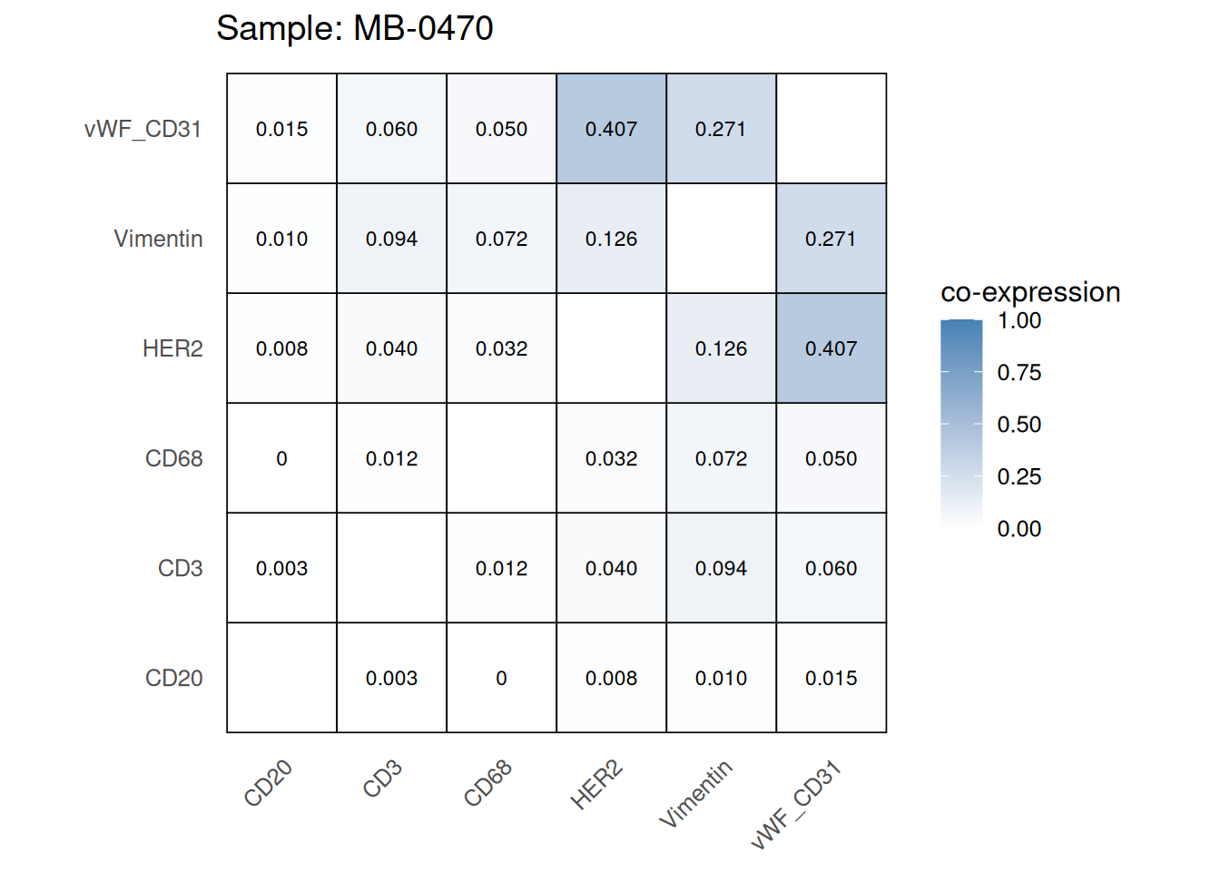
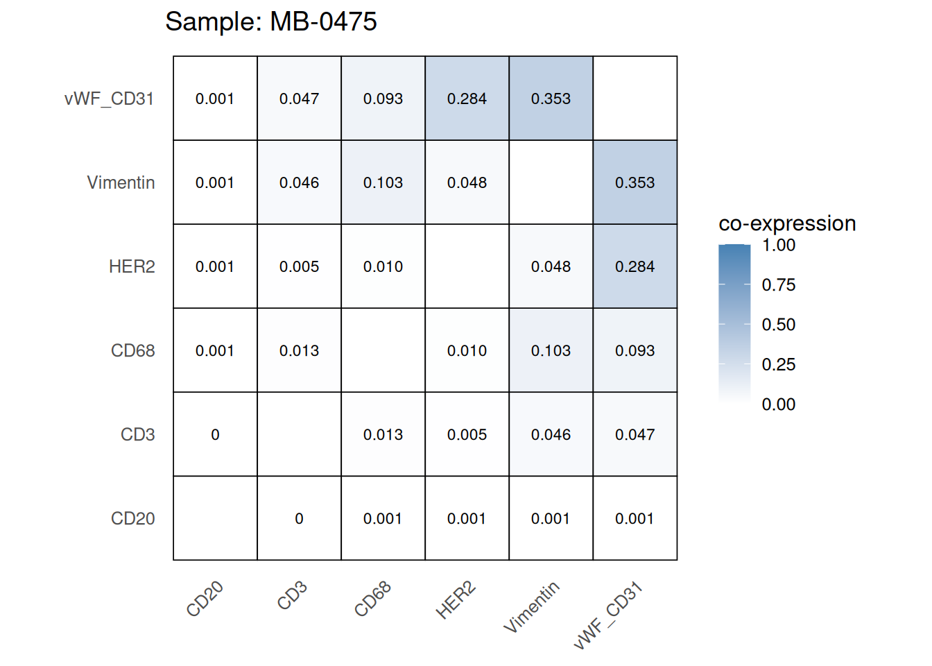
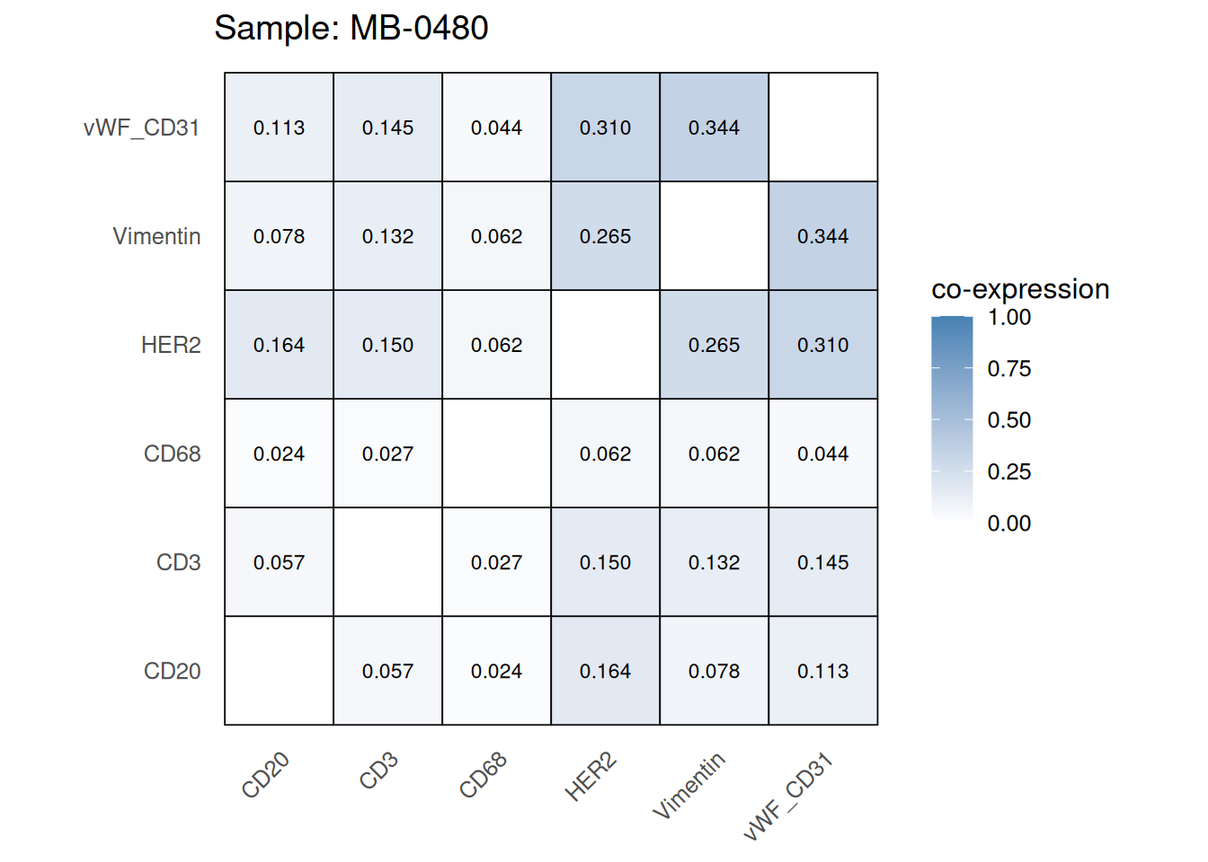
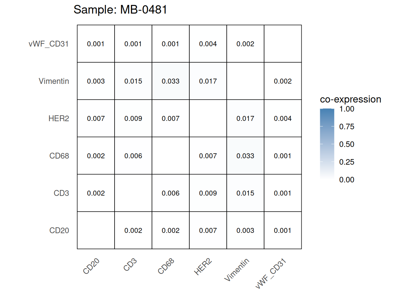
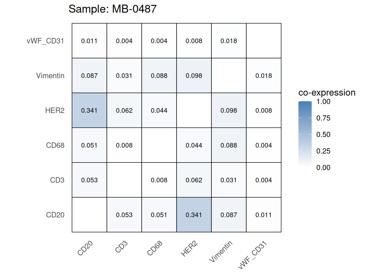
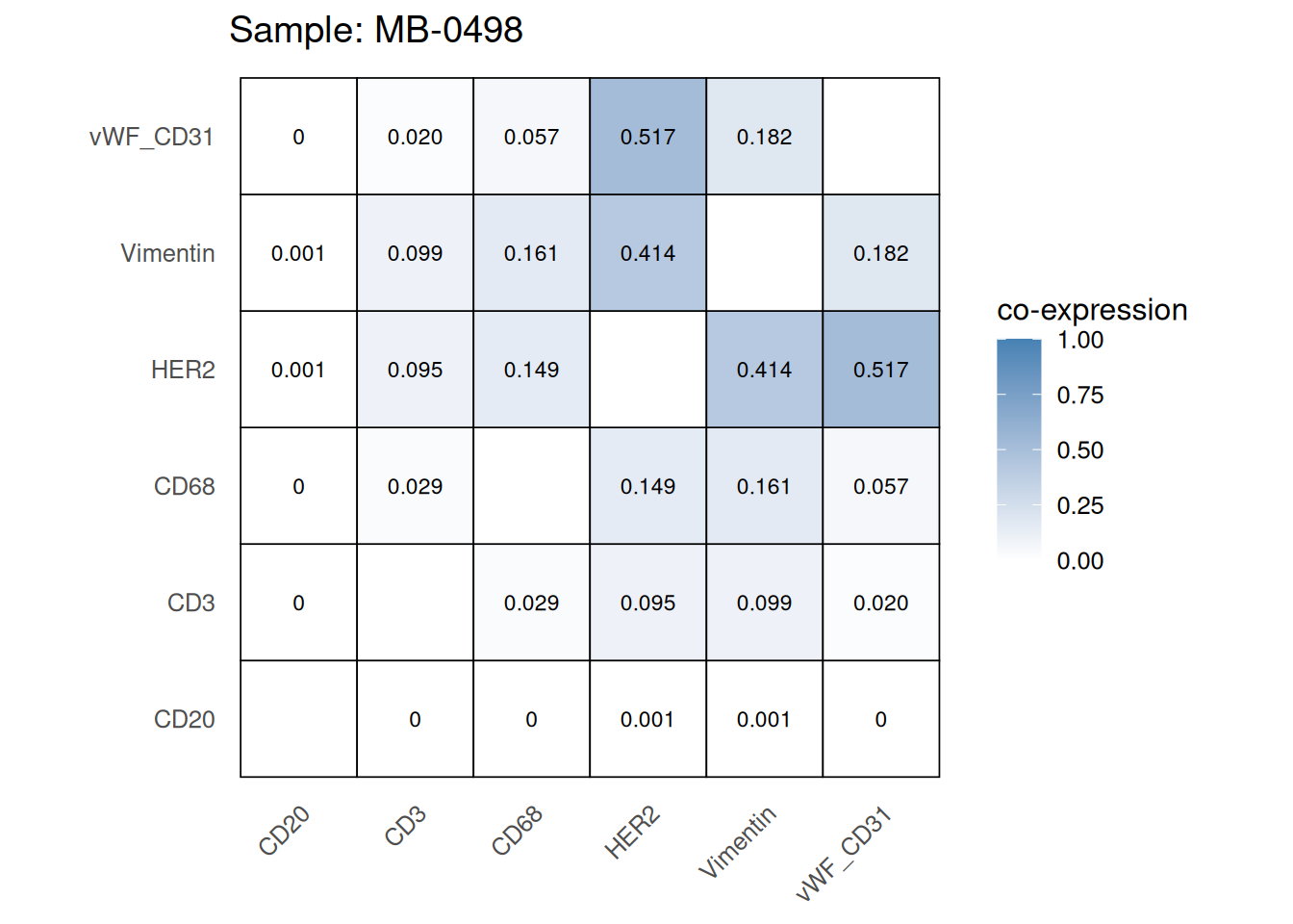
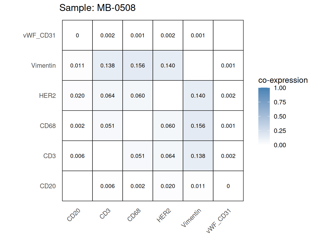
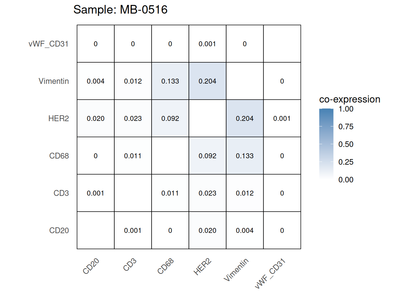
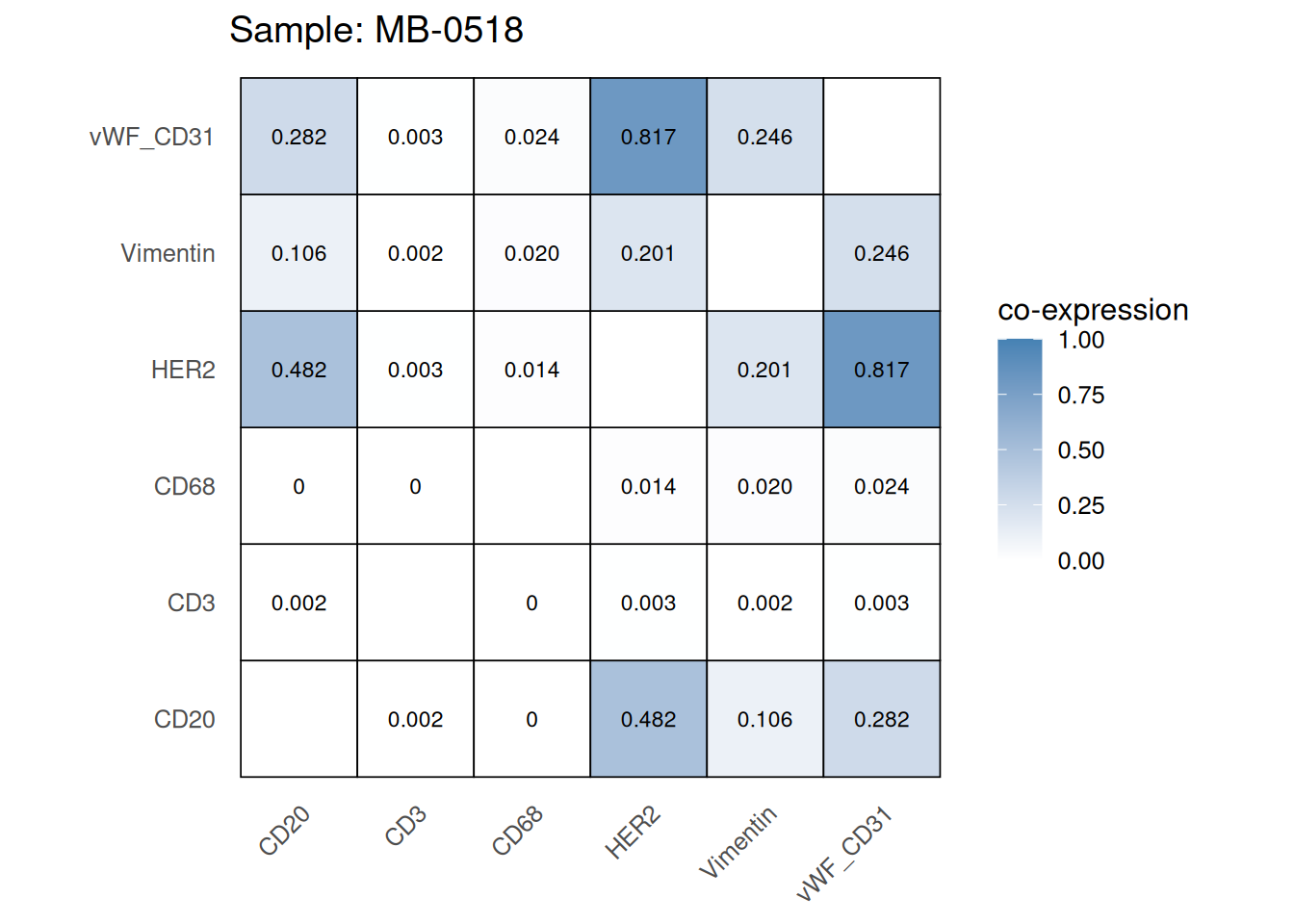
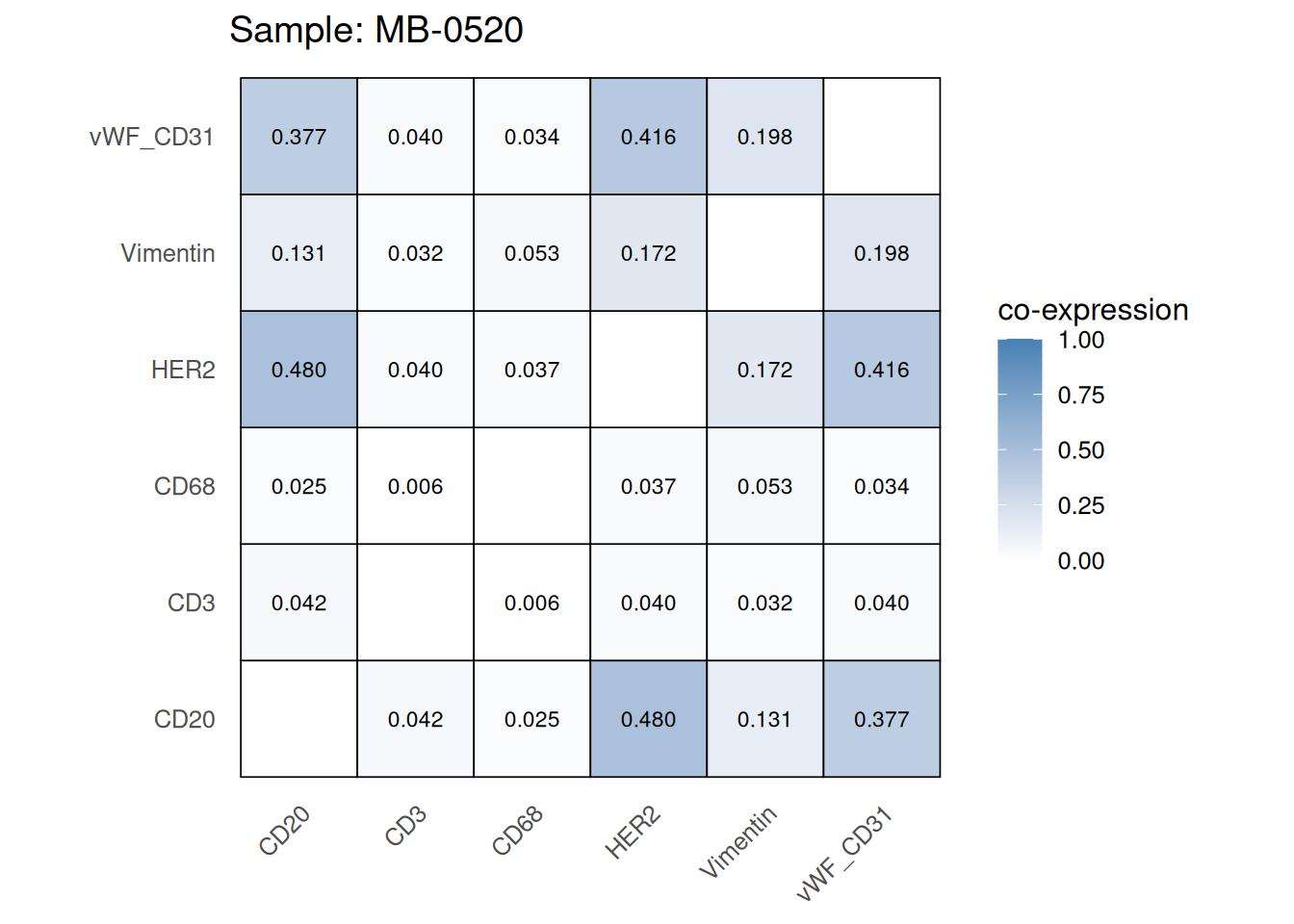
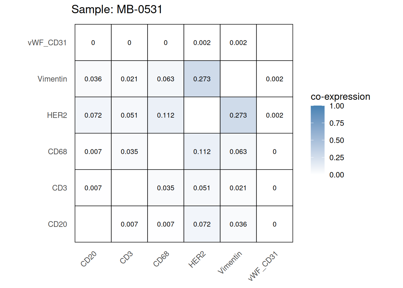
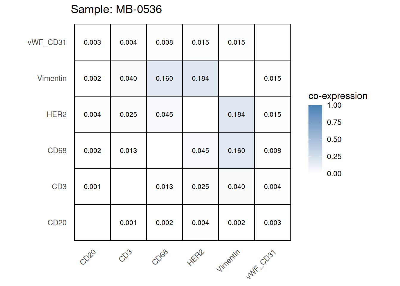
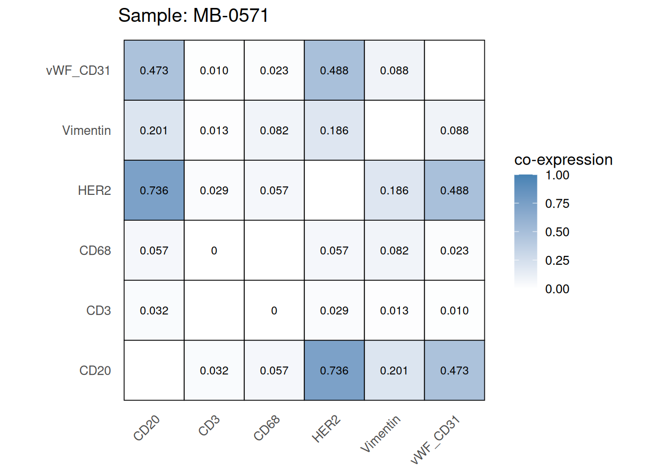
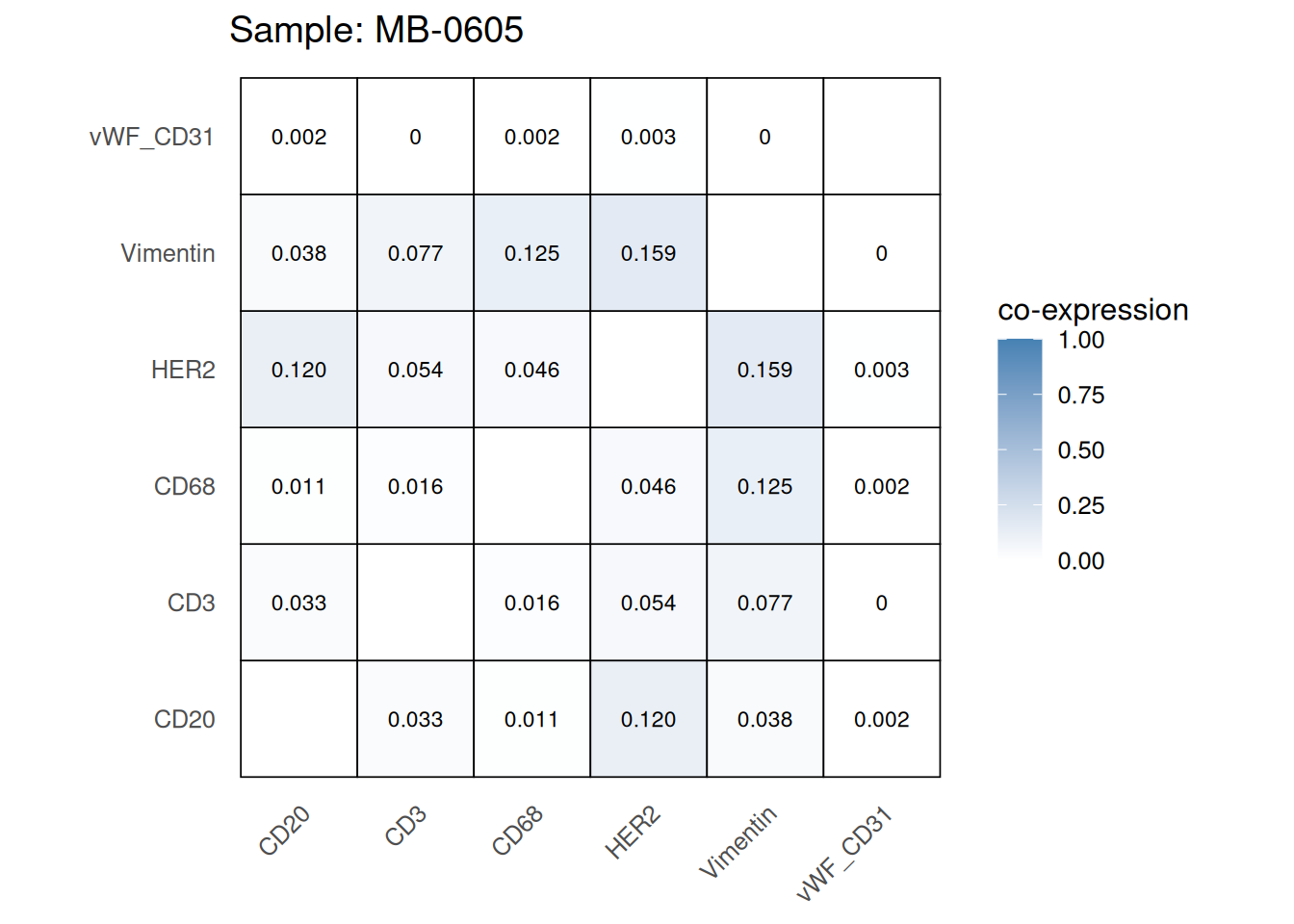
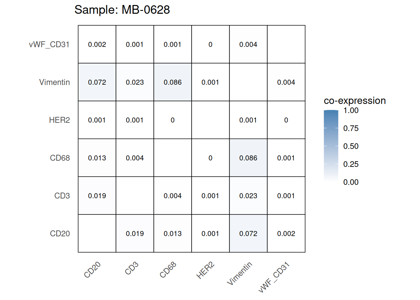
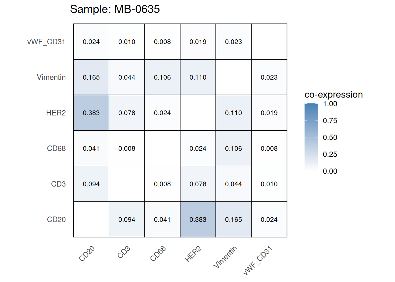
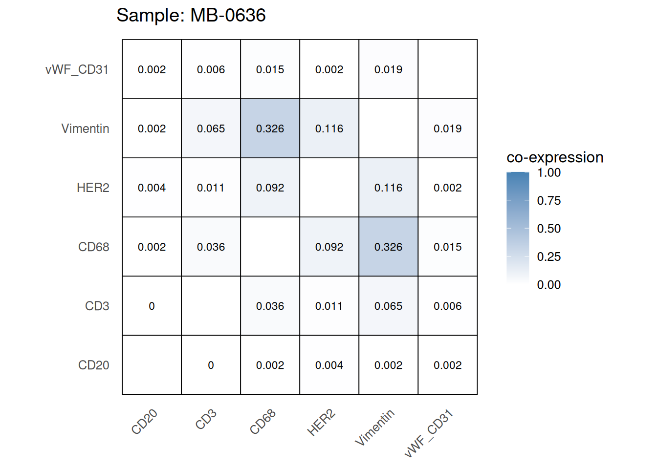
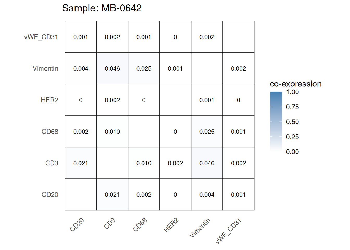
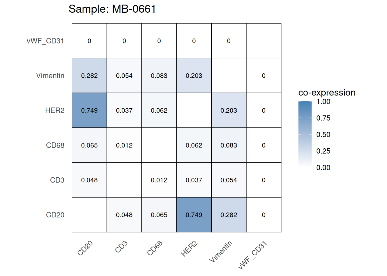
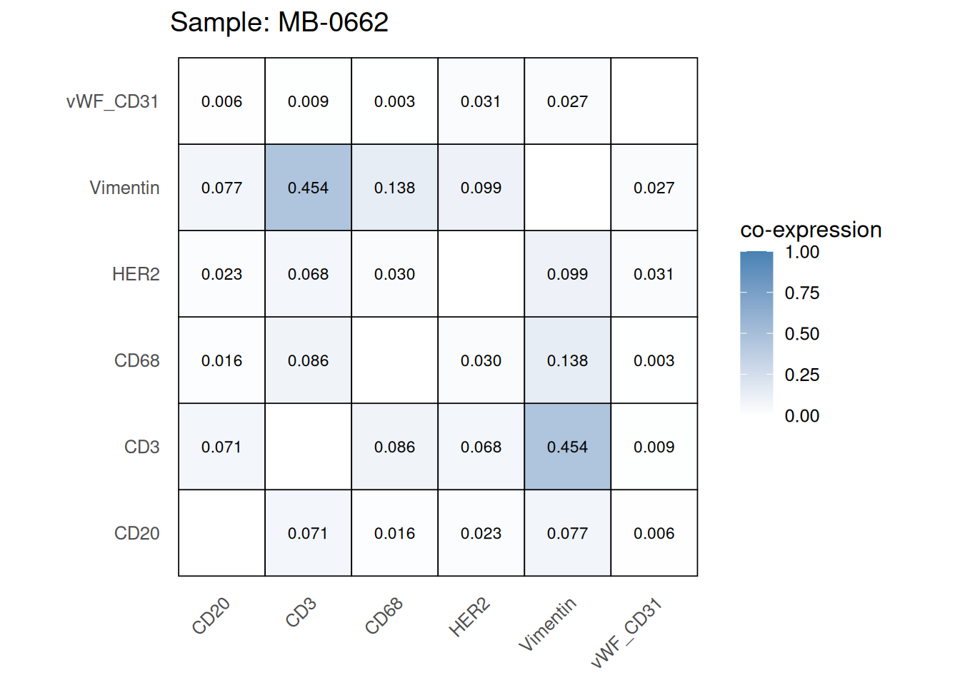
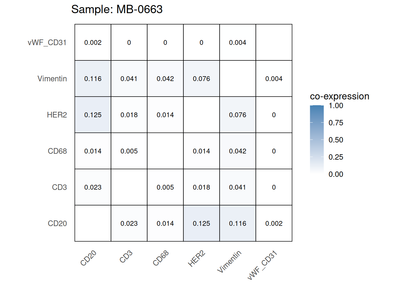
Questions
mean_coexp_per_sample <- coexp_df %>%
  dplyr::select(-cell_id, -cell_type) %>%  # remove columns not related to prob values
  group_by(metabricId) %>%
  summarise(mean_coexp_prob = mean(c_across(where(is.numeric)), na.rm = TRUE)) %>%
  ungroup()


merged_df <- left_join(mean_coexp_per_sample, cell_counts, by = "metabricId")

# Scatter plot
ggplot(merged_df, aes(x = cell_count, y = mean_coexp_prob)) +
  geom_point(size = 3, color = "steelblue") +
  labs(
    x = "Cell Count per Sample",
    y = "Mean Co-expression",
    title = "Mean Co-expression vs. Cell Count"
  ) +
  theme_minimal(base_size = 14)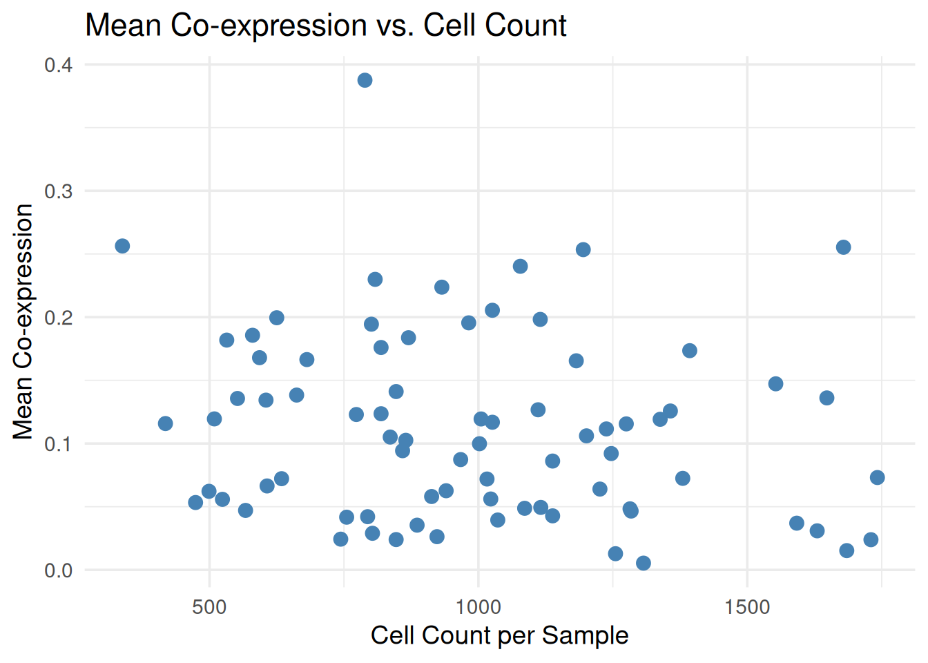
Another way to QC our data is to explore whether the DE genes or associations we find matches current literature. For example, we have a breast cancer cohort. Breast cancer is very well studied and so it should be very easy to perform a DE analysis after pseudobulking our data to see if it makes findings in previous bulk RNA-seq studies of breast cancer cohorts. We can also do this at the single-cell level and compare with previous single-cell proteomic/RNA-seq studies of breast cancer cohorts. We won’t be running the code below. But here is an example of how one might perform a basic DE analysis using package limma.
# Note: The same approach can be used for pseudobulk or single-cell level data.
# Just change `logcounts(data_sce)`

# We want low ki67 to be the reference level (baseline level)
data_sce$ki67 <- factor(data_sce$ki67, levels=c("low_ki67", "high_ki67"))

# Here we specify the design matrix. We are specifying that Y are the expression values and X is ki67 status (but it could be any other variable - such as "good" or "bad" prognosis)
# Y~X: Expression as a function of ki67 status.
design_matrix <- model.matrix(~data_sce$ki67)

# Fit model
fit <- lmFit(assay(data_sce, "norm"), design = design_matrix)

# Estimate variance and SE of coefficients
fit <- eBayes(fit)

tt <- topTable(fit, coef = 2, n = 5, adjust.method = "BH", sort.by = "p")
tt
logFC AveExpr t P.Value adj.P.Val
HH3_total 2.99807594 5.3783014 126.61566 0.000000e+00 0.000000e+00
HH3_ph 0.22158959 0.3549916 67.81304 0.000000e+00 0.000000e+00
Ki67 0.07903174 0.1129605 65.26755 0.000000e+00 0.000000e+00
E_cadherin 0.03507204 0.5389372 31.99330 4.085283e-223 3.881019e-222
H3K27me3 -0.03479189 0.4609833 -30.33584 6.094169e-201 4.631568e-200
B
HH3_total 7265.7780
HH3_ph 2222.8176
Ki67 2062.7347
E_cadherin 498.5455
H3K27me3 447.5419There are two approaches for performing cell types annotation:
For unannotated data, two primary annotation strategies are available:
For supervised annotation, we recommend scClassify, a robust framework for cell-type classification. Below we visualise the data with and without spatial information before exploring the data further.
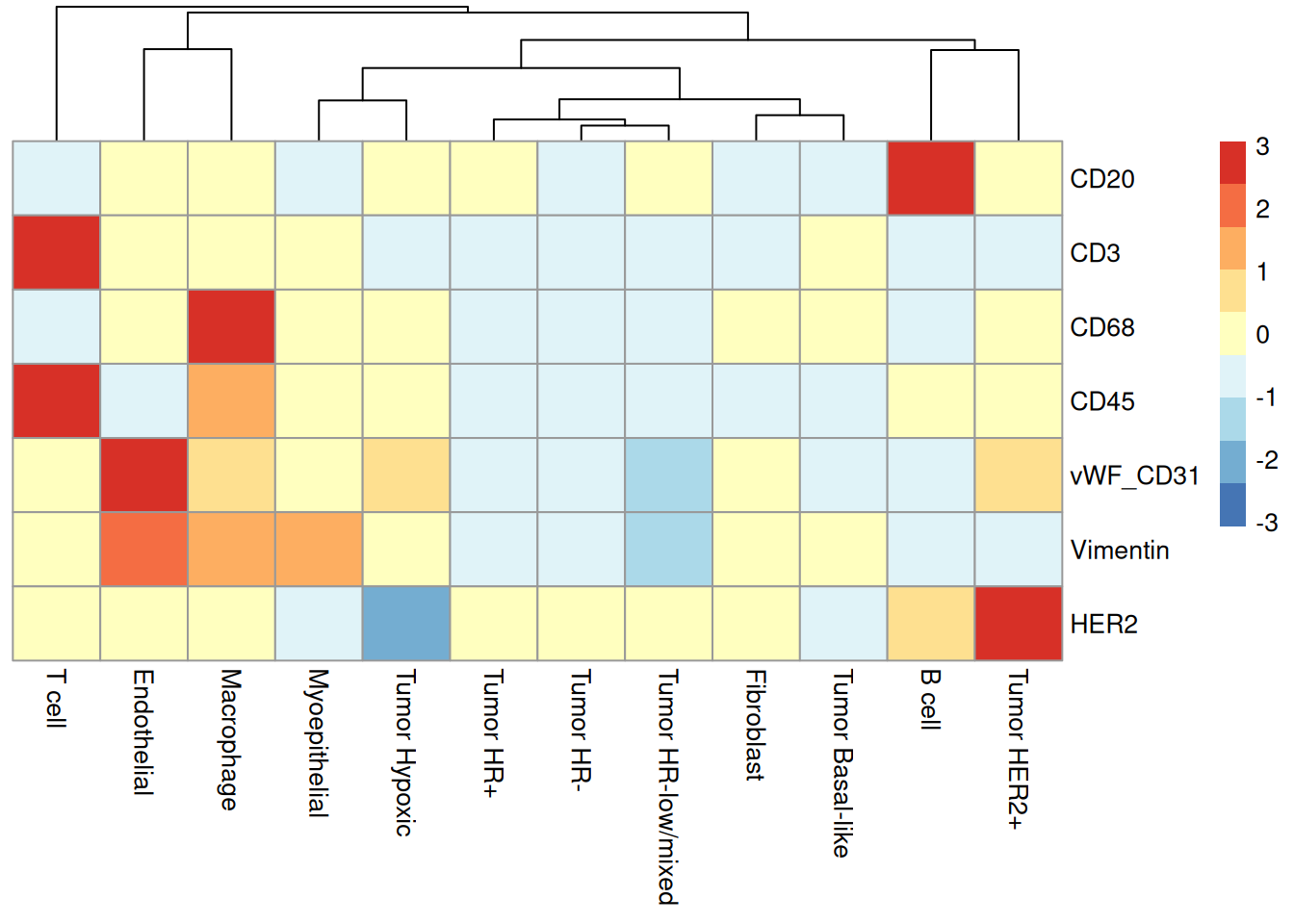
Once cell type annotation is complete, we can also check whether they make sense by investigating marker expression patterns. One way to do this is to check whether the marker expression levels agree with the cell type annotations. For example, we expect CD3 to be highly expressed in T cells, CD20 to be highly expressed in B cells, CD68 to be highly expressed in Macrophages, vWF_CD31 to be highly expressed in Endothelial cells, Vimentin to be highly expressed in Fibroblasts, and HER2 to be highly expressed in Tumor HER2+ cells.
# Plot heatmap of marker by celltype
scater::plotGroupedHeatmap(
  object = data_sce,
  features = c("CD20", "CD3", "CD68", "CD45", "vWF_CD31", "Vimentin", "HER2"),
  group = "high_level_category",
  exprs_values = "norm",
  cluster_rows = FALSE,
  block = "high_level_category",
  center = TRUE,
  scale = TRUE
)
We can also visualise the cell type clusters in a UMAP. We now examine cell-type-specific clustering patterns. Distinct, biologically meaningful clusters should emerge for each annotated cell type. The presence of heterogeneous clusters containing unrelated cell types may indicate incomplete or inaccurate cell-type annotations.
plotUMAP(data_sce, colour_by = "high_level_category")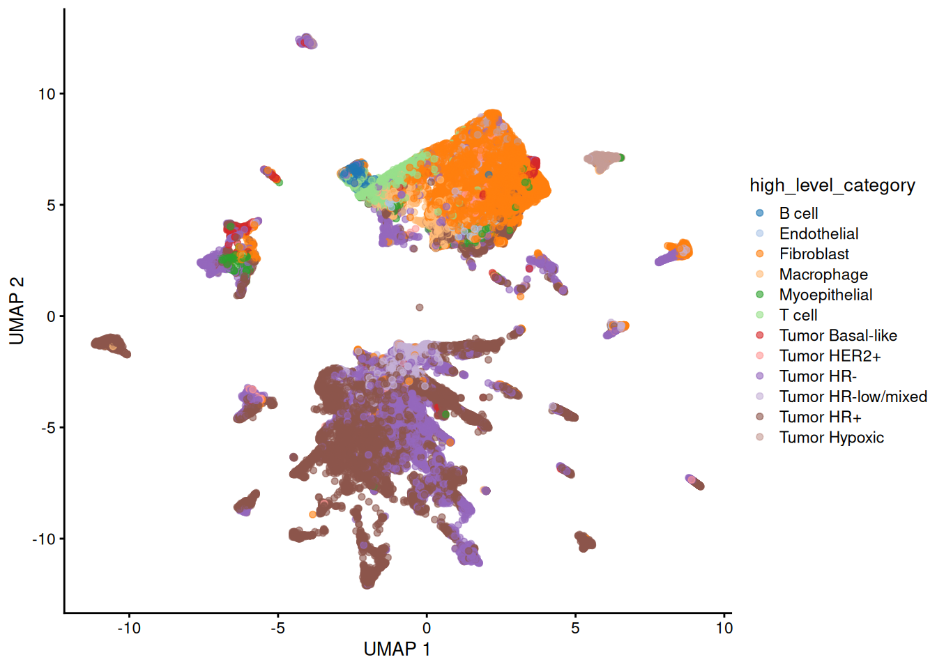
Discussion
Background: The advantage with spatial omics is that we can examine the organisation of the cell-types as it occurs on the tissue slide. One of the most common questions or analyses in spatial data is spatial domain detection. “Spatial domains” are regions within a tissue where cells share similar gene expression profiles and are physically clustered together. Here, we will use the terminology “spatial domain” and “regions” interchangeably. Most common analytical strategies involve spatial clustering, where different methods use different levels of information, such as gene expression data only, cell type information, and spatial coordinates.
First, we visualise a slide from patient “MB-0002” to get a feel for spatial omics data. Do we see any spatial patterning or does it look randomly distributed?
# obtaining the meta data for this patient
one_sample <- data_sce |>
  filter(metabricId == "MB-0002")

one_sample |>
  ggplot(aes(x = Location_Center_X, y = Location_Center_Y, colour = description)) +
  geom_point(alpha = 0.7) +
  theme(panel.background = element_blank(),
        axis.line = element_line(color = "black")) +
  ggtitle("Original slide")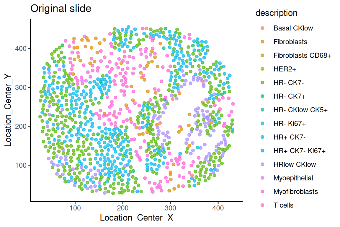
Questions
Another method for digital segmentation across multiple samples is the package Banksy. Banksy identifies spatial regions by integrating both gene expression and spatial information. We have already run Bansky for you, so all you need to do is run the code below to visualise the results. You can use the code that is commented to run Banksy in case you’d like to use it as a template for the future.
### The code below takes a while to run, so we have saved the output as an RDS file that can be loaded directly.

# spe_base <- SpatialExperiment(
#   assays = assays(data_sce),
#   rowData = rowData(data_sce),
#   colData = colData(data_sce),
#   spatialCoords = as.matrix(colData(data_sce)[, c("Location_Center_X", "Location_Center_Y")])
# )
# assay_to_use <- if ("counts" %in% assayNames(spe_base)) "counts" else assayNames(spe_base)[1]
# sample_ids <- unique(spe_base$metabricId)
# spe_list <- lapply(sample_ids, function(id) {
#   spe_subset <- spe_base[, spe_base$metabricId == id]
#   Banksy::computeBanksy(
#     spe_subset,
#     assay_name = assay_to_use,
#     k_geom = 18
#   )
# })
# spe_joint <- do.call(cbind, spe_list)
# spe_joint <- Banksy::runBanksyPCA(
#   spe_joint,
#   lambda = 0.8,
#   npcs = 30,
#   group = "metabricId"
# )
# spe_joint <- Banksy::clusterBanksy(
#   spe_joint,
#   lambda = 0.8,
#   npcs = 30,
#   algo = "kmeans",
#   kmeans.centers = 5
# )
# clust_col <- grep("^clust_", colnames(colData(spe_joint)), value = TRUE)[1]
# data_sce$banksy_region <- colData(spe_joint)[colnames(data_sce), clust_col]

banksy_ouput_spe_joint <- readRDS(system.file("extdata",
                                              "banksy_ouput_spe_joint.rds",
                                              package = "scdneySpatialABACBS2025"))

colData(banksy_ouput_spe_joint)[,c("Location_Center_X", "Location_Center_Y")] <- NULL

hatchingPlot(
  banksy_ouput_spe_joint,
  region = "banksy_region",
  imageID = "metabricId",
  cellType = "description",
  spatialCoords = c("Location_Center_X", "Location_Center_Y")
)
# Specify ID of sample to plot
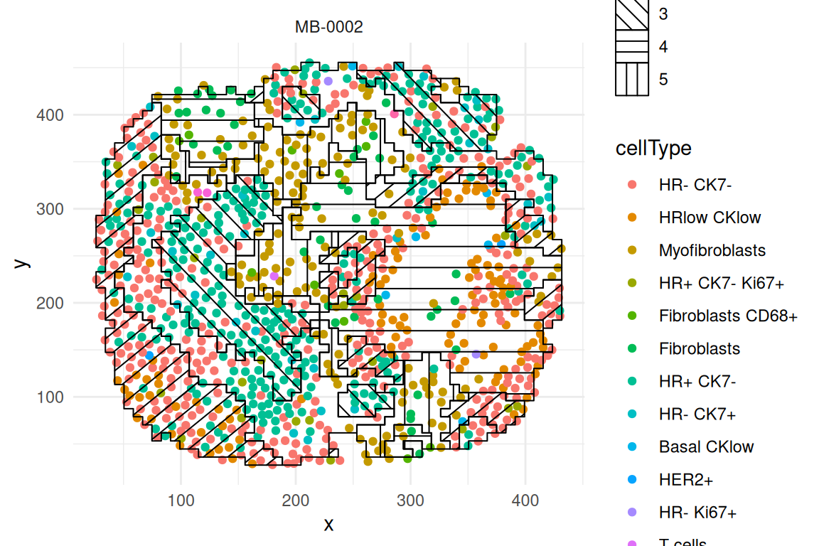
sample_id <- "MB-0002"
# Save the hatching plot for specified sample
plot1 <- hatchingPlot(
banksy_ouput_spe_joint[, banksy_ouput_spe_joint$metabricId == sample_id],
region = "banksy_region",
imageID = "metabricId",
cellType = "description",
spatialCoords = c("Location_Center_X", "Location_Center_Y")
) + ggtitle(sample_id)
# Repeat for second plot
sample_id <- "MB-0064"
plot2 <- hatchingPlot(
banksy_ouput_spe_joint[, banksy_ouput_spe_joint$metabricId == sample_id],
region = "banksy_region",
imageID = "metabricId",
cellType = "description",
spatialCoords = c("Location_Center_X", "Location_Center_Y")
) + ggtitle(sample_id)
# Plot both hatching plots by using the cowplot function. Notice that the input `plotlist` is a list containing plot 1 and plot 2
cowplot::plot_grid(plotlist = list(plot1, plot2), ncol = 2)Using the regions detected by lisaClust. We’re now going to characterise the regions by summarising the proportion of each cell-type in each region across the individuals and then compare between prognostic outcomes.
# Extract out colData and convert to data frame
df <- as.data.frame(colData(data_sce))
# Merge the data frame with the clinical data
df <- merge(df, clinical, by="metabricId")

df_plot <-
  df |>
  dplyr::count(region, description, name = "n") |>
  group_by(region) |>
  mutate(prop = n / sum(n)) |>
  ungroup()

ggplot(df_plot,
       aes(x = region,
           y = description,
           size = prop,
           colour = prop)) +
  geom_point() +
  scale_colour_viridis_c() +
  theme_minimal() +
  xlab("Region") +
  ylab("Cell type")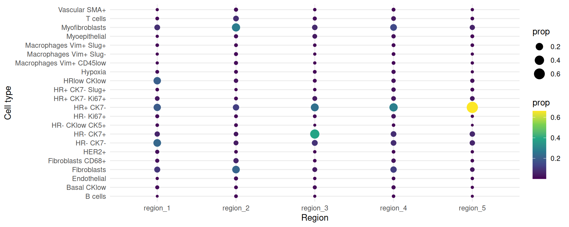
Now we want to visualise the same plot but split it by good and bad prognosis.
# We want to filter out those who do not belong in either `good` or `bad` prognosis
df <- df[!(df$survivalgroup == "neither"),]

# Code is the same as before but we now group by survivalgroup
df_plot <-
  df |>
  dplyr::count(survivalgroup, region, description, name = "n") |>
  group_by(survivalgroup, region) |>
  mutate(prop = n / sum(n)) |>
  ungroup()

ggplot(df_plot,
       aes(x = region,
           y = description,
           size = prop,
           colour = prop)) +
  geom_point() +
  facet_wrap(~ survivalgroup) +
  scale_colour_viridis_c() +
  theme_minimal() +
  xlab("Region") +
  ylab("Cell type")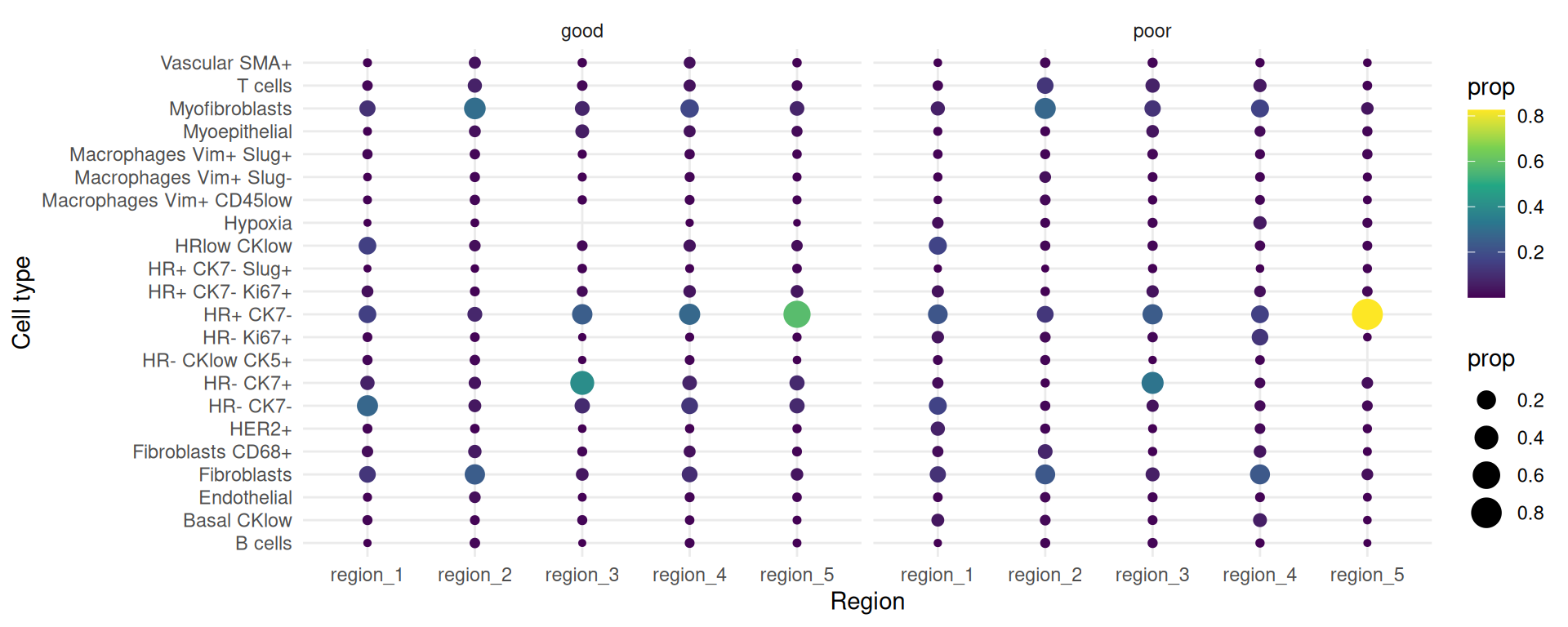
The number of sub-cell types increase considerably when we want to add spatial domain (region) information. To enhance clarity and facilitate understanding, it may be helpful to choose a predetermined region. The code generates a set of boxplots that enable the comparison of cell-type proportions between individuals with good and poor prognosis in region_5.
draw_selected_region_boxplot(data_sce,
                             sample = "metabricId" ,
                             celltype ="description" ,
                             group  = "survivalgroup",
                             group_of_interest =  c("poor" , "good"),
                             select_region = "region_5")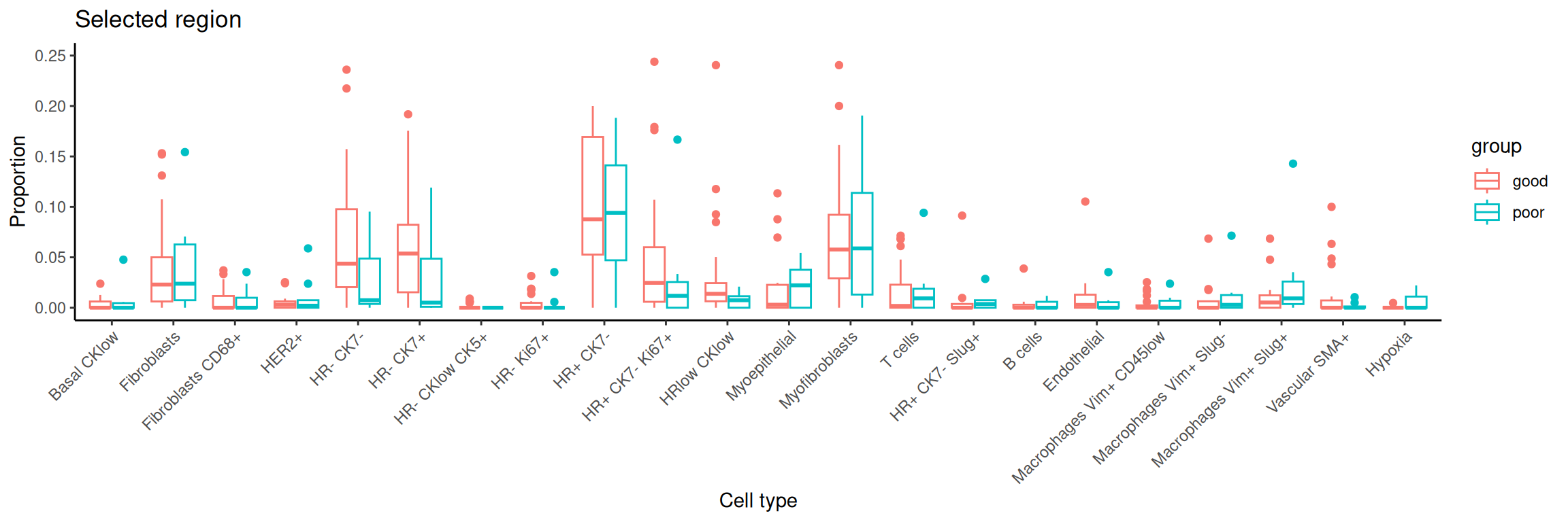
Here, we use scFeatures to generate molecular features for each individual using the features x cells matrices. These features are interpretable and can be used for downstream analyses. In general, scFeatures generates features across six categories:
The different types of features constructed enable a more comprehensive multi-view understanding of each individual. By default, the function will generate a total of 13 different types of features and are stored as 13 samples x features matrices, one for each feature type.
In this section, we will examine spatial information from two perspectives. Utilising spatial domain detection described in part 3, we select a specific region of interest and create molecular representations of that region for each individual (Section 4.1). Second, we will utilise spatial statistics to capture spatial relationships within the region of interest, such as Moran’s I (Section 4.2)
region <- data_sce$region

# Define a series of sub-cell-types that is regional specific
data_sce$celltype <- paste0( data_sce$description , "-" , region)Here, we can consider regional information and the following code allows us to create cell-type specific features for each region. We use the function “paste0” to construct region-specific sub cell-types and name it as celltype in the R object data_sce. For simplicity, in this workshop, the variable celltype in the R object data_sce refers to region-specific sub-cell-types.
There are a total of 13 different types of features (feature_types) that you can choose to generate. The argument type refers the type of input data we have. This is either scrna (single-cell RNA-sequencing data), spatial_p (spatial proteomics data), or spatial_t (single-cell spatial data). In this section, we will ignore spatial information and generate non-spatial features, such as pseudobulking at the sample /cell type levels, overall expression, cell type proportions etc…
We can also use scFeatures to generate region-specific characteristics. Here, we look at the proportions of the cell type HR- CK7+ across the 5 regions. It is necessary to specify type = spatial_p to reflect that we have spatial proteomics data and feature_types = proportion_raw.
Question
## [A] The next few lines extract specific information from data_sce as input to scFeatures.
## Select the HR- CK7+-region sub-cell-type

# There are different ways you can use `scFeatures` to generate molecular representations for individuals and it requires the following information for spatial data.
#
# data,\
# sample,
# X coordinates,
# Y coordinates,
# feature_types, and
# type

# Select the region of interest
idx <- grepl("HR- CK7+-region", data_sce$celltype, fixed = TRUE)

# Extract out the variables of interest for this region: Expression, sample id, cell types, and coordinates
index <- grepl("HR- CK7+-region", data_sce$celltype, fixed = TRUE)

selected_data <- IMCmatrix[, index] # Expression
selected_sample <- sample[index] # Sample ID
selected_celltype <- data_sce$celltype[index] # Cell types
selected_spatialCoords <- list(
  data_sce$Location_Center_X[index], # X coordinates
  data_sce$Location_Center_Y[index] # Y coordinates
)

# Run scFeatures on this region
scfeatures_result <- scFeatures(
  selected_data,
  sample = selected_sample,
  celltype = selected_celltype,
  spatialCoords = selected_spatialCoords,
  feature_types = "proportion_raw",
  type = "spatial_p"
)

feature <- scfeatures_result$proportion_raw
feature <- feature[grepl("poor|good", rownames(feature)), ]

plot_barplot(feature) + labs(y = "proportion")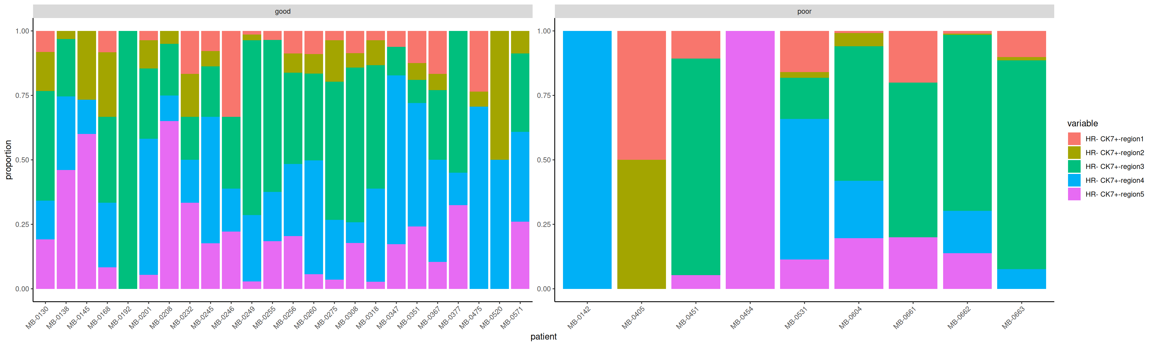
Can we identify “differential expression” for a feature of interest? The R object scfeatures_result contains a variety of features. A important question focuses on the identification of features that reflect an association with the prognostic outcome, specifically distinguishing between good and poor outcomes. The code provided below demonstrates the use of the limma() function to fit a linear model for the purpose of analysing gene_mean_celltype as an illustration feature type. The feature type known as gene_mean_celltype represents the mean protein expression for each sub-cell-type specific to a spatial region. It is a matrix consisting of 77 individuals and 4180 features. It is important to acknowledge that within the context of our IMC data, the term “gene” is used to refer to “protein”.
scfeatures_result <- readRDS(system.file("extdata",
                                              "scfeatures_result.rds",
                                              package = "scdneySpatialABACBS2025"))
# Extract cell-type specific gene expression for all regions.
gene_mean_celltype <- scfeatures_result$gene_mean_celltype

# Extract HR+ CK7 cell-type specific gene expression for Region5
index <-  grep("HR- CK7+-region5", colnames(gene_mean_celltype) , fixed= T)
gene_mean_celltype <- gene_mean_celltype [, index]

# transpose to ensure we have gene by sample matrix
gene_mean_celltype <- t(gene_mean_celltype)

# Extract the two conditions of interest - poor prognosis vs good prognosis
condition  <- unlist( lapply( strsplit( colnames(gene_mean_celltype) , "_cond_"), `[`, 2))
condition <- data.frame(sample = colnames(gene_mean_celltype), condition = condition )
select_index <- which( condition$condition %in% c("poor",  "good" ))
condition <- condition[ select_index, ]
gene_mean_celltype<- gene_mean_celltype [ ,  select_index]


# Calculate log fold change each protein using limma
design <- model.matrix(~condition, data = condition) # Specify design matrix for model
fit <- lmFit(gene_mean_celltype, design) # Fit the linear models
fit <- eBayes(fit) # compute moderated t-statistics and shrink variances
tT <- topTable(fit, n = Inf) # Extract the results, n=Inf means we want the stats for all genes
tT$gene <- rownames(tT)
tT[1:6] <- signif(tT[1:6], digits=2) # format numeric columns to two significant figures
DT::datatable(tT)
We visualise the comparison using a volcano plot and a dotplot for the cell-type specific expression feature. This is a type of scatter-plot that is used to quickly identify changes in large datasets and represent the significance (y-axis) versus effect size or fold-change (x-axis).
# order the proteins by log fold change
tT <- tT[order(tT$logFC, decreasing=TRUE), ][1:20, ]

ggplot(tT, aes(y = reorder(gene, logFC), x = logFC)) +
  geom_point(aes(colour = P.Value), alpha = 2/3, size = 4) +
  scale_colour_gradient(low = "blue", high = "red") +
  theme_bw() +
  xlab("logFC") +
  ylab("region specific cell type specific features")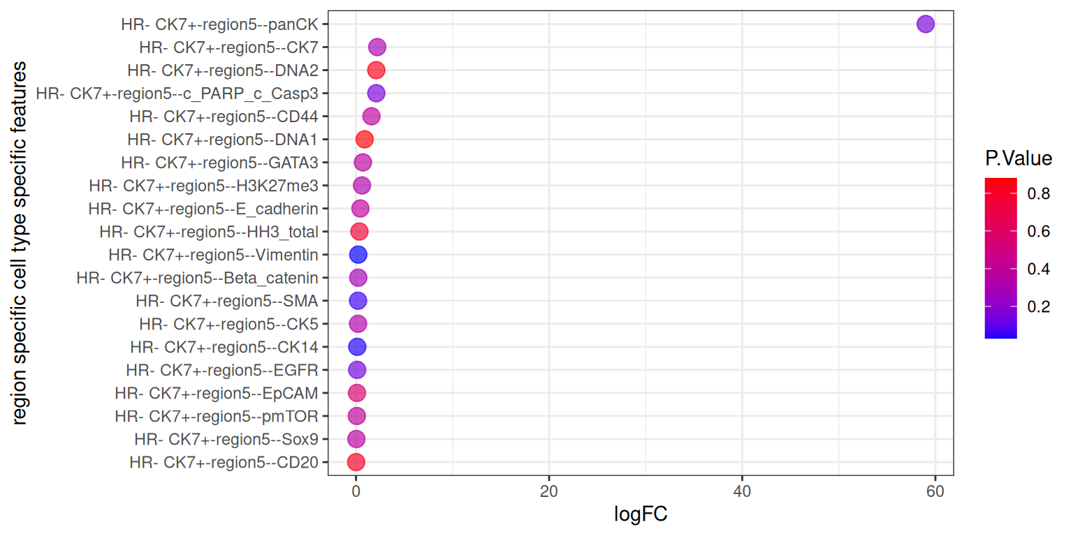
We can see that the logFC for panCK is skewing the results. This makes it difficult to interpret the plot. We have removed panCK from the results and re plot the results below.
# order the proteins by log fold change
tT <- tT[!(tT$gene == "HR- CK7+-region5--panCK"), ]

ggplot(tT, aes(y = reorder(gene, logFC), x = logFC)) +
  geom_point(aes(colour = P.Value), alpha = 2/3, size = 4) +
  scale_colour_gradient(low = "blue", high = "red") +
  theme_bw() +
  xlab("logFC") +
  ylab("region specific cell type specific features")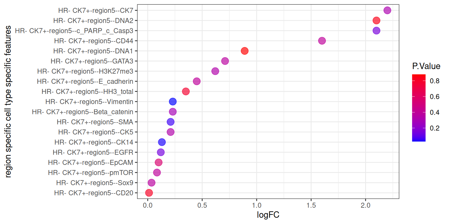
The code below enable us to generate all feature types for all cell-types in a line. Due to limitations with today’s computational capacity, Please DO NOT run it in today’s workshop, it will crash your system.
# here, we specify that this is a spatial proteomics data
# scFeatures support parallel computation to speed up the process
# scfeatures_result <- scFeatures(IMCmatrix,
#                                 type = "spatial_p",
#                                 sample = sample,
#                                 celltype = celltype,
#                                 spatialCoords = spatialCoords,
#                                 ncores = 32)
Assuming you have already generated a collection of molecular representation for individuals, please load the prepared RDS file scfeatures_result.rds. Again, you can remind yourself that all generated feature types are stored in a matrix of samples x features.
# Upload pre-generated RDS file


scfeatures_result <- readRDS(system.file("extdata",
                                              "scfeatures_result.rds",
                                              package = "scdneySpatialABACBS2025"))

# What are the features and the dimensions of features matrices that we have generated?
lapply(scfeatures_result, dim)
$proportion_raw
[1] 77 110
$proportion_logit
[1] 77 110
$proportion_ratio
[1] 77 5995
$gene_mean_celltype
[1] 77 4180
$gene_prop_celltype
[1] 77 4180
$gene_cor_celltype
[1] 77 27958
$gene_mean_bulk
[1] 77 38
$gene_prop_bulk
[1] 77 38
$gene_cor_bulk
[1] 77 703
$L_stats
[1] 77 3842
$celltype_interaction
[1] 77 4393
$morans_I
[1] 77 38
$nn_correlation
[1] 77 38We will now look at the spatial statistic output by scFeatures and qualitively assess whether there is any association between between these statistics and the “good” and “bad” prognosis groups.
Questions
The L function is a spatial statistic used to assess the co-localisation of cell-types. High values indicate spatial association (co-localisation) while low values indicate spatial avoidance. To demonstrate what the L-function tries to capture, we will plot a specific patient “MB-0128” who has a high L value for B cells interacting with Fibroblasts and a low L value for Fibroblasts interacting with HR- CK7- cells.
tableau_palette <- scale_colour_tableau( palette = "Tableau 20")
color_codes <- tableau_palette$palette(10)

# Create a named color vector
cell_colors <- c(
  "B cells" = color_codes[1],
  "Fibroblasts" = color_codes[2],
  "HR- CK7-" = color_codes[9],
  "others" = color_codes[4]
)

# select one patient
one_sample  <- data_sce[ , data_sce$metabricId == "MB-0128"  ]
one_sample <- data.frame( colData(one_sample) )

one_sample$celltype <- one_sample$description

# High L-function value plot.
one_sample <- data.frame(colData(data_sce[, data_sce$metabricId == "MB-0128"]))
one_sample$celltype <- one_sample$description
index <- one_sample$celltype %in% c("B cells", "Fibroblasts")
one_sample$celltype[!index] <- "others"

a <- ggplot(one_sample, aes(x = Location_Center_X, y = Location_Center_Y, colour = celltype)) +
  geom_point() + theme(panel.background=element_blank(),
        axis.line=element_line(color="black")) +
  scale_colour_manual(values = cell_colors) +  # Use named vector
  ggtitle("Patient MB-0128 - high L value with \n B cells interacting Fibroblasts")

# Low L-function value plot.
one_sample$celltype <- one_sample$description
index <- one_sample$celltype %in% c("Fibroblasts", "HR- CK7-")
one_sample$celltype[!index] <- "others"
b <- ggplot(one_sample, aes(x = Location_Center_X, y = Location_Center_Y, colour = celltype)) +
  geom_point() + theme(panel.background=element_blank(),
        axis.line=element_line(color="black")) +
  scale_colour_manual(values = cell_colors) +  # Use named vector
  ggtitle("Patient MB-0128 - low L value with \n B cells interacting HR_ CK7")

# Plot both
ggarrange(plotlist = list(a, b))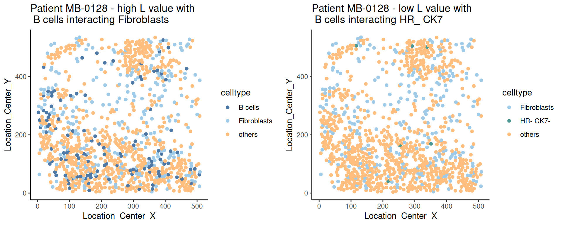
Moran’s I is a spatial autocorrelation statistic based on both location and values. It quantifies whether similar values tend to occur near each other or are dispersed.
feature <- scfeatures_result$morans_I
feature <- feature[grep("poor|good", rownames(feature)), ]

df <- as.data.frame(feature)
df$Group <- ifelse(grepl("good", rownames(feature)), "Good", "Poor")
df <- df |>
  pivot_longer(-Group, names_to = "var", values_to = "val")

top5 <- df |>
  group_by(var) |>
  summarise(rank = mean(val[Group == "Good"]) - mean(val[Group == "Poor"])) |>
  slice_max(abs(rank), n = 5) |>
  pull(var)

df |>
  filter(var %in% top5) |>
  ggplot(aes(y = var, x = val, fill = Group)) +
  geom_boxplot() +
  theme_bw() +
  labs(y="Gene", x="Moran's I")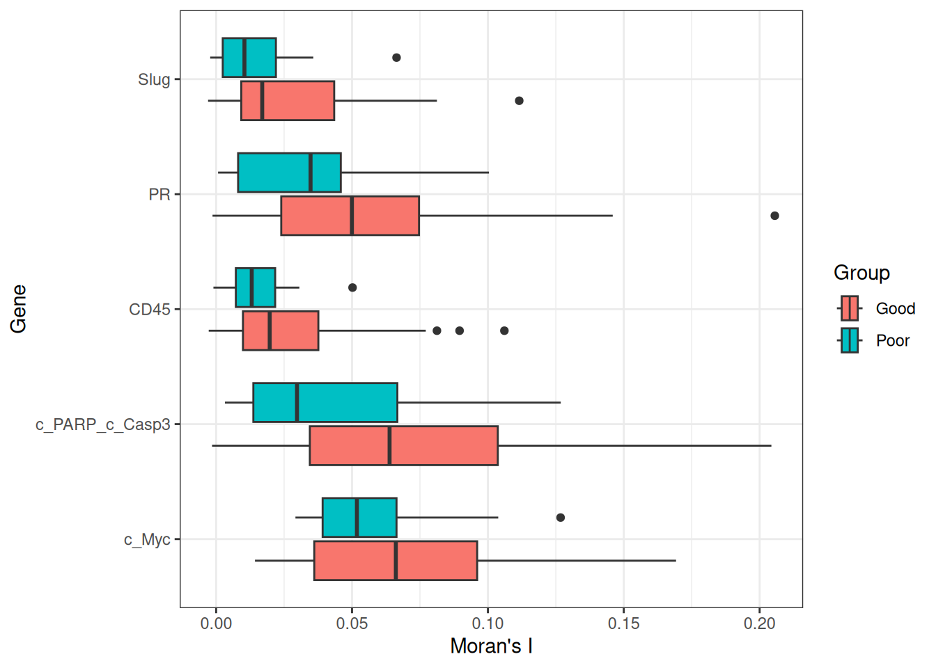
Recurrence risk estimation is a fundamental concern in medical research, particularly in the context of patient survival analysis. In this section, we will estimate recurrence risk using the molecular representation of individuals generated from scFeatures to build a survival model. We will use classifyR to build the survival model. The patient outcome is time-to-event, so, by default, ClassifyR will use Cox proportional hazards ranking to choose a set of features and also Cox proportional hazards to predict risk scores. We will also demonstrate other available models in ClassifyR.
Questions
To examine the distribution of prognostic performance, use performancePlot. Currently, the only metric for time-to-event data is C-index and that will automatically be used because the predictive model type is tracked inside of the result objects.
## Putting two sets of cross-validation results together
multiresults <- append(classifyr_result_IMC, survForestCV)
ordering <- c("clinical", names(scfeatures_result))

performancePlot(multiresults,
                characteristicsList = list(x = "Assay Name",
                                           row = "Classifier Name"),
                orderingList = list("Assay Name" = ordering)) +
                theme(axis.text.x = element_text(angle = 45, vjust = 1, hjust = 1))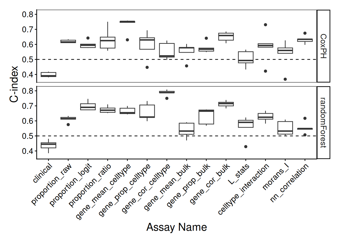
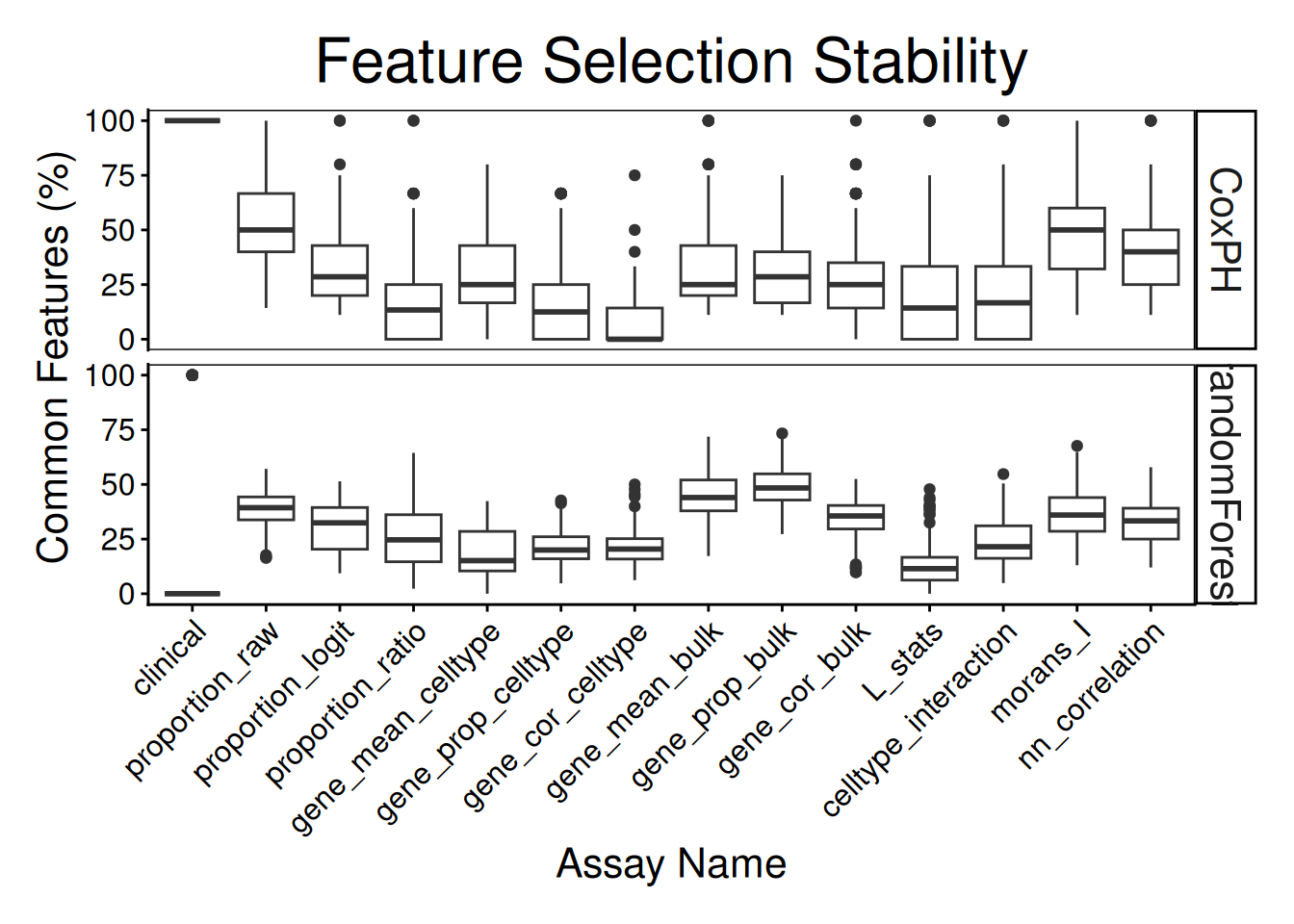
Note how the resultant plot is a ggplot2 object and can be further modified. The same code could be used for a categorical classifier because the random forest implementation provided by the ranger package has the same interface for both. We will examine feature selection stability with selectionPlot.
distribution(classifyr_result_IMC[[1]], plot = FALSE) assay feature proportion
1 clinical Inferred.Menopausal.State 1Does each individual require a different collection of features? Using samplesMetricMap compare the per-sample C-index for Cox models for all kinds of metafeatures.
samplesMetricMap(classifyr_result_IMC)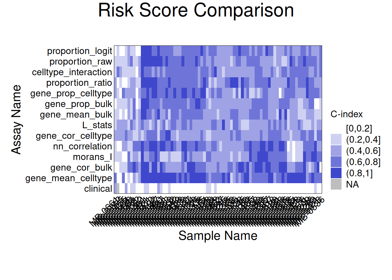
TableGrob (2 x 1) "arrange": 2 grobs
  z     cells    name                 grob
1 1 (2-2,1-1) arrange       gtable[layout]
2 2 (1-1,1-1) arrange text[GRID.text.8117]The L function is a spatial statistic used to assess the spatial distribution of cell-types. It assesses the significance of cell-cell interactions, by calculating the density of a cell-type with other cell-types within a certain radius. High values indicate spatial association (co-localisation), low values indicate spatial avoidance.
tableau_palette <- scale_colour_tableau( palette = "Tableau 20")
color_codes <- tableau_palette$palette(10)

# select one patient
one_sample  <- data_sce[ , data_sce$metabricId == "MB-0128"  ]
one_sample <- data.frame( colData(one_sample) )

one_sample$celltype <- one_sample$description

# select certain cell types to examine the interaction
index <-  one_sample$celltype  %in% c("B cells", "Fibroblasts")
one_sample$celltype[!index] <- "others"

a <- ggplot( one_sample, aes(x = Location_Center_X , y = Location_Center_Y, colour = celltype )) +
  geom_point()  +
  scale_colour_manual(values = color_codes) +
  ggtitle( "Patient MB-0128 - high L value with \n B cells interacting Fibroblasts")


one_sample$celltype <- one_sample$description
index <-  one_sample$celltype  %in% c("Fibroblasts", "HR- CK7-")
one_sample$celltype[!index] <- "others"

b <- ggplot( one_sample, aes(x = Location_Center_X , y = Location_Center_Y, colour = celltype )) +
  geom_point()  +
  scale_colour_manual(values = color_codes) +
  ggtitle( "Patient MB-0128 - low L value with \n B cells interacting HR_ CK7")

ggarrange(plotlist = list(a,b))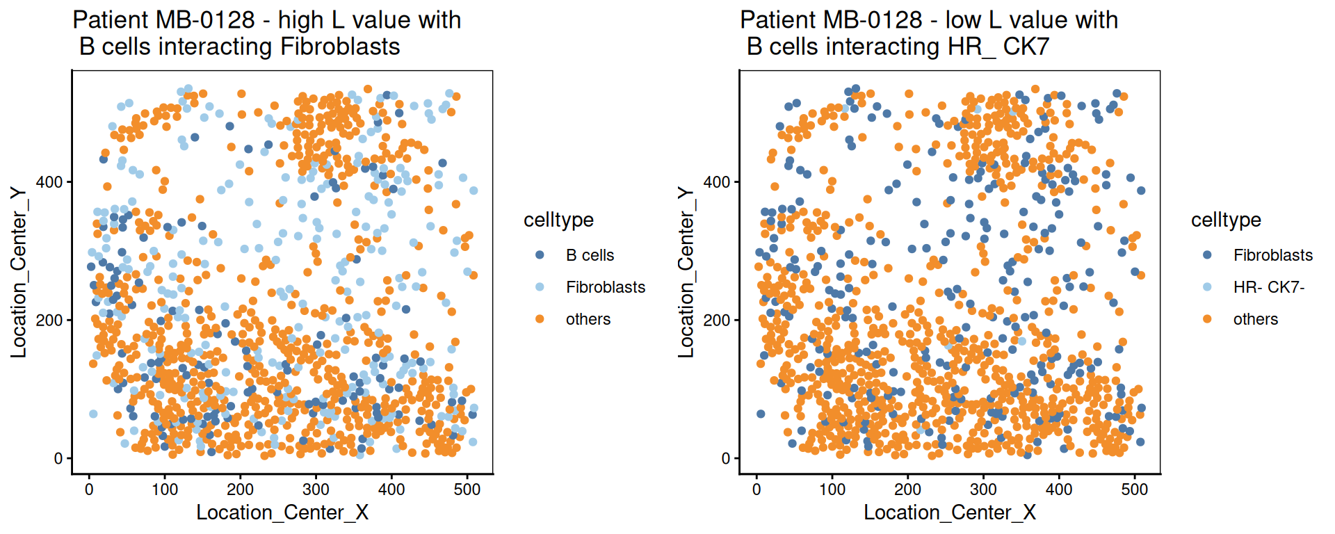
We calculate the nearest neighbours of each cell and then calculate the pairs of cell-types based on the nearest neighbour. This allows us to summarise it into a cell-type interaction composition.
 one_sample  <- data_sce[ , data_sce$metabricId == "MB-0263"  ]
one_sample <- data.frame( colData(one_sample) )

one_sample$celltype <- one_sample$description

a <-ggplot( one_sample, aes(x = Location_Center_X , y = Location_Center_Y, colour = celltype )) + geom_point()  + scale_colour_manual(values = color_codes)  + ggtitle("Patient MB-0263")

feature  <- scfeatures_result$celltype_interaction
to_plot <- data.frame( t( feature[ "MB-0263_cond_poor" , ])  )
to_plot$feature <- rownames(to_plot)
colnames(to_plot) <- c("value", "celltype interaction composition")

to_plot <- to_plot[ order(to_plot$value, decreasing = T), ]
to_plot <- to_plot[1:10, ]
to_plot$`celltype interaction composition` <- factor(to_plot$`celltype interaction composition`, levels = to_plot$`celltype interaction composition`)

b <- ggplot(to_plot, aes(x =  `celltype interaction composition`  ,  y = value, fill=`celltype interaction composition`)) + geom_bar(stat="identity" ) + ylab("Major cell-type interactions")  +
  theme(axis.text.x = element_text(angle = 45, vjust = 1, hjust=1))

ggarrange(plotlist = list(a,b))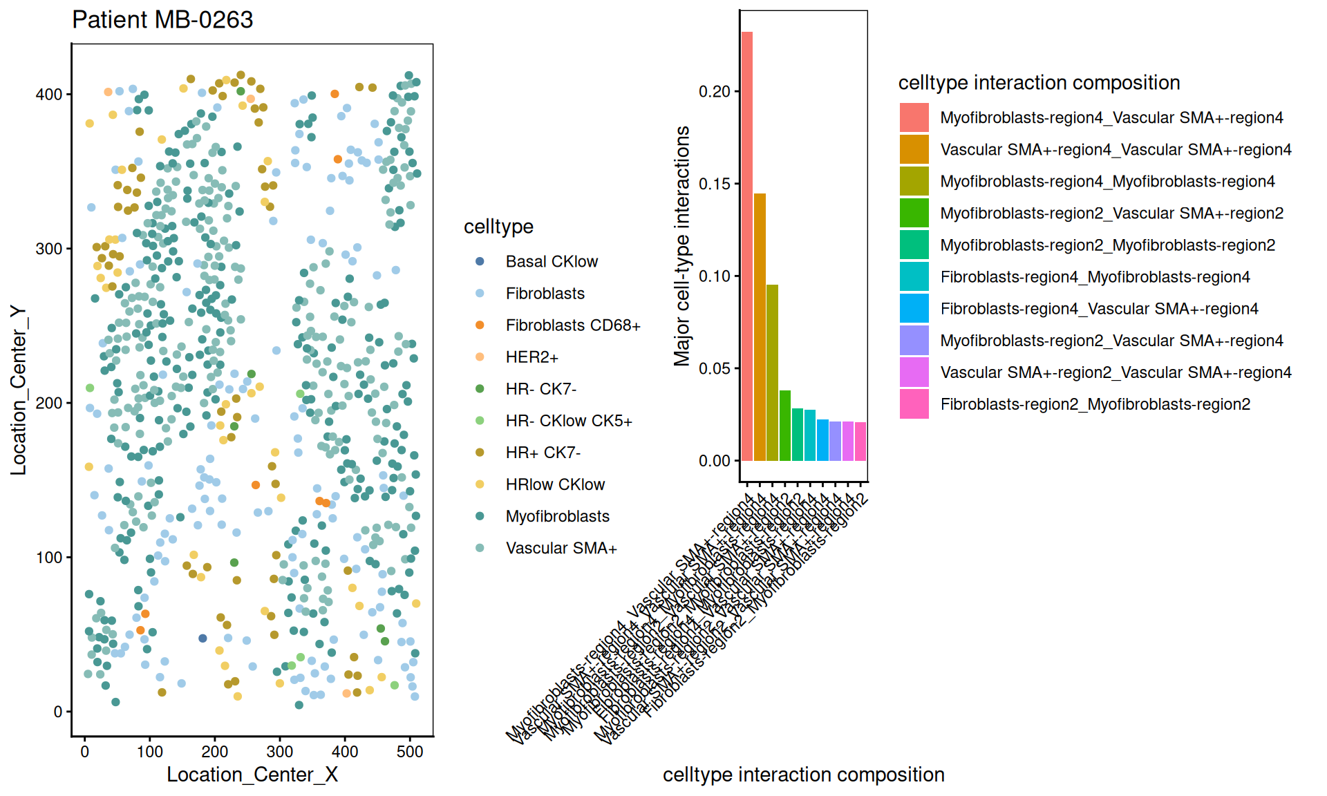
Moran’s I is a spatial autocorrelation statistic based on both location and values. It quantifies whether similar values tend to occur near each other or are dispersed.
high  <- data_sce["Ki67", data_sce$metabricId == "MB-0132"  ]
high_meta <- data.frame( colData(high) )
high_meta$expression <- as.vector(logcounts( high))

low  <- data_sce["Ki67",  data_sce$metabricId == "MB-0249" ]
low_meta <- data.frame( colData(low) )
low_meta$expression <- as.vector(logcounts(low))


a <- ggplot(high_meta, aes(x = Location_Center_X , y = Location_Center_Y, colour =expression)) + geom_point(alpha=0.5) + scale_colour_viridis_c() + ggtitle("Patient MB-0132 - high Moran's I in Ki67")

b <- ggplot(low_meta, aes(x = Location_Center_X , y = Location_Center_Y, colour =expression)) + geom_point(alpha=0.5) + scale_colour_viridis_c() + ggtitle("Patient MB-0249 - low Moran's I in Ki67")

ggarrange(plotlist = list(a,b))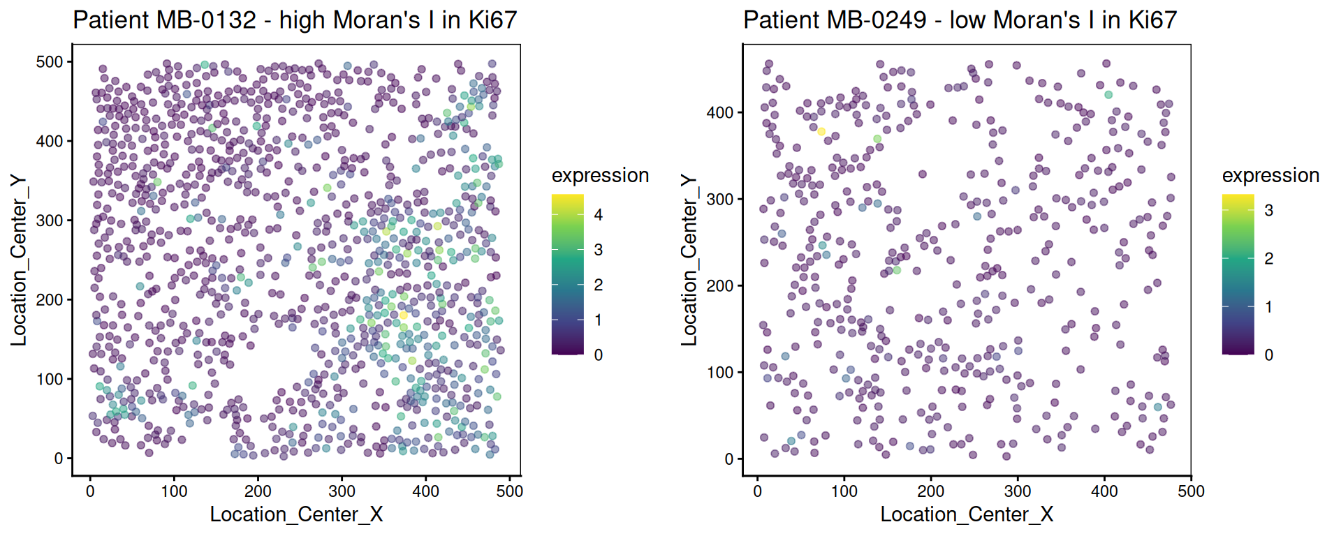
This metric measures the correlation of proteins/genes between a cell and its nearest neighbour cell.
plot_nncorrelation <- function(thissample , thisprotein){

       sample_name <- thissample
       thissample <- data_sce[, data_sce$metabricId ==     sample_name]


      exprsMat <- logcounts(thissample)

    # calculate NN correlation
    cell_points_cts <- spatstat.geom::ppp(
            x = as.numeric(thissample$Location_Center_X ), y = as.numeric(thissample$Location_Center_Y),
            check = FALSE,
            xrange = c(
                min(as.numeric(thissample$Location_Center_X)),
                max(as.numeric(thissample$Location_Center_X))
            ),
            yrange = c(
                min(as.numeric(thissample$Location_Center_Y)),
                max(as.numeric(thissample$Location_Center_Y))
            ),
            marks = t(as.matrix(exprsMat))
        )

     value <-  spatstat.explore::nncorr(cell_points_cts)["correlation", ]
      value <-  value[  thisprotein]

    # Find the indices of the two nearest neighbors for each cell
    nn_indices <- nnwhich(cell_points_cts, k = 1)

    protein <-  thisprotein
    df <- data.frame(thiscell_exprs  = exprsMat[protein, ] , exprs =  exprsMat[protein,nn_indices ])

   p <-  ggplot(df, aes( x =thiscell_exprs ,  y = exprs , colour =  exprs  )) +
      geom_point(alpha = 0.3) + ggtitle(paste0( "Patient ", sample_name ,  " nn_corr = " ,  round(value, 2)  )) + scale_colour_viridis_c() + xlab("This cell expression") + ylab("Neighbouring cell expression")

   return (p )

}


p1 <- plot_nncorrelation("MB-0605",  "HER2")
p2 <- plot_nncorrelation("MB-0258",  "HER2")

ggarrange(plotlist = list(p1, p2))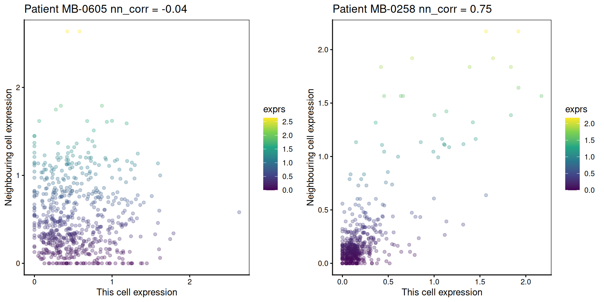
R version 4.5.2 (2025-10-31)
Platform: x86_64-pc-linux-gnu
Running under: Ubuntu 24.04.3 LTS

Matrix products: default
BLAS:   /usr/lib/x86_64-linux-gnu/openblas-pthread/libblas.so.3
LAPACK: /usr/lib/x86_64-linux-gnu/openblas-pthread/libopenblasp-r0.3.26.so;  LAPACK version 3.12.0

locale:
 [1] LC_CTYPE=C.UTF-8       LC_NUMERIC=C           LC_TIME=C.UTF-8
 [4] LC_COLLATE=C.UTF-8     LC_MONETARY=C.UTF-8    LC_MESSAGES=C.UTF-8
 [7] LC_PAPER=C.UTF-8       LC_NAME=C              LC_ADDRESS=C
[10] LC_TELEPHONE=C         LC_MEASUREMENT=C.UTF-8 LC_IDENTIFICATION=C

time zone: UTC
tzcode source: system (glibc)

attached base packages:
[1] stats4    grid      stats     graphics  grDevices utils     datasets
[8] methods   base

other attached packages:
 [1] SpatialExperiment_1.20.0        Banksy_1.6.0
 [3] cytomapper_1.22.0               EBImage_4.52.0
 [5] lisaClust_1.18.0                ClassifyR_3.14.0
 [7] BiocParallel_1.44.0             MultiAssayExperiment_1.36.1
 [9] scFeatures_1.3.4                spicyR_1.22.0
[11] limma_3.66.0                    scran_1.38.0
[13] scater_1.38.0                   scuttle_1.20.0
[15] simpleSeg_1.12.0                tidySingleCellExperiment_1.20.1
[17] ttservice_0.5.3                 SingleCellExperiment_1.32.0
[19] SummarizedExperiment_1.40.0     Biobase_2.70.0
[21] GenomicRanges_1.62.0            Seqinfo_1.0.0
[23] IRanges_2.44.0                  S4Vectors_0.48.0
[25] BiocGenerics_0.56.0             generics_0.1.4
[27] MatrixGenerics_1.22.0           matrixStats_1.5.0
[29] cowplot_1.2.0                   purrr_1.2.0
[31] naniar_1.1.0                    reshape_0.8.10
[33] spatstat_3.4-1                  spatstat.linnet_3.3-2
[35] spatstat.model_3.4-2            rpart_4.1.24
[37] spatstat.explore_3.6-0          nlme_3.1-168
[39] spatstat.random_3.4-3           spatstat.geom_3.6-1
[41] spatstat.univar_3.1-5           spatstat.data_3.1-9
[43] survminer_0.5.1                 ggpubr_0.6.2
[45] survival_3.8-3                  tidyr_1.3.1
[47] scattermore_1.2                 plotly_4.11.0
[49] dplyr_1.1.4                     pheatmap_1.0.13
[51] ggthemes_5.1.0                  ggplot2_4.0.1

loaded via a namespace (and not attached):
  [1] igraph_2.2.1               graph_1.88.0
  [3] Formula_1.2-5              BiocBaseUtils_1.12.0
  [5] tidyselect_1.2.1           bit_4.6.0
  [7] doParallel_1.0.17          clue_0.3-66
  [9] lattice_0.22-7             rjson_0.2.23
 [11] blob_1.2.4                 stringr_1.6.0
 [13] rngtools_1.5.2             S4Arrays_1.10.0
 [15] parallel_4.5.2             png_0.1-8
 [17] cli_3.6.5                  ggplotify_0.1.3
 [19] ProtGenerics_1.42.0        multtest_2.66.0
 [21] goftest_1.2-3              textshaping_1.0.4
 [23] BiocIO_1.20.0              bluster_1.20.0
 [25] grr_0.9.5                  BiocNeighbors_2.4.0
 [27] uwot_0.2.4                 curl_7.0.0
 [29] mime_0.13                  evaluate_1.0.5
 [31] tidytree_0.4.6             tiff_0.1-12
 [33] V8_8.0.1                   ComplexHeatmap_2.26.0
 [35] ggh4x_0.3.1                stringi_1.8.7
 [37] backports_1.5.0            lmerTest_3.1-3
 [39] XML_3.99-0.20              orthogene_1.16.0
 [41] httpuv_1.6.16              AnnotationDbi_1.72.0
 [43] magrittr_2.0.4             rappdirs_0.3.3
 [45] splines_4.5.2              mclust_6.1.2
 [47] KMsurv_0.1-6               jpeg_0.1-11
 [49] doRNG_1.8.6.2              DT_0.34.0
 [51] ggbeeswarm_0.7.2           DBI_1.2.3
 [53] terra_1.8-80               HDF5Array_1.38.0
 [55] jquerylib_0.1.4            withr_3.0.2
 [57] reformulas_0.4.2           class_7.3-23
 [59] matrixTests_0.2.3.1        systemfonts_1.3.1
 [61] ggnewscale_0.5.2           GSEABase_1.72.0
 [63] bdsmatrix_1.3-7            rtracklayer_1.70.0
 [65] htmlwidgets_1.6.4          fs_1.6.6
 [67] ggrepel_0.9.6              labeling_0.4.3
 [69] SparseArray_1.10.2         SingleCellSignalR_2.0.1
 [71] h5mread_1.2.0              annotate_1.88.0
 [73] zoo_1.8-14                 raster_3.6-32
 [75] XVector_0.50.0             knitr_1.50
 [77] nnls_1.6                   UCSC.utils_1.6.0
 [79] AUCell_1.32.0              foreach_1.5.2
 [81] fansi_1.0.7                dcanr_1.26.0
 [83] patchwork_1.3.2            data.table_1.17.8
 [85] ggtree_4.0.1               rhdf5_2.54.0
 [87] R.oo_1.27.1                ggiraph_0.9.2
 [89] irlba_2.3.5.1              gridGraphics_0.5-1
 [91] ellipsis_0.3.2             lazyeval_0.2.2
 [93] yaml_2.3.10                crayon_1.5.3
 [95] RColorBrewer_1.1-3         tweenr_2.0.3
 [97] later_1.4.4                codetools_0.2-20
 [99] GlobalOptions_0.1.2        KEGGREST_1.50.0
[101] sccore_1.0.6               Rtsne_0.17
[103] shape_1.4.6.1              gdtools_0.4.4
[105] Rsamtools_2.26.0           filelock_1.0.3
[107] leidenAlg_1.1.5            pkgconfig_2.0.3
[109] GenomicAlignments_1.46.0   aplot_0.2.9
[111] spatstat.sparse_3.1-0      ape_5.8-1
[113] viridisLite_0.4.2          xtable_1.8-4
[115] car_3.1-3                  plyr_1.8.9
[117] httr_1.4.7                 rbibutils_2.4
[119] tools_4.5.2                beeswarm_0.4.0
[121] broom_1.0.10               dbplyr_2.5.1
[123] crosstalk_1.2.2            survMisc_0.5.6
[125] assertthat_0.2.1           lme4_1.1-37
[127] digest_0.6.39              numDeriv_2016.8-1.1
[129] Matrix_1.7-4               farver_2.1.2
[131] AnnotationFilter_1.34.0    reshape2_1.4.5
[133] yulab.utils_0.2.1          viridis_0.6.5
[135] glue_1.8.0                 cachem_1.1.0
[137] BiocFileCache_3.0.0        polyclip_1.10-7
[139] proxyC_0.5.2               Biostrings_2.78.0
[141] visdat_0.6.0               ggalluvial_0.12.5
[143] statmod_1.5.1              concaveman_1.2.0
[145] ScaledMatrix_1.18.0        fontBitstreamVera_0.1.1
[147] carData_3.0-5              minqa_1.2.8
[149] httr2_1.2.1                glmnet_4.1-10
[151] dqrng_0.4.1                utf8_1.2.6
[153] gtools_3.9.5               ggsignif_0.6.4
[155] gridExtra_2.3              shiny_1.11.1
[157] GSVA_2.4.1                 BulkSignalR_1.2.1
[159] R.utils_2.13.0             rhdf5filters_1.22.0
[161] RCurl_1.98-1.17            memoise_2.0.1
[163] rmarkdown_2.30             scales_1.4.0
[165] R.methodsS3_1.8.2          stabledist_0.7-2
[167] svglite_2.2.2              RANN_2.6.2
[169] fontLiberation_0.1.0       km.ci_0.5-6
[171] EnsDb.Mmusculus.v79_2.99.0 cluster_2.1.8.1
[173] msigdbr_25.1.1             spatstat.utils_3.2-0
[175] coxme_2.2-22               scam_1.2-20
[177] colorspace_2.1-2           rlang_1.1.6
[179] EnsDb.Hsapiens.v79_2.99.0  GenomeInfoDb_1.46.0
[181] DelayedMatrixStats_1.32.0  sparseMatrixStats_1.22.0
[183] shinydashboard_0.7.3       aricode_1.0.3
[185] ggforce_0.5.0              homologene_1.4.68.19.3.27
[187] circlize_0.4.16            dbscan_1.2.3
[189] mgcv_1.9-3                 xfun_0.54
[191] iterators_1.0.14           abind_1.4-8
[193] tibble_3.3.0               treeio_1.34.0
[195] Rhdf5lib_1.32.0            bitops_1.0-9
[197] Rdpack_2.6.4               fftwtools_0.9-11
[199] promises_1.5.0             RSQLite_2.4.4
[201] DelayedArray_0.36.0        compiler_4.5.2
[203] boot_1.3-32                beachmat_2.26.0
[205] RcppHungarian_0.3          Rcpp_1.1.0
[207] fontquiver_0.2.1           edgeR_4.8.0
[209] BiocSingular_1.26.1        tensor_1.5.1
[211] MASS_7.3-65                ggupset_0.4.1
[213] babelgene_22.9             R6_2.6.1
[215] fastmap_1.2.0              rstatix_0.7.3
[217] vipor_0.4.7                ensembldb_2.34.0
[219] rsvd_1.0.5                 gtable_0.3.6
[221] deldir_2.0-4               htmltools_0.5.8.1
[223] bit64_4.6.0-1              lifecycle_1.0.4
[225] S7_0.2.1                   nloptr_2.2.1
[227] restfulr_0.0.16            sass_0.4.10
[229] vctrs_0.6.5                ggfun_0.2.0
[231] sp_2.2-0                   bslib_0.9.0
[233] gprofiler2_0.2.4           pillar_1.11.1
[235] GenomicFeatures_1.62.0     magick_2.9.0
[237] metapod_1.18.0             locfit_1.5-9.12
[239] otel_0.2.0                 jsonlite_2.0.0
[241] svgPanZoom_0.3.4           cigarillo_1.0.0
[243] GetoptLong_1.0.5 The authors thank all their colleagues, particularly at The University of Sydney, Sydney Precision Data Science and Charles Perkins Centre for their support and intellectual engagement. Special thanks to Ellis Patrick, Shila Ghazanfar, Andy Tran, Helen, and Daniel for guiding and supporting the building of this workshop.