Introduction to spicyr#
Do T cells gather around tumour cells more in ER-positive breast cancers than in ER-negative ones? Do patients whose tumour cells are surrounded by immune cells relapse later? spicyr answers questions like these for every pair of cell types in an imaging study. This tutorial works through a study of 456 breast tumours: testing every pair, looking closely at one, finding the images behind the result, and checking that the test behaves when there is nothing to find.
Overview#
A pair is written from → to and asks whether to cells are placed near from cells more than other cells
are. For each to cell, spicyr checks whether there is a from cell within a radius, and compares the share of
to cells that have one with what we would expect if the to cells were a random choice among the cells of the
same image that are not from cells. The effect is the extra fraction of to cells placed next to from
cells, beyond chance: 0.2 means as if a fifth of the to cells had been moved next to from cells and the rest
left where chance would put them. For a pair whose to cells avoid the from cells (fewer have one nearby than
chance, over all images), the effect is measured the other way: -0.2 means as if a fifth of the to cells that
chance would put next to a from cell had been moved away. The side column says which scale a pair uses. Each
to cell counts once, however many from cells are beside it, so more
numerous or more tightly packed from cells do not inflate the effect. Because the comparison uses only the cells
that are actually there, empty regions such as holes or air spaces, and uneven cell density, do not by themselves
create a signal (artefacts that affect one cell type more than others are not removed). spicyr then compares the
effect
between groups of patients, treating patients, not images or cells, as the units of the test.
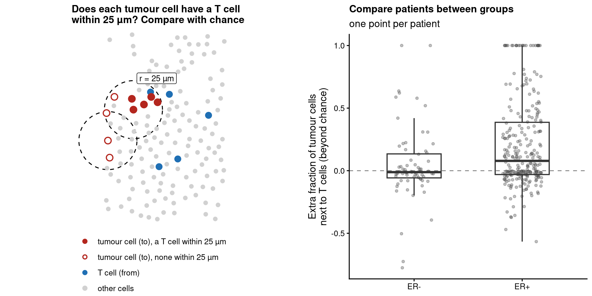
The pair T cells → proliferating tumour cells. For each proliferating tumour cell (red, the to type), spicyr
checks whether a T cell (blue, the from type) lies within 25 µm, and compares the share of tumour cells that have
one with chance. Each patient gets an effect, and the effect is compared between ER-negative and ER-positive tumours.#
Note
Pairs are directional. Tumour cells → T cells asks whether T cells are placed near tumour cells (the extra fraction of T cells with a tumour cell nearby), which is a different question from T cells → tumour cells (are tumour cells placed near T cells?).
spicyr needs the type and position of every cell, as from imaging mass cytometry, CODEX, MIBI, Xenium, CosMx or MERSCOPE. It is not designed for spot-based data such as Visium.
Installation#
spicyr will be on PyPI with its first release. Until then, install it from GitHub (this needs a C++17 compiler):
pip install "spicyr[data,plot,anndata] @ git+https://github.com/SydneyBioX/spicyr-py"
import matplotlib.pyplot as plt
import numpy as np
import pandas as pd
import spicyr

pd.set_option("display.precision", 4)
pd.set_option("display.width", 120)
The data#
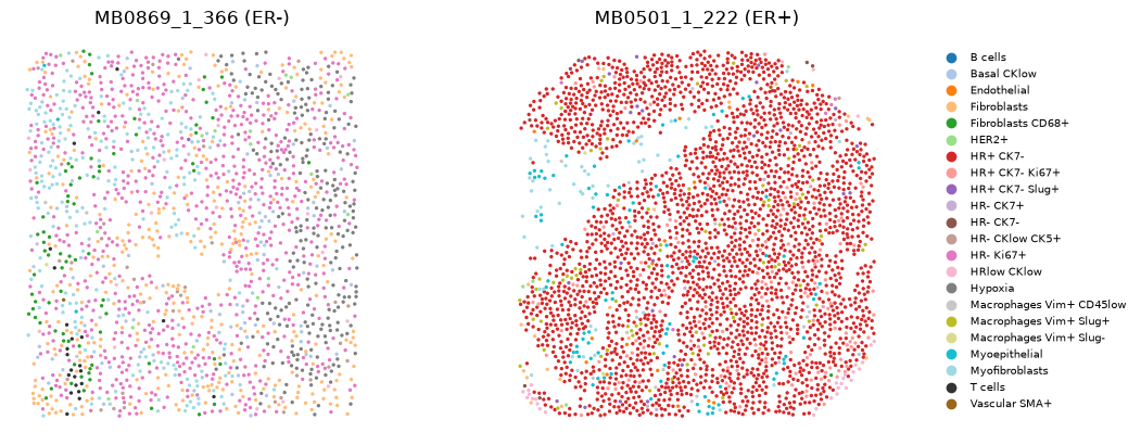
We use imaging mass cytometry of breast tumours from the METABRIC cohort (Ali et al., Nature Cancer 2020). Each
of the 456 patients with known oestrogen receptor (ER) status contributed one tumour core, and the authors assigned
each cell to one of 22 types. Their labels name tumour cells by marker: HR is hormone receptor, CK cytokeratin, and
Ki67+ marks proliferating cells, so HR- Ki67+ are proliferating hormone-receptor-negative tumour cells.
spicyr.datasets.metabric_ali2020() downloads the data once (130 MB) and caches it. We ask for an AnnData object:
one observation per cell, with the clinical data in obs and the coordinates, in micrometres, in
obsm["spatial"].
adata = spicyr.datasets.metabric_ali2020(as_anndata=True)
adata = adata[adata.obs["ER.Status"].isin(["neg", "pos"])].copy()
adata.obs["ER"] = pd.Categorical(adata.obs["ER.Status"].map({"neg": "ER-", "pos": "ER+"}), categories=["ER-", "ER+"])
adata
AnnData object with n_obs × n_vars = 422629 × 0
    obs: 'file_id', 'metabricId', 'core_id', 'ImageNumber', 'ObjectNumber', 'Location_Center_X', 'Location_Center_Y', 'SOM_nodes', 'pg_cluster', 'description', 'Age.At.Diagnosis', 'Breast.Tumour.Laterality', 'Date.Of.Diagnosis', 'Last.Followup.Status', 'NPI', 'ER.Status', 'Inferred.Menopausal.State', 'Lymph.Nodes.Positive', 'Breast.Surgery', 'CT', 'HT', 'RT', 'Grade', 'Size', 'Histological.Type', 'Stage', 'DeathBreast', 'Death', 'T', 'TLR', 'LR', 'TDR', 'DR', 'Complete.Rec.History', 'timeRFS', 'eventRFS', 'sample_id', 'ER'
    obsm: 'spatial'
print(adata.obs.drop_duplicates("metabricId")["ER"].value_counts().sort_index())
adata.obs["description"].value_counts()
ER
ER-     83
ER+    373
Name: count, dtype: int64
description
HR+ CK7-                    114828
Myofibroblasts               57295
Fibroblasts                  49043
HR- CK7-                     34951
HR- CK7+                     29432
HRlow CKlow                  22824
T cells                      19218
HR+ CK7- Ki67+               17203
Fibroblasts CD68+            13716
HR- Ki67+                    13062
HR+ CK7- Slug+                7417
Macrophages Vim+ Slug-        6721
Hypoxia                       5639
Myoepithelial                 4637
HER2+                         4434
Macrophages Vim+ Slug+        3657
Macrophages Vim+ CD45low      3600
Endothelial                   3480
B cells                       3232
Basal CKlow                   3226
Vascular SMA+                 2908
HR- CKlow CK5+                2106
Name: count, dtype: int64
types = sorted(adata.obs["description"].unique())
palette = dict(zip(types, plt.cm.tab20(np.linspace(0, 1, 20)).tolist() + [[0.2, 0.2, 0.2, 1], [0.6, 0.4, 0.1, 1]]))
size = adata.obs["file_id"].value_counts()                      # show the largest core of each group
two_cores = [size[adata.obs.loc[adata.obs["ER"] == g, "file_id"].unique()].idxmax() for g in ["ER-", "ER+"]]

fig, axes = plt.subplots(1, 2, figsize=(11, 4.8))
for ax, core in zip(axes, two_cores):
    sub = adata[adata.obs["file_id"] == core]
    xy = sub.obsm["spatial"]
    ax.scatter(xy[:, 0], xy[:, 1], s=2, c=sub.obs["description"].map(palette).tolist())
    ax.set_title(f"{core} ({sub.obs['ER'].iloc[0]})")
    ax.set_aspect("equal")
    ax.axis("off")
handles = [plt.Line2D([], [], marker="o", ls="", color=palette[t], label=t) for t in types]
fig.legend(handles=handles, fontsize=7, loc="center left", bbox_to_anchor=(0.92, 0.5), frameon=False)
plt.subplots_adjust(right=0.9)
Testing every pair of cell types#
spicy() needs the column of the condition, the column of the patient (subject) and a radius. It accepts an
AnnData object, a SpatialData object or a pandas DataFrame with one row per cell. By default it looks for columns
called imageID and cellType; here we name the dataset’s own columns.
Tip
Choose the radius before looking at the results, from the scale at which you expect cells to interact: 10 to 25 µm for contact, 50 to 100 µm for a shared neighbourhood. Here we use 25 µm, about two to three cell diameters. If you are unsure, give several radii (see Which radius?).
res = spicyr.spicy(adata, condition="ER", subject="metabricId", r=25,
                   image_id="file_id", cell_type="description")
res
spicyr (cell-level test): 484 pairs, ER+ vs ER-, r = 25
Units: 456 patients with 456 images
BH-adjusted p < 0.05: 32 pairs
See top_pairs() and .cell_results.
All 484 ordered pairs of cell types are tested in a few seconds on one core. Run time and memory grow roughly in proportion to the number of cells and to the radius.
top_pairs() lists the most significant pairs. intercept is the average effect in ER− patients, and
coefficient is the difference in average effect between ER+ and ER− patients (ER+ minus ER−), as a fraction of
the to cells. P-values are adjusted across all pairs by the Benjamini–Hochberg method.
res.top_pairs(8)
| intercept | coefficient | p.value | adj.pvalue | from | to | |
|---|---|---|---|---|---|---|
| HR+ CK7-__HR+ CK7- Ki67+ | 0.0864 | 0.5531 | 1.1721e-27 | 5.6730e-25 | HR+ CK7- | HR+ CK7- Ki67+ |
| HR+ CK7-__HR- CK7- | 0.0838 | 0.3442 | 2.2483e-18 | 5.4410e-16 | HR+ CK7- | HR- CK7- |
| HR+ CK7-__HR- CK7+ | 0.1019 | 0.3892 | 5.9455e-16 | 9.5921e-14 | HR+ CK7- | HR- CK7+ |
| HR+ CK7-__HR+ CK7- | 0.2389 | 0.3611 | 2.7152e-10 | 3.2854e-08 | HR+ CK7- | HR+ CK7- |
| HR+ CK7-__Macrophages Vim+ Slug+ | 0.0402 | 0.3062 | 8.2457e-10 | 7.9818e-08 | HR+ CK7- | Macrophages Vim+ Slug+ |
| HR+ CK7-__HR+ CK7- Slug+ | 0.0516 | 0.4594 | 6.4469e-09 | 5.2005e-07 | HR+ CK7- | HR+ CK7- Slug+ |
| HR+ CK7- Ki67+__HR- CK7+ | 0.2354 | -0.2109 | 1.1925e-08 | 8.2455e-07 | HR+ CK7- Ki67+ | HR- CK7+ |
| HR- CK7+__HR+ CK7- Ki67+ | 0.4153 | -0.3229 | 4.8231e-08 | 2.9180e-06 | HR- CK7+ | HR+ CK7- Ki67+ |
The most significant pairs nearly all have HR+ CK7- tumour cells as the from type; we come back to them in
Tissue compartments.
The full results are in res.cell_results, a DataFrame with one row per pair:
Column |
Meaning |
|---|---|
|
average effect in the reference group (ER−) and the comparison group (ER+) |
|
their difference, its standard error and degrees of freedom |
|
p-value, and Benjamini–Hochberg adjusted p-value across all pairs |
|
how much the effect varies between patients within a group |
|
with covariates, what the test was adjusted for and the effect of each covariate |
|
with covariates, the same test without them |
With more than two groups there is one row per pair and group, each compared with the reference group, in a column
level.
Seeing every pair at once#
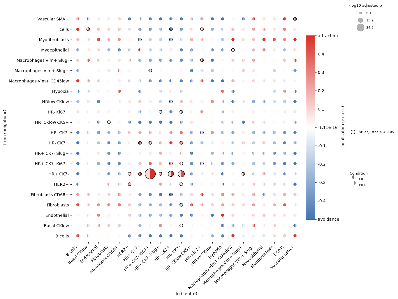
signif_plot() shows the whole study. Read rows as from and columns as to. Each circle is a pair: the left half
is coloured by the effect in ER− tumours and the right half by the effect in ER+ tumours (red: more to cells next
to from cells than chance, blue: fewer), the size reflects the p-value, and a black ring marks a BH-adjusted p-value below 0.05.
res.signif_plot(fdr=True, breaks=(-0.5, 0.5, 0.1));
Looking at one pair#
We focus on an immune pair, T cells → HR- Ki67+: are proliferating hormone-receptor-negative tumour cells placed
near T cells? Its effect is the extra fraction of these tumour cells with a T cell within 25 µm.
pair = "T cells__HR- Ki67+"
res.cell_results.loc[[pair], ["excess_ref", "excess_comp", "excess_difference", "p_value", "p_adj"]]
| excess_ref | excess_comp | excess_difference | p_value | p_adj | |
|---|---|---|---|---|---|
| T cells__HR- Ki67+ | 0.0275 | 0.1387 | 0.1113 | 0.0008 | 0.0196 |
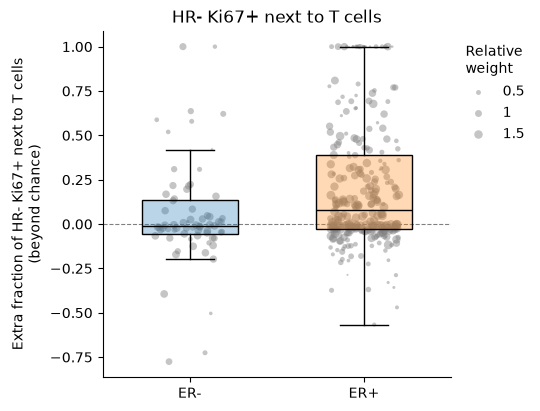
In ER− tumours these tumour cells have a T cell nearby barely more often than chance would give (0.02). In ER+ tumours the effect is 0.12, as if about one in nine of them had been placed next to T cells.
box_plot() shows the effect in each image (here one image per patient), with a point per image behind each box.
Points are sized by how much the image contributes to the test.
res.box_plot("T cells", "HR- Ki67+");
With interactive=True the plot is a plotly figure. Hover over a point to see which image it is.
res.box_plot("T cells", "HR- Ki67+", interactive=True)
Important
This is an association in one cohort; it does not show that T cells attract the tumour cells, or the reverse.
bind() returns the per-image values as a DataFrame, for your own plots or models. Images without any HR- Ki67+
cells carry no information about the pair (NaN).
res.bind(pair).head(6)
| imageID | condition | subject | T cells__HR- Ki67+ | |
|---|---|---|---|---|
| 0 | MB0000_1_527 | ER+ | MB-0000 | NaN |
| 1 | MB0002_1_345 | ER+ | MB-0002 | -0.0109 |
| 2 | MB0005_1_211 | ER+ | MB-0005 | -0.0131 |
| 3 | MB0010_1_420 | ER+ | MB-0010 | 0.2566 |
| 4 | MB0013_1_371 | ER+ | MB-0013 | NaN |
| 5 | MB0014_1_326 | ER+ | MB-0014 | 0.4800 |
Looking at the images#
plot_image() shows one image: the density of all cells in blue, the from cells in gold and the to cells in
dark red. With r, it draws the circle around each to cell inside which spicyr looks for from cells. We look
at three images found with the interactive box plot.
d = res.bind(pair).set_index("imageID")
d["weight"] = res.image_weights[pair]
examples = ["MB0150_1_155", "MB0132_1_533", "MB0244_1_519"]
d.loc[examples, ["condition", pair, "weight"]]
| condition | T cells__HR- Ki67+ | weight | |
|---|---|---|---|
| imageID | |||
| MB0150_1_155 | ER+ | 0.6774 | 0.0055 |
| MB0132_1_533 | ER- | -0.0791 | 0.0172 |
| MB0244_1_519 | ER+ | 1.0000 | 0.0010 |
fig, axes = plt.subplots(1, 3, figsize=(16, 5))
for ax, image in zip(axes, examples):
    spicyr.plot_image(adata, image, "T cells", "HR- Ki67+", r=25, image_id="file_id", cell_type="description", ax=ax)
    ax.set_title(f"{image} ({d.loc[image, 'condition']}), effect {d.loc[image, pair]:.2f}")
plt.tight_layout()
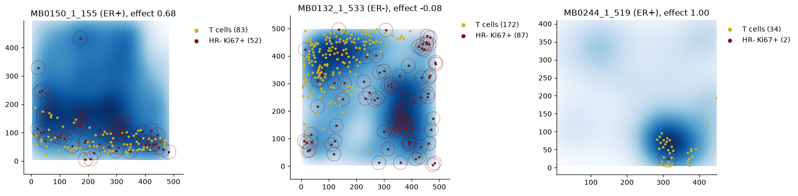
In the ER+ image on the left, the T cells run along the band of tumour cells at the bottom: an effect of 0.68, as if two-thirds of the tumour cells had been placed next to T cells. In the ER− image in the middle, the T cells are concentrated top left, apart from most of the tumour cells, and slightly fewer tumour cells have a T cell nearby than chance would give (−0.08). The ER+ image on the right reaches the largest possible value, 1, but only because its two tumour cells both happen to sit in a cluster of T cells.
Tip
Point size matters. The right-hand image sits at the top of the box plot, but its weight is close to zero: an
effect estimated from two cells says little. Weights also level off. Once an image has a few dozen to cells,
more cells add little, because the differences between patients outweigh the noise within an image.
The weights are in res.image_weights.
Tissue compartments#
The most significant pairs have HR+ CK7- tumour cells as the from type. These cells make up about a quarter of
the cells in a typical ER+ core and almost none in ER− cores. In ER+ tumours they make up much of the tumour tissue
and the other tumour cells sit among them, so far more of those cells have an HR+ CK7- cell nearby than if they
had been placed at random among all the other cells, stroma included.
tab = res.cell_results[res.cell_results["from"] == "HR+ CK7-"]
tab.sort_values("p_value")[["to", "excess_ref", "excess_comp", "p_adj"]].head(6)
| to | excess_ref | excess_comp | p_adj | |
|---|---|---|---|---|
| HR+ CK7-__HR+ CK7- Ki67+ | HR+ CK7- Ki67+ | 0.0864 | 0.6395 | 5.6730e-25 |
| HR+ CK7-__HR- CK7- | HR- CK7- | 0.0838 | 0.4280 | 5.4410e-16 |
| HR+ CK7-__HR- CK7+ | HR- CK7+ | 0.1019 | 0.4911 | 9.5921e-14 |
| HR+ CK7-__HR+ CK7- | HR+ CK7- | 0.2389 | 0.5999 | 3.2854e-08 |
| HR+ CK7-__Macrophages Vim+ Slug+ | Macrophages Vim+ Slug+ | 0.0402 | 0.3465 | 7.9818e-08 |
| HR+ CK7-__HR+ CK7- Slug+ | HR+ CK7- Slug+ | 0.0516 | 0.5110 | 5.2005e-07 |
In ER+ tumours the effect for proliferating HR+ CK7- Ki67+ cells is 0.60, against 0.07 in ER− tumours, while
fibroblasts and T cells are placed away from HR+ CK7- cells (where HR+ CK7- cells are rare, as in ER− cores, an
effect cannot fall far below zero). These are real differences in arrangement, but they
describe the structure of the tissue (tumour cells sit with tumour cells) more than an interaction between
particular cell types.
Note
To ask about arrangement within a compartment, for example whether proliferating tumour cells sit closer to
HR+ CK7- cells than other tumour cells do, compare with random labelling among the tumour cells only. The
Kontextual test in the R package Statial does this.
Allocation or count?#
By default spicyr asks whether each to cell has a from cell nearby. With effect="count" it asks how many: the
effect is then the number of extra from cells within the radius of each to cell.
res_count = spicyr.spicy(adata, condition="ER", subject="metabricId", r=25,
                         image_id="file_id", cell_type="description", effect="count")
res_count.cell_results.loc[[pair], ["excess_ref", "excess_comp", "excess_difference", "p_value", "p_adj"]]
| excess_ref | excess_comp | excess_difference | p_value | p_adj | |
|---|---|---|---|---|---|
| T cells__HR- Ki67+ | 0.0439 | 0.2912 | 0.2474 | 6.6539e-05 | 0.0015 |
In ER+ tumours each proliferating tumour cell has about 0.16 extra T cells within 25 µm, against 0.01 in ER−
tumours. The count also reflects how many T cells surround each tumour cell, but it grows with how tightly the
from cells are packed: if T cells form denser clusters in one group, each tumour cell next to a cluster counts more
T cells. The default effect counts each tumour cell once, however many T cells are beside it, so denser clusters do
not inflate it.
Note
Use the default when your question is whether to cells are placed next to from cells. Use effect="count" when
the number of from cells around each to cell is the question, keeping in mind that it also rises when the from
cells are packed more tightly. adjust_abundance=True adds the log share of the from type in each image to the
model, so that groups are compared at the same abundance; it does not account for how tightly the from cells are
packed, and when that share differs strongly between groups, as for HR+ CK7- here, it leaves little power.
Patients with several images#
Each patient here has one core. When patients contribute several images, give the patient column as subject: the
images of each patient are combined, and patients remain the units of the test.
Warning
Treating every image as an independent patient overstates the evidence. Always give subject when patients have
several images.
Adjusting for clinical covariates#
Covariates measured per patient or per image are added with covariates. Here we also adjust the ER comparison for
age at diagnosis and tumour grade.
adata.obs["Grade"] = pd.Categorical(adata.obs["Grade"])
res_cov = spicyr.spicy(adata, condition="ER", subject="metabricId", r=25,
                       image_id="file_id", cell_type="description",
                       covariates=["Age.At.Diagnosis", "Grade"])
res_cov
spicyr (cell-level test): 484 pairs, ER+ vs ER-, r = 25
Units: 456 patients with 456 images
Adjusted for: covariates (unadjusted test in the unadjusted_* columns)
3 pairs could not be adjusted and are reported unadjusted (see adjusted_for)
BH-adjusted p < 0.05: 20 pairs (32 without adjustment)
See top_pairs() and .cell_results.
The main columns (excess_difference, p_value, p_adj) are now the ER comparison adjusted for age and grade.
Each covariate also has its own effect and p-value. A categorical covariate has one per level after the first:
Grade2 and Grade3 compare grades 2 and 3 with grade 1.
cols = ["excess_difference", "p_value", "Age.At.Diagnosis_effect", "Age.At.Diagnosis_p_value",
        "Grade2_effect", "Grade2_p_value", "Grade3_effect", "Grade3_p_value"]
res_cov.cell_results.loc[[pair], cols]
| excess_difference | p_value | Age.At.Diagnosis_effect | Age.At.Diagnosis_p_value | Grade2_effect | Grade2_p_value | Grade3_effect | Grade3_p_value | |
|---|---|---|---|---|---|---|---|---|
| T cells__HR- Ki67+ | 0.1141 | 0.0011 | 0.0011 | 0.1992 | 0.0181 | 0.7581 | 0.0241 | 0.6759 |
The difference between ER+ and ER− patients is much the same after adjusting for age and grade, and neither has a clear effect of its own on this pair. Patients with a missing covariate are left out of the adjusted test.
Note
A pair that cannot be adjusted, for example because its cell types appear in images of only one grade, is reported
unadjusted, and its adjusted_for column says why. The printed summary above counts these pairs.
Restricting from_ and to does not change the results for the pairs that are tested.
Which radius?#
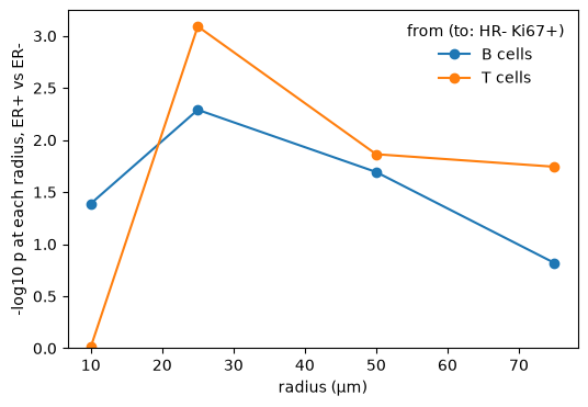
The scale of an interaction is rarely known in advance. Give several radii and spicyr tests them together, using a
max-T test that accounts for the strong correlation between neighbouring radii. The exact max-T handles up to six
radii; for a finer grid, such as every 2 µm up to 50 µm, combine="davies" uses Davies’ bound for the maximum over a
smooth range of radii, which stays close to the exact max-T when neighbouring radii are highly correlated.
combine="cauchy" is another alternative.
res_r = spicyr.spicy(adata, condition="ER", subject="metabricId", r=[10, 25, 50, 75],
                     image_id="file_id", cell_type="description")
res_r.cell_results.loc[[pair, "B cells__HR- Ki67+"], ["r", "excess_difference", "p_value"]]
| r | excess_difference | p_value | |
|---|---|---|---|
| T cells__HR- Ki67+ | 25.0 | 0.1113 | 0.0028 |
| B cells__HR- Ki67+ | 25.0 | 0.0539 | 0.0180 |
r is the radius with the strongest evidence, and p_value the combined p-value over all radii.
Tip
The effect depends on the radius: at a larger radius more cells have a from cell nearby by chance, and the effect
describes placement at that scale. Where most cells have a from cell nearby by chance, there is little room for
an effect and it is noisy. Compare p-values across radii rather than the size of the effect. The effect at
the chosen radius is a little optimistic, because that radius was picked for its strength.
rr = res_r.radius_results
fig, ax = plt.subplots(figsize=(6, 4))
for from_, g in rr[(rr["to"] == "HR- Ki67+") & rr["from"].isin(["T cells", "B cells"])].groupby("from"):
    ax.plot(g["r"], -np.log10(g["p_value"]), marker="o", label=from_)
ax.set(ylim=(0, None), xlabel="radius (µm)", ylabel="-log10 p at each radius, ER+ vs ER-")
ax.legend(title="from (to: HR- Ki67+)", frameon=False);
Is co-localisation associated with survival?#
With survival=(time, event), spicyr asks whether a patient’s effect is associated with their outcome. Here we use
relapse-free survival, adjusting for age.
res_s = spicyr.spicy(adata, survival=("timeRFS", "eventRFS"), subject="metabricId", r=25,
                     image_id="file_id", cell_type="description", covariates="Age.At.Diagnosis")
res_s
spicyr (cell-level test): 484 pairs, association with survival, r = 25
Units: 456 patients with 456 images
Adjusted for: covariates
BH-adjusted p < 0.05: 5 pairs
See top_pairs() and .cell_results.
cols = ["from", "to", "p_value", "p_adj", "hazard_ratio_sd"]
res_s.cell_results.sort_values("p_value")[cols].head(6)
| from | to | p_value | p_adj | hazard_ratio_sd | |
|---|---|---|---|---|---|
| HR+ CK7-__HR- CK7+ | HR+ CK7- | HR- CK7+ | 1.8279e-05 | 0.0064 | 0.6473 |
| HR+ CK7-__HR+ CK7- Ki67+ | HR+ CK7- | HR+ CK7- Ki67+ | 2.6318e-05 | 0.0064 | 0.6783 |
| HRlow CKlow__HR- CK7+ | HRlow CKlow | HR- CK7+ | 1.0234e-04 | 0.0165 | 0.6692 |
| HR- CK7+__HRlow CKlow | HR- CK7+ | HRlow CKlow | 1.4122e-04 | 0.0171 | 0.7081 |
| HR+ CK7-__Endothelial | HR+ CK7- | Endothelial | 4.7536e-04 | 0.0460 | 1.5314 |
| Myoepithelial__Macrophages Vim+ CD45low | Myoepithelial | Macrophages Vim+ CD45low | 9.7603e-04 | 0.0787 | 0.6411 |
The p-value comes from a score test that relates each patient’s effect to their outcome. hazard_ratio_sd is the
hazard ratio for a one standard deviation higher effect, from a Cox model; below one, patients with a higher effect
had a lower risk of relapse. It is missing when the effect barely varies between patients.
Two pairs are significant after adjusting for multiple testing, both with HR+ CK7- tumour cells as the from
type: patients in whom more of the other tumour cells sat next to HR+ CK7- cells relapsed later. These cells are
typical of ER+ tumours, and ER status is itself related to relapse, so we add it to the covariates.
res_s_er = spicyr.spicy(adata, survival=("timeRFS", "eventRFS"), subject="metabricId", r=25,
                        image_id="file_id", cell_type="description", covariates=["Age.At.Diagnosis", "ER"])
res_s_er
spicyr (cell-level test): 484 pairs, association with survival, r = 25
Units: 456 patients with 456 images
Adjusted for: covariates
BH-adjusted p < 0.05: 0 pairs
See top_pairs() and .cell_results.
No pair remains significant: these two pairs say little about relapse beyond the tumour’s ER status.
A check you can run#
A test should give few significant results when there is nothing to find. Shuffling the ER labels across patients removes any real difference, so about 5% of pairs should then have p < 0.05, and about 1% p < 0.01.
rng = np.random.default_rng(2026)
patients = adata.obs.drop_duplicates("metabricId")[["metabricId", "ER"]]
rows = []
for i in range(5):
    label = dict(zip(patients["metabricId"], rng.permutation(patients["ER"].to_numpy())))
    adata.obs["shuffled"] = adata.obs["metabricId"].map(label).astype(str)
    s = spicyr.spicy(adata, condition="shuffled", subject="metabricId", r=25,
                     image_id="file_id", cell_type="description")
    p = s.cell_results["p_value"]
    rows += [(i, "p < 0.05", 100 * (p < 0.05).mean()), (i, "p < 0.01", 100 * (p < 0.01).mean())]
shuffles = pd.DataFrame(rows, columns=["shuffle", "threshold", "percent"])
shuffles.groupby("threshold")["percent"].mean()
threshold
p < 0.01    1.0744
p < 0.05    5.2066
Name: percent, dtype: float64
fig, ax = plt.subplots(figsize=(5, 3.5))
for k, th in enumerate(["p < 0.05", "p < 0.01"]):
    v = shuffles.loc[shuffles["threshold"] == th, "percent"]
    ax.scatter(k + rng.uniform(-0.08, 0.08, len(v)), v, color="black", alpha=0.7)
    ax.hlines({"p < 0.05": 5, "p < 0.01": 1}[th], k - 0.25, k + 0.25, color="#b3261e", lw=2)
ax.set_xticks([0, 1], ["p < 0.05", "p < 0.01"])
ax.set(xlim=(-0.6, 1.6), ylim=(0, 15), ylabel="pairs below the threshold",
       title="5 shuffles of the ER labels (red: expected)")
ax.yaxis.set_major_formatter(lambda v, _: f"{v:g}%")
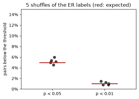
Pairs share cells, so the percentage moves by a few points from one shuffle to the next.
Tip
Run this check on your own data before trusting a discovery. It takes a few minutes and shows whether the test is calibrated for your study design.
How it works#
For a pair from → to and an image, let \(O\) be the number of to cells with at least one from cell within \(r\),
out of \(n\) to cells. If the to cells were a random choice among the cells of the image that are not from
cells, keeping every cell where it is, \(O\) would have an exact mean and variance, which spicyr computes without
permutations. The effect of an image is
where \(\mathrm{E}_{\mathrm{RL}}(O)\) is that expectation under random labelling. If a fraction \(f\) of the to
cells were placed next to from cells and the rest at random, \(\delta\) would estimate \(f\). At radius \(r\), \(O/n\) is
the cross-type nearest-neighbour distribution function \(G\) of spatial statistics, and \(\delta\) compares it with
random labelling, much as the J function compares \(G\) with the empty-space function (van Lieshout and Baddeley
1996). Negative values mean
fewer to cells next to from cells than chance; they are not a fraction, and the lowest possible value,
\(-\mathrm{E}_{\mathrm{RL}}(O)/(n - \mathrm{E}_{\mathrm{RL}}(O))\), is far below zero only where from cells are
common. With effect="count", \(O\) is instead the sum, over the to cells, of the number of from cells within \(r\)
of each, and the denominator is \(n\), an analogue of Ripley’s K function.
Images from the same patient are combined, giving more weight to more informative images (usually those with more
to cells), up to a limit: a patient’s images can differ in their true effect, by an amount estimated from the
spread between each patient’s images (DerSimonian and Laird), so one large image cannot outweigh the patient’s other
images. Each patient has its own true effect, which varies around its group’s mean by an amount estimated
from the data (a frailty, or random-effects, model). The difference between groups, adjusted for any covariates, is
tested with a small-sample cluster-robust (CR2) variance on
Satterthwaite degrees of freedom, with patients as the clusters. This is designed to keep false positives near the
nominal rate even with modest numbers of patients. A paper describing the method is in preparation.
Small studies#
With fewer than about ten patients per group, expect few significant pairs, even when an effect is consistent across
patients: a calibrated test cannot be confident with little information. Look at whether the patients agree in
direction with box_plot().
Note
variance="hartung_knapp" can give more power in very small studies. It assumes that patients vary about equally
in both groups and can give too many small p-values for rare cell types, so it is not the default.
Very large data sets: SpatialData stores#
Some imaging studies hold more cells than fit in memory. spicy() also reads a SpatialData Zarr store, or an
AnnData Zarr store, from disk: give the path of the store as cells. Every neighbour count is a sum within one
image, so spicyr loads the image and cell-type columns once as integer codes and reads the coordinates one batch of
whole images at a time. Memory then depends on the size of an image and on the number of threads (cores), not on
the size of the study, and the results are the same as for the same cells in memory.
To make a small store, we write 20 cores of each ER group with write_cell_store(). It needs a DataFrame (or an
AnnData object) with one row per cell; the image column becomes the table’s region key and the coordinates its
obsm array "spatial". A second table holds one row per core, with the patient and ER status.
import tempfile
from pathlib import Path

some_cores = [c for g in ["ER-", "ER+"] for c in sorted(adata.obs.loc[adata.obs["ER"] == g, "file_id"].unique())[:20]]
small = adata[adata.obs["file_id"].isin(some_cores)]
small = small[np.argsort(small.obs["file_id"].to_numpy(), kind="stable")].copy()  # the rows of each core together
core_info = small.obs.drop_duplicates("file_id").set_index("file_id")[["metabricId", "ER"]]
xy = small.obsm["spatial"]
path = Path(tempfile.mkdtemp()) / "metabric.zarr"
spicyr.write_cell_store(small.obs[["file_id", "description"]].assign(x=xy[:, 0], y=xy[:, 1]), path,
                        image_id="file_id", image_info=core_info)
print(small.n_obs, "cells of", len(core_info), "cores")
sorted(p.name for p in (path / "tables").iterdir() if p.is_dir())
43271 cells of 40 cores
['images', 'table']
The store holds the cells of the 40 cores in a cell table, and a table of the cores called "images".
spicy() reads the store with the arguments used above. The image column defaults to the table’s region key and
the coordinates to obsm["spatial"]. The condition and the patient are not columns of the cell table, so
image_info names the table that holds them.
res_store = spicyr.spicy(str(path), condition="ER", subject="metabricId", r=25, cell_type="description",
                         image_info="images")
The result is that of the same cells in memory:
res_memory = spicyr.spicy(small, condition="ER", subject="metabricId", r=25, image_id="file_id",
                          cell_type="description")
pd.testing.assert_frame_equal(res_store.cell_results, res_memory.cell_results, check_exact=True)
res_store.cell_results.equals(res_memory.cell_results)
True
Every estimate, standard error and p-value is identical, not just close. The spatialdata package reads the same
store as a SpatialData object, which spicy() analyses in the same way:
import spatialdata as sd

sdata = sd.read_zarr(path)
res = spicyr.spicy(sdata, condition="ER", subject="metabricId", r=25, cell_type="description", image_info="images")
A few arguments matter for stores. table_key chooses the cell table of a SpatialData store or object (by default
"table"). image_info supplies the condition, the patient, covariates or the survival columns when they are not
columns of the cell table: give a DataFrame (or an AnnData object) whose image_id column, or else its index,
holds the image IDs, or the key of a table in the store. Every image needs a row in it. spatial_coords names
either two obs columns or one obsm array, whose first two columns are used; by default obsm["spatial"].
Tip
Store the cells grouped by image. When the rows of each image sit together, as they do when the table is sorted by its region column before it is written, each batch of images is read as one slice of rows. Otherwise each batch needs a pass over the image codes. Categorical image and cell-type columns also keep the store small.
In a benchmark on a synthetic store of one billion cells in 500 images, spicy() ran on one thread in under 4 GB of
memory.
Reporting results#
A methods sentence might read: “We used spicyr (version 1.99.15) to test, for every ordered pair of cell types,
whether the fraction of to cells with at least one from cell within 25 µm, relative to random labelling of the
cells in each image, differed between ER+ and ER− patients, with patients as the units of analysis. P-values were adjusted across pairs by the Benjamini–Hochberg method.” Show a
per-patient plot (box_plot()) and an image of the pair (plot_image()) alongside the p-value. Please cite
Canete et al. (2022), Bioinformatics 38(11), 3099–3105; a paper describing the cell-level test is in preparation.
spicyR in R#
The same test is in the Bioconductor package spicyR, for
SpatialExperiment objects, with the same results. spicyR also has the original image-level test of spicyR before
version 2.0.
Session information#
import importlib.metadata as md
import platform

print("Python", platform.python_version())
for p in ["spicyr", "numpy", "pandas", "anndata", "zarr", "matplotlib", "plotly"]:
    print(p, md.version(p))
Python 3.12.15
spicyr 1.99.21
numpy 2.5.4
pandas 3.0.6
anndata 0.13.4
zarr 3.4.1
matplotlib 3.11.2
plotly 7.1.0