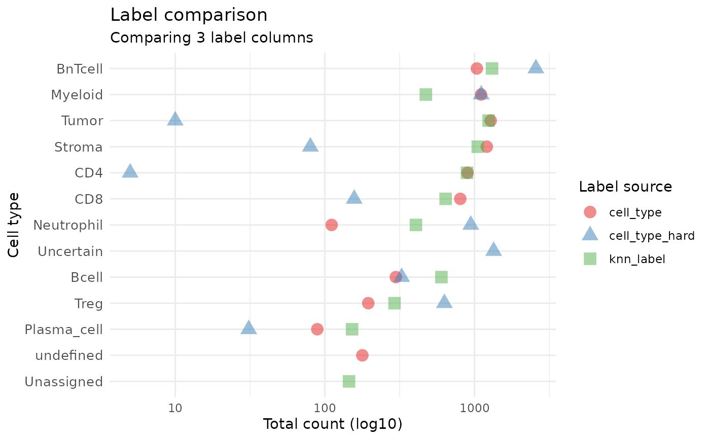
Creates a dotplot comparing cell type distributions across multiple label columns. The y-axis shows all unique cell types found across the specified label columns (excluding Unknown/NA), x-axis shows counts, and points are colored by which label column they came from.
Usage
plot_label_dotplot(
  spe,
  label_cols,
  title = "Label comparison",
  subtitle = NULL,
  drop_unknown = TRUE,
  drop_na = TRUE,
  point_size = 4,
  show_legend = TRUE
)
Arguments
- spe
A `SpatialExperiment`/`SingleCellExperiment`.
- label_cols
Character vector of column names in `colData(spe)` to compare. Each column should contain cell type labels.
- title
Plot title.
- subtitle
Optional subtitle.
- drop_unknown
Logical; if TRUE, exclude "Unknown" from cell types. Default TRUE.
- drop_na
Logical; if TRUE, drop NA values. Default TRUE.
- point_size
Size of points. Default 4.
- show_legend
Logical; show legend. Default TRUE.