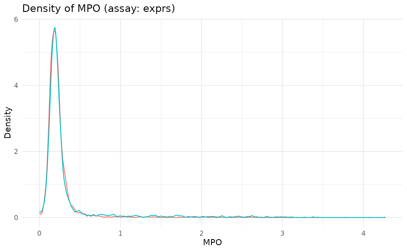
Generates a density plot for a single marker using the specified assay, with curves colored by the image/sample column. Useful for quick QC of normalisation steps.
Usage
plot_marker_density(
  spe,
  marker,
  assay_name = "exprs",
  image_col = "image_name",
  title = NULL,
  show_legend = FALSE
)
Arguments
- spe
A `SpatialExperiment`/`SingleCellExperiment` with the target assay and metadata in `colData()`.
- marker
Marker name to plot (must match a row in the assay).
- assay_name
Assay name to pull values from. Default "exprs".
- image_col
Column in `colData()` used to color densities. Default "image_name".
- title
Optional plot title. Defaults to "Density of {marker} (assay: {assay_name})".
- show_legend
Logical; whether to show the legend. Default `FALSE`.