5 Quality Control
Variability in marker intensity across images is a common challenge in spatial imaging, often driven by technical factors like staining efficiency, imaging conditions, or sample preparation. For instance, a marker such as CD3 might appear overly bright in one sample and faint in another, even if the underlying biology is similar. These inconsistencies can blur the distinction between marker-positive and -negative cells, leading to misclassification and unreliable comparisons between and within samples.
Because raw intensities aren’t always directly comparable across or within images, quality control is an essential next step after segmentation. The simpleSeg package includes tools to support this process, with functions for visualising expression, detecting batch effects, and applying normalisation. These steps help harmonise marker distributions across samples, clarify cell populations, and improve the reliability of downstream analyses.
# set parameters
set.seed(51773)

# whether to use multiple cores (recommended)
use_mc = TRUE
is_windows = .Platform$OS.type == "windows"

if (use_mc) {
  nCores = max(ceiling(parallel::detectCores() / 2), 1)

  if (nCores == 1) {
    BPPARAM = BiocParallel::SerialParam()
  } else if (is_windows) {
    BPPARAM = BiocParallel::SnowParam(workers = nCores, type = "SOCK")
  } else {
    BPPARAM = BiocParallel::MulticoreParam(workers = nCores)
  }
} else {
  BPPARAM = BiocParallel::SerialParam()
}

theme_set(theme_classic())
5.1 simpleSeg: Do my images have a batch effect?
First, let’s load in the images we previously segmented out in the last section. The SpatialDatasets package conveniently provides the segmented out images for the Ferguson 2022 dataset.
# load in segmented data
fergusonSPE <- SpatialDatasets::spe_Ferguson_2022()
Next, we assess whether the marker intensities require transformation or normalisation. This step is important for two main reasons:
Skewed distributions: Marker intensities are often right-skewed, which can distort downstream analyses such as clustering or dimensionality reduction.
Inconsistent scales across images: Due to technical variation, the same marker may show very different intensity ranges across images. This can shift what’s considered “positive” or “negative” expression, making it difficult to label cells accurately.
By applying transformation and normalisation, we aim to stabilise variance and bring the data onto a more comparable scale across images.
Below, we extract marker intensities from the counts assay and take a closer look at the CD3 marker, which is typically expressed in T cells and is often used as a canonical marker to annotate T cell populations. This provides a useful starting point for assessing intensity distributions and spotting potential technical variation across samples.
We use density plots here because they offer a straightforward way to visualise the distribution of expression values across cells in each image, making it easier to compare overall signal shifts and detect batch effects.
# plot densities of CD3 for each image
fergusonSPE |>
  join_features(features = rownames(fergusonSPE), shape = "wide", assay = "counts") |>
  ggplot(aes(x = CD3, colour = imageID)) +
  geom_density() +
  theme(legend.position = "none")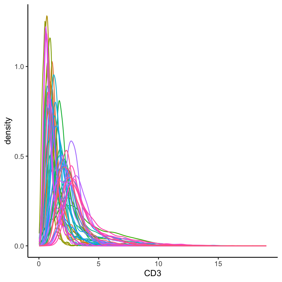
Here, we can see that the CD3 intensity distributions are highly skewed, making it difficult to distinguish CD3⁺ cells from CD3⁻ cells. Ideally, for a marker like CD3, we would expect to see a bimodal distribution—one peak corresponding to CD3⁻ cells (background or low expression) and another for CD3⁺ cells (true positive signal).
In addition to skewness, we also observe clear image-level batch effects. For example, the position and shape of the intensity peaks vary substantially between images, suggesting that what counts as “positive” expression in one image might fall below detection in another.
What we’re looking for
- Do the CD3+ and CD3- peaks clearly separate out in the density plot? To ensure that downstream clustering goes smoothly, we want our cell type specific markers to show 2 distinct peaks representing our CD3+ and CD3- cells. If we see 3 or more peaks where we don’t expect, this might be an indicator that further normalisation is required.
- Are our CD3+ and CD3- peaks consistent across our images? We want to make sure that our density plots for CD3 are largely the same across images so that a CD3+ cell in one image is equivalent to a CD3+ cell in another image.
Another way to visualise batch effects is by applying dimensionality reduction techniques (like PCA or UMAP) to the marker expression data and plotting the cells in two dimensions. If there are no major batch effects, cells from different images should largely overlap or mix well in this reduced space. However, if strong batch effects are present, cells will tend to cluster by image rather than by biological similarity—indicating that technical variation is dominating the structure of the data.
set.seed(51773)

# specify a subset of informative markers for UMAP and clustering
ct_markers <- c("podoplanin", "CD13", "CD31",
                "panCK", "CD3", "CD4", "CD8a",
                "CD20", "CD68", "CD16", "CD14",
                "HLADR", "CD66a")

# perform dimension reduction using UMAP
fergusonSPE <- scater::runUMAP(
  fergusonSPE,
  subset_row = ct_markers,
  exprs_values = "counts"
)

# select a subset of images to plot
someImages <- unique(fergusonSPE$imageID)[c(1, 5, 10, 20, 30, 40)]

# UMAP by imageID
scater::plotReducedDim(
  fergusonSPE[, fergusonSPE$imageID %in% someImages],
  dimred = "UMAP",
  colour_by = "imageID"
)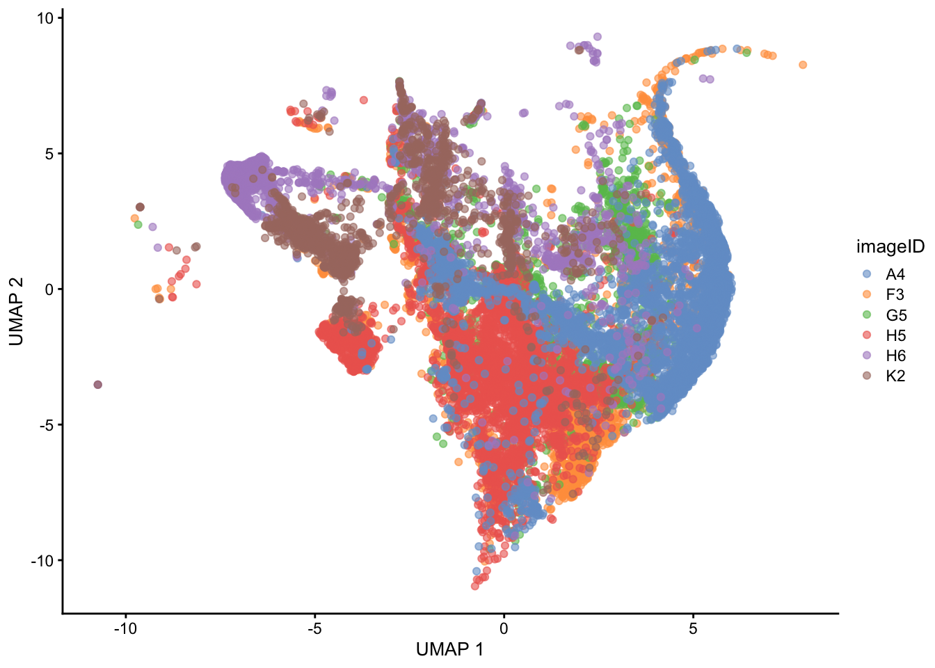
In the UMAP plot, cells cluster by image rather than mixing uniformly, indicating the presence of batch effects. This suggests that technical variation between images is driving much of the separation, rather than true biological differences.
We can use the normalizeCells function from the simpleSeg package to correct for image-level batch effects. We specify the following parameters:
-
transformationis an optional argument which specifies the function to be applied to the data. We do not apply an arcsinh transformation here, as we already apply a square root transform in thesimpleSegfunction. -
method = c("trim99", "mean", PC1")is an optional argument which specifies the normalisation method(s) to be performed. A comprehensive table of methods is provided below. -
assayIn = "counts"is a required argument which specifies the name of the assay that contains our intensity data. In our context, this is calledcounts.
# leave out the nuclei markers from our normalisation process
useMarkers <- rownames(fergusonSPE)[!rownames(fergusonSPE) %in% c("DNA1", "DNA2", "HH3")]

# transform and normalise the marker expression of each cell type
fergusonSPE <- normalizeCells(fergusonSPE,
                        markers = useMarkers,
                        transformation = NULL,
                        method = c("trim99", "mean", "PC1"),
                        assayIn = "counts",
                        cores = nCores)
This modified data is then stored in the norm assay by default, but can be changed using the assayOut parameter.
Choosing transformation and normalisation methods
Not all datasets require the same transformation or normalisation strategy. Choosing the right one can depend on both the biological context and the source of technical variability.
Do your marker intensities show strong skew or heavy tails? If so, applying a transformation (e.g., square root, log, or arcsinh) can help stabilise variance and separate low vs high signal populations.
Do images cluster separately in the UMAP plots? This often points to batch effects, which may require normalisation across images using approaches like centering on the mean, scaling by standard deviation, or regression-based adjustments (e.g., removing PC1, removing the highest 1% of values, etc.).
Are there markers you shouldn’t normalise? Nuclear markers like DNA1, DNA2, or HH3 often serve as internal references and typically aren’t normalised.
There’s no universal solution—experiment with different approaches, carefully examine the results, and focus on methods that best preserve biological meaning and interpretability rather than just achieving perfect statistical uniformity.
5.1.0.1 method Parameters
| Method | Description |
|---|---|
| “mean” | Divides the marker cellular marker intensities by their mean. |
| “minMax” | Subtracts the minimum value and scales markers between 0 and 1. |
| “trim99” | Sets the highest 1% of values to the value of the 99th percentile.` |
| “PC1” | Removes the 1st principal component. |
Multiple normalisation techniques can be applied within one call of the function, in the order specified by the user.
To check whether our transformation has worked, we can then plot the same density curve for the CD3 marker using the normalised data.
# plot densities of CD3 for each image
fergusonSPE |>
  join_features(features = rownames(fergusonSPE), shape = "wide", assay = "norm") |>
  ggplot(aes(x = CD3, colour = imageID)) +
  geom_density() +
  theme(legend.position = "none")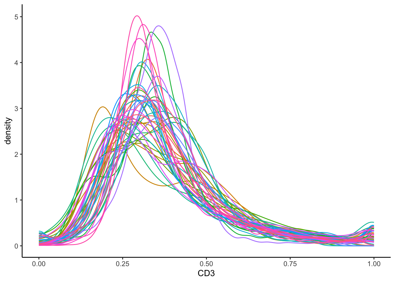
In the plot above, the normalised data appeas more bimodal. We can observe one clear CD3- peak at around 0.00, and a CD3+ peak at 1.00. Image-level batch effects also appear to have been mitigated, since most peaks occur at around the same CD3 intensity.
Questions revisited
- Do the CD3+ and CD3- peaks clearly separate out in the density plot? If not, we can try optimising the transformation if the distribution looks heavily skewed.
- Are our CD3+ and CD3- peaks consistent across our images? We can try to be more stringent in our normalisation, such as by removing the 1st PC (
method = c(..., "PC1")) or scaling the values for all images between 0 and 1 (method = c(..., "minMax")).
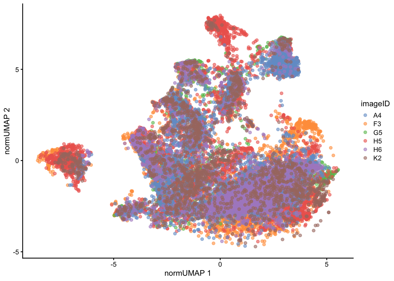
We can also visualise the effect of normalisation on the UMAP, which shows that the cells from different images now overlap with each other to a much greater extent.
set.seed(51773)

# perform dimension reduction using UMAP
fergusonSPE <- scater::runUMAP(
  fergusonSPE,
  subset_row = ct_markers,
  exprs_values = "norm",
  name = "normUMAP"
)

someImages <- unique(fergusonSPE$imageID)[c(1, 5, 10, 20, 30, 40)]

# UMAP by imageID
scater::plotReducedDim(
  fergusonSPE[, fergusonSPE$imageID %in% someImages],
  dimred = "normUMAP",
  colour_by = "imageID"
)
5.2 sessionInfo
R version 4.5.0 (2025-04-11)
Platform: aarch64-apple-darwin20
Running under: macOS Sonoma 14.4.1

Matrix products: default
BLAS:   /Library/Frameworks/R.framework/Versions/4.5-arm64/Resources/lib/libRblas.0.dylib
LAPACK: /Library/Frameworks/R.framework/Versions/4.5-arm64/Resources/lib/libRlapack.dylib;  LAPACK version 3.12.1

locale:
[1] en_US.UTF-8/en_US.UTF-8/en_US.UTF-8/C/en_US.UTF-8/en_US.UTF-8

time zone: Australia/Sydney
tzcode source: internal

attached base packages:
[1] stats4    stats     graphics  grDevices utils     datasets  methods
[8] base

other attached packages:
 [1] SpatialDatasets_1.6.3           SpatialExperiment_1.18.1
 [3] ExperimentHub_2.16.0            AnnotationHub_3.16.0
 [5] BiocFileCache_2.16.0            dbplyr_2.5.0
 [7] scater_1.36.0                   scuttle_1.18.0
 [9] simpleSeg_1.9.2                 ggplot2_3.5.2
[11] ttservice_0.4.1                 tidyr_1.3.1
[13] dplyr_1.1.4                     tidySingleCellExperiment_1.18.1
[15] SingleCellExperiment_1.30.1     SummarizedExperiment_1.38.1
[17] Biobase_2.68.0                  GenomicRanges_1.60.0
[19] GenomeInfoDb_1.44.0             IRanges_2.42.0
[21] S4Vectors_0.46.0                BiocGenerics_0.54.0
[23] generics_0.1.4                  MatrixGenerics_1.20.0
[25] matrixStats_1.5.0

loaded via a namespace (and not attached):
  [1] RColorBrewer_1.1-3      rstudioapi_0.17.1       jsonlite_2.0.0
  [4] magrittr_2.0.3          spatstat.utils_3.1-4    ggbeeswarm_0.7.2
  [7] magick_2.8.5            farver_2.1.2            rmarkdown_2.29
 [10] vctrs_0.6.5             memoise_2.0.1           RCurl_1.98-1.17
 [13] terra_1.8-50            svgPanZoom_0.3.4        htmltools_0.5.8.1
 [16] S4Arrays_1.8.0          curl_6.2.3              BiocNeighbors_2.2.0
 [19] raster_3.6-32           Rhdf5lib_1.30.0         SparseArray_1.8.0
 [22] rhdf5_2.52.0            htmlwidgets_1.6.4       cachem_1.1.0
 [25] plotly_4.10.4           mime_0.13               lifecycle_1.0.4
 [28] pkgconfig_2.0.3         rsvd_1.0.5              Matrix_1.7-3
 [31] R6_2.6.1                fastmap_1.2.0           GenomeInfoDbData_1.2.14
 [34] shiny_1.10.0            digest_0.6.37           colorspace_2.1-1
 [37] AnnotationDbi_1.70.0    irlba_2.3.5.1           RSQLite_2.3.11
 [40] textshaping_1.0.1       beachmat_2.24.0         labeling_0.4.3
 [43] filelock_1.0.3          fansi_1.0.6             nnls_1.6
 [46] httr_1.4.7              polyclip_1.10-7         abind_1.4-8
 [49] compiler_4.5.0          bit64_4.6.0-1           withr_3.0.2
 [52] tiff_0.1-12             BiocParallel_1.42.0     DBI_1.2.3
 [55] viridis_0.6.5           HDF5Array_1.36.0        cytomapper_1.20.0
 [58] rappdirs_0.3.3          DelayedArray_0.34.1     rjson_0.2.23
 [61] tools_4.5.0             vipor_0.4.7             beeswarm_0.4.0
 [64] httpuv_1.6.16           glue_1.8.0              h5mread_1.0.1
 [67] EBImage_4.50.0          rhdf5filters_1.20.0     promises_1.3.2
 [70] grid_4.5.0              gtable_0.3.6            spatstat.data_3.1-6
 [73] data.table_1.17.4       BiocSingular_1.24.0     ScaledMatrix_1.16.0
 [76] sp_2.2-0                XVector_0.48.0          RcppAnnoy_0.0.22
 [79] spatstat.geom_3.4-1     BiocVersion_3.21.1      ggrepel_0.9.6
 [82] pillar_1.10.2           stringr_1.5.1           later_1.4.2
 [85] lattice_0.22-6          bit_4.6.0               deldir_2.0-4
 [88] tidyselect_1.2.1        locfit_1.5-9.12         Biostrings_2.76.0
 [91] knitr_1.50              gridExtra_2.3           svglite_2.2.1
 [94] xfun_0.52               shinydashboard_0.7.3    stringi_1.8.7
 [97] UCSC.utils_1.4.0        fftwtools_0.9-11        yaml_2.3.10
[100] lazyeval_0.2.2          evaluate_1.0.3          codetools_0.2-20
[103] tibble_3.2.1            BiocManager_1.30.25     cli_3.6.5
[106] uwot_0.2.3              xtable_1.8-4            systemfonts_1.2.3
[109] dichromat_2.0-0.1       Rcpp_1.0.14             png_0.1-8
[112] spatstat.univar_3.1-3   parallel_4.5.0          ellipsis_0.3.2
[115] blob_1.2.4              jpeg_0.1-11             bitops_1.0-9
[118] viridisLite_0.4.2       scales_1.4.0            purrr_1.0.4
[121] crayon_1.5.3            rlang_1.1.6             cowplot_1.1.3
[124] KEGGREST_1.48.0